No matter how brilliant your business idea is or how good the marketing and developing teams are doing their jobs, if you don’t know how well it’s all performing, all your efforts are destined to fail.
Too often, SaaS business owners focus on managing development or doing PR and forget about the bigger picture. What they should do instead is focus on the most important task of a CEO, making informed decisions that lead the company forward.
That can’t be done without setting up a reliable SaaS data analytics system. That’s why 93% of CEOs are increasing their investments in data analytics.
Want to learn why you need analytics for SaaS and how to implement it in your company? This comprehensive guide will take you through that.
Why do you need SaaS analytics?
To exceed, you have to understand every aspect of your SaaS business. How it functions, how it develops, and where it fails.
Monitor growth
One of the most important things a business owner can know about their business is the dynamics of its growth. Month-over-month growth figures across the most important business metrics can show how well your business is doing or signal that a change in strategy is needed.
A well-managed SaaS analytics system turns gigabytes of sales and marketing data into a handy SaaS dashboard that shows all the important metrics.
You want to track the year-over-year and month-over-month change in revenue, sales volume, customer growth, and churn rate. The change in these is a strong indicator of how well a business is doing.
It’s even better if you can view these metrics in the quarterly or monthly form to see the change more clearly.
Monitor the performance of new strategies
Analytics for SaaS allows business owners and CEOs to not only monitor how the business is doing overall over long periods of time but also track the performance of specific business decisions.
You can track performance on select email campaigns in comparison with the ones you employ regularly. This can be done easily by comparing the number of conversions from different campaigns in a dashboard.
Or you can compare sales performance after you’ve implemented a new sales or marketing strategy. That would be a bit more complicated — you’d have to look not just for growth, but for month-over-month growth larger than in previous periods. This way, you’re checking if the new strategy is more effective than the previous one.
Speaking of SaaS strategies, we encourage you to have a look at the bonus part at the end of this article that’s devoted in particular to SaaS growth strategies and includes real-life examples.
Find bottlenecks that prevent growth
A huge benefit of setting up a SaaS data analytics system that stores historical data from multiple sources is that you can find bottlenecks that stifle growth opportunities. Can you do this with the help of an analytical dashboard? You can if it displays proper metrics.
It’s important to not only select metrics but also track their correlation and act on the results. For example, customer support tickets collected via a well-implemented help desk ticketing system can provide you with many insights on how you can improve your SaaS product: enhanced features, additional functionalities, revamped UI, and more. However, this information is not directly connected to analytics. In this example, active user metrics as a part of SaaS analytics can give more valuable insights. When you see that usage is dropping on a particular feature, it signals there’s been a failure on your part that needs improvement. Finding out what correlates with higher sales helps focus resources on improving aspects of your business that may lead to faster growth.
Therefore, the dashboard itself is not a magic pill. Not least important is the ability to read the data in the right way. That’s not a beginner-friendly task, so you may have to use the help of data experts.
Get insight into customers & customer journeys
In a business model where the bottom line depends on tens of thousands of users, understanding the customer journey is paramount. Analytics for SaaS helps you take a deep dive into the way your customers use the products to find a way to increase profits.
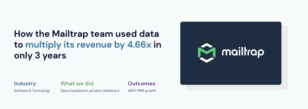
Coupler.io team analyzed customer behavior for Mailtrap to find what features are used the most and how different cohorts of users use the platform. After doing that and fine-tuning the pricing, 20% of free users signed up to a plan, and in the next three years, MRR grew 466%. Learn more
Predict future profits
A feature of data analytics that is important for any business, and is of utmost importance for startups, is the ability to predict future revenue. You can do a rough estimate by going with the current average month-over-month revenue growth to see what the revenue is likely to be in six to twelve months.
Knowing that allows you to budget for the future — when to increase spending and when to cut it.
Of course, any prediction based on historical data is only a projection. There are multiple factors at play when it comes to the functioning of a business. You can arrive at a more accurate picture of the future if you run prediction calculations with different key metrics.
This allows you to figure out how much the sales increase or customer churn can change before it affects the bottom line significantly.
Data sources for SaaS reporting and analytics
You can draw data from multiple platforms and applications to build SaaS performance reports for analytic purposes. Here’s a breakdown of the critical data sources:
CRMs
Customer relationship management (CRM) platforms provide data like customer contact information, interaction history, lead and opportunity details, purchase history, and customer segmentation. They also track feedback, satisfaction levels, engagement with marketing campaigns, service requests, and case resolutions. Analyze this data to improve your sales, marketing, and customer service efforts.
Popular CRMs: Salesforce, Pipedrive, HubSpot, Zoho
Analytics tools
Various analytics platforms let you monitor and understand user activity. For example, Google Analytics 4 is widely used for tracking website traffic. It records user actions as individual events, together with information about the source of users and sessions. In comparison, Amplitude shows how each individual interacts with your application or website, making it particularly helpful for product analytics.
Popular analytics tools: Google Analytics 4, Amplitude
Payment platforms
Systems like Stripe, Chargebee, and Braintree capture critical billing data, which is especially valuable for monitoring MRR. They provide detailed invoice and subscription records, which are ideal for tracking revenue streams. If you’re running a B2B business with larger invoices and longer billing cycles, you can use accounting platforms like QuickBooks or Xero to collect transaction data.
Popular payment platforms: Stripe, Chargebee, Braintree, QuickBooks, Xero
User activity monitoring tools
These tools provide user activity logs, which capture actions taken by both external customers and internal users. To track user actions, you can use built-in logging tools provided by your platform or cloud provider, such as AWS CloudTrail and Amazon CloudWatch for AWS services, as well as Google Cloud Audit Logs and Logs Explorer for Google Cloud resources.
Additionally, you can set up custom logging in your application to monitor specific actions through API calls. Tools like Microsoft Clarity and Hotjar can also record user sessions, providing heatmaps and video recordings to analyze user behavior.
Popular user activity monitoring tools: AWS CloudTrail, Amazon CloudWatch, Google Cloud Audit Logs, Google Logs Explorer, Microsoft Clarity, Hotjar
What metrics should you track for SaaS reporting?
Your business decisions depend on the data you track. So choosing the right metrics to keep an eye on is crucial for the development of your business. Here are what metrics you should track in the four aspects of your business.
SaaS business analytics
Business analytics is approached as a set of metrics that help measure business success with the main indicator expressed via revenue. Hence, the core SaaS business analytics metrics you should focus on are revenue-centered:
- Monthly recurring revenue (MRR)
- Annual recurring revenue (ARR)
- Life-time value (LTV)
- Customer churn rate
Additionally, you can track:
- Gross margin
- Average order
- Sales volume
- Month-over-month sales growth
- Month-over-month revenue growth
- Product funnel
Whenever you see a drop in these, it’s time to do a deeper analysis of the causes. You can do that by looking for correlations within other metrics, including marketing ones.
SaaS product analytics
Apart from knowing the financial figures, you also need to understand how customers use your SaaS product. The most convenient way to do product analytics for SaaS is with the help of the AARRR framework that covers the following set of metrics:
- Acquisition – number of users on all stages of the funnel.
- Activation – number of active users, those who experienced the product value.
- Retention – number of users who came back after activation.
- Referral – number of new users brought by the happy users of your product.
- Revenue – revenue brought by paid users.
Another set of metrics you can track is user success metrics. These give you a sense of how well both your product and your support teamwork.
- Customer satisfaction
- Number of support tickets
- Trends in support tickets
Product analytics for SaaS provide business owners with a lot of first-party data that can be used to improve the core product. Feature use trends can show you where to put resources in R&D to maximize growth. Low conversion figures on a product funnel indicate where you should put your marketing efforts. Trends in support tickets can show what your development team should improve on or what you should explain in a help portal in more detail.
SaaS marketing analytics
Marketing analytics for SaaS covers metrics to measure the performance of every channel used in your marketing and track revenue/number of leads in view of each channel.
Marketing analytics for SaaS, especially when compared between marketing campaigns, help you understand what type of marketing and which campaigns perform better. Understanding why that happens goes beyond statistics, though.
SaaS predictive analytics
Predictive analytics for SaaS can be added on any dashboard, but it’s most useful in general business analytics. Based on historical data on revenue and month-over-month growth, you can get an estimate of what MRR and other important metrics can be in six to twelve months. Then, you can build MRR dashboard to visualize it.
It’s best to do predictive analytics for SaaS in good and bad scenarios, with bad scenarios having lower month-over-month growth and higher customer churn.
SaaS analytics tools
There are dozens of SaaS analytics tools out there, but an average business only uses a couple. Let’s take a look at the most popular ones.
Google Analytics
Google Analytics is a must-have analytics tool. It provides hundreds of data points on your website and can be configured to track quite complex metrics. For instance, you can attribute conversions to specific channels or pages to have an idea of where to focus your efforts. You can run A/B tests on your site to improve conversion, or track customer behavior in real-time.
Google Analytics does have a paid version, but it’s for large corporations only as it sets you back $150,000 annually. Most small to medium businesses and even some larger ones can satisfy their data needs with the free plan.
UserPilot
UserPilor for apps is what GA is for websites. This business analytics tool allows users to record usage data inside the app and understand how your customers interact with the product. Also, you can do A/B tests within the SaaS product to see what brings better conversion figures.
This can be very helpful with both improving user onboarding and overall business goals. UserPilor is moderately priced for a business analytics platform, with plans starting at $249 per month.
Profitwell
Profitwell combines SaaS business analytics capabilities with an array of business development tools. For a monthly payment of between $1,000 and $15,000, you can get access to software that helps with revenue recognition, customer retention, and product pricing.
If the only thing that you need is business analytics, however, ProfitWell Metrics is completely free. The platform is surprisingly handy for a free one. It tracks dozens of subscription metrics like MRR tracking, engagement tracking, customer segmentation, and more.
Coupler.io
Coupler.io is known as a data integration solution to automate data exports. At the same time, Coupler.io is more than an ETL tool – it’s a data analytics platform that offers a set of tools and services for getting insights from data in a painless way. With it, you can create self-updating reports yourself using multiple integrations, such as Google Ads to BigQuery or Mailchimp to Google Sheets. In addition, Coupler.io offers free templates that let you create automated reports in minutes – for example, Google Sheets dashboards or templates for Looker Studio and Power BI.
One of the key powers of this tool is AI integrations – the capability to connect your data flows to AI tools like Claude or ChatGPT for conversational AI analytics.
Integrate your business data with AI?
 Try Coupler.io
Integrate your business data with AI?
Try Coupler.ioMost of the dashboards above were built by data analytics experts at Coupler.io. Such SaaS analytics dashboards allow you to have the whole picture in one place. This is a significant improvement to your decision-making that will be driven by data rather than guesswork. In addition to this, you get other benefits for your business.
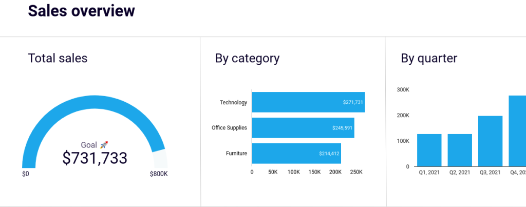
How to build a SaaS dashboard + example
If you’re not looking for just a single report but rather a collection of them presented in one place, a dashboard is the solution. Various BI tools are available for this purpose, such as Google Sheets, Looker Studio, Power BI, Qlik, and others. To give you an idea of the process, see how to create a high-level SaaS dashboard in Looker Studio to analyze your website performance.
The first thing to complete is to load source data for your SaaS dashboard. As you could see earlier on, you can export SaaS data from different sources, such as marketing apps, CRM systems, accounting platforms, and more. In our case, the data source will be GA4, which is commonly used to track conversions from your traffic.
For this purpose, consider using a partner connector by Coupler.io. It allows you to select metrics and dimensions to load from GA4, configure the reporting period, filter data, and more. Besides, Coupler.io supports many other data sources and BI tools we’ve mentioned above.
It only takes three steps to turn your raw data into insightful reports.
Step 1. Collect data for the report
Connect your data source and select the data you want to derive insights from. For this, identify the key metrics you want to track on your dashboard. Additionally, consider who will be viewing the data and determine the appropriate level of detail and accessibility based on your audience’s needs.
As we want to create a high-level dashboard for our example, we’ll select key metrics such as Total users, New users, Sessions, and Key events. Next, choose basic dimensions like Session default channel group, Device category, and Date to filter data by channel, device, and date, respectively.
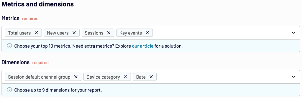
When you’re ready, proceed to collect data, and then you’ll be taken to the next step.
Step 2. Transform your data into a custom report
Review your data and make any necessary transformations. Coupler.io allows you to:
- Rename, rearrange, hide, or add columns
- Apply filters and sort your data
- Create new columns with custom formulas
- Combine data from several accounts or apps
- Aggregate data to let you discover meaningful insights and track trends in time
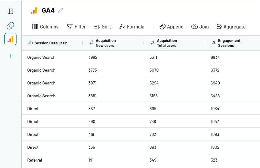
Once your report is ready, proceed to load it into the selected spreadsheet or BI tool.
Step 3. Load your data and visualize it
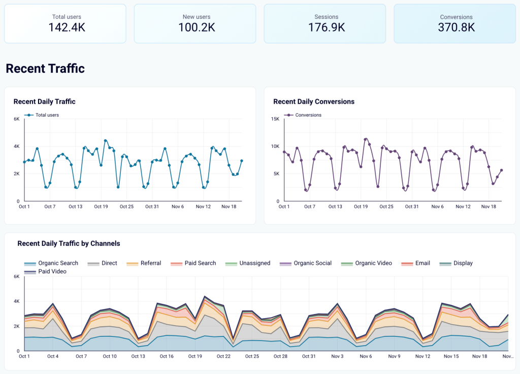
Authorize the Coupler.io connector and generate a data source in Looker Studio by following the in-app instructions. As soon as you import the data, transform it into an insightful dashboard. For instance, display key metrics first to have them readily available. Then, visualize recent overall daily traffic and conversions to stay updated on the latest developments. Next, present recent daily traffic by channel to see which brings more visitors to your website. Here is what it may look like:
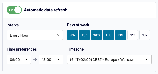
Monitor KPIs in real time
To ensure your dashboard remains up-to-date and reflects any changes in the source, you need to set up automated data refreshes. Coupler.io allows you to do this with a couple of button clicks. Choose intervals ranging from monthly updates to as frequent as every 15 minutes for near real-time reporting.
You can get started with Coupler.io for free to try all the available features and then decide which subscription fits your reporting needs.
SaaS report examples
With Coupler.io, you can not only send your data to a BI tool and then build your custom SaaS report. In fact, there’s a quicker and easier way to enable your SaaS analytics, free ready-made dashboard templates. Let’s look at dashboard templates that might turn out handy for your SaaS reporting:
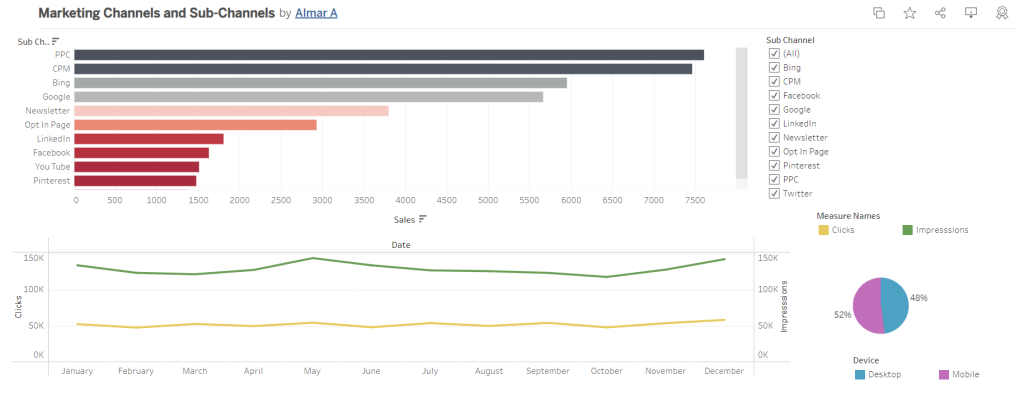
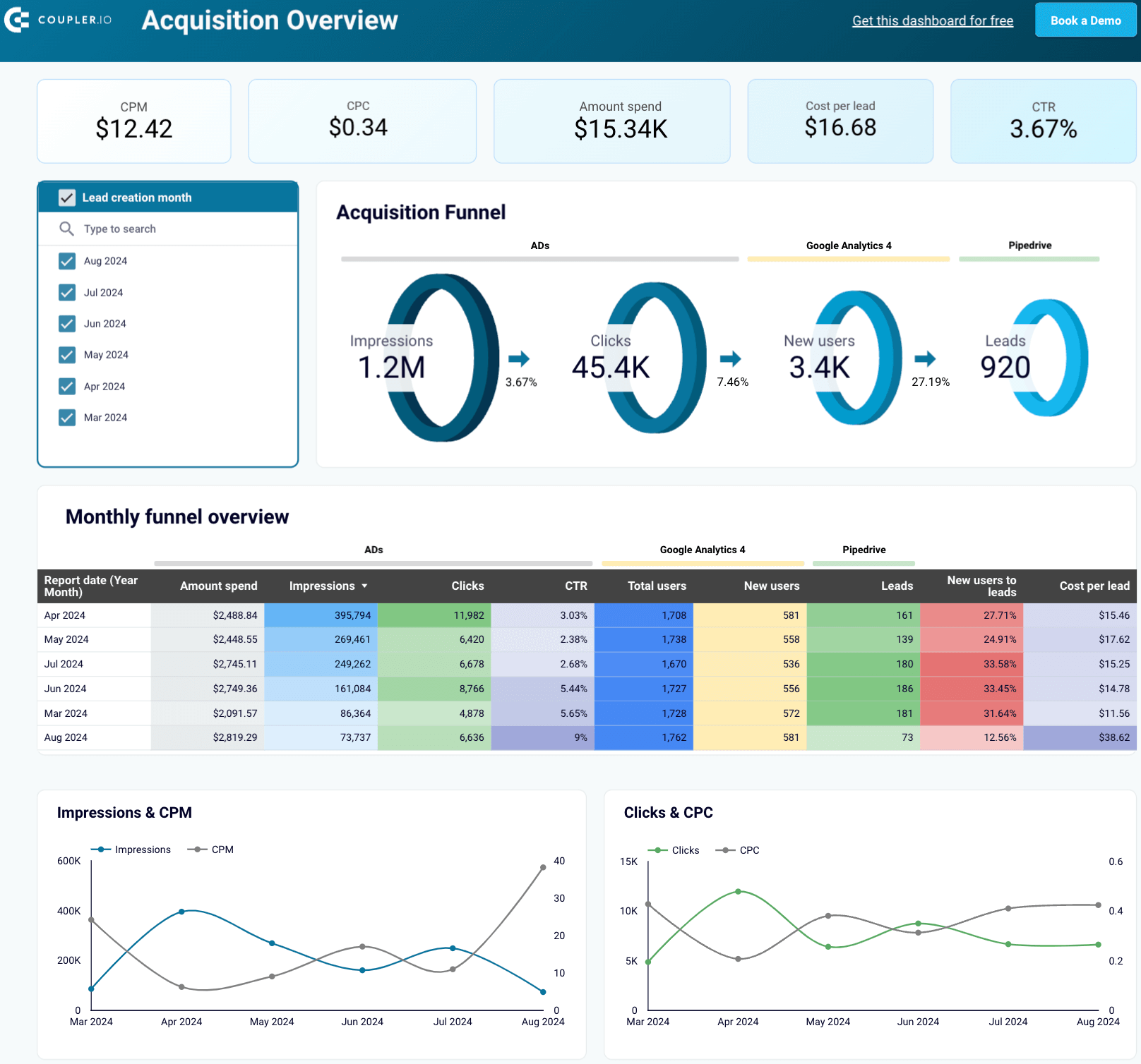
SaaS marketing dashboard + template
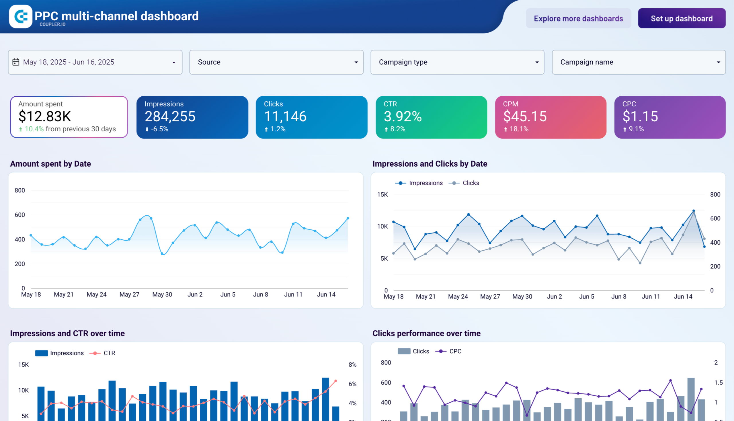
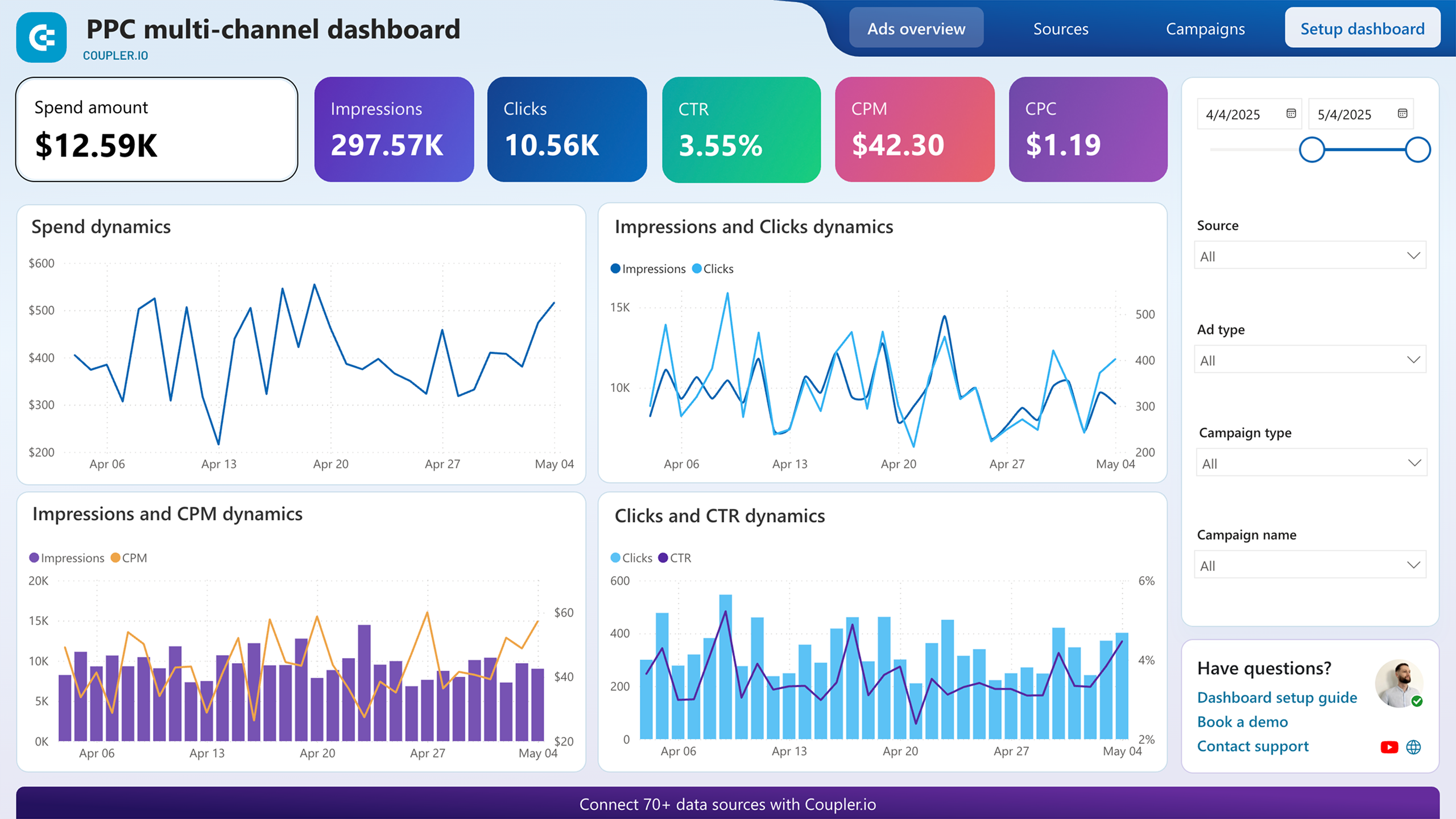
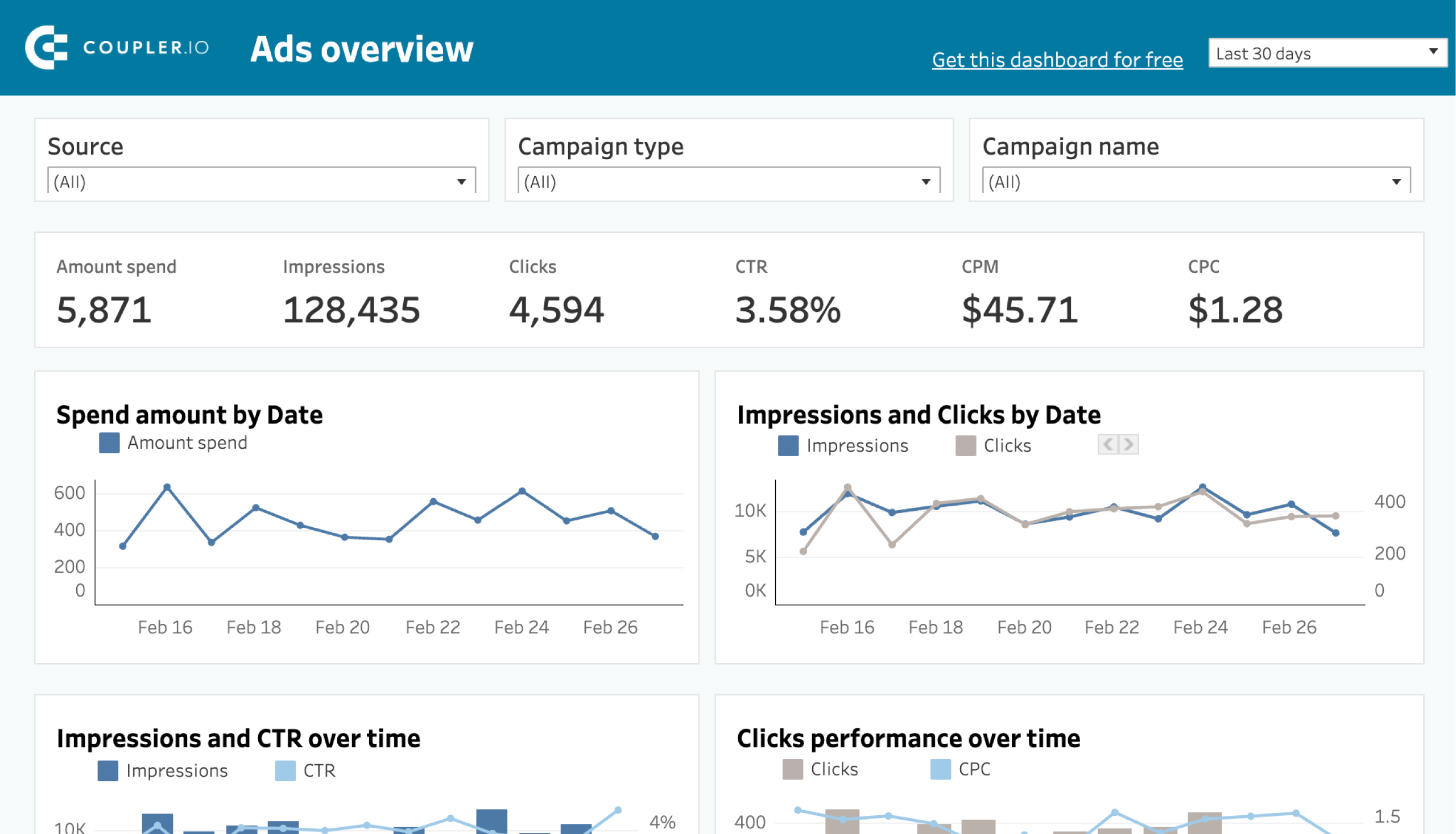
A SaaS marketing dashboard provides insights into various marketing metrics. It displays performance per channel and offers an overview of the marketing activities within your SaaS product. In this example, we’ve chosen Coupler.io’s PPC multi-channel dashboard.
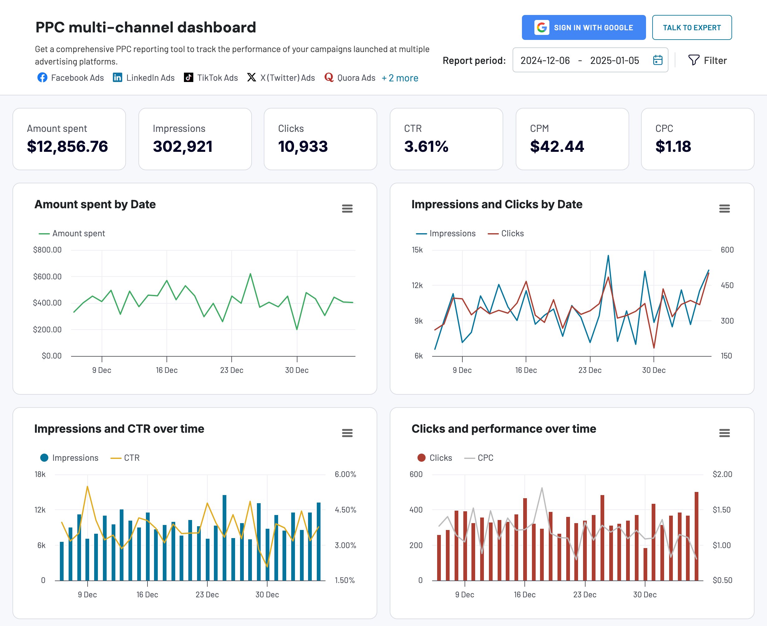
This marketing dashboard is designed to optimize your PPC strategy by analyzing campaign performance across specific channels, such as Google Ads, Facebook Ads, TikTok Ads, and more.
Critical metrics for a SaaS marketing dashboard:
- Amount spent – the total amount spent on running ad campaigns
- Total impressions – the number of times your ad was shown to users
- Total clicks – the number of times users clicked on your ad
- CTR (clickthrough rate) – the ratio of clicks to impressions
- CPM (cost per mille) – the cost for every thousand impressions
- CPC (cost per click) – the cost for each click on your ad
This dashboard template is available in Google Sheets, Looker Studio, Power BI, and Tableau. Go to the readme/setup guide to discover how to get started using it.


SaaS sales dashboard + template
A sales dashboard reveals the revenue of your SaaS business. You can use it to monitor and analyze metrics such as sales by region, lead conversion rate, sales-to-date, and more – all of which are critical to your operational success. Here’s an example of a sales overview dashboard in Looker Studio, designed by Coupler.io.
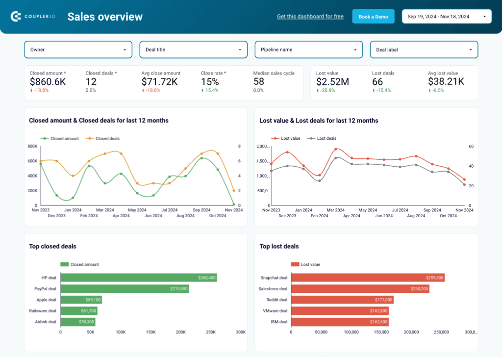
Critical metrics for a SaaS sales dashboard:
- Sales pipeline value – the total value of all deals currently in your sales pipeline
- Sales win rate – the percentage of successfully closed deals
- Sales conversion rate – the percentage of leads converted into paying customers
In addition to the dashboard designed for Pipedrive, there is also a version available for HubSpot. To begin using the template, check the readme tab for instructions.


Finance SaaS dashboard + template
A finance SaaS dashboard offers up-to-date financial information, including profit and loss, earnings, cash flow, etc. For example, here’s the QuickBooks financial dashboard built by Coupler.io in Looker Studio.
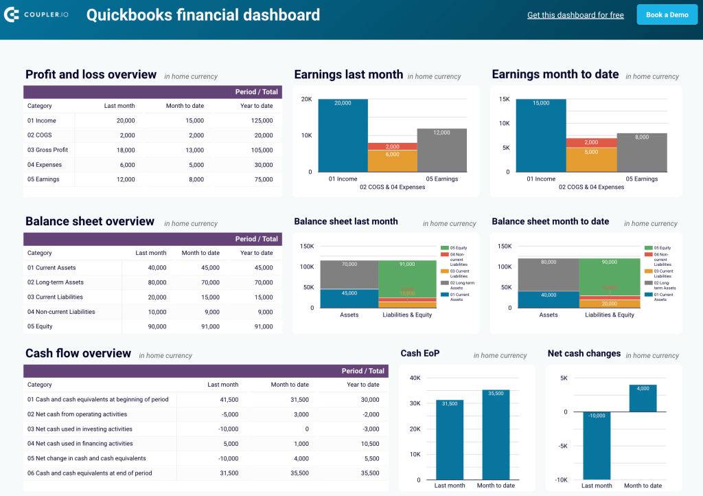
Critical metrics for a finance SaaS dashboard:
- Profit and loss (P&L) – a financial statement that summarizes your revenues, costs, and expenses over a specific period
- Earnings – your net income or profit, typically after taxes and other expenses are deducted from total revenue
- Cost of goods sold (COGS) – the direct costs of producing goods or services sold by your company, including materials, labor, and manufacturing costs
- Cash flow – the total amount of money being transferred into and out of your company
- Cash at the end of period (EoP) – the total cash you have at the end of a specified period
- Net cash changes – the difference between cash inflows and outflows during a specific period
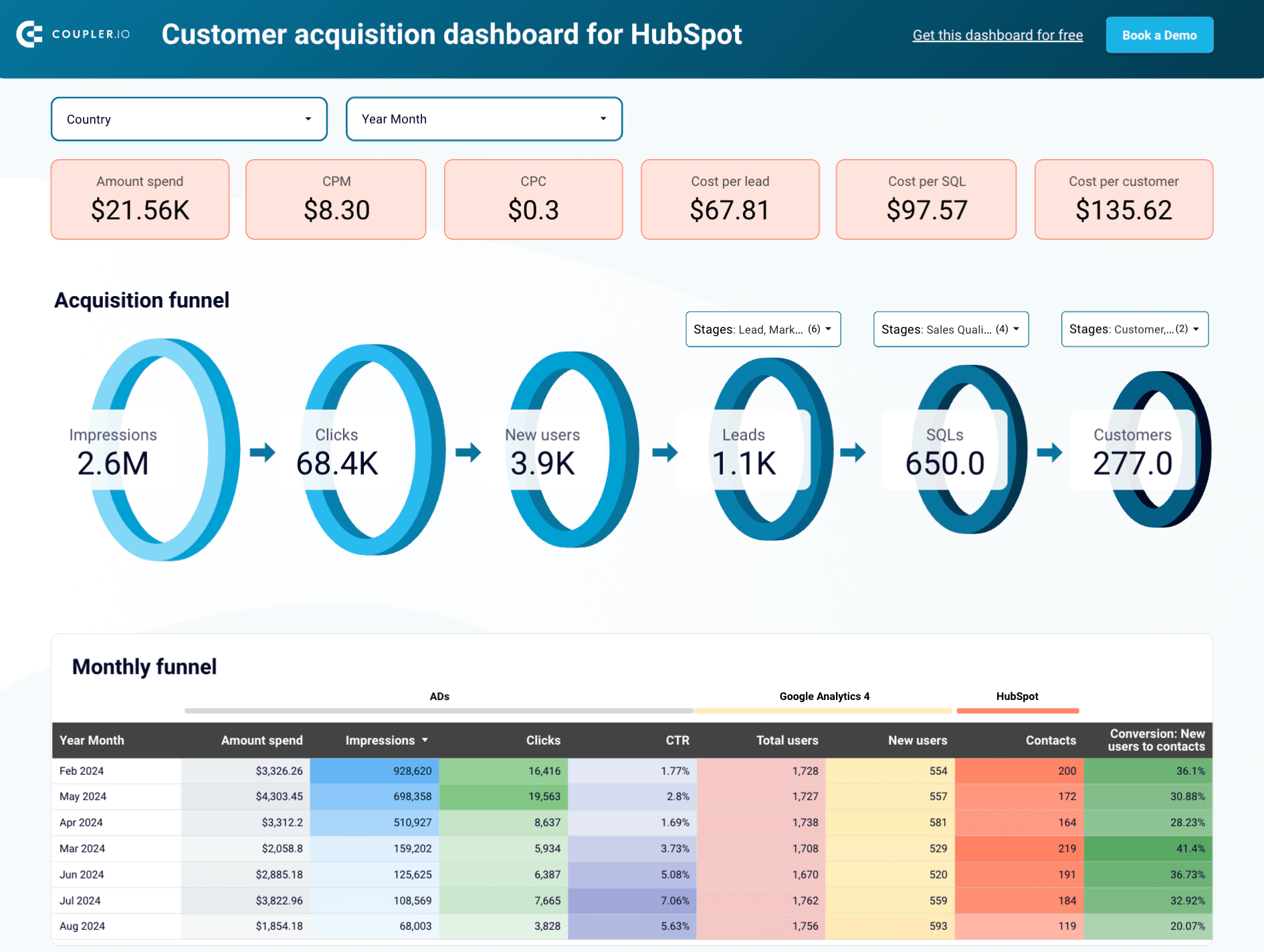
SaaS customer dashboard + template
A customer dashboard allows you to assess the overall health of your customer base. It should display metrics such as the total number of leads, leads per channel, progress in lead generation, and more. For example, check out the customer acquisition dashboard for Pipedrive prepared by Coupler.io in Looker Studio.
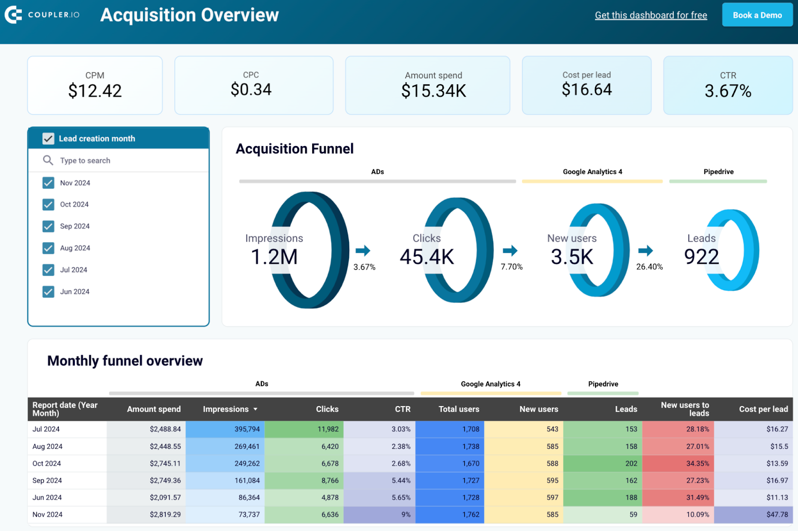
Critical metrics for a SaaS customer dashboard:
- Customer count – the number of active customers of your SaaS product
- Customer acquisition rate – the rate at which you’re adding new customers to your SaaS product over a specific period
- Customer churn rate
- Customer lifetime value
- Net promoter score
- Customer engagement – how actively customers are using and interacting with your SaaS product. This metric can include other ones such as the number of logins, feature usage, session duration, etc.
Apart from Pipedrive, this dashboard is also available for HubSpot. Follow the steps outlined in the readme tab to get started with the template.

Level up your SaaS analytics with a data analytics consulting service
SaaS startups usually don’t have data analysts in their team at all. For a small to medium company, a data engineer plus a data analyst should be enough to set up infrastructure, automation, and handle data visualization. But the hiring process is usually associated with high resource investment. In this case, outsourcing your SaaS data analytics is advantageous compared to hiring an in-house team. And it really is for a few reasons.
Minimize the cost
Salaries for in-house data specialists are pricey, and for a small to medium SaaS company, it’s an expense you can easily forgo. Hiring an outsourced team can help cut down the cost without compromising the quality. You also save the time of your current employees who would have to be involved in the process of setting up business analytics.
On top of that, hiring a data analyst team requires a lot of commitment as they’re going to be indirectly responsible for every business decision you end up making. The hiring process, onboarding, and managing a new workflow may be too much to handle for a growing startup that has to focus on development and marketing.
Not to mention, mistakes are inevitable when setting up an analytics solution from scratch. Coupler.io data consulting service makes this process cheaper, faster, and more efficient. The data experts can help you figure out the key reporting solutions for your organization’s needs and create them fast, without disrupting your operations.
Optimize your time
In the end, you need SaaS data analytics to make your company more efficient. That includes making you, a decision-maker, more efficient as well.
By outsourcing the hard work of business analytics to Coupler.io, you can forgo having to organize the work of another department in your company and spend that time making informed decisions based on correct data. Book an exploratory call to see how we can help.
Minimize data inconsistency
In the 2020 O’Reilly survey, inconsistent data gathered across multiple sources was the most common problem CEOs and data analysts faced, with 60% of respondents saying it impacts their business.
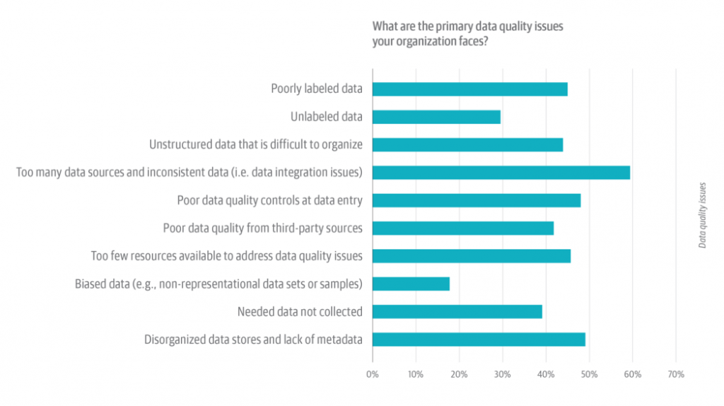
Data quality and data entry control were other significant issues but this is rarely the case in the SaaS industry as most of the data come from automated sources and eliminates human error.
Keeping all the data consistent for reporting, however, is a major problem. An average company uses three external sources for decision-making, with 18% using up to 20.
When you have multiple sources of data to combine and interpret, many times, the data isn’t stored in a consistent format. It may have different metadata, and different labels, or it may simply be duplicated from two sources.
Coupler.io’s data analytics service makes sure your data stays consistent, and that you’re not basing your business decisions on biased or compromised data. The analytics dashboard you’ll get is going to be pulling data from a well-structured source double-checked for any inconsistency.
Let’s build a better SaaS business together!
Your company has a limited amount of resources, so finding the right thing to focus on is key to success. 74% of “best-in-class” companies base their decisions on data rather than gut feeling. Analyzing financial, marketing, and product performance, as well as SaaS accounting metrics, helps you find growth opportunities and make the right decision when it comes to exploiting them.
Are you ready to start building a better business through SaaS analytics? Schedule an introductory call and see how Coupler.io can help.
Bonus: The list of most promising SaaS growth strategies to consider
As a bonus, we’ve gathered several strategies that address the most pressing challenges facing SaaS businesses today. All these strategies can be customized according to your specific product, market niche, and other factors.
- Leverage data analysis to make better decisions
- Focus on audience growth and retention
- Adopt smart pricing to stay competitive
- Automate and optimize processes
- Expand the set of marketing and sales channels
Let’s dive in and explore these SaaS growth strategies in more detail.
Leveraging data analysis – a crucial factor for SaaS business growth
Data-driven decision-making is not just a ubiquitous buzz-word. It’s a vital strategy that will benefit your business enormously, both short-term and in the long run. The raw data you collect across your organization contains valuable insights and answers to many pressing questions you might have. So, focusing on data analysis, you can tap into the potential of your data and put it to use. This will allow you to uncover hidden issues and spot new opportunities, providing full transparency and a rigid basis for informed decisions.
Making a SaaS company data-driven can include:
- Data visualization. This is a powerful instrument that allows you to transform raw data into compelling visual stories. In this format, your business data will be easy to interpret, monitor, share, or present. Be it various graphs or advanced comprehensive dashboards – when visualized, your numbers will clearly show you emerging trends and correlations.
- Data automation. Streamlining your data flows and automating repetitive tasks can significantly boost efficiency. It saves time, eliminates human errors, and helps to manage data with minimal effort. This can be achieved by using various automation solutions – from simple tools to complex custom-developed platforms.
- Business analytics. By processing and analyzing your historical business data, you can better understand how to improve performance and achieve the goals you set. Business analytics allows you to build forecasts for the future and transform the obtained insights into clear action points.
- Setting up data infrastructure. Investing in infrastructure is important to companies that work with huge amounts of data. They will need to ensure efficient storing, hosting, and processing of data. These goals can be achieved by setting up an analytical system, data warehouse, custom BI solution, and so on.
- Working with a data consultancy partner. Companies wishing to benefit from data analytics often run into typical roadblocks. They collect massive amounts of data but have difficulties interpreting it and deriving meaningful conclusions. In such a case, requesting data consultancy services from a knowledgeable partner may be an efficient solution. A company that specializes in data analytics can help you set up the tools and processes you need. Such a partner can also give your team the necessary directions to help manage data independently in the future.
Which of these aspects are the most relevant for your business depends on your product, goals, company size, etc. If your SaaS organization is a small or medium-sized one, it’s possible that you won’t need a whole data analysis department or complex data analysis infrastructure. However, even using some simple tools and efficient processes can be enough to make a big difference and provide you with valuable insights derived from your data.
Example: implementing a data-driven approach to enable SaaS growth
Problem
Nextiva is a SaaS company that provides business communications collaboration software and helps businesses to be better connected with their clients. The product is actively developing – this year, it received an impressive set of new features.
After the update, the team faced several business challenges:
- To adopt a new pricing model and increase revenue
- To persuade the existing customers they should switch to the new pricing
- To expand the audience and attract new customers
However, despite the efforts, the adoption rate was growing relatively slowly. The steps devised by the team weren’t bringing the expected effect. The reason for this was the lack of relevant data to back up the strategy.
Solution
The team decided to revise their plan, focusing on a data-driven approach. In particular, they used data analysis to adjust their SEO and content strategy. This included:
- Using Google Analytics and PowerBI to determine which of the relevant pages on the Nextiva’s website had a high bounce rate
- Conducting research with seoClarity to determine the proper keywords and topics to target in new pages
- Using the results of this research to understand how to adjust the content and SEO strategy
The conducted data analysis provided Nextiva with the necessary insights for refreshing the website content. As a result, the team split the pricing options into three different tiers, updated the pricing page, and improved content on multiple other pages on the website. Once this was done, the company’s pricing pages started ranking better for terms related to the cost and pricing of the software features.
Results:
As a result of these efforts, the updated content and SEO strategy yielded the following outcomes:
- An improved Google SERP positioning for targeted feature and pricing keywords
- An 8% increase in the number of leads for the new software approach
- A significant growth of the updates from the existing customers who now better understood the value of the updated product
All this enabled Nextiva to increase the MRR and expand the customer base, opening new opportunities for SaaS business growth.
Focusing on audience growth and retention
SaaS business growth would be impossible without loyal customers. So, predictably, an effective SaaS growth strategy should include action points focused specifically on the audience. The main challenges are expanding the customer base and minimizing the churn rate.
- Personalized approach remains one of the crucial factors for developing a successful acquisition and retention strategy. You may need to conduct additional research on your audience, create buyer personas, and define criteria for dividing your potential and existing customers into distinctive groups. This will allow you to come up with a tailored engagement strategy for each segment. With a different value proposition, messaging, and content for each target group, your organization will be able to increase the quality of leads and significantly improve retention.
- Another thing to focus on is making the most out of your existing customer base. Research shows that selling to existing customers is much easier and significantly less expensive than selling to new users. However, it’s not just about upselling. For example, you can launch a referral program using a referral program software or a promotional campaign urging your customers to recommend your product to their colleagues or vendors. Your existing audience can also be an invaluable source of insights. Find out what features your users miss and exactly what problems they solve with your SaaS product. The obtained information can give you an impulse to develop your service further and deliver even more value to your customers.
Providing additional value is one of the key factors in improving retention. It can take different forms: from improved functionality to a new channel for customer support or useful informative content on your blog.
Example: driving retention through data automation and analysis
Problem
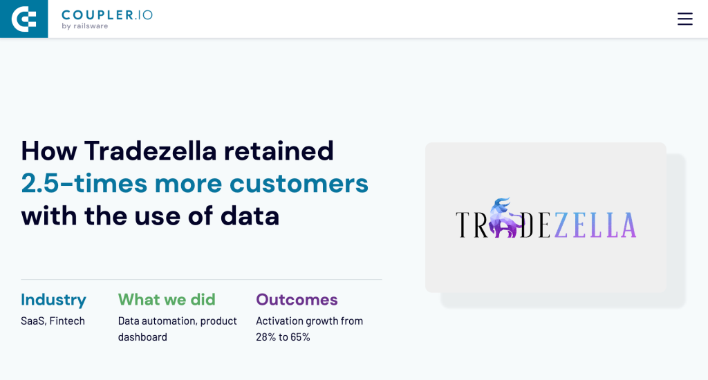
Tradezella is a SaaS product that helps traders track and analyze their activity in order to improve performance. It allows them to accumulate data on their past decisions, spot risky patterns, and determine promising opportunities. When the product was still rather new to the market, the team ran into a blocker. While the acquisition rates looked optimistic, the churn rate was high, and re-engagement efforts seemed to produce little effect.
To improve the situation, they needed to focus on such challenges:
- To re-engage existing users, improve retention and bring down the unsatisfactory attrition rate
- To analyze how users go through the funnel and determine at what stages precisely they drop out
- To segment the audience into several distinctive groups in order to personalize content, offers, and marketing activities
Solution
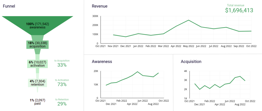
In collaboration with Coupler.io’s data analytics consulting experts, the Tradezilla team was able to:
- Clearly define different stages of the funnel and determine criteria for analyzing user journey
- Automate data flows from their app to the database and set data processing in BigQuery
- Build a comprehensive self-updating SaaS dashboard in Google Sheets (based on processed data pulled from BigQuery)
Results
With the help of automation, data analysis, and data visualization, they received the necessary instruments to improve the situation. Tradezella’s marketing team was able to closely monitor user activity through self-updating reports and dashboards in Google Sheets. This enabled them to prepare customized messages and offerings that varied depending on a specific funnel stage for a given user.
As a result, user retention and engagement significantly increased:
- 2.5 times more users reactivated in the first month after implementing the changes (compared to previous monthly results that year).
- The activation rate after signup increased from 28% to an impressive 65%.
The improved activation and retention rate helped Tradezilla to significantly grow its customer base. As a result, with the influx of new users, the company’s revenue increased. The existing reactivated users also contributed to the MRR growth. At the same time, the implemented changes in data management and audience monitoring provided the foundation for further business growth.
For more details, please view the full case study.
Adopting smart pricing to stay competitive in the SaaS market
It’s difficult to overstate the importance of pricing in a business growth strategy in SaaS. If the price is too high, an organization will be losing customers. If the price is too low, it will be losing revenue. To stay competitive, it’s crucial to find the right balance. As the SaaS market continuously shifts and changes, revising the pricing strategy is an ongoing process. Continuous competitor analysis, competitor price change tracking, and market research should be a mandatory part of any SaaS growth strategy.
A good approach is to treat each segment of your audience differently and develop several pricing options. They can be offered as separate tiers that include different sets of features or different levels of access to your SaaS product. For example, occasional users probably won’t be ready to pay as much as people who rely on your product on a daily basis. At the same time, customers who use your product for business purposes will be inclined to pay more than those who need it for personal use. You can analyze your historical data to determine typical usage patterns and see how they evolve over time. Then you will be able to decide how your pricing strategy can reflect the changes to facilitate SaaS business growth.
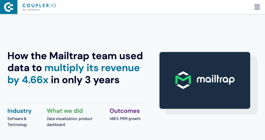
Example: increasing revenue through analyzing usage patterns
Problem
Mailtrap is a popular SaaS product for email testing and sending, mainly used by software engineers and QA teams. Over the years, the company experienced exponential growth, and the complexity of its data flows grew as well. At a certain point, the team decided to revise their pricing model and stop offering a freemium plan. They wanted this revision to be a data-driven process. But with the complex and inefficiently managed data flows, turning data into action points wasn’t a simple task.
Solution
To solve this issue, the Mailtrap team partnered with Coupler.io. This collaboration allowed them to benefit from data analytics expertise, which they didn’t have in-house. The solution included:
- Establishing automated data flows and efficient data management processes
- Gathering all data in a centralized BigQuery database and processing it for further use
- Analyzing how different groups of customers used the product – what features they needed, how often they used them, etc.
- Modeling several scenarios predicting how the change in pricing would affect user behavior
- Determining the new pricing model based on these scenarios
Results
As an outcome of the steps mentioned above, the company was able to streamline its data management processes and enable data-driven decisions. The deep analysis of user behaviour allowed them to come up with the optimal pricing strategy. Shaping data-based scenarios for the future provided an opportunity to access possible risks and make informed choices.
The new pricing plan was a success:
- About 20% of free users upgraded to a paid plan
- The overall MRR increased by 466% in the course of 3 years after launching the new pricing model
Once the new plan was launched, the company’s revenue started growing rather quickly. However, it’s important to point out that the adopted changes were fundamental, and as such, they produced a long-term effect. The MRR has been increasing for the next several years, eventually reaching +466% compared to the revenue with the old pricing.
The implemented solution allowed Mailtrap to make their organization data-driven. This, in turn, affected the company at many levels and created new opportunities for business growth even besides changing the pricing model.
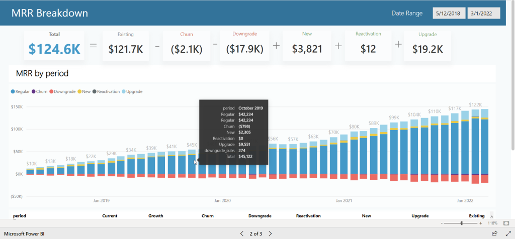
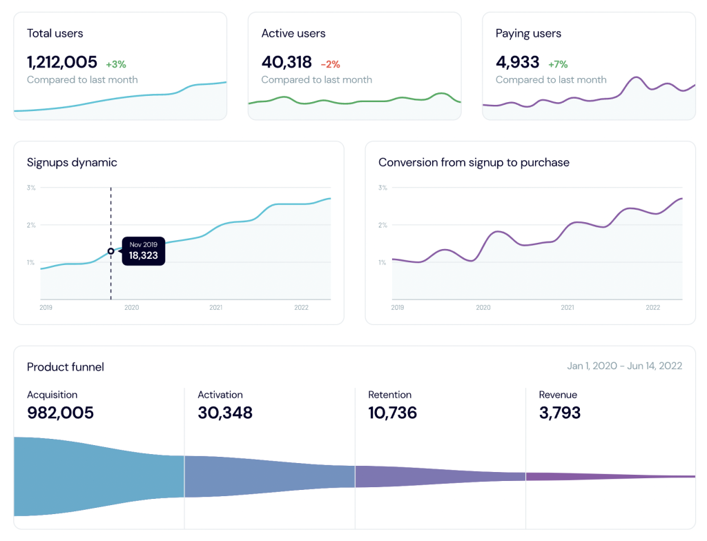
With extensive data analysis and efficient data management tools, Mailtrap could make better decisions in many different areas. An example of such a tool is a comprehensive self-updating dashboard in Looker Studio. This is yet another result of the company’s collaboration with Coupler.io’s team. This visualization is powered with data from BigQuery, automatically collected from multiple data sources across the organization. The dashboard includes hundreds of tabs with various charts and visualized reports. The Mailtrap team uses it to revise and adjust their pricing strategy, as well as to obtain insights for other business decisions.
For more details, please view the full case study.
Automating and optimizing processes to enable scalability
An efficient SaaS growth strategy should include a distinct vision for the future. What are you going to do when your company, indeed, achieves the expected growth? Or, maybe, even more than expected? Rapid growth comes with new challenges, and it’s better to start preparing for them in advance. At a certain point, you might need a whole department where you have just one employee now. Workflows that were fine for small teams, may start failing you when the team gets bigger.
To address these risks, make sure your processes are designed with scalability in mind. In other words – standardize, automate, and optimize. Process automation allows businesses to minimize human errors, streamline workflows, and quickly scale teams. When every process is robust, fully transparent, and efficiently automated, it’s easier to onboard new employees and synchronize team effort. You can bring automation to different areas of your organization – marketing and sales, customer support, accounting, maintenance, and others.
Automation can take many different forms – from complex custom-made platforms to simple tools. You don’t necessarily have to go big from the start. You can begin by assessing your needs and introducing a set of relevant tools and apps that can help you. For example, this can be automating sales processes with Pipedrive, creating automated workflows in Airtable, or automating reporting with Coupler.io. The effect from the automation in different areas will build up, significantly increasing your company’s efficiency and scalability. Business optimization is an ongoing process. So it’s important to have a clear roadmap and keep revising your operations to be ready for future growth.
Example: automate reporting and save thousands of hours for your team
Preparing various reports is a common regular activity for SaaS companies. Sales, marketing, advertising, accounting – reports are everywhere. This task can be easily automated, which will save you an enormous amount of time. Additionally, it will increase efficiency by eliminating human errors.
To introduce this automation, you will need a data integration solution, such as Coupler.io. It can help you automate data flows in your SaaS company. In particular, you can use Coupler.io to create automated reports and have them updated without any involvement from your team.
The process is rather simple. Select as a source the app where you accumulate fresh data on a regular basis – for example, HubSpot, Pipedrive, Mailchimp, and so on. Then, select a destination – where you want your data to land. For reporting purposes, it’s convenient to import data to Excel or Google Sheets. If you want to have your reports in a visual format, select a BI tool: Looker Studio, Tableau, or PowerBI. If you need to perform complex analysis, you can select BigQuery or Redshift as a destination.
After this, you will need to select a data type for exporting – for example, marketing campaign results. Additionally, you can set up a schedule for automated updates. Coupler.io will regularly fetch fresh data from the selected data source to the specified spreadsheet, database, or dashboard. When the marketing campaign results change, the metrics in your report will be updated during the next scheduled refresh. You can easily turn your data into visualized reports with this collection of free Dashboard Templates.
It’s also worth mentioning that Coupler.io allows you to accumulate data from multiple sources in one place. For example, your marketing team can gather in one report information from Mailchimp, Google Ads, LinkedIn Ads, Airtable, and so on. They’ll just need to set a separate integration for each data source or use a cross-channel report template from Coupler.io’s dashboard gallery. View the full list of the available sources to see which of your most-used apps are included.
When everything is ready, you will get a self-updating automated report or dashboard. Your team won’t need to collect and manipulate data manually anymore. Once built, the report will always stay up-to-date, providing you with the most important highlights based on the latest data.
The same process can be used to back up your data from different apps. Your team can set up an integration, and Coupler.io will automatically transfer information from your data source to BigQuery or a spreadsheet. Thanks to the automatic data refresh function, the backup copy will always be up-to-date.
From this example, you can see how relatively simple automation can be a powerful instrument that boosts efficiency and optimizes processes. It also facilitates growth in several ways. First of all, it frees hundreds of hours for your team. This time, previously spent on repetitive manual tasks, can be reallocated to more meaningful activities. It can be used for performing analysis, planning, and acting on your data faster. All of this is an investment in further growth. Secondly, automation streamlines processes and makes them easily scalable. If you want to add a dozen new data sources to your reports, it’s enough to connect the new apps to the existing template. Data from them will be included automatically. Your team won’t need more time or more people to handle the reporting from these additional sources. Without automation, such a situation could have created an increased workload slowing down a company’s growth. Automation, on the contrary, allows you to accelerate it.
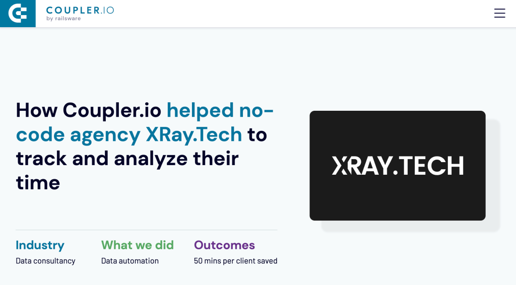
If you take it a step further and opt for a bit more complex automation, the outcome may be even more impressive. For instance, see how a no-code agency XRay.Tech used automation to reduce 1 hour of paperwork per client to just 10 minutes. Although this company is not a SaaS business, their experience can still be relevant. The processes and challenges described in this particular case are quite common for any growing business.
Expanding the set of marketing and sales channels
One of the SaaS growth strategies worth considering is to revise and expand the set of channels you use. Even if your current choice brings good results, it’s important to make sure nothing critical is missing.
For instance, many SaaS companies spend thousands of dollars on advertising but fail to invest in SEO and content marketing. Meanwhile, the latter is a viable business growth strategy in SaaS, and it should not be underestimated. Content marketing is projected to be one of the crucial factors driving SaaS business growth this year. Customers see significant value in relevant content. Articles in your blog, case studies, e-books, video lessons, podcasts, tutorials – all this can help increase traffic to your website. This is an excellent way to ignite interest in new customers, and build trust and loyalty with the existing ones. All this, in turn, will help enhance customer acquisition and retention.
Apart from SEO and content marketing, there are other instruments that can help you grow. Marketplaces, review platforms, video ads, direct mail marketing – all this can be useful as well. Launching an employee advocacy program is also a viable idea. A coordinated campaign with your employees acting as brand ambassadors is a very cost-efficient marketing tool. In general, using a diverse set of channels is a beneficial strategy. This allows you to experiment, reach new audiences, and see what works best for your company.
Example: growing customer base with the new marketing channels
Problem
Checkr is a SaaS company that specializes in providing background check services for businesses. It helps companies to improve the hiring process by assessing job applicants faster and more accurately. The company needed to accelerate its SaaS business growth, and their main challenge was generating new leads and expanding the customer base. However, their efforts to reach new customers via their usual marketing channels weren’t bringing enough new leads.
Solution
The company decided to tackle this problem by leveraging data analytics. The goal was to better understand the target market and identify potential new customers and promising marketing channels. To achieve this, the Checkr team:
- Used their internal data to analyze customer trends and define the audience’s preferences
- Analyzed external data received from surveys, market research reports, and other industry sources
- Used the results of the research to determine potentially effective new channels and other new opportunities available in their target markets
Based on the findings, Checkr expanded their media mix to include some new channels, such as online advertising and PR. In addition to this, the sales and marketing team adjusted their strategies, taking into consideration insights from the research.
Results
- Checkr reached out to new customers and significantly grew the customer base
- Implementing the changes led to a 10% increase in conversion rates for new leads
- As a result of expanding the audience, the company’s revenue grew by 20%
As we can see, the company employed several SaaS growth strategies that helped it address its challenges and facilitate growth. In this case, these strategies were leveraging data analytics and using new marketing channels.