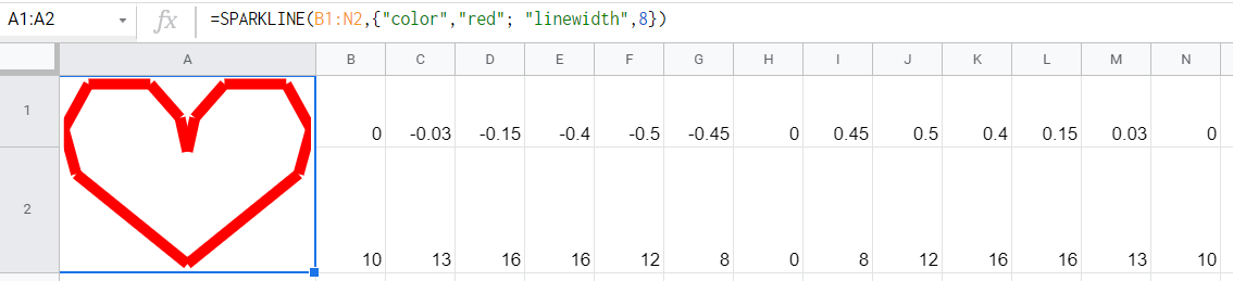
In 2014, Google announced an appealing function available in Google Sheets – SPARKLINE. The function allows you to build miniature charts in a cell that will depict the trend of the selected data range. Here is what it looks like:
Although the SPARKLINE function is an oldie, many Google Sheets users don’t know about it and keep inserting charts in the regular way. So, it’s time to open up this uncharted feature and spark your lines and bars 🙂
In this blog post, we’ll try to answer the most frequent questions you may have. At the same time, you can check out our new ultimate guide to SPARKLINE Google Sheets on the Coupler.io Academy YouTube channel.
What is SPARKLINE in Google Sheets?
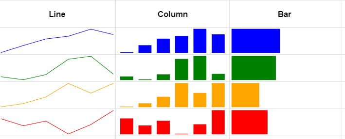
A sparkline is a mini graph that represents the trend of the selected numerical data. Sparklines are drawn without axes and can take the form of a line, column, or bar chart.
SPARKLINE in Google Sheets is a function that allows users to build sparkline charts within a cell. This means that you need to write a formula to create a miniature chart.
How to insert a sparkline in Google Sheets
How do you create charts in Google Sheets? You go to Insert => Chart and configure your chart or graph in the Chart Editor. For more on this, read our blog post on how to make charts and graphs in Google Sheets.
Sparklines are not available in this way. They are generated automatically once you specify the required parameters in the SPARKLINE formula. So, you have to know its syntax pretty well to customize your sparkline. Let’s see what options you can tune.
SPARKLINE Google Sheets Explained
SPARKLINE syntax
=SPARKLINE(data-range)data-range– the data range you want to create the sparkline for. The data range may vary depending on the chosen type of chart, but must include more than two cells in a column or row.
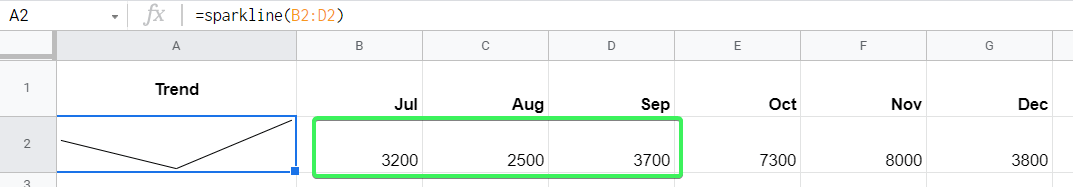
This is the basic SPARKLINE formula syntax that will return a miniature line chart by default. It works well if you want to return a sparkline fast and without any customization. For example,
=sparkline(B2:D2)
SPARKLINE syntax with options
=SPARKLINE(data-range,{option1,option1-value;option2,option2-value,...})data-range– the data range you want to create the sparkline for. The data range must include more than two cells in a column or row.option– the customization setting for the sparkline chart.option-value– the value associated with the customization setting.
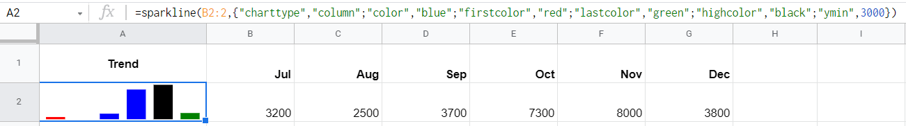
This is the advanced syntax for SPARKLINE function that lets you customize the type of your sparkline chart, change the colors, and implement other customization options. For example,
=sparkline(B2:2,{"charttype","column";"color","blue";"firstcolor","red";"lastcolor","green";"highcolor","black";"ymin",3000})
The first-tier option is "charttype", which lets you define the type of sparkline chart to return. The second-tier options include three common options ("nan", "empty", and "rtl") and the options specific to the chart type you chose.
Table of SPARKLINE options in Google Sheets
Note: Booleans, integers, and numeric values must be specified without quotes.
| First-tier option | Values |
|---|---|
"charttype" | – "line" – a miniature line graph– "bar" – a miniature stacked bar chart– "column" – a miniature column chart– "winloss" – a miniature column chart that plots 2 possible outcomes: positive and negative |
| Common second-tier options for all types of sparklines | |
"nan" | Specify how to treat cells with non-numeric data – either convert them to zero ("convert") or ignore ("ignore"). |
"empty" | Specify how to treat empty cells – either treat them as zero ("zero") or ignore ("ignore"). |
"rtl" | Specify the direction of the chart rendering. Two values are available: – true to render right to left – false to render left to right |
| Specific second-tier options for line graphs | |
"xmin" | Specify the minimum value along the horizontal axis. |
"xmax" | Specify the maximum value along the horizontal axis. |
"ymin" | Specify the minimum value along the vertical axis. |
"ymax" | Specify the maximum value along the vertical axis. |
"color" | Specify the color of the line. |
"linewidth" | Specify the thickness of the line by entering an integer. The higher the number, the thicker the line. |
| Second-tier options for stacked bar charts | |
"max" | Specify the maximum value along the horizontal axis. |
"color1" | Specify the first color used for bars in the chart. |
"color2" | Specify the second color used for bars in the chart. |
| Second-tier options for column and win/loss charts | |
"color" | Specify the color of the line. |
"lowcolor" | Specify the color for the lowest value in the chart. |
"highcolor" | Specify the color for the highest value in the chart. |
"firstcolor" | Specify the color of the first column. |
"lastcolor" | Specify the color of the last column. |
"negcolor" | Specify the color of all negative columns. |
"axis" | Specify whether you want to draw an axis: true or false |
"axiscolor" | Specify the color of the axis (if applicable). |
"ymin" (not applicable for win/loss charts) | Specify the custom minimum data value to use for scaling the height of columns |
"ymax" (not applicable for win/loss charts) | Specify the custom maximum data value to use for scaling the height of columns. |
Google Sheets SPARKLINE examples: "nan", "empty", and "rtl" options
Let’s see how the SPARKLINE works in the example of using the common second-tier options. For this, we’re using the data about orders exported from Shopify to Google Sheets using Coupler.io, a reporting automation solution. We extracted the core data and got the following.
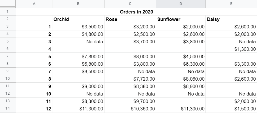
The data set contains empty cells and non-numeric data – this is exactly what we need to demonstrate three options: "nan", "empty", and "rtl". Now we’ll choose two sets of options to build and compare sparklines.
Options set No. 1:
=sparkline(B3:B14,{"nan", "convert";"empty", "zero";"rtl",true})
"nan", "convert"– this will convert non-numeric values to zero."empty", "zero"– this will count the empty cells as zero."rtl", true– this will render the chart right to left.
Options set No. 2:
=sparkline(B3:B14,{"nan", "ignore";"empty", "ignore";"rtl",false})
"nan", "ignore"– this will ignore non-numeric values."empty", "ignore"– this will ignore the empty cells."rtl", false– this will render the chart left to right.
Since we did not specify the charttype, the SPARLINE function will return a line graph by default. Here are the sparklines that our formulas returned:
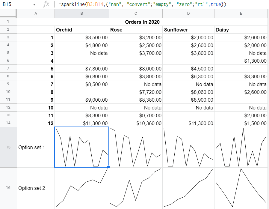
You can see that the second-tier parameters can drastically change the display of your sparkline. So, pay attention to the non-numeric values, as well as empty cells, in your data sets.
Types of sparklines in Google Sheets
Now we’re going to dive deeper into the types of sparklines you can insert:
- Line graph
- Column chart
- Win/loss column chart
- Stacked bar chart
As a bonus, we’ll show you how to create an hourly sparkline, i.e. make your sparkline refresh every hour!
Line sparkline
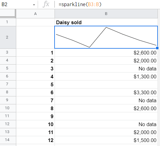
Line sparkline is the default type of miniature chart you can return. So, it’s not necessary to use the "charttype" option in the SPARKLINE formula syntax – you can just specify the data range (up to two columns or rows) and hit enter. However, you have a few customization options to adjust your line graph.
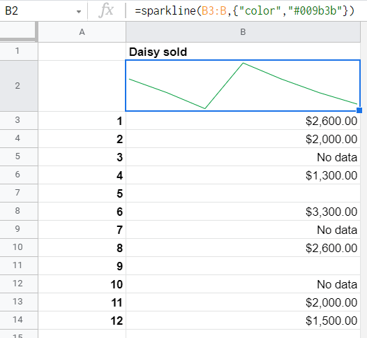
Line sparkline color
Option:
{"color", "color-name-or-code"}Let’s change the color of our miniature line graph to red. For this, you need to use the "color" option in the curly brackets and specify the color you want either textually (e.g. "red", "green", "yellow") or with a color hex code (e.g. "#FF0000", "#009b3b", "#ffff3f"). For example,
=sparkline(B3:B,{"color","#009b3b"})
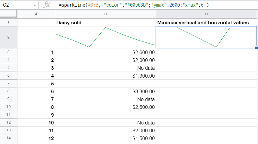
Min/max values for line sparkline for two axes
Options:
{"ymin", numeric-value-or-cell-reference}
{"ymax", numeric-value-or-cell-reference}
{"xmin", numeric-value-or-cell-reference}
{"xmax", numeric-value-or-cell-reference}
If your data range for the sparkline includes two columns or rows, you can set min/max values for both vertical (y-axis) and horizontal (x-axis) axes. In our example, let’s use the A3:B data range and set up the following values:
- Minimum value along the vertical axis – 2,000
- Maximum value along the horizontal axis – 6
The SPARKLINE formula will look like this:
=sparkline(A3:B,{"ymax",2000;"xmax",6})
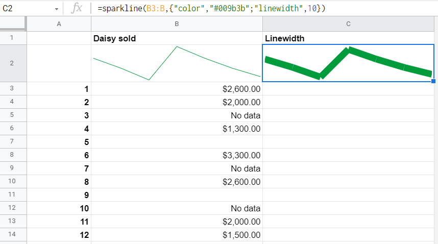
Width of line for the sparkline
Option:
{"linewidth", integer}Do you think that the line in your miniature line graph is too thin? No problem – use the "linewidth" option to make it thicker. Enter an integer from 0 to ??? and adjust the width to your liking. We tried to determine the threshold integer, but couldn’t. If you know it, please let us know. 🙂
Let’s use 10 as the linewidth. Here is how the SPARKLINE formula will look:
=sparkline(B3:B,{"color","#009b3b";"linewidth",10})
Column sparkline
Option:
{"charttype", "column"}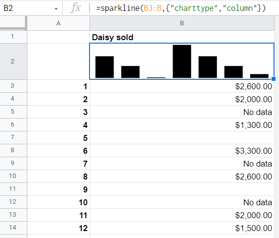
Column sparkline requires you to specify the respective chart type and the data range – a single column or row (unlike the line sparklines, where you can specify up to two columns/rowsO. Check out the customization options available for columns sparklines.
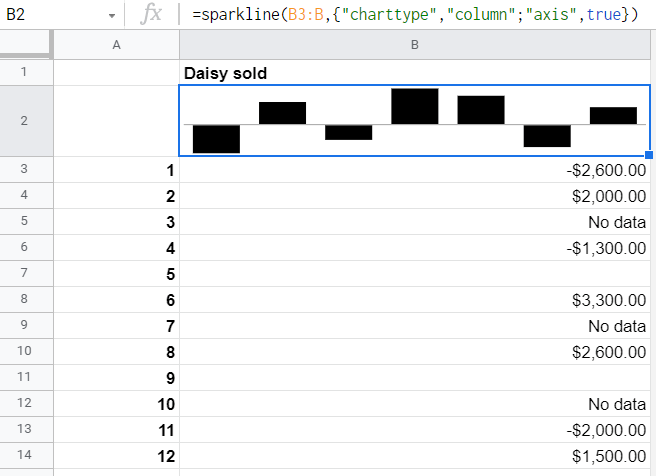
Column sparkline axis
Options:
{"axis", true}
{"axiscolor","color-name-or-code"}
If your data range has negative values, the column sparkline will look like this:
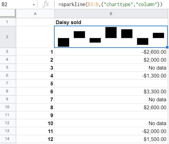
But you can add a horizontal axis to the chart to easily differentiate between the positive and negative values on it. For this, use the "axis" option and specify the boolean as true. For example,
=sparkline(B3:B,{"charttype","column";"axis",true})
Now it looks better, but the axis seems to blend into the columns. To avoid this, change the axis color using the "axiscolor" option. You can use the hex code or color name as the value. For example,
=sparkline(B3:B,{"charttype","column";"axis",true;"axiscolor","red"})
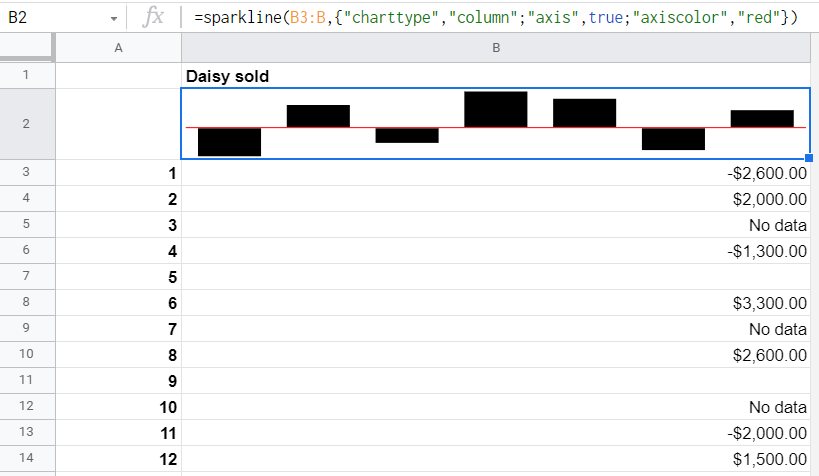
However, the axis is not the only element you can change the color of.
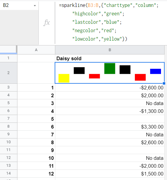
Column sparkline colors
Options:
{"color", "color-name-or-code"}
{"lowcolor", "color-name-or-code"}
{"highcolor", "color-name-or-code"}
{"firstcolor", "color-name-or-code"}
{"lastcolor", "color-name-or-code"}
{"negcolor", "color-name-or-code"}
You can customize color of the columns in your column sparkline:
- For all columns –
"color" - For all negative columns –
"negcolor" - For the lowest column –
"lowcolor" - For the highest column –
"highcolor" - For the first column –
"firstcolor" - For the last column –
"lastcolor"
Bear in mind the following interdependencies:
"color"will not work if any other color option is used."firstcolor"and"lastcolor"will not work if the"lowcolor"or"highcolor"options coincide with the first or last column, respectively.
Here is how the SPARKLINE formula for a column chart will look:
=sparkline(B3:B,{"charttype","column";
     "highcolor","green";
     "lastcolor","blue";
     "negcolor","red";
     "lowcolor","yellow"})
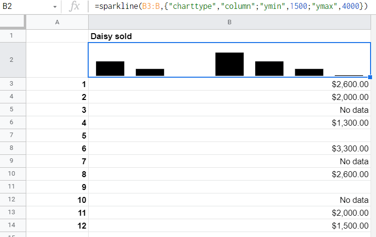
Min/max values for column sparkline
Options:
{"ymin", numeric-value-or-cell-reference}
{"ymax", numeric-value-or-cell-reference}
You can specify the custom minimum and maximum value for scaling the height of columns in your column sparkline. For example,
=sparkline(B3:B,{"charttype","column";"ymin",1500;"ymax",4000})
Win-Loss sparkline
Option:
{"charttype", "winloss"}The win-loss sparkline is a simplified version of a column sparkline. The difference between them is that columns in a column sparkline can have different height based on the value in the data range. In a win-loss sparkline, columns are equally sized and only differentiate between positive and negative values. This can be useful, for example, if you need to differentiate between income and expenses in your profit and loss report.
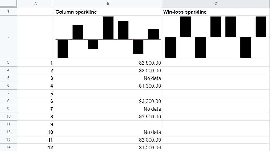
Win-loss sparklines have the same customization options as the column sparklines, excluding "ymax" and "ymin".
Bar sparkline
Option:
{"charttype", "bar"}The logic of bar sparklines is different from that of line or column sparklines. It uses only two different colors to differentiate between the values in the specified data range. This is why it is recommended to use bar sparklines for a maximum of two values in a column/row. Here is an example of a bar sparkline for two values:
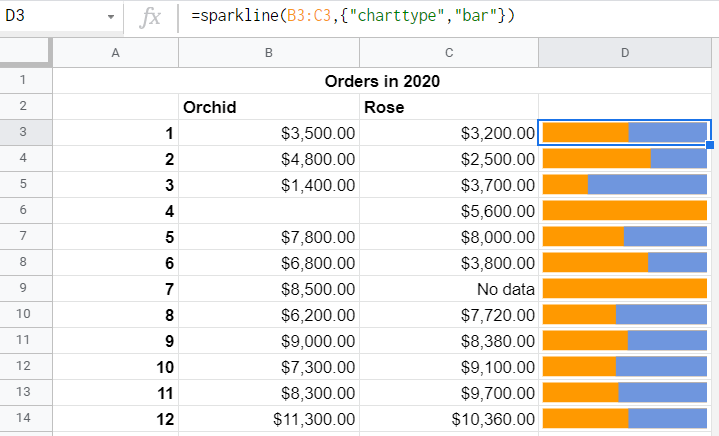
In this example, we applied 12 separate SPARKLINE formulas for each data range (B3:C3, B4:C4, and so on).
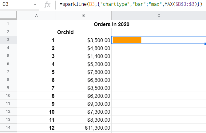
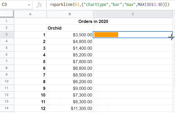
Max value for a bar sparkline
Option:
{"max",value}The "max" option lets you specify the maximum value along the horizontal axis. With it, you can build bar sparklines like in the following screenshot:
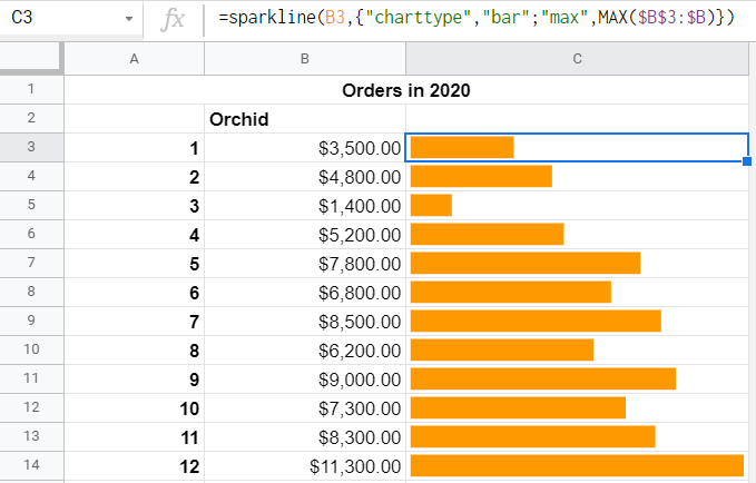
Here is the SPARKLINE formula syntax you need to use:
=SPARKLINE(value,{"charttype","bar";"max",MAX($data-range)})value– the cell or cells that contain the target values in the data range$data-range– the data range fixed using the$symbol
You should get the following formula:
=sparkline(B3,{"charttype","bar";"max",MAX($B$3:$B)})
Then drag the formula down to fill the rest of the cells with bar sparklines.
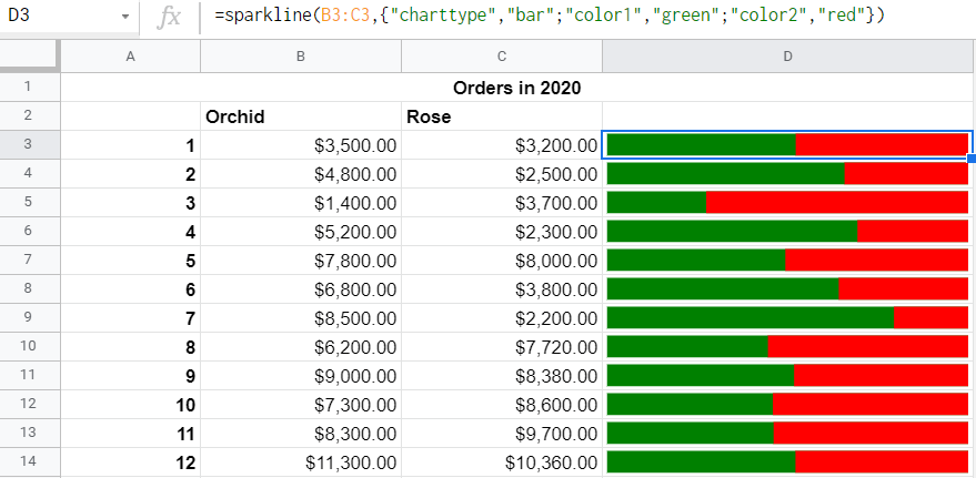
Bar sparkline colors
Bar sparklines use two colors to differentiate between values, and you can customize them using options "color1" and "color2". For example,
=sparkline(B3:C3,{"charttype","bar";"color1","green";"color2","red"})
Hourly sparkline
This is not a separate chart type, but a solution for creating an interactive sparkline that will update every hour. For this, you need to schedule data imports from your data source to Google Sheets using Coupler.io, a reporting automation solution.
It supports 50+ ready-to-use Google Sheets integrations including Shopify, Slack, Airtable, etc. You can also set up a custom connection via API using the JSON Client by Coupler.io. The data will be imported to your spreadsheet every hour. Here are the steps you will need to complete:
- Step 1. Extract data – configure the source of data you will be exporting
- Step 2. Transform data – preview and transform your data before loading to the destination
- Step 3. Manage data – configure the selected destination, i.e., where the data will be imported
- Step 4. Schedule importer – configure the Automatic data refresh for your report
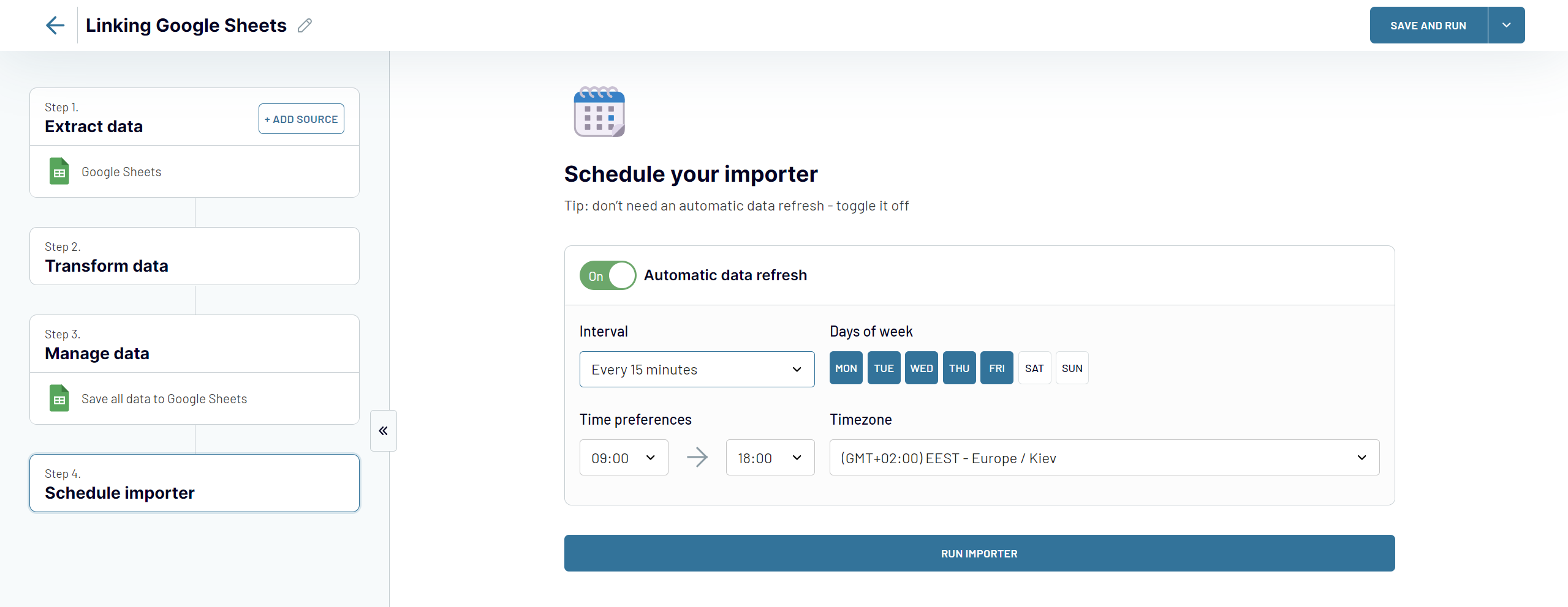
Depending on the source, you may need to choose the append importing mode. This allows you to append the newly imported data to the data previously imported.
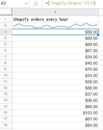
Then you need to link the sheet with the imported data to the sheet with the SPARKLINE formula. Here is what it will look:
Sparkline Google Sheets FAQs
In the sections above, we tried to cover as much as possible, but some other questions may arise. So, this is why we created a separate block with FAQs – you’ll definitely find the best answer to your question here.
How to write sparkline formulas in Google Sheets
You need to complete three steps:
- Specify the date range
=SPARKLINE(A3:A)- Choose the chart type
=SPARKLINE(A3:A,{"charttype","column"})- Customize your sparkline with the available options
=SPARKLINE(A3:A,{"charttype","column";"color","green")How to edit sparkline in Google Sheets
You can edit the sparkline using the second-tier options depending on the charttype you used for sparkline. Check out our SPARKLINE options table.
How many colors can a Google Sheets sparkline have?
- A line sparkline can only have one color.
- A bar sparkline can only have two colors.
- A column sparkline (including win-loss charttype) can have up to six colors for columns + a separate axis color:
- Custom color for the lowest column
- Custom color for the highest column
- Custom color for the first column
- Custom color for the last column
- Custom color for negative columns
Google Sheets SPARKLINE not working
Incorrect syntax is the most common reason for a SPARKLINE formula to return an error. So, check the following:
- Curly brackets for all the options and their values
- Quotes for all options and textual values
- Numeric values, integers, and booleans are used without quotes
How to combine multiple sparklines into one sparkline in Google Sheets
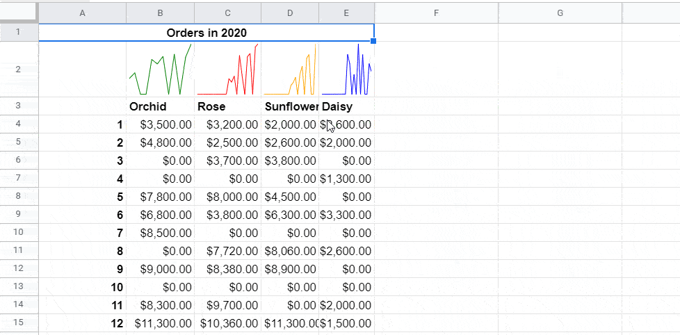
We have 4 sparklines generated using the following formulas:
=sparkline(A4:B15,{"color","green"})
=sparkline({A4:A15;C4:C15},{"color","red"})
=sparkline({A4:A15;D4:D15},{"color","orange"})
=sparkline({A4:A15;E4:E15},{"color","blue"})
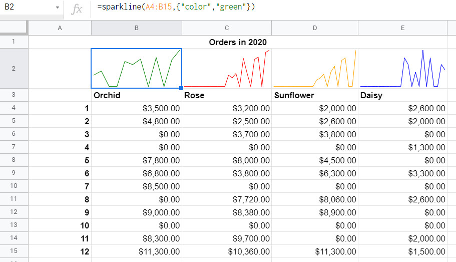
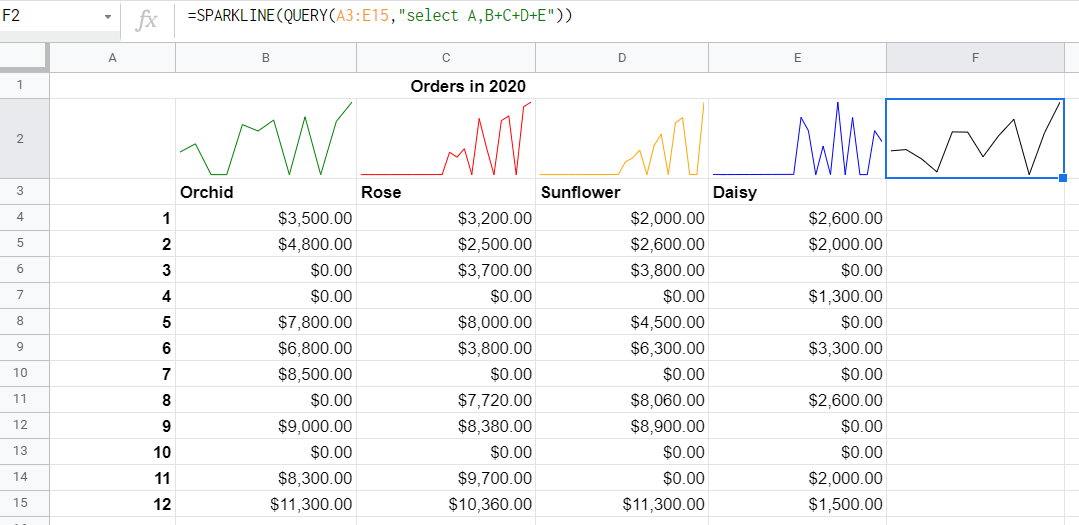
To combine these sparklines into one, you need to combine the data ranges into one. So, you should keep the range A4:A15 and sum up the values in the columns B, C, D, and E. This can easily be done using the QUERY Google Sheets function. Here is the formula we used:
=QUERY(A3:E15,"select A,B+C+D+E")
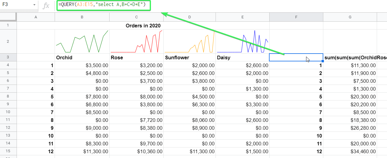
You can nest this QUERY formula into the SPARKLINE formula to merge multiple sparklines into one:
=SPARKLINE(QUERY(A3:E15,"select A,B+C+D+E"))
Can you make a bar sparkline vertical in Google Sheets?
A bar chart arranged vertically is called a stacked column chart in Google Sheets. You can insert in using the Chart Editor, but you can’t create it using the SPARKLINE function.
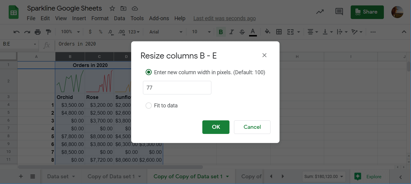
Change column size for a sparkline in Google Sheets
Sometimes, the generated sparklines are so tiny that you may want to zoom in on them.
You can do this by expanding the width of your column in two ways:
- Drag the width with your mouse
- Select the column(s), right-click, choose Resize columns, and enter the column width in pixels
Usage of SPARKLINE function in Google Sheets
Sparklines in Google Sheets are a rather understated feature that can make your spreadsheet visually attractive. Besides, we do prefer making sparklines to inserting charts in the regular way. What about you?
By the way, how many of your friends or colleagues use the SPARKLINE function? We bet that most of them have not even heard about it. So, feel free to share this guide and let them discover it for their workflow. Good luck with your data!