ClickUp native reporting is enough… until you need real business intelligence. Native dashboards deliver nice cards and basic charts or graphs, but they fall short on the big stuff:
- true cross-project profitability
- revenue-tied velocity
- advanced formulas
- complex blending with external tools (e.g., Pipedrive or Stripe)
- seamless merging of data across sources (including separate docs and spreadsheets) without manual exports
Coupler.io upgrades your ClickUp reporting in minutes. It auto-exports your full ClickUp data (tasks, custom fields, time entries, statuses, assignees), blends it with any other source, and loads fresh datasets into Looker Studio, Power BI, BigQuery, etc. As a result, you get powerful, refreshed BI reports and dashboards that native ClickUp can’t match.
In this article, you’ll discover how to optimize your project management processes by turning your ClickUp data into actual intelligence with Coupler.io.
Why native ClickUp reporting features often fall short?
ClickUp offers a suite of built-in reporting tools, including dashboards, time tracking cards, and scheduled reports. However, while these features provide a solid starting point for basic oversight, they frequently prove insufficient for teams that require deeper insights, scalability, or customization. Many users report turning to external solutions to overcome these gaps, as native options can feel restrictive in real-world applications.
ClickUp struggles to meet more demanding requirements due to the following limitations:
- Usage caps on plans: Scheduled reports are limited to 40 uses (non-resetting) on Free Forever, Unlimited, and Business plans, quickly exhausting for teams that generate frequent updates.
- Dashboard card restrictions: In ClickUp dashboards, calculation cards display a maximum of 25,000 tasks, while folder cards cap at 1,000 items. This is problematic for large or high-volume projects and often requires manual workarounds or upgrades.
- Limited customization and depth: Options for tailored KPI tracking feel basic; time reporting cards exclude nested subtasks in multiple lists and can take up to 10 minutes to export, which slows decision-making.
- Advanced feature restrictions: Custom fields, sprint points, and granular reporting are limited or unavailable on lower tiers, often pushing users to external tools like Power BI or Looker Studio.
- Performance challenges: Dashboards and reports slow down in growing workspaces with high data volumes. It causes loading/export delays, cluttered interfaces, and difficulties with real-time overviews or cross-system syncing.
How you can optimize ClickUp reporting with Coupler.io
Coupler.io shines for ClickUp users because it powers ClickUp analytics with automated data export to tools like Google Sheets, BigQuery, Looker Studio, Power BI, or other reporting platforms.
Coupler.io pulls key entities such as tasks, time tracking, custom fields, users, lists, spaces, folders, and more, which allows for scheduled refreshes and data blending with other sources (Harvest, Clockify, Google Analytics, or financial sources). This enables deeper agency performance analysis without manual exports or ClickUp’s native limits:
- Up-to-date project & client health: See which client projects or phases are blocked because tasks (e.g., creative reviews, approvals, or revisions) remain open or overdue in ClickUp.
- Activity vs. progress correlation: Build dashboards showing “Tasks completed per project phase” (e.g., strategy → execution → delivery), “Average days per phase with/without key activities,” or “Time spent on billable vs. non-billable work” to identify inefficiencies in workflows.
- Team & resource performance visibility: Track individual and team productivity, e.g., “Who delivers fastest/most billable hours when tasks are completed on time?” or utilization rates (billable hours vs. capacity). This helps optimize staffing, prevent burnout, and balance workloads across designers, developers, and account managers.
- Forecast accuracy boost: Blend historical task completion rates with Pipedrive revenue forecasts for more reliable predictions.
- Delivery & profitability forecast boost: Blend historical task completion rates, time-tracked data, and project budgets to predict delivery dates more accurately, flag at-risk projects, and enhance overall agency margins (e.g., spot patterns like “Projects with on-time creative tasks finish 25% under budget”).
- No manual data export: Set auto-refreshes (hourly/daily/weekly) to keep interactive reports, agency-wide dashboards, or BigQuery-powered analytics always current for leadership, team leads, and client reporting.
Data flow setup: up to 10 minutes. Then it runs hands-free.

See the simplicity of automated reporting with Coupler.io
Book a demoTop 3 ClickUp reporting use cases with Coupler.io that deliver fast wins
ClickUp already captures the raw data for sales activities, marketing workflows, and client deliverables. But the real advantage comes from automated ClickUp reporting, which makes it instantly visible and actionable. See how Coupler.io makes these possible with the three most popular ClickUp custom reporting use cases.
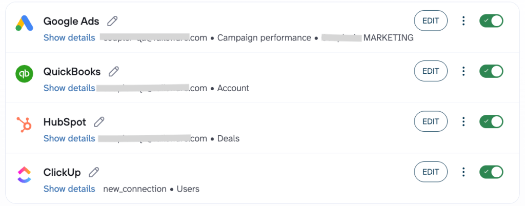
Use Case 1: Agency performance dashboard
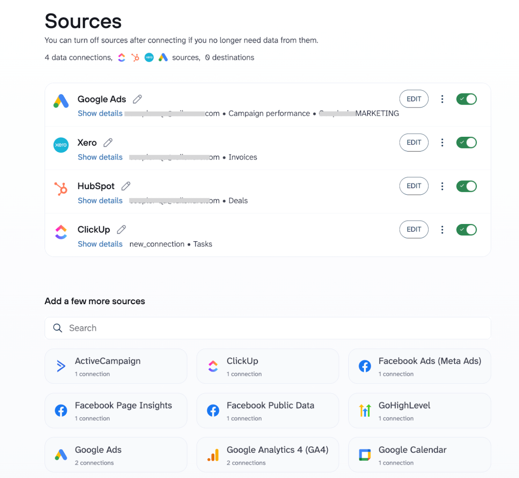
Challenge: Your agency tracks project tasks, deliverables, and billable hours in ClickUp, client deals and pipeline in HubSpot, and revenue, invoices, and expenses in QuickBooks (or Xero). Besides, paid acquisition costs and campaign performance data live separately in Google Ads/Facebook Ads. Without integration, true project profitability is obscured:
- Hours rack up without tying back to client revenue
- Ad spend erodes margins unnoticeably
- Leadership struggles to see which clients, channels, or services are actually profitable
Reporting remains fragmented because time data in ClickUp, deal values in HubSpot, financials in accounting tools, and acquisition costs are isolated in ad platforms.
The fix: With Coupler.io, you can blend data from ClickUp, HubSpot, QuickBooks/Xero, and Google Ads/Facebook Ads into unified, analysis-ready datasets. This creates a complete profitability picture: project effort (tasks/hours) + sales commitments (deals) + financial reality (revenue/expenses) + acquisition costs (ad spend) = automated, accurate agency performance reporting.
How it works:
1. Agency teams log tasks, time entries, milestones, and project details in ClickUp, using custom fields or linked properties to associate them with specific HubSpot deals, clients, or campaigns (e.g., via deal ID, client name, project code, or ad campaign tags).
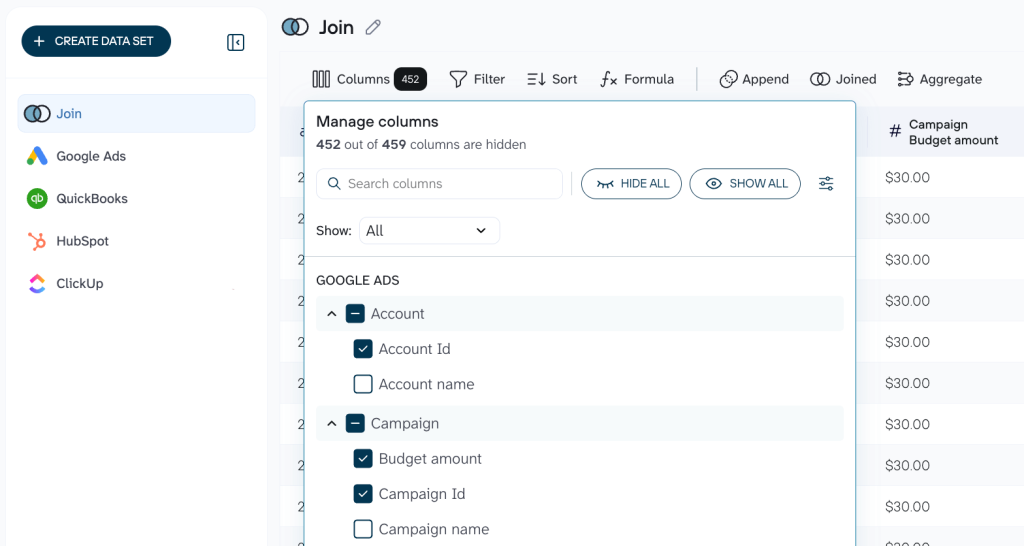
2. Coupler.io helps team members automatically extract data from:
- ClickUp (tasks, time tracked, assignees, statuses, custom fields)
- HubSpot (deals, stages, amounts, associated contacts/companies)
- QuickBooks/Xero (invoices, payments received, expenses, billable items)
- Google Ads/Facebook Ads (campaign spend, impressions, clicks, conversions, attributed costs).
They blend this data precisely as needed. For example, join time-logged hours, task completions, and ad spend with deal revenue and expenses using shared keys like deal ID, client ID, project codes, or campaign names. This gives full control over merge logic, filters, calculations (e.g., total hours, ad cost per project/client), and transformations before loading into your reporting tool.
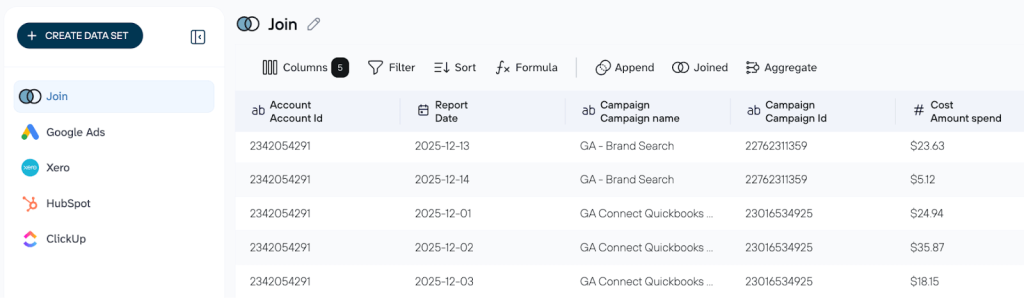
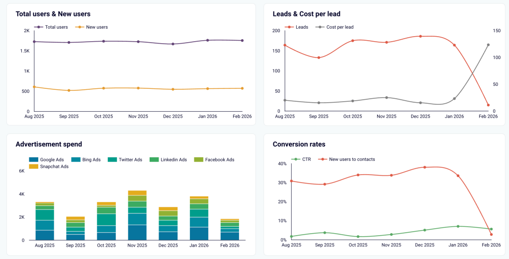
3. Blended data loads to the solution you choose(e.g., BigQuery, Looker Studio). As hours are logged in ClickUp, invoices are paid in QuickBooks/Xero, or ad campaigns are run in Google/Facebook Ads, and the dataset updates automatically. This feeds live dashboards with current profitability and channel efficiency views.
Result: The outcome is a single, consolidated dataset that combines ClickUp project data, HubSpot deal details, QuickBooks/Xero financial records, and Google Ads/Facebook Ads spend metrics. Plug this unified view into Looker Studio, Power BI, or Google Sheets; this lets you:
- Calculate true Effective Hourly Rate (Revenue from QuickBooks/Xero ÷ Hours logged in ClickUp) per project, client, or service line adjusted for ad acquisition costs
- Spot projects going over budget in real time by comparing logged hours + ad spend against estimated/billed amounts
- Identify high-margin vs. loss-making clients, services, or acquisition channels to refine targeting and delivery
- Reveal patterns (e.g., which ad platforms deliver the most profitable clients, how scope creep or under-billing impacts margins, or which team members deliver the highest-ROI work)
You get profitable projects prioritized and better control over budgets and ad spend. This leads to smarter pricing, better channel decisions, and faster data-driven growth for your agency.
Use Case 2: Sales activity tracking
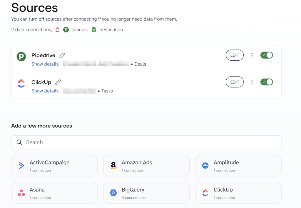
Challenge: Your sales team uses ClickUp for daily tasks (“Follow up with Lead X”, “Send proposal”, “Book demo”), but the pipeline truth lives in Pipedrive. Without connection, follow-ups get missed, deals stall silently, and managers lack real insight into why progress is slow. Reporting stays fragmented: task completion hidden in ClickUp, deal status isolated in Pipedrive.
The fix: Coupler.io blends data from ClickUp and Pipedrive into unified, analysis-ready datasets. This creates a true 1-to-1 link between tasks and deals and enables rich, automated reporting. You can also add more sources to create the custom report (e.g., a CRM your sales team uses).
How it works:
1. Sales reps create tasks in ClickUp tied to specific Pipedrive deals.
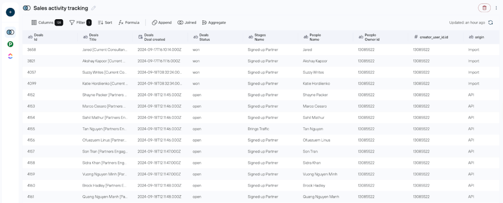
2. Coupler.io lets you automatically extract data from ClickUp and Pipedrive and blend it exactly as you need. For example, you can join task completions (status, dates, assignees) with deal details (stage, value, owner) using shared fields like deal ID or custom links. This way, you get full control over the merge logic, filters, and other changes to your data before loading it into the reporting tool.
3. Blended data loads to your destination (e.g., Google Sheets, Looker Studio, BigQuery). When a key task is completed in ClickUp, it instantly updates the deal record and feeds live dashboards.
Result: You get one clean, combined dataset with a unified view of your Pipedrive and ClickUp data. This single view lives in Looker Studio, Power BI, or Google Sheets. It lets you:
- Find deals stuck because tasks are not done
- Reveal what actually drives or blocks sales progress
- Spot useful patterns (e.g., how long tasks take per stage or which reps close faster)
You end up with fewer lost deals, a clear understanding of what drives results, and data-driven, informed decisions powered by blended ClickUp + Pipedrive data in one reporting layer.
If “Where did that deal go?” and scattered reporting frustrate your team, Coupler.io data blending delivers the missing link.
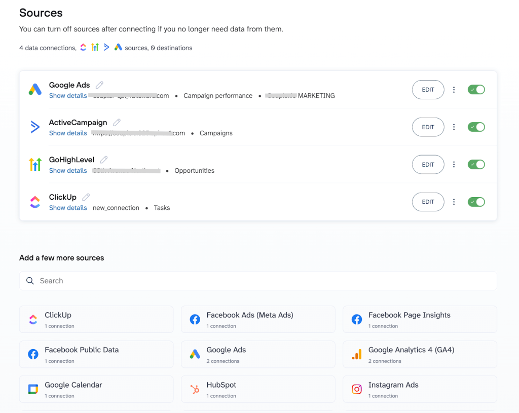
Use Case 3: Marketing operations hub
Challenge: Your marketing team relies on ClickUp for managing creative workflows (“Design ad visuals”, “Write campaign copy”, “Review and approve assets”), but the real campaign performance data is scattered across:
- Automation tools like GoHighLevel and ActiveCampaign
- Ad platforms like Facebook Ads and Google Ads
Without integration, launches drag on, ad tests get delayed, and managers can’t pinpoint why certain campaigns underperform. Reporting remains siloed: task progress is buried in ClickUp, lead-nurturing metrics in ActiveCampaign, workflow automations in GoHighLevel, and ad results are isolated in platform dashboards.
The fix: Coupler.io blends data from ClickUp, GoHighLevel, ActiveCampaign, and Facebook/Google Ads into unified, analysis-ready datasets. This creates a seamless connection between creative tasks and campaign execution, which enables automated, insightful reporting.
How it works:
1. Marketing teams create and track tasks in ClickUp linked to specific campaigns using custom fields for identifiers (like campaign IDs or ad set names).
2. Coupler.io allows you to automatically export data from:
- ClickUp (tasks data, completion dates, assignees, etc.)
- GoHighLevel (automation workflows, contact interactions)
- ActiveCampaign (email sequences, engagement metrics),
- Advertising platforms (impressions, clicks, conversions).
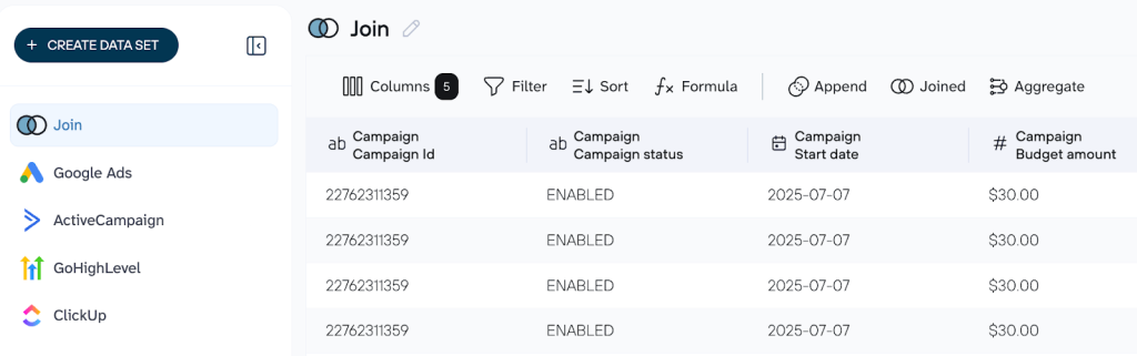
3. Blended data automatically loads into your preferred reporting tool (e.g., Google Sheets, Looker Studio, or BigQuery). As soon as a creative task is marked complete in ClickUp, it instantly updates linked automation workflows and pulls in the latest ad performance metrics. This keeps your live dashboards refreshed with up-to-date insights and shows relevant correlations between creative velocity and campaign results.
Result: You now have one powerful, blended dataset with ClickUp creative progress, GoHighLevel workflows, ActiveCampaign interactions, and real ad metrics (from Google Ads or Facebook Ads). Regardless of the reporting tool you choose (e.g., Looker Studio, Power BI, Google Sheets), this unified view lets you:
- Identify bottlenecks in campaign launches caused by slow creative tasks
- Correlate team velocity (tasks completed per week) with campaign output (ads launched, tests run)
- Spot patterns (e.g., how faster copy approval in ClickUp impacts ad performance metrics like ROI or CTR)
You gain streamlined campaign launches, faster and smarter ad testing, and definitive proof of whether quicker creative production drives stronger results. All of this comes from one unified layer of blended marketing operations data.
Getting started with ClickUp analytics and custom reporting is simpler than you think
You don’t need weeks of setup to start seeing real value from ClickUp analytics and your existing data. Choose the biggest blind spot hurting your business right now (e.g., project profitability gaps or stalled sales follow-ups and follow this step-by-step guide to get fast, actionable insights:
- Connect your platforms via Coupler.io: Link ClickUp with your key tools (HubSpot, QuickBooks, Google Ads, etc.) in about 15 minutes without coding or IT help needed.
- Organize your data set: Rearrange, rename, or filter columns as needed; add formulas or use data blending to customize the merged data before sending it to your reporting tool.
- Connect the reporting tool: Link the reporting solution of your choice (e.g., Looker Studio, Google Sheets, etc.)
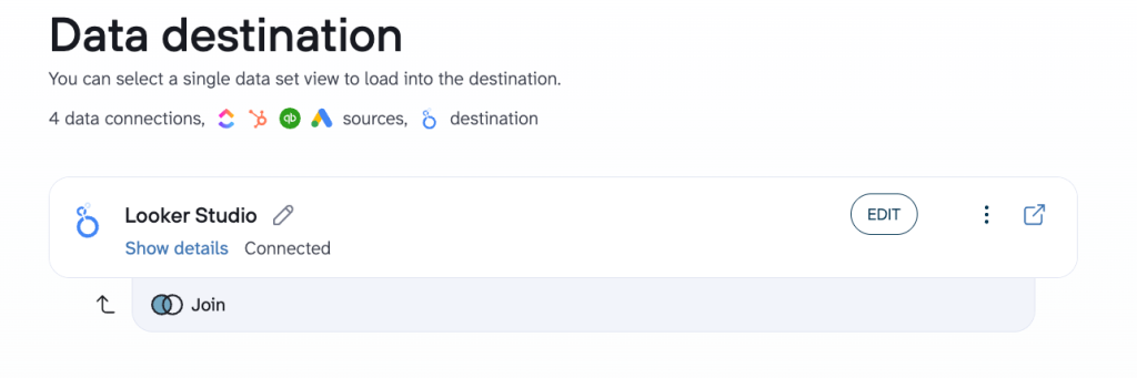
- Review the automated dashboard: As soon as the data blend finishes, a ready-to-use dashboard appears instantly in Looker Studio, Google Sheets, Power BI, or another reporting tool you’ve selected.
- Expand as value proves itself: Once you see real impact, gradually connect more sources, add custom calculations, or get deeper insights into your report with Coupler.io’s AI Agent.
Automate ClickUp reporting with Coupler.io
Get started for freeWhy this works
ClickUp custom reporting with Coupler.io ClickUp connector is perfect even for beginners: it’s a real no-brainer because it upgrades your current stack without breaking anything. Teams get hooked quickly thanks to:
- No data migration needed. All your information remains in its native home (ClickUp, HubSpot, QuickBooks/Xero, ad platforms). Coupler.io accesses and unifies it securely in place.
- No additional software to master. Team members keep working with the tools they already know and use daily.
- No manual refreshes. Automated, scheduled data refreshes with Coupler.io ensure dashboards and reports are always up to date without human intervention.