Committing to a project is very risky without a plan. Having a proper Gantt chart to visualize project schedules helps you manage your project better. You can see all the work mapped out, check whether the plan looks doable, show it to people involved, and even monitor the progress by coloring the pieces you’ve done.
There are many software programs out there for creating Gantt charts. It’s good if you have access to any of them and understand how they work. But for most of us, creating Gantt charts using a spreadsheet app like Google Sheets is probably the easiest way to do it. Besides, you can start from a template.
In this article, we will show you how to make a Gantt chart easily in Google Sheets. If you don’t like the idea of creating a Gantt chart from scratch, you can also start from the templates we provide. Sound interesting? Let’s start.
What is a Gantt chart, and what is it used for?
Gantt charts were invented by Henry Gantt way back in 1910. They have been around for more than a century. Yet, amazingly, they’re still widely used in the Project Management world. This proves that Gantt charts are useful and essential to help your project succeed.
Here’s an example of a modern Gantt chart created using Google Sheets:
To put it simply, a Gantt chart is a project calendar laid out horizontally. It has a series of horizontal bars along a horizontal timeline that visually represents the planned tasks and durations. It helps you see which tasks are occurring at the same time, which is useful for recognizing issues such as a conflict of resources.
Ways a Gantt chart can be used:
- In planning and scheduling, a Gantt chart helps you assess how long a project should take and plan the order in which you’ll complete the tasks. They’re also helpful for managing the dependencies between tasks and determining the resources needed.
- Once a project is underway, a Gantt chart is useful for monitoring its progress. You can immediately see what should have been performed by a specific date. And if the project is behind schedule, you can take action to bring it back on track.
Why is a Gantt chart important?
Well, here are the main reasons why a Gantt chart is essential:
- Communication. Gantt charts are one of the best ways to visualize project tasks and their key dates. Additionally, you can show who’s responsible for each task. You can see what’s big and what’s small, which tasks are critical, and whether you are on schedule. Gantt charts also allow stakeholders to have the same information about the project — and there are fewer chances for misunderstanding.
- Resource planning. Gantt charts allow you to see when your busy periods are. You can look vertically and see whether there are too many tasks to complete in one week. Using this info, you can also prepare in advance to anticipate more resources during these ‘hectic’ periods.
- Monitoring. By using Gantt charts, you can ensure each project is working towards the same goal. You can monitor your progress by displaying a progress bar, or by coloring in the tasks you’ve completed. It also allows you to focus more on outstanding tasks and items that are overdue.
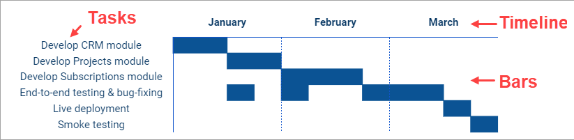
Elements of a Gantt chart
A Gantt chart has three major elements, which are:
- Tasks. On the left side of the chart, you’ll see a list of tasks. Sometimes these are grouped into phases.
- Timeline. In the chart’s horizontal axis (usually displayed above the chart), you’ll see a timeline. The granularity can be daily, weekly, monthly, or even yearly.
- Bars. Adjacent to each task, you’ll see a horizontal bar representing the duration of each task. These give you an indication of how many tasks are happening simultaneously, and how long it will take to complete the entire project.
You may also find these additional elements in various Gantt chart software:
- Milestones. Traditionally, milestones divide projects into phases, but you can choose to create a milestone to indicate a big task or a deliverable. Milestones are usually marked using diamonds.
- Resources. These can be people, tools, or other resources associated with the tasks. Listing resources can be helpful, but you may want to omit them to prevent your chart becoming too cluttered.
How to make a Gantt chart in Google Sheets using a stacked bar chart
Usually, the easiest way to make a Gantt chart in Google Sheets is by using the inbuilt chart feature. Refer to our blog post to learn how to create a chart in Sheets. While there is no Gantt chart type in Google Sheets, you can create one using a stacked bar chart by following the steps below:
Step 1. Prepare tasks and dates
You may already have data stored in a project management tool such as Jira. In this case, you can import this first into Google Sheets using an integration tool such as Coupler.io. You can also import data easily from Airtable, Clockify, and other popular sources. With Coupler.io, you can even set up automatic data refresh, so that your data will be always up-to-date.
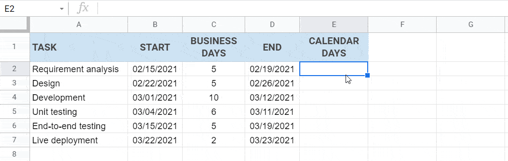
If your data doesn’t contain end dates, these can be calculated from the estimated duration in days. Here’s an example (you can also copy from this spreadsheet):
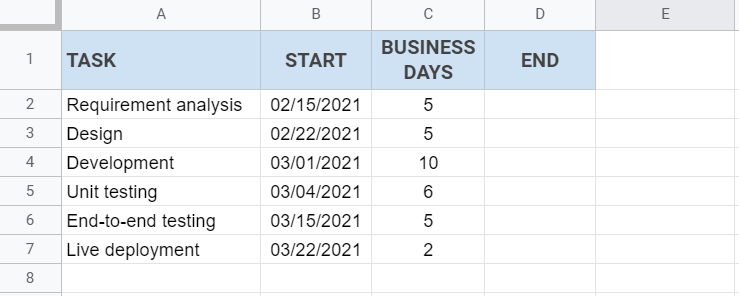
Now, suppose you want to exclude weekends from the calculation. You can acquire the end dates using a simple formula =WORKDAY(start, days). However, this will include an extra one day. To include start dates in the calculation, you’ll need to subtract one day, using this formula: =WORKDAY(start, days-1).
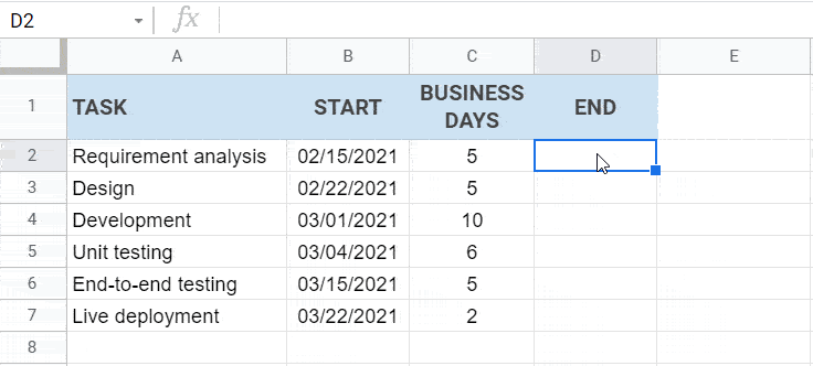
Type the following formula in D2. The auto-fill feature will suggest you to copy the formula downwards.
=WORKDAY(B2, C2-1)
Next, calculate the actual duration in calendar days. To do this, add CALENDAR DAYS in Column E (right next to the end dates). Then, use the following formula in E2 and copy the formula downwards using the auto-fill feature.
=D2-B2+1
Step 2. Insert a stacked bar chart
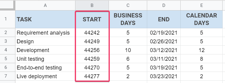
Before creating the chart, let’s change the format of the start dates into numbers. This will make it easier for you when customizing your chart later.
Change the format of the start dates to numbers
Select the START column, then click Format > Number > Automatic. You’ll see a result as the following screenshot shows:
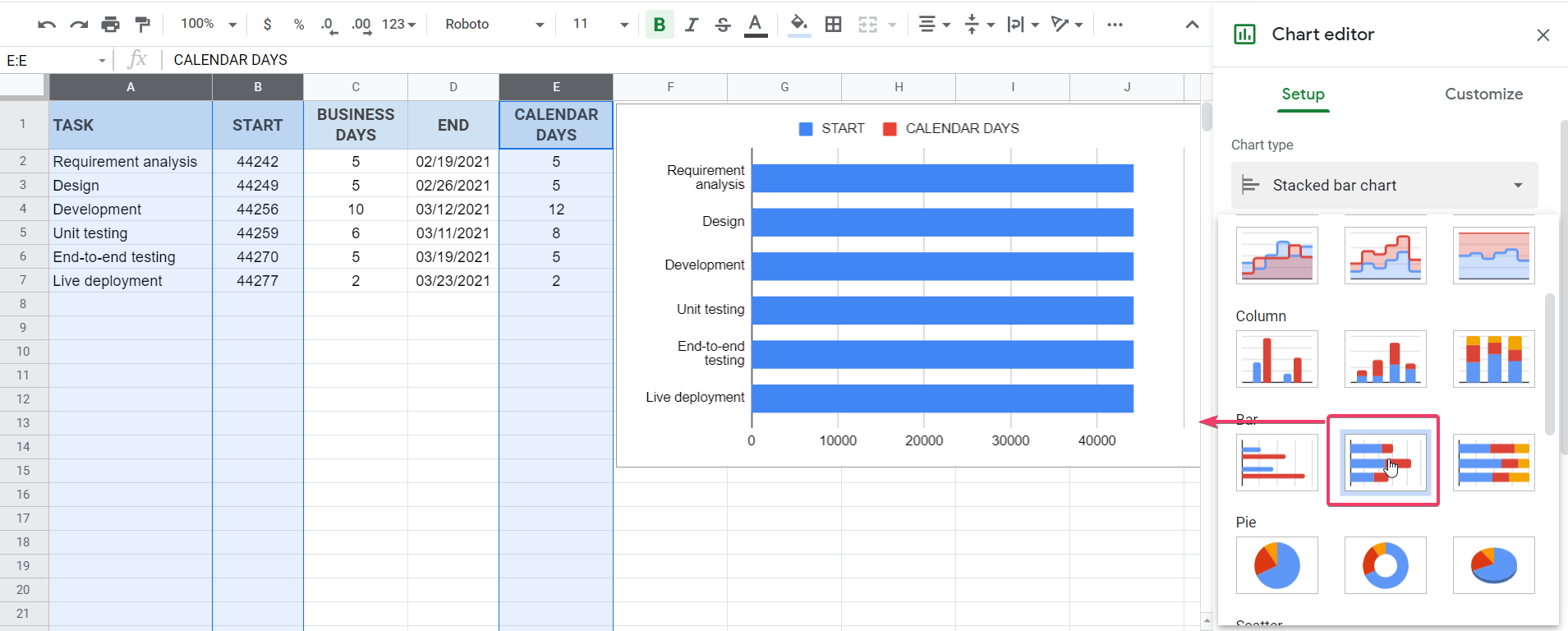
Insert the chart
Next, highlight the TASK, START, and CALENDAR DAYS columns. Then, click Insert > Chart from the menu. In the Chart editor, select “Stacked bar chart” from the chart type dropdown.
Step 3. Customize the chart
Now, let’s customize the chart’s horizontal axis to show proper dates instead of numbers. We’ll also customize the bars’ colors.
Customize the horizontal axis
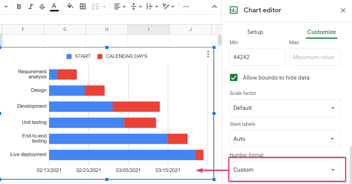
In the Chart editor, click the Customize tab and expand the Horizontal axis section. Change the Min value to 44242, which is the start date of the first task (first row).
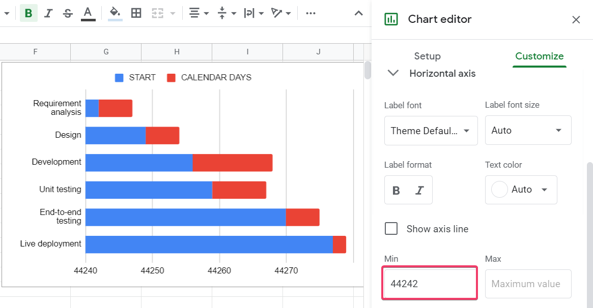
Then, in the Number format dropdown, choose Other custom formats. Type MM/dd/yyyy, then click the Apply button.
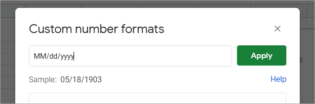
Here’s the result — notice that your X-axis now displays dates instead of numbers:
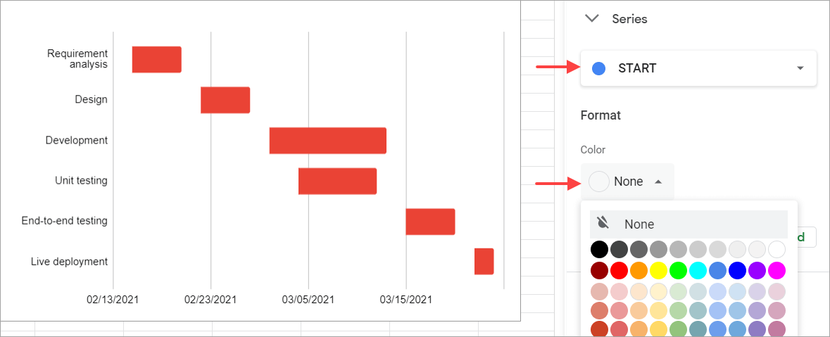
Customize the bars
Expand Series and select the START series from the dropdown. Change its color to None. Notice that your chart now is more like a Gantt chart instead of a standard stacked bar chart.
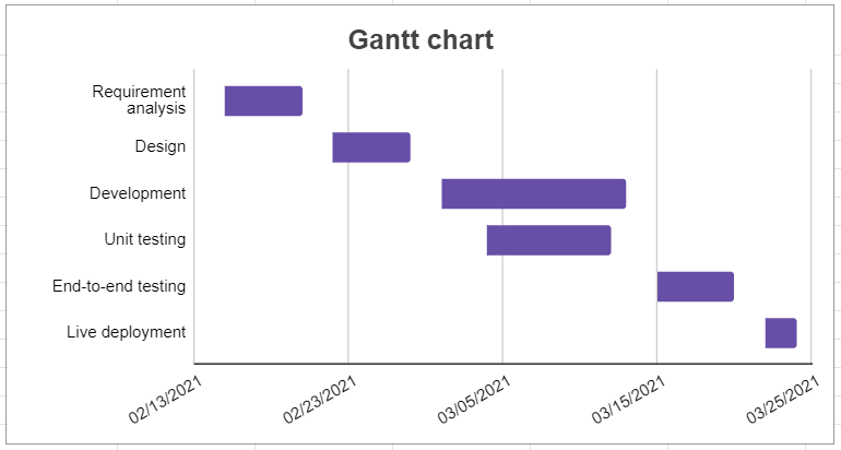
If you like, you can also customize other things using the Chart editor. For example, you can modify the chart’s title, legend, bar color, slant labels, and so on — here’s an example result:
Change back the format of the start dates
Finally, don’t forget to change back the START column’s format to MM/dd/yyyy to make it readable. To do that, select Column B, then click Format > Number > Custom number format from the menu. Type MM/dd/yyyy, then click the Apply button.
Here’s the final result:
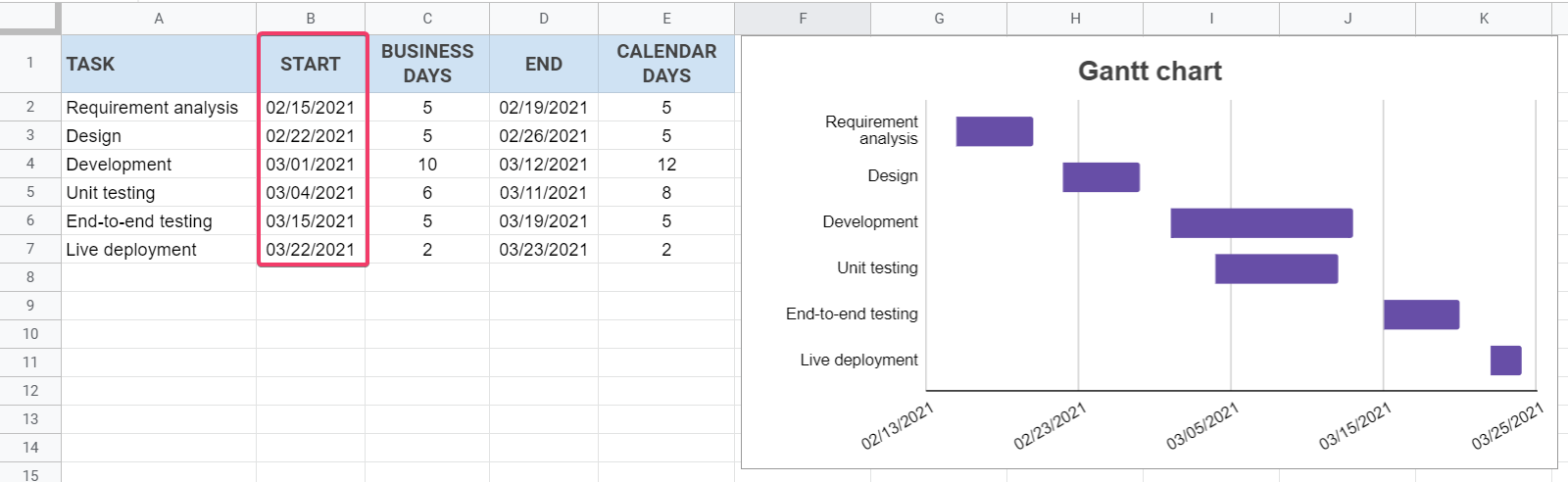
Now you have successfully created a Gantt chart using a stacked bar chart in Google Sheets. 🙂
How to make a Gantt chart in Google Sheets using conditional formatting
The following steps demonstrate how to create a Gantt chart in Google Sheets using conditional formatting. The steps are easy to follow — you only need basic Google Sheets knowledge. 🙂
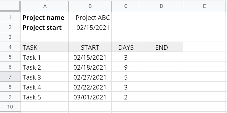
Step 1. Prepare tasks and dates
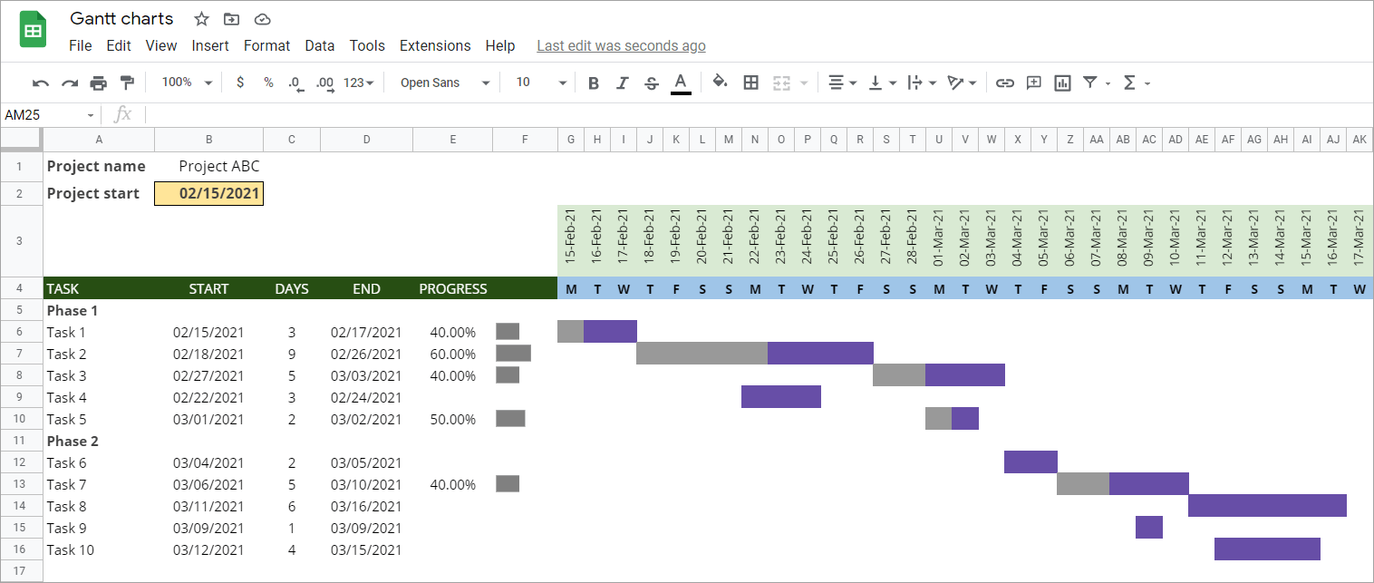
First, prepare a list of tasks, start dates, and durations in days. Also, add your project name and start date in the spreadsheet — here’s an example:
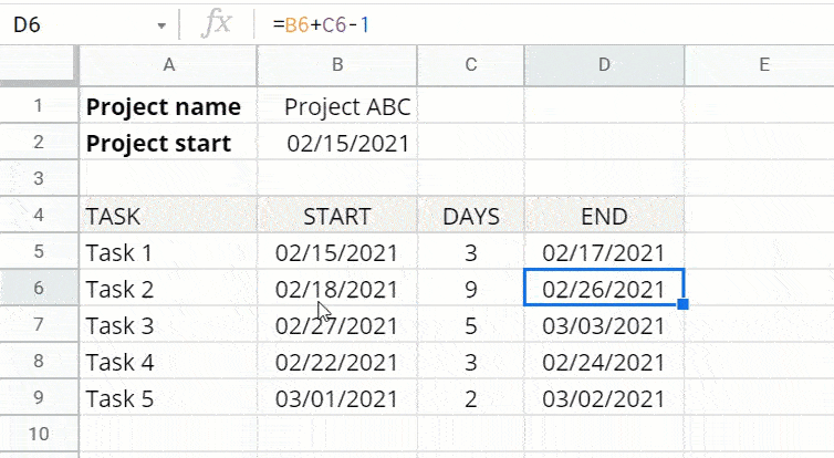
Now, suppose you want to include weekends (different from the previous example, which excludes weekends). Type the following formula in D5, then double-click the small blue dot to copy the formula downwards.
=B5+C5-1
Step 2. Create task dependencies in a Google Sheets Gantt chart
Suppose Task 1, Task 2, and Task 3 are the critical path (the longest sequence of tasks) of your project. Thus, you can’t start Task 2 before Task 1 is complete, and you can’t start Task 3 before Task 2 is complete. Also, any delay in one of these tasks will delay the finish date of the project.
To ensure the above dependency, use the following formulas in B6 and B7:
- B6:
=D5+1 - B7:
=D6+1
Here’s an example of how to do it:
Now, every time you increase the duration of Task 1, it will affect the end dates of Task 2 and Task 3.
Step 3. Create the timeline
We’ll create a 3-week timeline. But we’ll start by formatting the size of the cells that we’re going to use for the timeline.
Format cells’ sizes
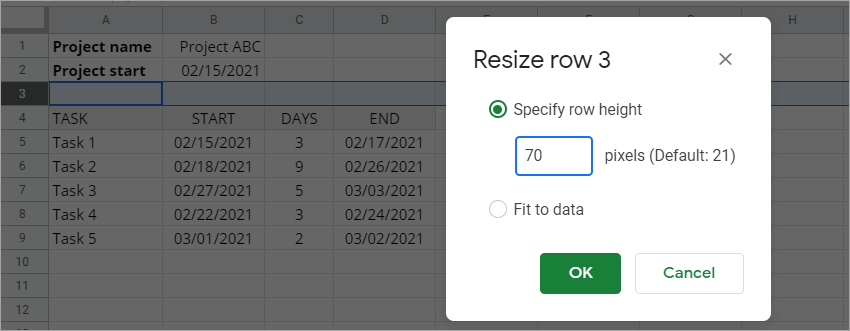
First, resize the height of Row 3. Right-click the row and select Resize row. Set the height to 70 pixels (for example). Then, click the OK button.
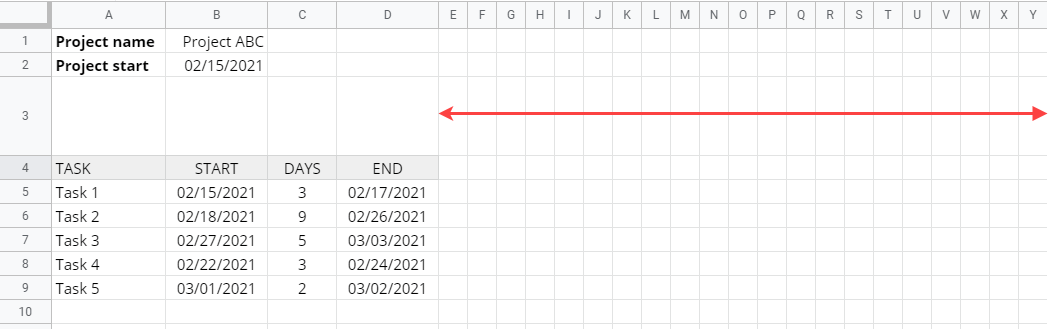
Second, resize the width of Column E-Y (21 columns). To do that, select the columns, then right-click and choose “Resize columns E – Y“. Input 25 in the text box to set the width of each column to 25 pixels. Then, click the OK button, and you’ll see the following result:
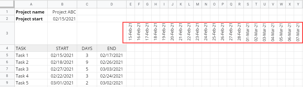
Third, change the rotation of Row 3. Select the row and click Format > Rotation > Rotate up from the menu.
Add the dates
Type the Project start date in E3, then drag the blue dot until Y3. You can also change the date format or make the text smaller to make it nice and tidy.
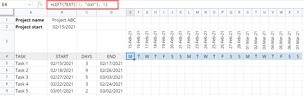
Below the dates, let’s also display the first letter of the day of the week to make it more informative. Type the following formula in E4:
=LEFT(TEXT(E3, "ddd"), 1)
Then again, drag the small blue dot until Y4. You can also change its fill color if you like.
Step 4. Add the bars using conditional formatting
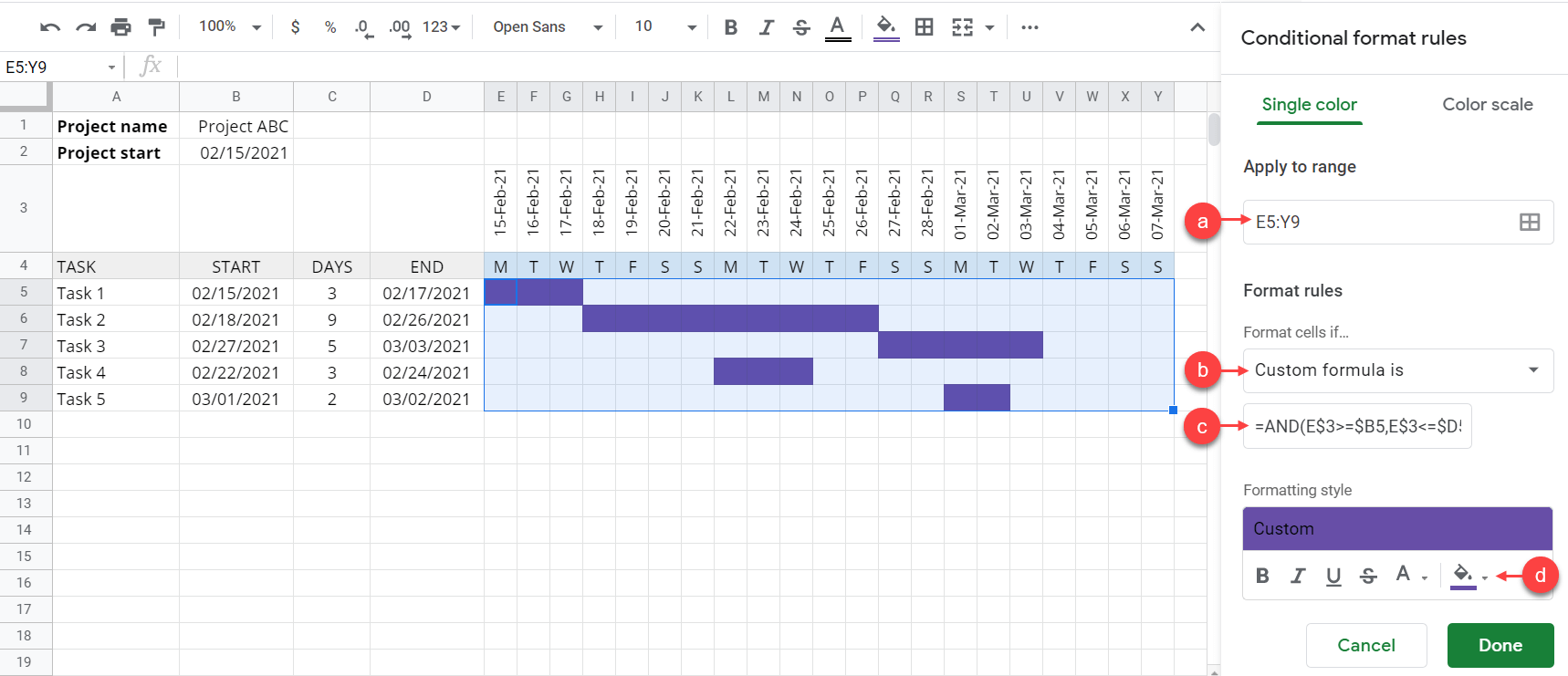
Now, let’s add bars using conditional formatting. From the menu, click Format > Conditional formatting. Then, follow the instructions below:
- In the Apply to range, enter
E5:Y9— this is the bars’ area. - Select Custom formula is from the dropdown.
- In the Value or formula textbox, enter
=AND(E$3>=$B5,E$3<=$D5). This formula evaluates the dates that are between each task’s start date and end date to TRUE. - In the Formatting style, click the paint bucket icon to change the color of the cells that match the condition. Choose a color you like, for example, purple.
See the following screenshot for more details:
Step 6. Create dynamic timeline Gantt chart in Google Sheets
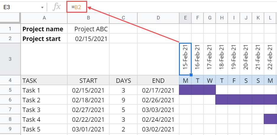
If you want, you can make the timeline dynamic. For example, you can make it change every time you change the project start date.
To do that, first, link the first date in the timeline to the project start date. Type the formula =B2 in E3, as the following screenshot shows:
Then, in F3, enter formula =E3+1. Drag the blue dot across until Y3 to add one day to each of the next dates. See the following image:
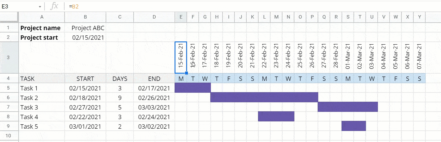
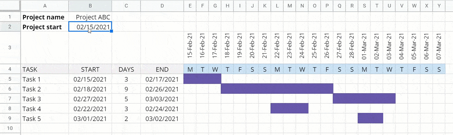
Now, let’s test it by changing the project start date. You’ll notice that the timeline changes every time you change the project start date.
Step 7. Create a progress bar in a Google Sheets Gantt chart
You can add a progress bar to monitor the completion of each activity in your project.
Add a new column PROGRESS, next to the END column. Format the column to % by clicking Format > Number > Percent from the menu. Then, put some values into this column.
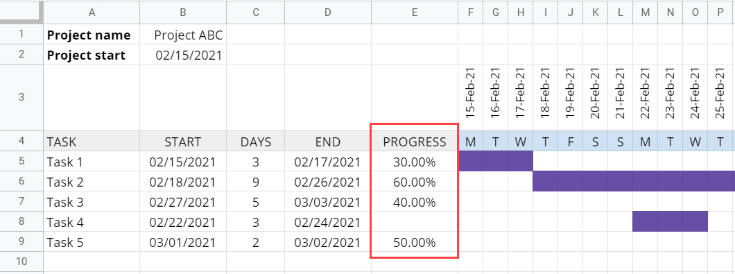
Add another column right next to the PROGRESS column. Use the following SPARKLINE formula to draw the progress bar.
=IFERROR(SPARKLINE(E5, {"charttype","bar";"color1","#d9d9d9";"max",1}), )
Then, drag the small dot down to copy the formula.
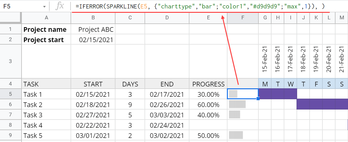
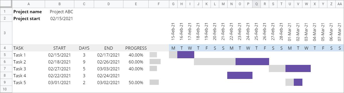
Notice that the light gray bar indicates the progress of each task. The higher the % value, the longer the gray progress bar.
Gantt chart template Google Sheets – use it for free
If you don’t like the idea of creating a Gantt from scratch — don’t worry. Take a look at the following Google Sheets Gantt chart templates and choose the ones that you need. Before you start, please make a copy (File > Make a copy) 🙂
Weekly Gantt chart template in Google Sheets by Coupler.io
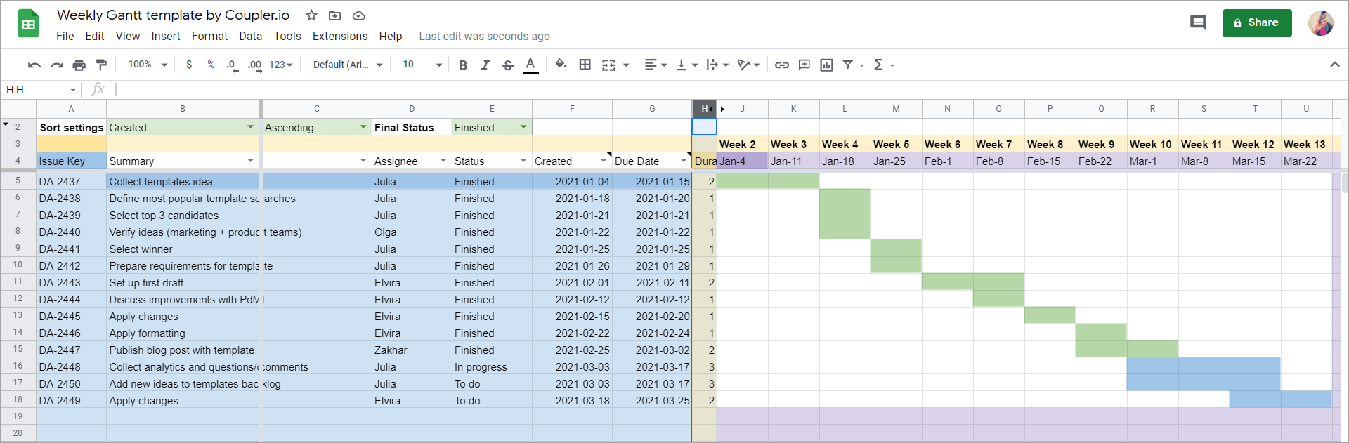
Download: Weekly Google Sheets Gantt chart template by Coupler.io
This is a ready-to-use template optimized by Coupler.io for Jira data. It consists of two Gantt Charts:
- Gantt Chart (play with it) for the manually added data
- Gantt Chart (view only, Jira) for the data imported from Jira
Gantt Chart (play with it)
You can use this chart right away by manually adding the following data:
- Name of the task
- Start date of the task
- End date of the task
Once the data is in the template, it will automatically create a Gantt chart. No other preparations are needed, however you can add auto calculation of end date and progress bar as described above.
Note: Do not change any value in the orange cells.
Gantt Chart (view only, Jira)
For this chart, you don’t have to manually add data – it will be imported automatically from your Jira Cloud. For this, you need to complete the following steps:
- Go to the JIRA params tab and specify values in green cells.
- If needed, you can rename the created and due fields to your own Start and End Dates in Jira.
- Insert the needed values in the Values column. You can also adjust the Operator column.
- Select the checkboxes (Include? column) of the filters that you want to include in your JQL.
- Install Coupler.io add-on.
- Go to Add-ons => Coupler.io => Open dashboard. You’ll see a pre-built importer named JIRA: Get jira issues.
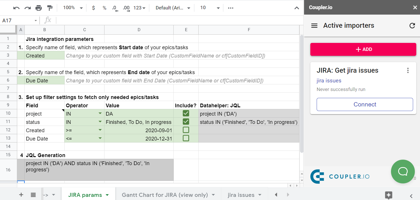
- Click the Connect button on the JIRA: Get jira issues importer. This will open the importer’s parameters.
- Click SAVE & RUN to import your data from Jira to your Gantt chart.
Google Sheets Gantt chart template with dates
Features:
- Progress bar
- Bars that also show progress
Download: Google Sheets Gantt chart template with dates
Gantt chart Google Sheets template for a multi-phase project
Features:
- Progress bar
- Bars that also show progress
- Multi-phase
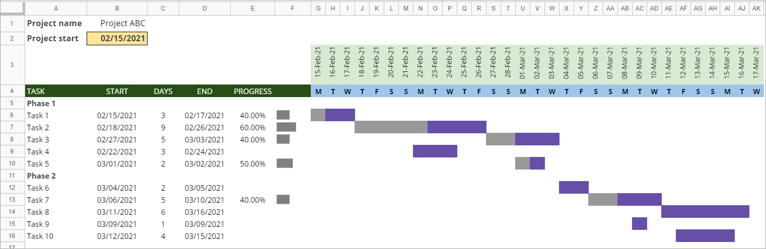
Download: Gantt chart Google Sheets template for a multi-phase project
Gantt chart template for months in Google Sheets
We also modified the above-mentioned multi-phase project template to make a Gantt chart template for months. Here is how it looks:
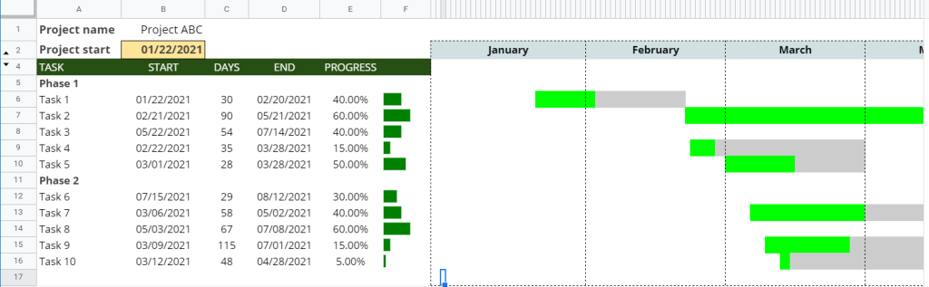
This template will be a fit for long-term tasks and projects.
Download: Gantt chart template for months in Google Sheets
Hourly labor allocation Gantt chart Google Sheets template
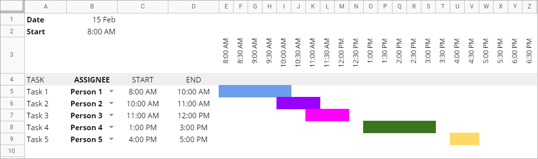
Download: Hourly labor allocation Gantt chart Google Sheets template
Pros & cons of creating a Gantt chart in Google Sheets
There are advantages to making a Gantt chart in Google Sheets. Still, there are always some disadvantages you must consider. Let’s take a look at some of the pros and cons when it comes to Gantt charts in Google Sheets.
Pros:
- Easy to get started. You can easily create a Gantt chart using a stacked bar chart then customize it in a few steps. There are also many templates available if you want to create a more complex Gantt chart.
- Shareable. Google Sheets allows you to share your spreadsheets and collaborate with others easily. If you’re using a stacked bar chart for your Gantt, you can even publish it on the Internet or download it as a PDF or PNG.
Cons:
- Not suitable for complex projects. Using Google Sheets, it’s easy to visualize simple timelines and a few tasks. However, for a large project with many activities, things can become complex. It can be frustrating to keep the chart updated. Additionally, too much data in your spreadsheet can make the performance slower.
- You can’t define milestones straightforwardly. For a workaround, you can use different colors or group rows that represent each milestone.
Gantt chart in Google Sheets not consistently working
It can be frustrating if your Google Sheets’ Gantt chart is not working consistently. In that case, we recommend you check the following things:
- Check the formulas. For example, check whether you have applied or copied formulas to the newly added rows. Also check for any wrong conditional statements.
- If you calculated end dates using start dates and durations, avoid changing the end dates manually — in this case, modify start dates or durations instead.
- If you are using conditional formatting, check whether all the rules are correct and in the right order.
- If you are starting from a template, read the instructions about how to use and modify it again, in case you missed anything.
