
How to Build Marketing Reporting Dashboards with Claude: Examples and Best Practices

Why marketing reporting takes too much time
Marketing data lives in too many places with no consistent way to bring it together. You pull exports from Google Ads, download reports from GA4, extract campaign data from HubSpot, and open Meta Ads Manager for paid social numbers. Then paste everything into Excel, align the date ranges manually, fix the columns that don’t match, and reconcile metrics that each platform calculates differently. By the time the report is ready, the data is already a week old. And next week, you do it again from scratch.
When I build dashboards I spend 70% of the time searching for correct tables and sources of information. 20% writing queries and setting up the logic for extraction and maybe 10% using the front end tool.
That experience, shared by someone on a Reddit thread, is a common frustration among dashboard builders.
Teams often solve part of this problem by building dashboards in BI tools like Data Studio. But that usually requires technical expertise in SQL, data modeling, and dashboard layout design.
Claude removes that barrier. I’ll show you how to connect your marketing data to Claude through Coupler.io and build a marketing dashboard without coding or writing a single query.

Connect your marketing data to Claude with Coupler.io
Get started for freeWhat does it mean to build a dashboard with Claude?
In traditional BI tools, building a marketing dashboard is a multi-step process. You start by connecting data sources to a BI tool. Then you clean and prepare the data by changing data types, merging tables, and creating calculated fields. After that, you move to data visualization, picking chart types, dragging fields, arranging layouts, and adding filters for interactivity.
Every step requires manual setup, whether you’re writing queries or configuring it through the UI. And even after all that, you still have to figure out what the dashboard numbers actually mean.
I got tired of that setup tax. So I connected my sources (Google Ads and HubSpot) through Coupler.io and let Claude handle the rest. With this workflow, I describe what I want in natural language, and Claude generates interactive dashboards with charts, filters, and insights. For example, I prompted: Build a professional paid vs organic marketing performance dashboard, and it generated the visual below along with insights in plain language.
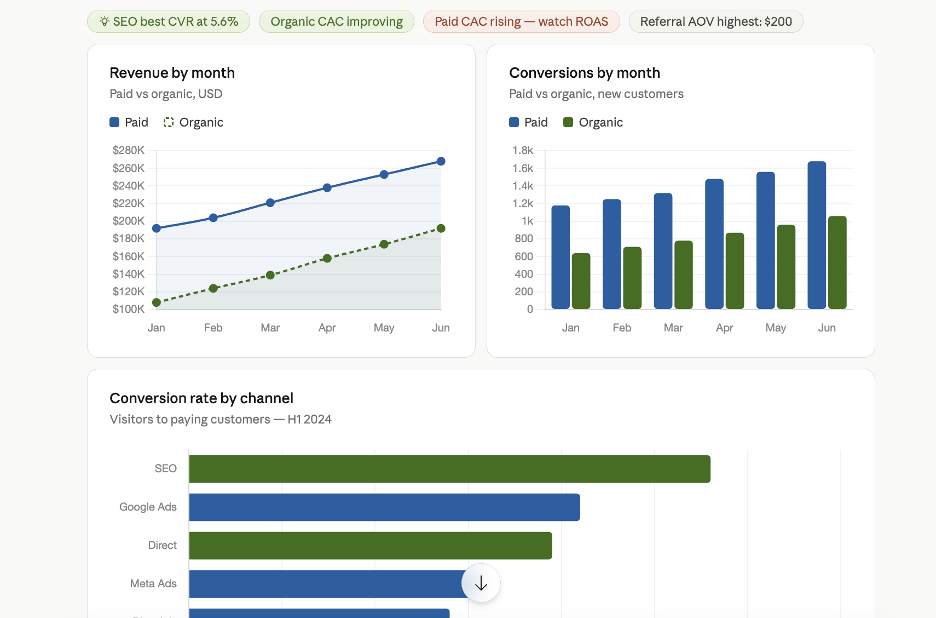
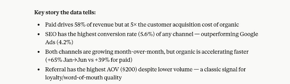
Here Coupler.io fits in as the data layer. It connects, structures, refreshes the data, and executes calculations against the dataset so the answers are verified rather than estimated. You can also add business context, so Claude understands what the numbers mean. As a resul, your Claude dashboards and insights are always based on up-to-date and verified numbers.
Now, there are two ways to use Claude:
- Claude as the dashboard builder: You connect your data to Claude and describe the dashboard you want. It generates the structure, visuals, and layout based on your prompt.
- Claude as the analyst on top of your dashboard: You build the dashboard using your existing BI tool or Coupler.io. Then you connect it to Claude and let it analyze the data, surface insights, and suggest next steps.
Build marketing dashboard with AI: Claude as the builder
In this approach, I use Claude to generate the dashboard for me.
I create a data flow in Coupler.io and connect it to Claude. Coupler.io provides Claude integrations for over 400 data sources, so I can pull in my marketing data from tools like Google Analytics (GA4), HubSpot, ad platforms, and more. Coupler.io collects and stores everything as a structured dataset that Claude then queries to build dashboards.
Check out this tutorial to see how it works step by step.
How to use Claude for data analysis (powered by Coupler.io)
You don’t have to leave Claude to set up the data pipeline. But you need to have a Coupler.io account.
Then install the Coupler.io connector in Claude, then describe the reporting job you need in a new chat:
I want to analyze Google Ads performance for the past 90 days, broken down by campaign and ad group.
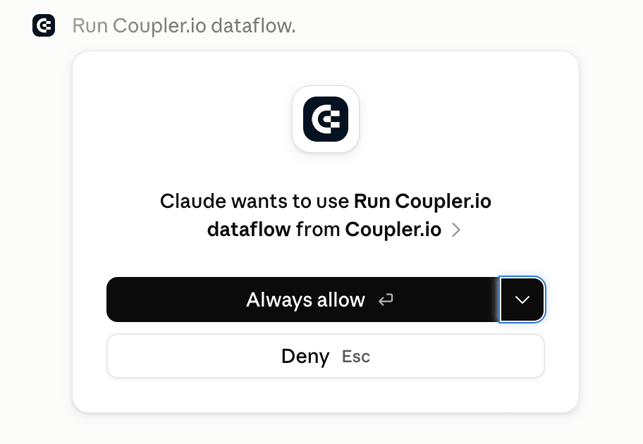
Claude prompts you to authorize your Google Ads account through a secure link. Once you confirm, Coupler.io creates the data flow, pulls your data, and makes it available for Claude to query. You can also set a refresh schedule so the dataset stays up to date for future analyses.
Set up the flow manually in Coupler.io
Starting in Claude is faster for a first try. If you want more control over which fields Claude sees, how sources are combined, or how the data is organized before analysis, set up the data flow in the Coupler.io app instead.
You can use the form below to pick a source and click Proceed to sign up for free and continue with no credit card required.
Then add your source account details and a few configurations. For example, with GA4:
- Select the property (website or app)
- Choose the reporting period (timeframe you want to analyze the data)
- Pick metrics and dimensions like sessions, clicks, conversions, and views
Coupler.io then loads your data and shows a preview.
In the app, you can filter rows, hide or rename columns, create custom metrics (like page conversion rate = conversions/views), and combine data from multiple sources into one dataset. If your data lives in GA4, Meta Ads, and HubSpot, for example, you can blend all three in the same data flow so Claude gets a combined view to query.
Once the dataset is ready, add Claude as a destination. Coupler.io connects through MCP, so Claude queries the structured dataset rather than receiving a raw data dump.
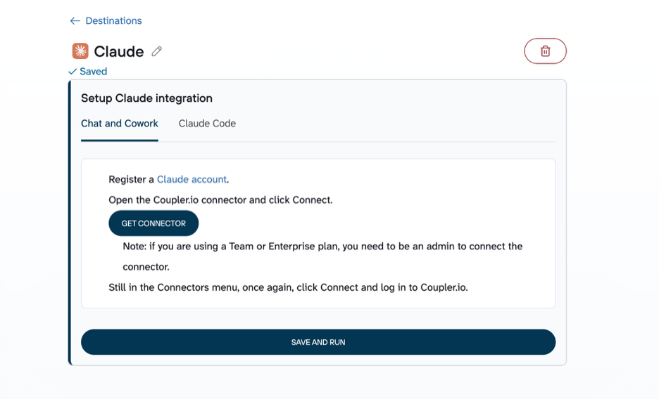
You’ll be redirected to Claude for authentication. After that, return to Coupler.io and click Save and Run to push the first load of data to Claude.
Additionally, you can chat with your business data right in Coupler.io using our own AI agent.
Give Claude the context behind your marketing data
Before you start prompting, you can add context that tells Claude what your data actually means. Coupler.io supports three layers:
- Data Context tells Claude what the fields and metrics represent, so it doesn’t have to guess whether “conversions” means form fills or purchases.
- Business Context provides information Claude can’t infer from the table: attribution model changes, seasonality patterns, a product launch that shifted traffic mid-quarter, or what your team means by “qualified lead.”
- Skills define how a recurring analysis should be performed, so you don’t reinvent the same reporting logic every week. Instead of rewriting the same prompt every Monday, a Skill encodes the analytical workflow once: compare spend, conversions, CPA and ROAS across channels, identify significant changes, and summarize what deserves attention. The benefit isn’t saving a long prompt. It’s applying the same analytical method to refreshed data every week instead of reinventing the analysis from scratch.
Coupler.io also has a library of prebuilt Skills for common marketing analysis workflows, so you don’t have to build from scratch. The marketing-analytics skill, for example, automatically runs campaign analysis, cross-channel comparisons, and anomaly detection on your live Coupler.io datasets. Skills are built into the Coupler.io MCP connection, so they activate automatically when you connect Coupler.io to Claude. No separate installation required. They also work in other AI tools like ChatGPT and Gemini via MCP.
For a one-off question, explaining a metric in the prompt is fine. But if “conversion” always means a qualified demo request for your team, store that definition in Context once and every future analysis starts from the right baseline.
Prompt Claude to build dashboards
Now that your dataset is connected to Claude, you can start building dashboards by prompting it. Every AI dashboard for marketing reporting starts with a clear prompt and a clean dataset.
For dashboards you want to reuse or share, it’s better to use Claude Artifacts. Artifacts give you a live, interactive workspace where Claude builds dashboards, visualizations, or small apps outside the main chat. This makes them easier to share, revisit, or refine.
To get started, open Artifacts from the left panel and click New artifact. This opens a new chat session.
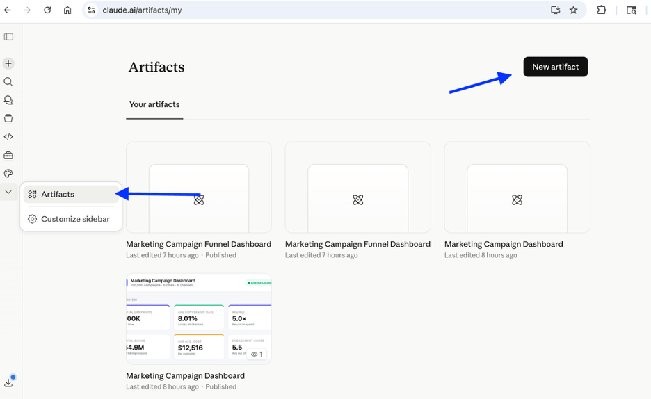
From here, describe what you want, and Claude builds it. Because you defined Context upstream, Claude has more useful information to work with: it knows what your metrics mean and how your team defines key terms.
I started with a simple prompt:
On marketing campaign flow, create a funnel view using: Impressions → Clicks → Conversions Calculate:
CTR = Clicks / ImpressionsConversion rate = Conversions / Clicks
Show total values and drop-off percentages between each stage.
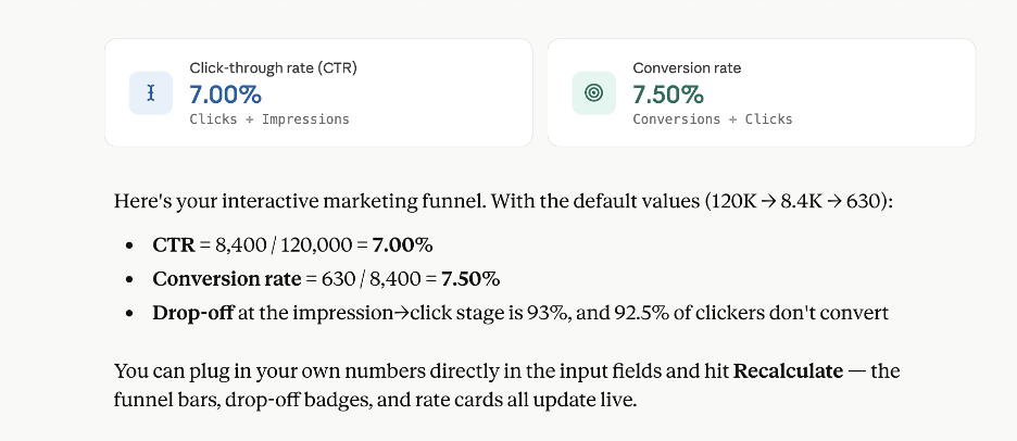
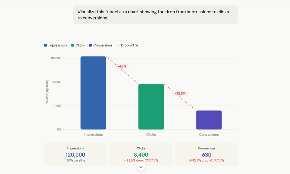
Then I wanted to visualize this data, so I prompted: Visualize this funnel as a chart showing the drop from impressions to clicks to conversions.
Then I asked for a more comprehensive dashboard using the prompt:
Build a funnel dashboard that includes:
overall funnel (impressions → clicks → conversions)funnel by channeltop 3 campaigns with highest drop-offsummary of key insights
Claude generated a dynamic, interactive dashboard with all the components. Then I clicked the Publish button to get a shareable link to my campaign funnel dashboard. I can share it with stakeholders or revisit and customize it anytime using this link.
Create dashboards in Claude for your marketing data
Try Coupler.io for freeAI-powered marketing reporting: Claude as the analyst
Another practical way I use Claude is as the analyst on top of an existing dashboard setup.
The actual dashboard still lives in tools like Data Studio or Google Sheets, and Coupler.io powers those dashboards with fresh data. Coupler.io also provides dashboard templates for popular marketing sources and use cases. You simply connect your data source to the template, and the dashboard is ready on your dataset.
In this setup, the data flow destination can be Coupler.io Dashboard, Data Studio, Power BI, Google Sheets, or others. To add the AI-powered analytics layer, use Claude as another destination in the same data flow.
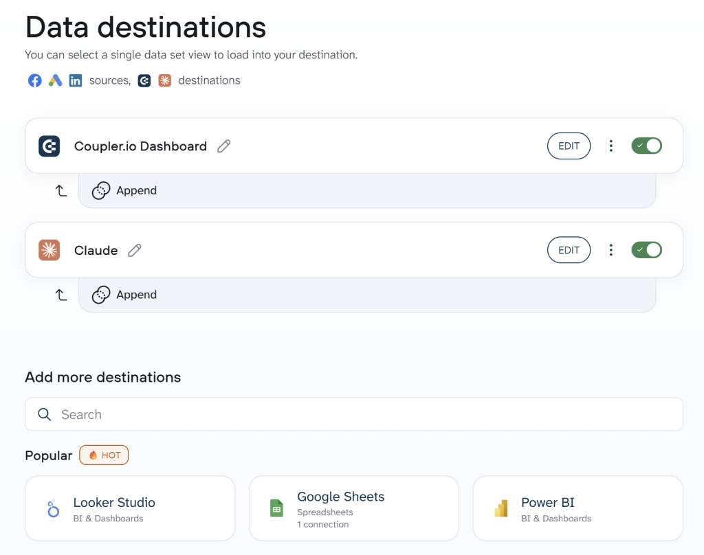
Through the Coupler.io MCP connection, Claude accesses the real data powering these dashboards. This is where Claude MCP servers for marketing data matter most: Claude doesn’t replace the dashboard; it sits on top of the same data and answers questions the dashboard can’t.
How query-based answers work
When you ask Claude a marketing question, it doesn’t guess at the answer from the raw data. The workflow looks like this: you ask a question in plain English, Claude generates a query based on what you asked, Coupler.io’s Analytical Engine executes that query against your dataset and runs the calculations, then Claude receives the computed result and explains what it means.
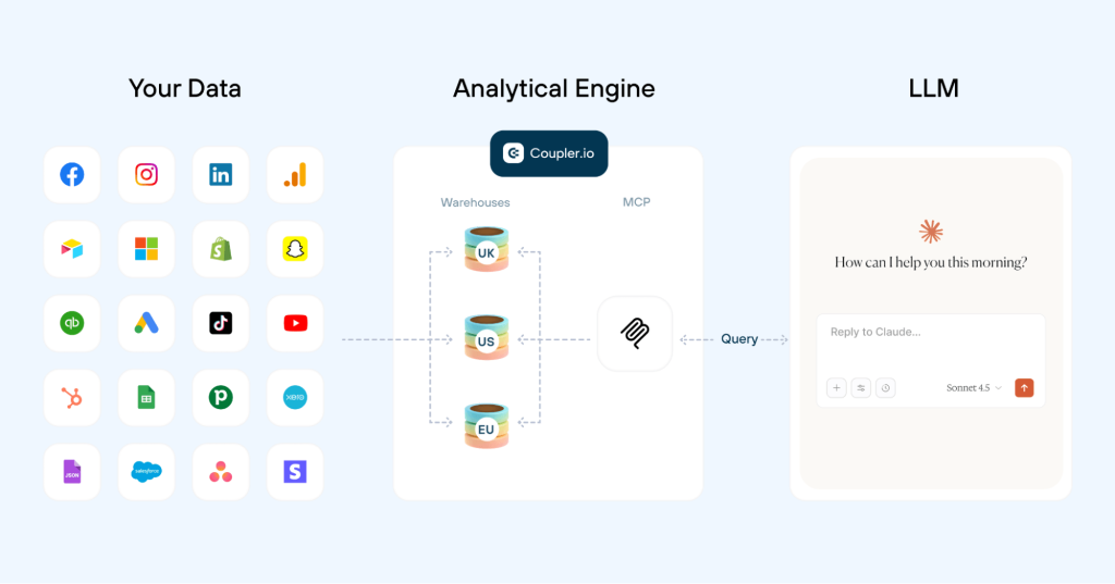
The SQL query itself stays visible and editable, so you can see exactly what was calculated and adjust it. This is what makes the answers traceable rather than opaque. Coupler.io does the math; Claude helps you ask the right questions and interpret the results.
For example, I built a PPC multi-channel dashboard using Coupler’s prebuilt template. This combines data from multiple advertising platforms and shows campaign performance, spend analysis, and more.
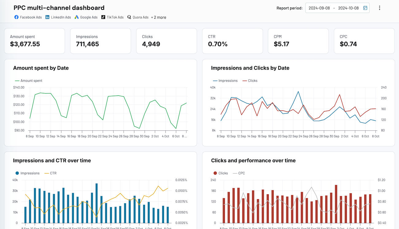
Then I connected Claude as a destination to the data flow of this dashboard and prompted Claude: Which campaigns are wasting the most budget? It ranked the campaigns based on spend efficiency and clearly explained which campaigns were underperforming, as shown in the image below.
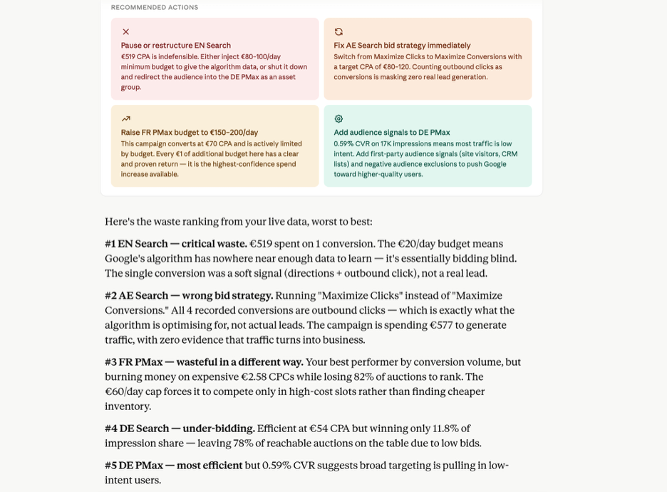
Claude didn’t estimate those numbers. Coupler.io’s Analytical Engine ran the spend-efficiency calculations against the dataset and returned verified results. Claude then interpreted them and surfaced the campaigns worth pausing or adjusting.
Once that kind of analysis works for one question, the natural next step is turning it into a repeatable process: daily health checks, weekly stakeholder summaries, creative fatigue scans, forecasting. The query logic stays the same, the data refreshes, and you get an updated answer without rebuilding the report.

I cut PPC reporting time by 60% with Claude
Gabe Solberg manages $1M+ in monthly Meta Ads spend at Right Percent. By connecting Meta Ads data to Claude through Coupler.io, he reduced analysis and reporting time by 60%. Daily campaign reviews now take under 10 minutes, and reusable Claude Artifacts handle recurring stakeholder reports, ad fatigue detection, and forecasting on demand.
Read moreRun multi-source PPC reporting in Claude with Coupler.io
Book a demoHow to visualize marketing data with Claude — what works and what doesn’t
When Claude creates dashboards, it creates them as Artifacts. Artifacts are persistent outputs that Claude generates and saves separately from the main chat. In this case, dashboards appear in a dedicated panel next to the conversation, where you can revisit, refine, or share them. These dashboards work especially well for:
Funnel visualizations
To quickly understand where users are dropping across steps like views → clicks → downloads → conversions, Claude helps you build flexible funnels on the fly. This marketing funnel visualization AI approach lets you redefine stages and metrics conversationally instead of rebuilding charts from scratch.
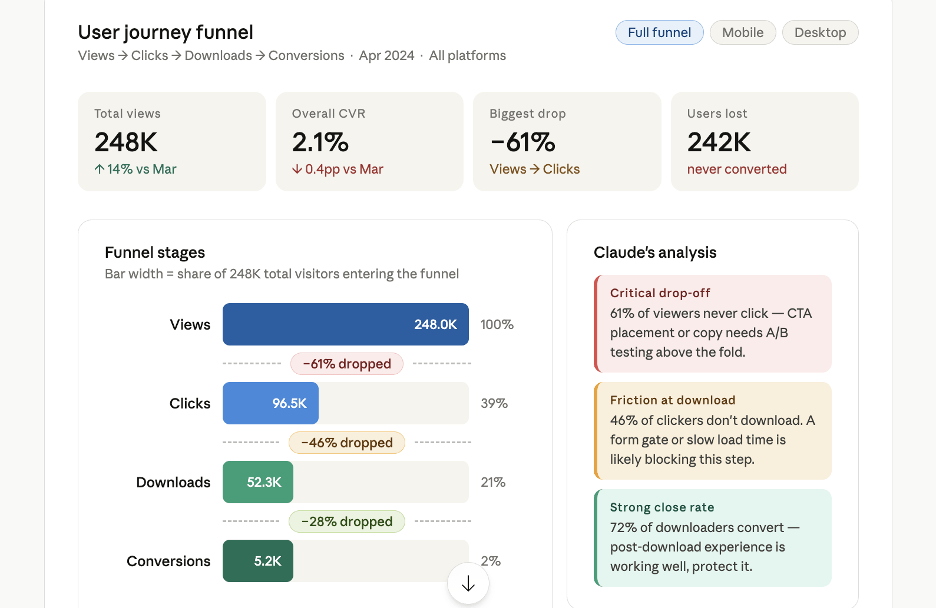
Also, you can talk to these dashboards through prompts. That means you can ask Claude to change funnel stages, adjust metrics, or redefine the funnel for a new use case. This makes it easier to explore different user journeys without rebuilding reports every time.
Dynamic comparisons
Static dashboards answer a fixed set of questions. When you want to compare something you didn’t anticipate, like organic vs. paid traffic on a specific landing page, or mobile vs. desktop conversions segmented by campaign, Claude gives a direct answer instead of you going back into the dashboard and reconfiguring filters. It’s faster and you’re not limited to the dimensions you set up in advance.
Conversational insights
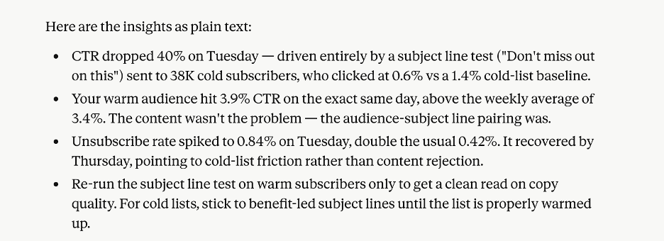
A dashboard can show that your email CTR dropped 40% last Tuesday. But it won’t explain why it happened.
Maybe the drop started after a subject line test sent to a cold audience, while your warm audience still performed well the same day. That kind of connection becomes visible when business context includes details like audience segmentation rules or recent test parameters. Claude cross-references the drop against those factors and narrows down what changed. Without that context, the same question gets a more generic answer.
Instead of opening GA4, then HubSpot, then your email tool to piece it together, you just ask Claude directly: What changed in email performance last week? It then analyzes the patterns, highlights unusual changes, and points out what’s actually worth paying attention to.
Adhoc analysis
Sometimes you don’t need a full reporting workflow. You just need answers fast.
For example, let’s say an anomaly happened last Thursday and conversions suddenly dropped. Instead of building a separate report, you can quickly ask Claude to compare traffic sources, landing pages, campaigns, or devices for that specific day. This makes one-off investigations much faster.
But there’s an important pattern here.
Prompt-driven dashboards and reports work best for exploratory and one-time analysis. For recurring reporting workflows, saving dashboards in tools like Google Data Studio or using Coupler’s 210+ dashboard templates is usually the more reliable option. For example, Data Studio includes built-in scheduling. So if I want dashboard updates sent automatically every Monday, I can connect Coupler.io with Data Studio, create the dashboard once, schedule the report, and Looker Studio automatically emails the updated dashboard every week.
This approach is also more scalable. Since the dashboards already live inside a BI tool or Coupler.io, multiple people can access the same reporting flow and analyze it through Claude at the same time.
Get marketing dashboards in Claude with Coupler.io
Get started for freeExamples of automated marketing reports with Claude
Channel attribution dashboard
Marketers often want to compare how channels like LinkedIn, email, and paid ads are performing. Some channels drive a lot of clicks but barely convert. Others bring lower traffic but generate much better ROI. But pulling that data together and figuring out which channel is actually working usually takes a lot of manual analysis.
So I used Coupler.io to pull data from those marketing sources and make it accessible to Claude through its native MCP server. Then I prompted Claude:
Build a multi-channel marketing dashboard that shows:
- CTR, conversion rate, and ROI by channel
- identify channels that drive high traffic but low conversions
- identify channels that drive fewer clicks but high ROI
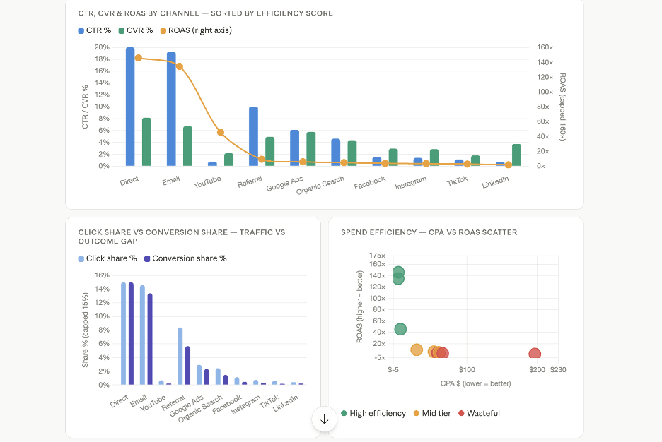
Claude generated comparison plots showing CTR, conversion rate, and ROAS across channels, along with visual breakdowns of traffic trends and spend efficiency. This kind of multi-channel marketing dashboard AI output would take hours to assemble manually across separate platform reports.
As a result, it’s much easier to decide where to scale campaigns, reduce spend, or improve conversion paths without manually comparing metrics across different tools.
PPC performance dashboard
Most marketing teams still export Google Ads data into Excel or dashboards, compare CPA, conversion rates, and spend efficiency manually, and then try to summarize what actually happened across campaigns.
To simplify this, I used Coupler.io’s pre-built multi-channel PPC dashboard template and connected Coupler.io to Claude through its native MCP connector. This allows me to query the underlying data directly inside Claude.
So I prompted Claude: In the Performance Max and Search campaigns which delivers better CPA and CVR across the same markets?
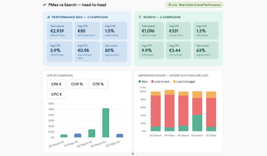
It showed a side-by-side comparison of both campaign types across total spend, CPA, CVR, and other key metrics. Claude also visualized the comparison using bar charts and tables, making it easier to understand which campaign type performed better on budget efficiency, acquisition cost, and conversion volume.
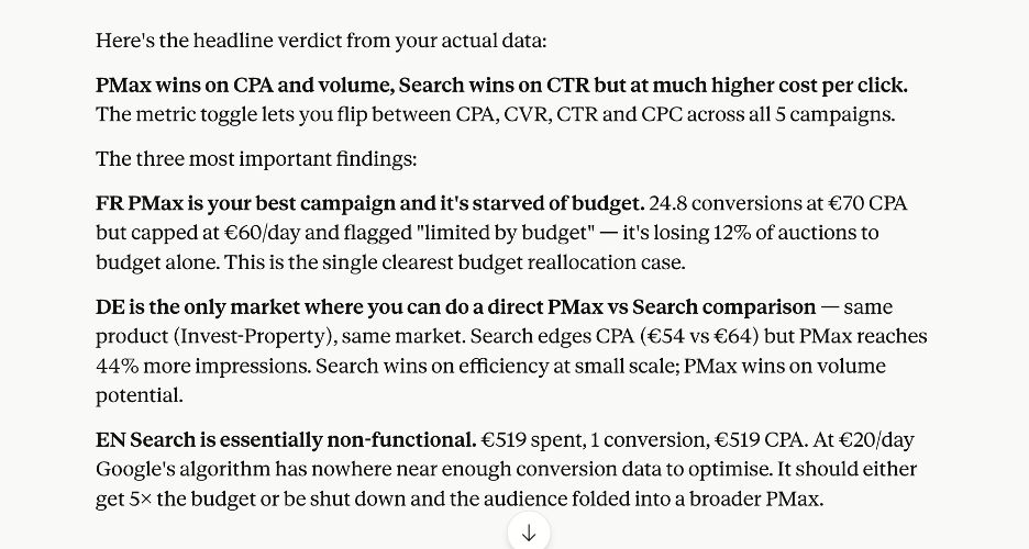
Finally, it generated suggestions I could use for campaign optimization from reallocating budget to pausing underperformers.
Is Claude better than Data Studio (formerly Looker Studio) for reporting?
The two tools don’t have to be an either/or choice. Lance Johnson at Clear Performance Ads uses Coupler.io to unify Google Ads, Meta Ads, and Amazon Ads into automatically updated client dashboards. He handles all client reporting in roughly 15 minutes per week, running the entire operation solo. For his workflow, conventional dashboards are the right output because clients need a stable, recurring view of their campaign performance.
Claude dashboards are useful for exploration, but recurring client-facing reporting like his may still belong in a conventional dashboard. Coupler.io powers both from the same reporting foundation.
Use the table below to decide which fits your workflow better.
| Data Studio / Power BI | Claude | |
| Best for | Standardized recurring reports | Exploratory dashboards, dynamic analysis, and one-off investigations |
| How you build it (UI clicks vs. plain-language prompt) | Using the tool’s UI to connect sources, configure fields, select charts, and design layouts | Through natural language prompts |
| Technical skills required | Data connector setup, field mapping, dashboard design, and familiarity with BI tools | None |
| Speed to first dashboard | A few hours or days when building from scratch, but only a few minutes with Coupler.io dashboard templates | Minutes |
| Fits for ongoing/scheduled reporting | Strong fit | Possible through Artifacts and automation workflows, but less ideal for large reporting operations |
| Fits for ad-hoc analysis and interpretation | Limited to predefined dashboards and filters | Best fit |
| Works with Coupler.io | Yes. Coupler.io powers dashboards with updated data pipelines and scheduled refreshes | Yes. Coupler’s MCP connection gives Claude access to live, updated data |
Whether you use Data Studio or Claude, both are only as good as the data behind them. Coupler.io connects to both natively. Sign up for free and keep your dashboards running on the latest data automatically.
Set up multi-channel reporting with Coupler.io
Get a demoTips for better marketing dashboard automation with AI
Building dashboards with Claude gets much easier once you learn how to prompt clearly. Good Claude prompts for marketing reports share a few traits: they name the dataset, specify the metrics, define the timeframe, explain the format, etc. The first prompt rarely gets it perfect, but a few iterations usually get you there.
Mention the data flow or dataset clearly: If you have multiple data flows connected through Coupler, mention the flow name or relevant dataset keywords in the prompt. This helps Claude pick the right dataset instead of guessing between similar sources.
Be specific about the dashboard type: Don’t just ask Claude to “build a dashboard.” Tell it what kind of dashboard you need. Example prompt:
Build a funnel dashboard that includes:
overall funnel (impressions → clicks → conversions)funnel by channeltop 3 campaigns with highest drop-off
Define metrics clearly: Be explicit about metrics and dimensions you want to track. Don’t use “performance.” Better: “CPA, ROAS, CTR.” For standard metrics, Claude usually knows what they mean. But if your business uses custom KPIs or internal terminology, like defining “conversion” as a qualified demo request, store those definitions in Context so you don’t have to explain them in every prompt.
Specify the timeframe: The dataset may contain years of data, and you don’t want Claude analyzing all of it. Specify the time window and comparison period, like “last week vs the week before”.
Ask for insights alongside the dashboard: You can ask Claude to generate insights together with the dashboard. This extracts the insights and presents them alongside the visuals.
Use segmentation explicitly: Specify the filters or the level at which you want to analyze the data. Example prompt: Build a dashboard showing conversion rate and ROI. Group the results by channels, target audience, and location so I can compare which channels, audiences, and regions perform best.
Save good prompts as reusable Skills: After a few iterations, you’ll usually end up with a prompt structure that consistently generates the dashboard you want. Save that final prompt as a Skill. This lets you rerun the same workflow later and generate similar dashboards much faster.
If you want to try this yourself, connect your first data source in Coupler.io and prompt Claude to build your first dashboard. The setup takes less than a few minutes.
FAQs
Can Claude pull my Google Ads data directly?
Yes, but Claude needs an MCP connection to access Google Ads data directly. Developers can configure this using Google Ads’ open-source MCP server. But if you’re a marketer and don’t want to deal with the setup, Coupler.io handles the MCP connection for you. It works the same way for Claude, ChatGPT, and other AI tools. You just connect your sources and destinations through its simple UI.
Do I need to know SQL for marketing reporting in Claude?
You don’t need to write SQL yourself. You ask questions in plain language, and Claude handles the rest. But the analysis isn’t just a guess from the raw data. When you use Coupler.io, Claude generates a query behind the scenes, and Coupler.io’s Analytical Engine executes it against your dataset. The query stays visible and editable, so the analytical logic is traceable even though you never had to write it. Connecting your SaaS data sources to Claude is also handled through the Coupler.io MCP connector without any SQL.
What’s the difference between Claude artifacts and a real dashboard?
Claude Artifacts are dashboards you build through prompting. They live in the side panel of the chat, and you can publish, share, or keep refining them by prompting further. A traditional dashboard in Looker Studio or Power BI has fixed layouts, filters, and scheduled reports. Use Artifacts for exploration and one-off analysis. Use a BI tool when you need the same report running on a schedule.
Yes. How sharing works depends on your Claude plan. On Free, Pro, and Max plans, you can publish an Artifact and get a public link that anyone can view without a Claude account. On Team and Enterprise plans, you can share Artifacts only within your organization, and viewers must be logged into the same account. Public publishing is not available on Team and Enterprise unless an admin enables it.