What is a HubSpot marketing dashboard?
A HubSpot marketing dashboard is a collection of metrics that let marketers, SEO experts, content creators, and other professionals track their performance.
Such dashboards can include reports that measure traffic growth, lead generation, user engagement, etc. As a result, you can track the customer journey along the acquisition funnel.
How you can create a HubSpot marketing dashboard
There are three ways to do this job:
- Native marketing dashboard template in HubSpot. It’s a straightforward option that lets you create a marketing dashboard without hassle. You only need to choose a predesigned template in HubSpot. This way is good, but you’re limited to what HubSpot offers for marketing reporting.
- Custom marketing dashboard template. This option is more interesting since it’s still easy to use but offers more than the native template. For instance, you can analyze data from GA4 and paid ad campaigns to see how much each customer costs you.
- Marketing dashboard DIY. Let’s call this option hardcore since you have to create a dashboard from scratch. It’s not easy, but you can significantly simplify it using proper reporting automation software like Coupler.io.
Let’s check each of these options so you can understand which works best for you.
Examples of HubSpot marketing dashboards
To analyze your marketing data from HubSpot and beyond without building dashboards yourself, use white-label templates. Coupler.io offers a gallery of free HubSpot marketing dashboard templates designed in BI tools. Each has a HubSpot data connector by Coupler.io to automatically load marketing data into the self-updating dashboard.
Take a look at some of the HubSpot dashboard examples to see more deeply how they are helpful and try it right away for free.
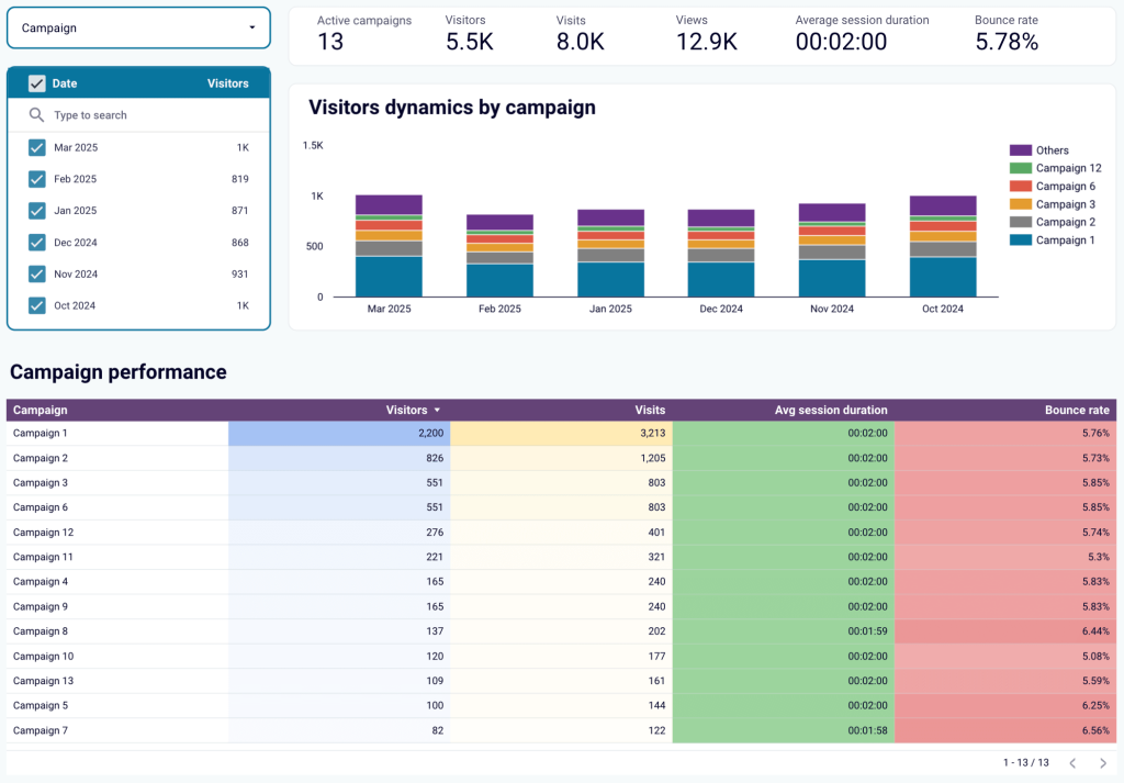
Customer acquisition dashboard for HubSpot
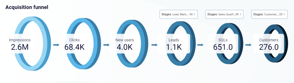
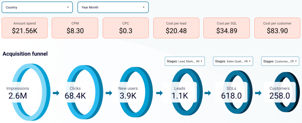
This dashboard illustrates how leads progress through the funnel – from ad impressions to CRM conversions. It combines HubSpot records with data from GA4 and ad platforms like Google, Meta, LinkedIn Ads, etc. With this information, you can identify funnel inefficiencies, optimize ad spend, and refine lead-generation strategies to maximize revenue.
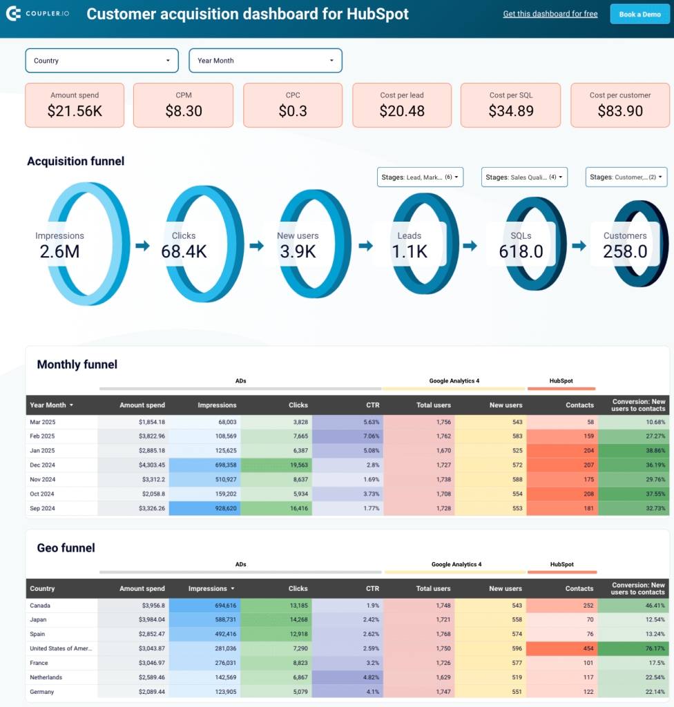
Here’s what you can do with this dashboard:
- Multi-source marketing funnel analytics: Explore the entire customer acquisition journey, including the number of impressions and clicks from your ads, website visitors, and leads who entered your HubSpot CRM.
By comparing conversion rates at each stage with industry benchmarks, you can identify funnel leaks and areas for improvement. If conversion rates are significantly below average, it’s an opportunity to develop and test hypotheses to optimize ad targeting, landing page experience, or lead qualification processes. Additionally, historical data will help you predict how lead volume may change with increased ad investments.
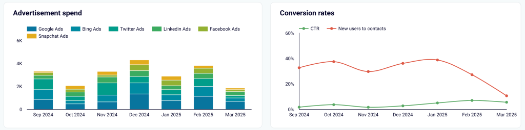
- Tracking funnel performance over time: Reveal month-to-month trends and correlations between marketing efforts and lead generation success. By discovering the best-performing months, you can link these periods to specific campaigns, budget shifts, or seasonal factors. This allows you to replicate workable strategies, allocate resources effectively, and improve long-term marketing ROI.
- Comparison of advertising spend vs. conversion: Assess ad spending across platforms against lead conversion rates to check channel efficiency. Suppose the dashboard shows that Google Ads had the highest spending over the month but produced fewer conversions than other platforms. If so, you can investigate the cause – audience targeting, ad creatives, or landing page performance. This approach helps ensure that marketing investments generate the greatest possible return.
The dashboard is available in Looker Studio. To set it up, go to the template’s Readme tab and follow the provided instructions.
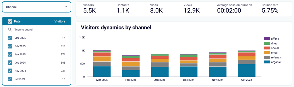
HubSpot marketing performance dashboard
It’s a general dashboard that covers all channels and funnel performance based on HubSpot’s CRM and marketing software. It combines website visitor reports with sales funnel overviews. This way, you can analyze visitor and lead geography, page performance, and the results of paid and email campaigns all in one place.
You must have a website created using HubSpot’s builder to get data for this dashboard.
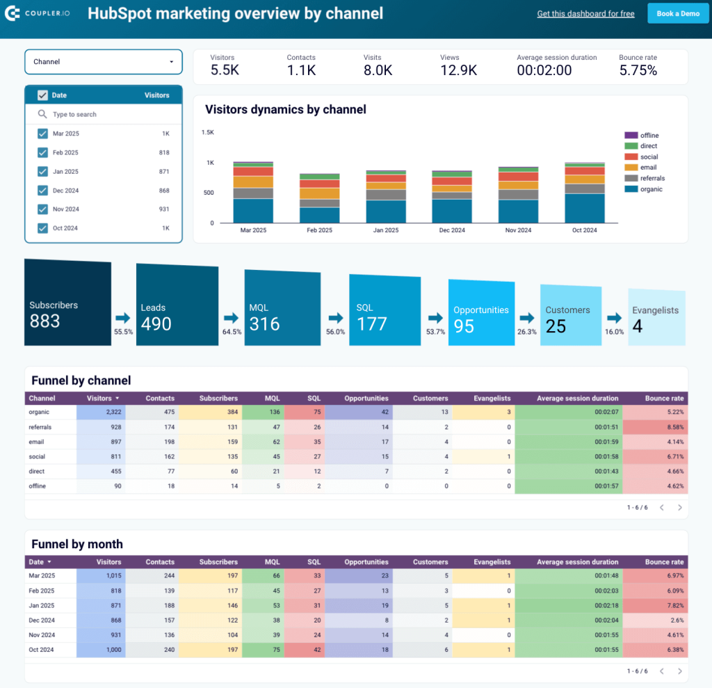
By using this dashboard, you’ll be able to view marketing performance from the following aspects:
- Visitor dynamics by channel: Track your site’s visitors with a breakdown by channel over the last 6 months.
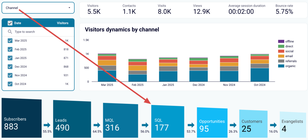
- Sales funnel analytics: Monitor a 7-step sales funnel from subscribers to evangelists, including leads, MQL, SQL, opportunities, and customers. Apply a channel filter to compare how different sources of visitors and subscribers perform.
Suppose referral traffic converts at the highest rates or brings in the most customers. If so, you can check where your website is mentioned and scale your presence to drive more visitors.
- Funnel performance by channel and month: Review your sales funnel across channels and month-to-month, with exact numbers for each stage.
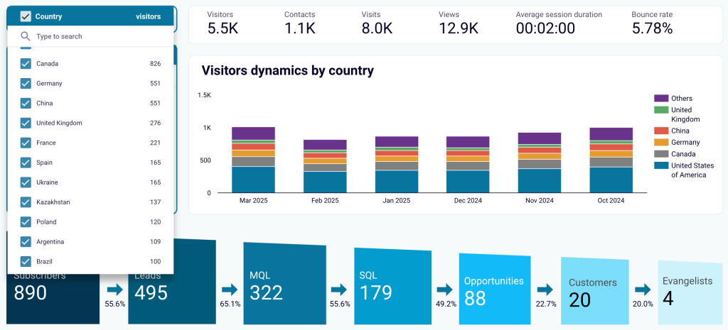
- Sales funnel by country: Check your funnel’s performance in different regions by applying a filter to the Geo performance report.
- Paid campaign performance: Stay updated on the effectiveness of your paid campaigns over time, comparing them against each other.
- Effectiveness of website pages: Assess the impact of individual pages using the filter on the Page performance report.
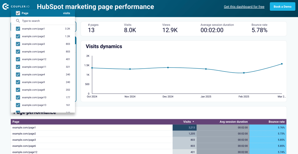
- Email campaign performance: Gain immediate insights into all email-related metrics.
You can set up this dashboard in Looker Studio. Click Readme for step-by-step instructions, and start using it for your reporting needs.
How to create a marketing dashboard in HubSpot?
Log in to your HubSpot account and go to Reporting => Dashboards.
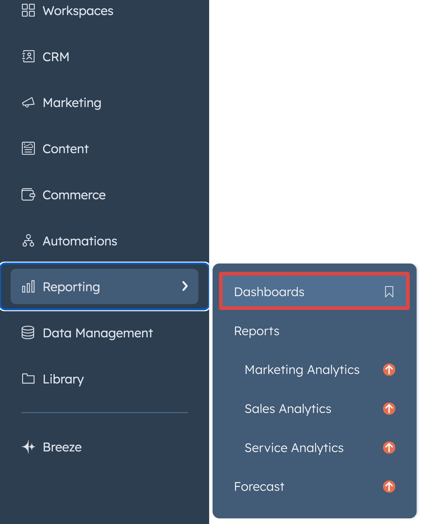
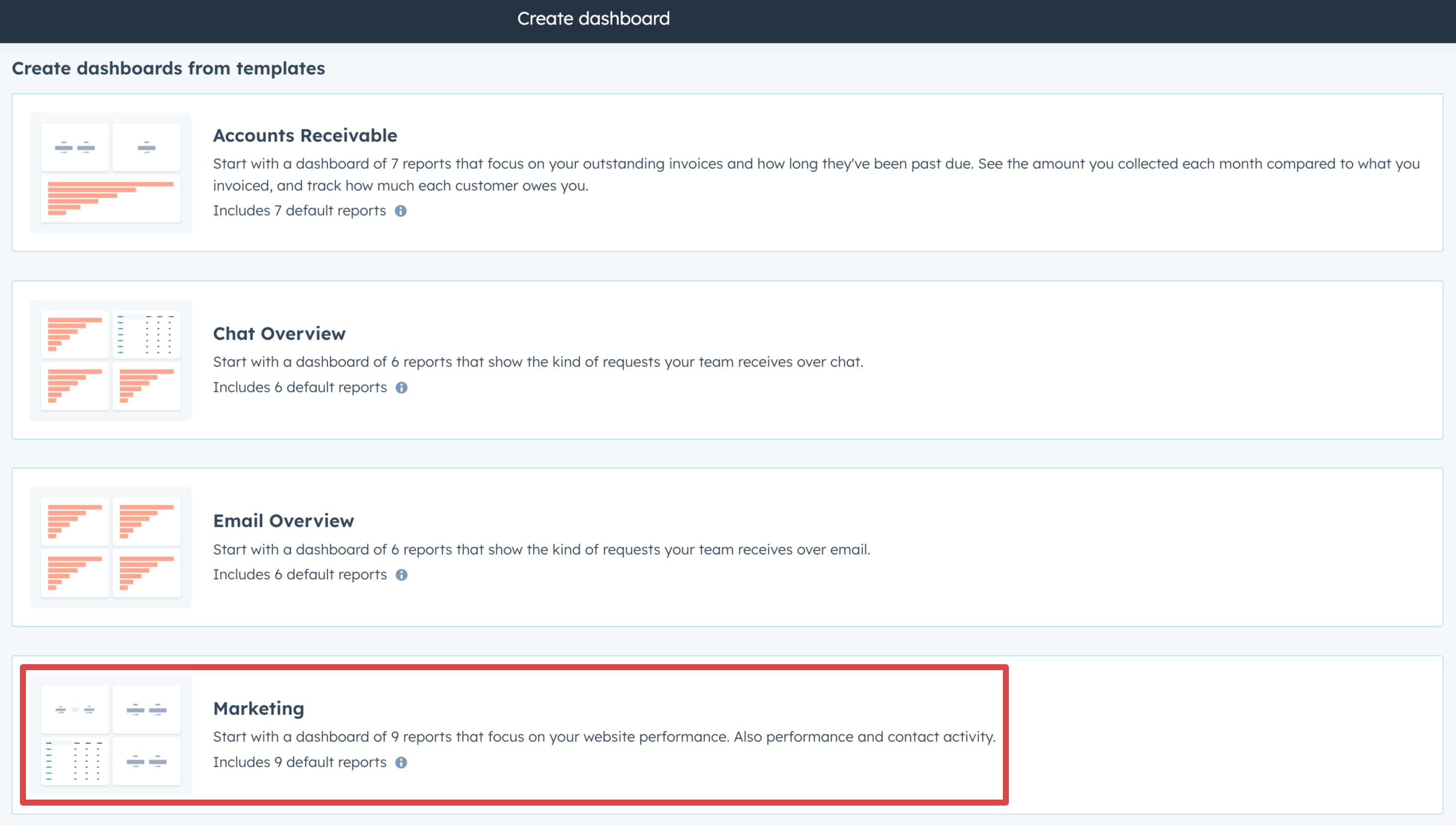
Click Create dashboard, then select the Marketing template.
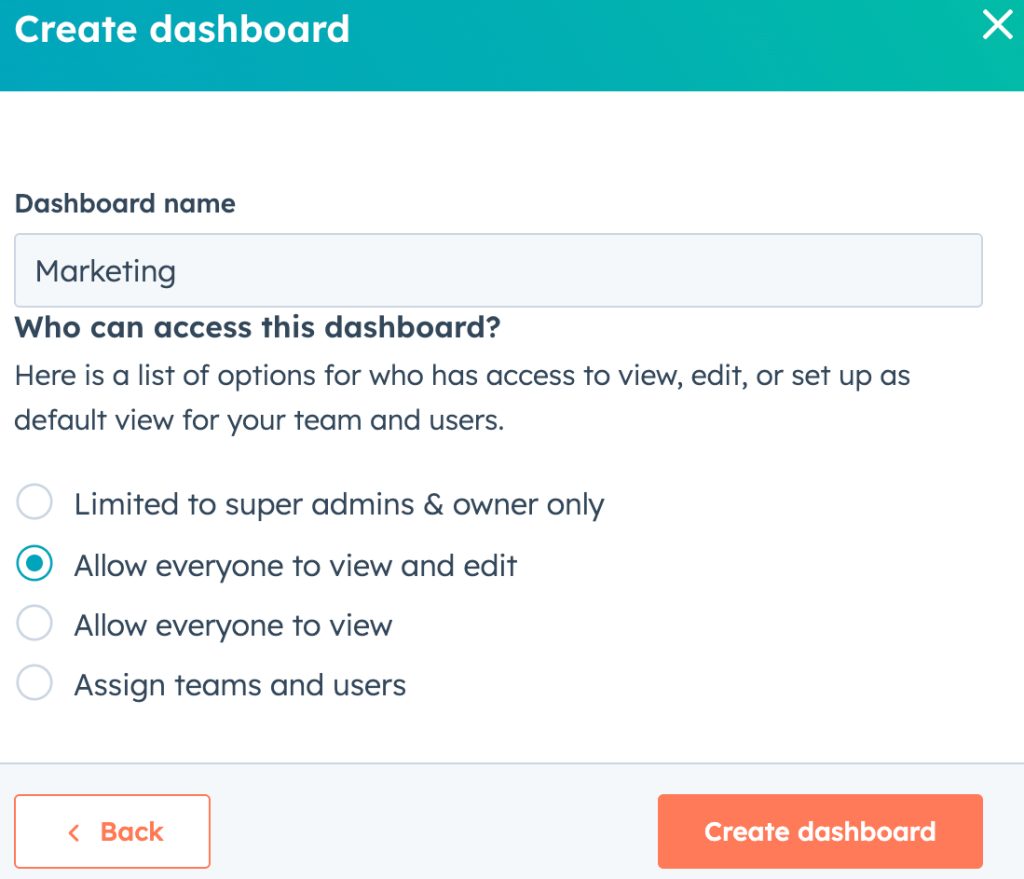
Press Next to name the dashboard and manage its access (view and edit). Then click the Create dashboard button.
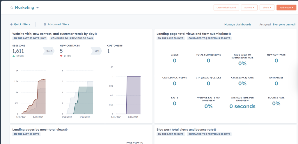
The dashboard will automatically populate once you connect your accounts/website and have the relevant data added to HubSpot.
If you want to create a dashboard from scratch, you can use a blank dashboard and add reports to it later.
What reports are included in the native HubSpot marketing dashboard template?
The built-in template supports 9 reports:
- Website visits, new contacts, and customer totals by day
- Landing page total views and form submissions
- Landing pages by most total views
- Blog post total views and bounce rate
- Blog posts by most total views
- Email send, opened, and click totals by email send date
- Marketing email sent totals with engagement rates
- Contact totals with time comparison
- Top personas
What other dashboard templates for marketing are available in HubSpot?
In addition to the very Marketing dashboard template, HubSpot offers other premade reporting options.
Marketing Channel Performance template
The template focuses on how your marketing efforts are performing across different channels. These reports may be of use to measure the success of your marketing channel:
- New visitor session totals by day with source breakdown
- Form submission totals
- Ad clicks by the social network, etc.
Website Analytics template
The template dives deeper into website traffic and user behavior. Reports for a Website Analytics dashboard include:
- Website visitor engagement rates.
- Session totals by day with source breakdown.
- Session bounce rate, average duration, page view totals by source, etc.
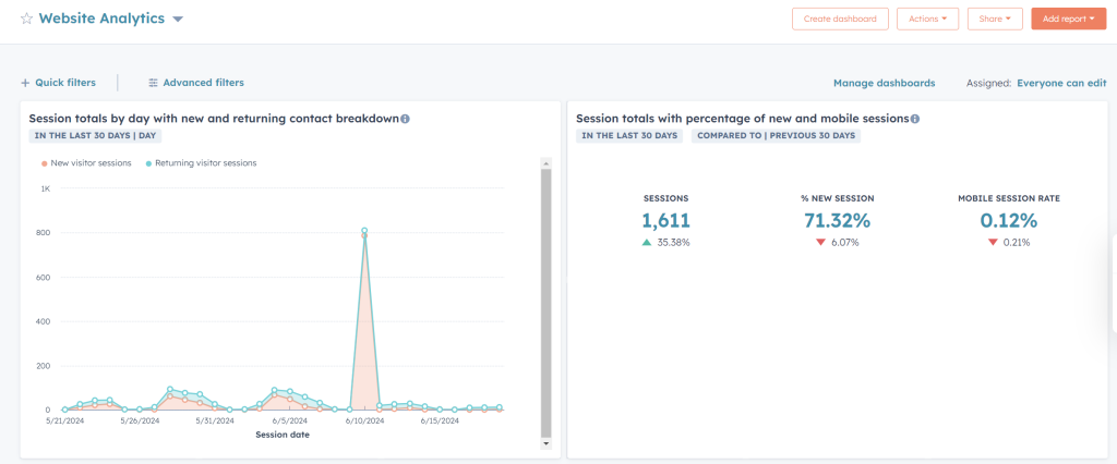
You can always create a custom dashboard for adding and removing the reports your business wants to focus on.
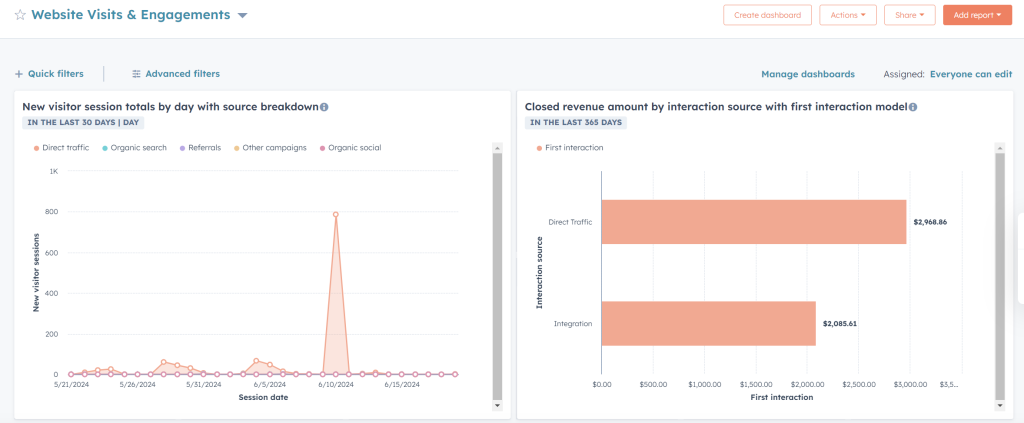
Website Visits & Engagements template
The template focuses on user interaction on your website. It includes the following reports:
- Website visitor engagement rates
- Session total by country
- Closed revenue amount by interaction source, etc.
How many dashboards you can create in HubSpot
The number of created dashboards in HubSpot is not unlimited. The higher your plan, the more dashboards you can have and more reports on each of them. The free account doesn’t include advanced reports such as a behavioral event trigger report, predictive lead scoring report, etc. As of today, HubSpot’s Marketing Hub plans are like this:
| Plan | Number of dashboards | Number of reports per dashboard | |
| For businesses and enterprises | Marketing Hub Professional | 25 | 30 |
| Marketing Hub Enterprise | 50 | 30 | |
For individuals and small teams | Free Tools | 2 | 5 |
| Marketing Hub Starter | 10 | 10 | |
| Marketing Hub Professional | 25 | 30 | |
To avoid quantity limitations, incorporate data from sources beyond HubSpot, and leverage advanced dashboard features, it’s better to use white-label templates.
Plus, you can share the dashboard externally – for instance, if you’re an agency, simply give clients access so they can spot the latest insights into their marketing performance. This will also be easy to navigate, thanks to interactive features like viewer filters and date range controls.
How to create a marketing HubSpot dashboard from scratch with Coupler.io
To focus on the KPIs that matter most to your business and not rely on metrics provided by templates, create a dashboard from scratch. This is done by exporting HubSpot records to data viz tools like Looker Studio – which would be time-consuming without automated integration.
Luckily, Coupler.io, a reporting automation platform, offers a no-code HubSpot connector. Use it to build a report based on extracted HubSpot records, combine multiple data entities, and enrich it with metrics from GA4 or ad platforms, all in a single view. Then, load it into Looker Studio, Power BI, Tableau, Qlik, Google Sheets, or Excel. Plus, your dashboard will self-update on schedule.
You only need to follow three easy steps:
1. Collect your HubSpot data
Get started with the form below. Choose the preferred destination for your HubSpot data from the dropdown list and click Proceed.
Now, sign up for Coupler.io free (no credit card required). Then, authorize your HubSpot account and pick the specific data entity you need to export. Deals are preselected by default, but you have 20+ other options, such as quotes, leads, taxes, and more.
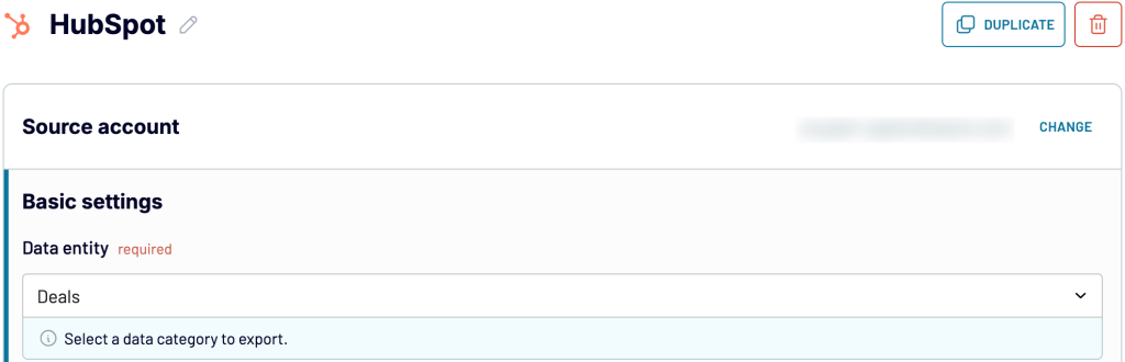
Adjust optional source settings if necessary, then move forward. If you need to fetch more than one data entity, choose HubSpot as an additional source and follow the same steps. A similar process applies when loading records from other sources, such as GA4 and ad platforms. Once you’re all set, proceed onward.
2. Organize and transform the data
Preview your data and transform it if required. Here’s what you can do:
- Rename, rearrange, hide, or add columns.
- Sort data in ascending or descending order.
- Create customizable columns with formulas.
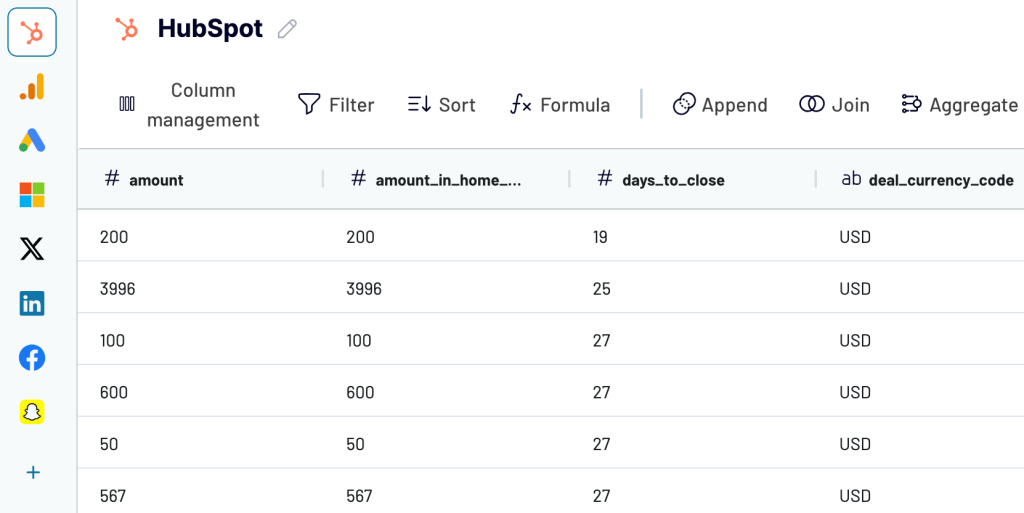
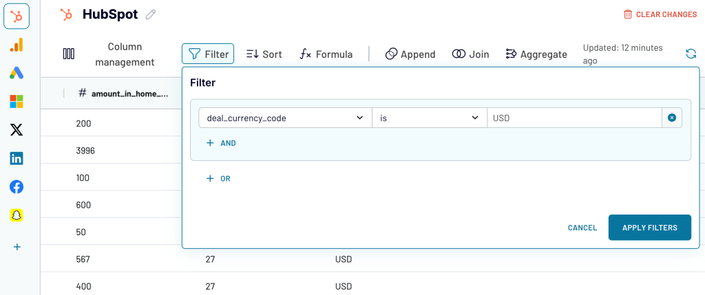
- Filter data to extract it based on the required criteria, as shown in the example below.
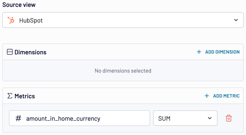
- Aggregate data using operations such as sum, avg., count, min., or max. For example, you can sum up the deal amounts, just like in the example:
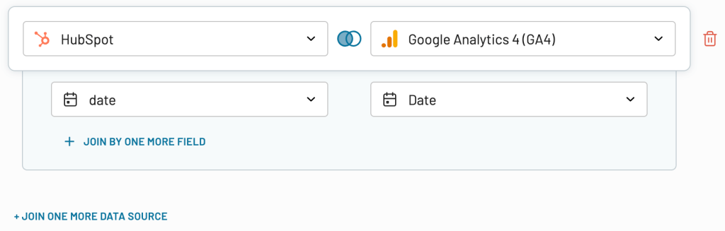
- Blend data from multiple sources in your chosen manner:
- Append – merge datasets with similar structures and columns matched by name.
- Join – combine datasets with different structures and at least one matched column.
Once the report is ready, go ahead.
3. Load the data and schedule a refresh
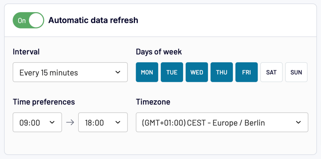
Connect your destination app account and select the file where you’ll upload your report. Next, depending on the destination, you will either run the data flow right away and then set up the schedule for automatic refresh (up to every 15 minutes) or do the reverse.
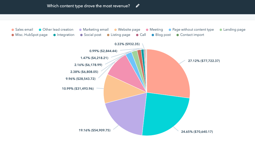
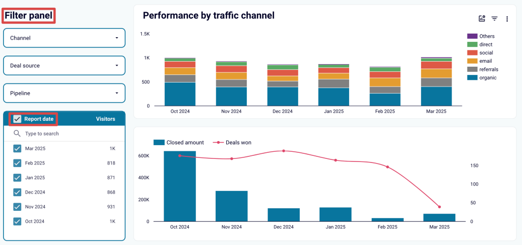
Once your data is at the destination, congratulations! You can now build a dashboard by applying various visualizations and interactive features. For instance, below is a sample Looker Studio dashboard with bar and bar-line charts filtered by channel, deal source, and pipeline, along with date range controls.
Try Coupler.io for free and create a self-updating HubSpot marketing dashboard without the hassle of manual data export!
What to monitor on a HubSpot marketing dashboard
You can keep track of various channels. Here are must-haves to monitor for specific types of reports:
- Ads – By connecting your accounts, you can analyze which ads bring in more customers. You can easily sync your CRM to your ad accounts to optimize the delivery of your ads across networks.
- Email – A great way to build your brand is by sending personalized, automated emails with a drag-and-drop editor and personalization tokens. With Marketing Hub Professional and Marketing Hub Enterprise plans, you can perform A/B testing and continuously improve your email marketing strategies. It also provides all the essential data, such as your open email totals, email subscribers list, etc.
- Landing pages – Whenever users visit the landing page, you can monitor and analyze how much time they spend on it. It also makes sense to monitor what they explore, which paths they take, on which pages they abandon the site, etc. You can analyze the effectiveness of the content and the CTA by looking into the conversion rates.
- Social – Analyze all your social media accounts. You can schedule and publish updates and analyze performance by monitoring campaigns, posting frequency, and engagement with different types of content.
- SEO – Optimize your content based on SEO and keyword recommendation reports. See what drives traffic and what underdelivers. Compare the results of the experiments.
- Campaign – HubSpot’s all-in-one campaign management makes things easier. You can create, manage, and run campaigns from one place. The real-time data reports help by giving ideas so you can tweak campaigns if needed.
- Forms – Integrate forms with the contact database. Analyze the conversion rate and see how each element of a form influences the process. Experiment with different approaches and see results on a dashboard.
- Behavioral triggers – Suppose someone visited your website and spent quite some time on a particular product page. This can be considered a potential lead. How about notifying that user when giving a discount on that product? This is just an example. However, you can set triggers that reach out to users when they perform a specific action.
- Website – HubSpot offers many website measuring metrics. These include visitor engagement rates, visit traffic sources by day, session bounce rate, average duration, and total page views by source.
Why set up a marketing dashboard in HubSpot?
HubSpot’s marketing dashboard presents data in a simple and digestible format. Having such a dashboard has a few other benefits too:
- It’s easy to skim through to analyze the crucial metrics.
- Visual representation makes it easier to tweak a marketing campaign.
- A well-thought-through HubSpot marketing dashboard will provide clear guidance for any business.
- Attract, engage, and delight – the flywheel model, adapted by HubSpot, ensures lead generation, customer engagement, and retention align with end goals.
- It’s a time-saving tool for visualizing your data.
- Constant monitoring helps examine the performance.
- You can create up to 300 different reporting dashboards for various reporting purposes.
Insights from a dashboard will keep you updated on how your marketing efforts are performing. Moreover, this information helps you adjust your strategy, including budget allocation, to maximize ROI. To see how this applies in the real business world, let’s explore examples of companies using HubSpot marketing dashboards in their workflow:
| Company | Use case | Description |
|---|---|---|
| Markentive, a HubSpot agency partner | Demonstrating marketing impact to customers as an agency | The agency began using the analytics dashboard to illustrate the return customers were getting from their marketing activities. Customers could then see how their visitors, leads, and sales had increased. For many, it was the first time they clearly understood how marketing had affected their bottom line. |
Meritech, a technology manufacturing company | In-house marketing analytics | The company previously assessed campaign performance by pulling data from native platforms, adding it to Excel, cleaning it to fit their reports, and formatting it into charts, which took an hour or two. There was no precise view of ROI or a way to track performance. However, it only took a few clicks to integrate all that data into HubSpot, set up a dashboard, and view all their campaigns in one place. They could also select attribution points, which were crucial KPIs for them. As a result, the company began testing and optimizing its PPC campaigns, expanding both reach and budget, and achieved success with these efforts. |
Infermedica, a healthcare company | Sales performance reporting | With rapid expansion and leads generated from inbound and outbound marketing campaigns, Infermedica sought to improve global sales performance reporting. For this purpose, personalized HubSpot dashboards were set up for the sales team so they could gain insights into daily operations, campaign effectiveness, and company growth. Consequently, Infermedica was able to focus on developing its AI product and increasing revenue. |
What happens if my marketing dashboard data disappears from HubSpot?
There can be several reasons behind the disappearing marketing dashboard data. Here are a few (with solutions):
- Missing tools, reports, and dashboards – You may not have access to all the features if you’re using a free account. See some examples here:
- Unable to access Contacts – If your account doesn’t have the Contacts tool, you must switch to the free HubSpot CRM.
- Unable to access a specific report – As we mentioned above, there’s a limitation to the number of reports one can have. You can check out your report library and see if the report you need is available or not.
- Unable to add a specific dashboard – If you can’t add a certain dashboard, such as Website Analytics, it may not be available with your current plan. You will need to upgrade your account to access that data.
- A tool that was accessible before is missing now – There’s a chance that HubSpot made some UI changes. They may have moved the tool under a different tab. After the initial troubleshooting, you can always write to HubSpot for further assistance.
- Bugs – It’s rarely something to be worried about. You can always raise an incident if you face any such issues.
Which way is best to build a Hubspot marketing analytics dashboard?
A well-designed dashboard is a convenient tool for monitoring the vital metrics of your business and streamlining HubSpot analytics. There’s a lot to track when it comes to marketing, but Hubspot makes it easy by bringing it all into one place.
And when it’s not enough, HubSpot data is easily exportable from the platform for further analysis with the help of integrations. BI tools are particularly suitable for crunching big sets of data points and translating them into human-readable charts, scorecards, and others. And do not forget about custom HubSpot report templates that can significantly simplify your workflow.
Choose what works best for you. Good luck, and thanks for your time!

Automate HubSpot reporting with Coupler.io
Get started for free