Sending a campaign in Mailchimp is just the beginning of the work. Once the first emails settle in and recipients begin to interact with them, Mailchimp reports begin to populate. Each new message and every email opened or clicked creates new data points that can be interpreted in a variety of ways.
There are plenty of reports up for grabs and many things you can do with your Mailchimp data outside of the platform. We’ll explore the available options in this article.
The basics of Mailchimp reports
There’s no one specific place where all Mailchimp reports would sit. Instead, they can be found in different sections around the platform. For example, audience reports reside in the Audience section on the menu; campaign reports can be found in the Campaigns tab, and so on.
We’ll explain where to look for particular reports in the respective chapters below.
The availability of reports also depends on your subscription plan – the higher the plan, the more reports at your disposal. You’ll want to upgrade to the Standard plan or higher for the most comprehensive set.
Here’s a breakdown of what’s available with each plan:
| Free | Essentials | Standard | Premium | |
| Audience Dashboard | ✅ | ✅ | ✅ | ✅ |
| Campaign Reports | ✅ | ✅ | ✅ | ✅ |
| Automation Reports | ✅ | ✅ | ✅ | ✅ |
| Landing Page Reports | ✅ | ✅ | ✅ | ✅ |
| SMS Reports | ✅ | ✅ | ✅ | |
| Ads Reports | ✅ | ✅ | ✅ | |
| Customer Journey Reports | ✅ | ✅ | ✅ | |
| Comparative Reports | ✅ | ✅ |
Mailchimp analytics report templates
Mailchimp offers different types of reports, but at some point, you may feel that you want to get even more out of your data. When that happens, consider building a custom report outside of Mailchimp. This can be done either from scratch in a spreadsheet or BI tool or with the help of Mailchimp report templates.
Mailchimp analytics dashboard
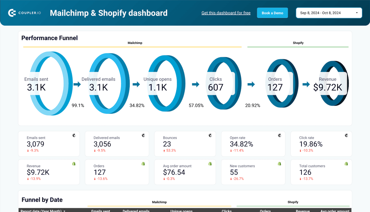
Here is a template for the Mailchimp analytics dashboard designed in Looker Studio. It provides a campaign performance overview, so marketers can monitor the performance funnel of their emails sent.
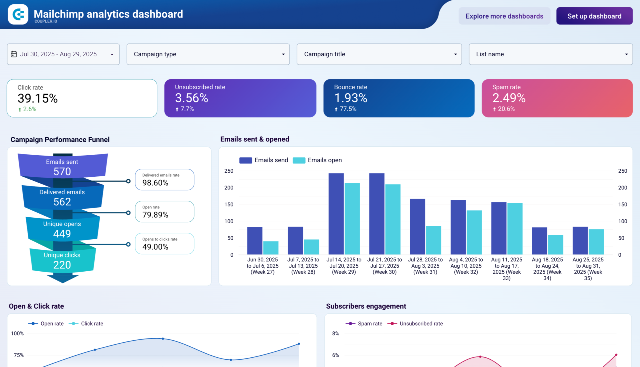
The dashboard also lets you track subscribers’ engagement, open and click rate, and more. In addition, you get audience analytics showing subscription changes over time, top sources, and the audience activity breakdown.
The Mailchimp dashboard template is equipped with the Coupler.io connector. This means that you won’t have to mess with uploading data to it. All you need to do is connect your Mailchimp account, and Coupler.io will populate the dashboard with your data. Try it yourself right away!
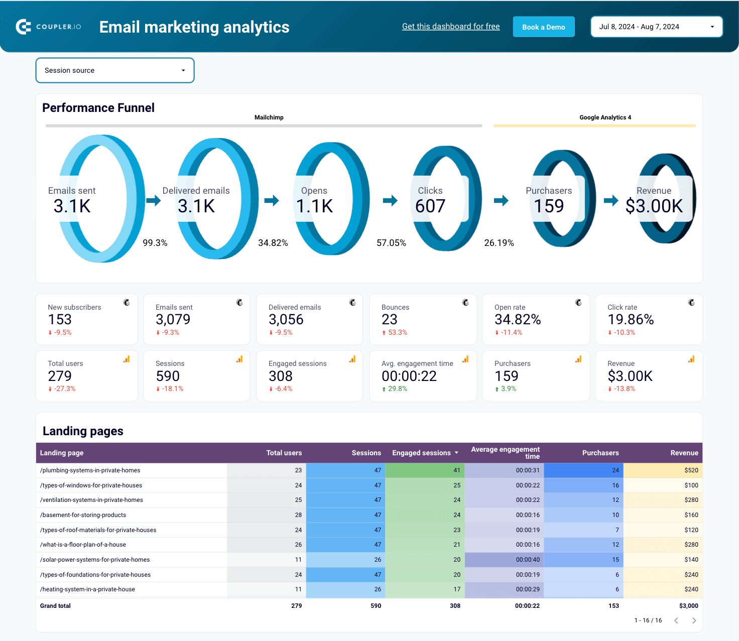
Email marketing analytics dashboard for Mailchimp
This dashboard template allows you to track user interactions with your email campaigns and their revenue performance. It combines Mailchimp data with records from GA4.
Mailchimp email marketing analytics dashboard
 Preview dashboard
Mailchimp email marketing analytics dashboard
Preview dashboardYou can visualize your email performance funnel and key metrics. Additionally, identify which landing pages succeed in traffic, engagement, purchases, and revenue. The dashboard also shows how many users were acquired and engaged, along with the revenue generated by your campaigns.
To get started, follow the template instructions to connect your Mailchimp and GA4 accounts, and then dive into the analytics!
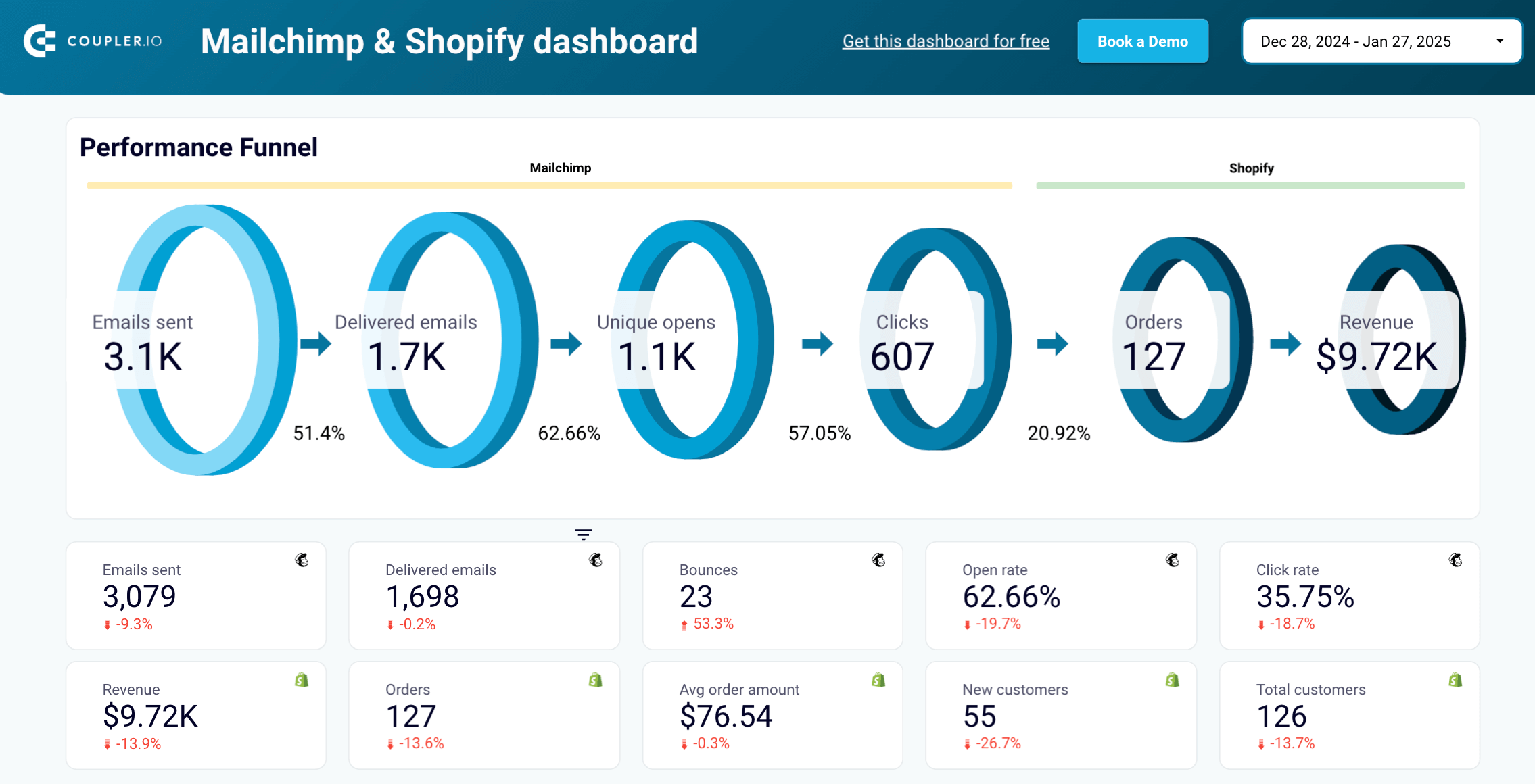
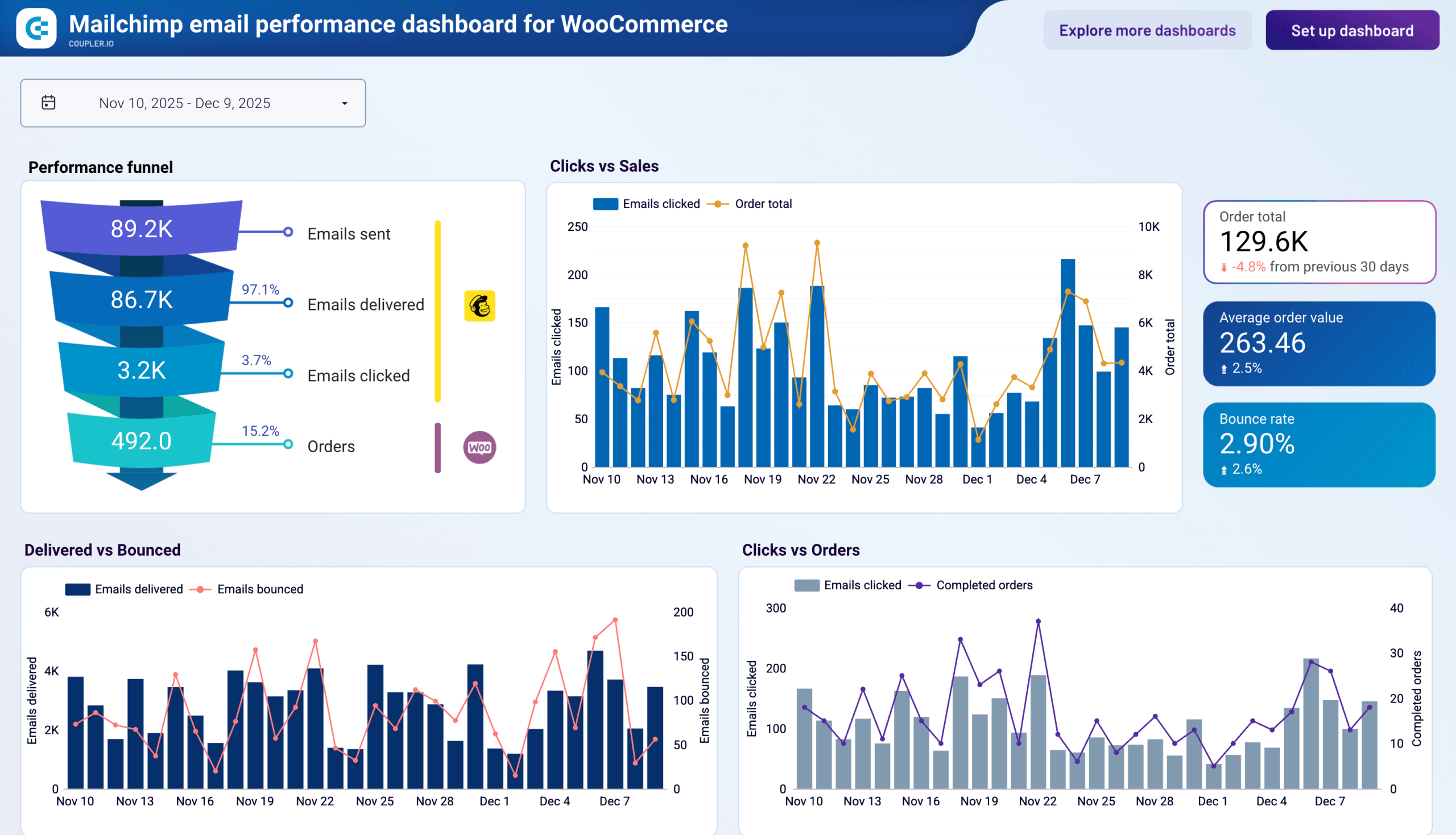
Mailchimp email campaign performance dashboard for Shopify/WooCommerce stores
The two templates above analyze Mailchimp campaigns on their own or alongside GA4 website data. If you run an online store, Coupler.io also offers dashboards that connect Mailchimp directly to your store’s order data. Separate versions are available for Shopify and WooCommerce.
Mailchimp email campaign performance dashboard for Shopify store
 Preview dashboard
Mailchimp email campaign performance dashboard for Shopify store
Preview dashboardThe Shopify version tracks the email performance funnel alongside product sales and customer retention metrics, so you can see which campaigns drive revenue and which products sell best through email.
The WooCommerce dashboard focuses on delivery health, click activity, and order outcomes.
Both templates are designed in Looker Studio and powered by Coupler.io connectors. Connect your Mailchimp account and your store platform to populate the dashboard with your data.


Mailchimp reports explained
Let’s now look at the various types of reports available in Mailchimp.
Mailchimp basic reports
Mailchimp basic reports are the standard set of reports available on each plan. These include:
- Audience dashboard – the go-to place for monitoring your audience dynamics – list growth, the campaigns that drive subscribers, or tags in common use.
- Email reports demonstrate the vital stats of each campaign, such as opens, clicks, deliveries, bounces, social media engagement, as well as a comparison to industry benchmarks.
- Automation reports focus on the email automation campaigns offered by Mailchimp and show how they’re interacted with, what the conversion rates are, and also how individual messages play out.
- Landing page reports track how each of your pages performs and give you metrics such as views, clicks, signups, and others.
- Social post reports show how the content posted to social media via Mailchimp performs, including the number of people reached, as well as impressions, clicks, and other engagements.
- Survey Reports track response rates, completion rates, and detailed answers for surveys you send to your audience, helping you understand customer feedback and preferences.
Mailchimp advanced reports
To access the following reports, you will need to be subscribed to an Essentials, Standard, or Premium plan.
- Comparative reports allow you to analyze and compare performance metrics across multiple email campaigns side-by-side, helping you identify trends and successful strategies over time.
- SMS reports provide comprehensive analytics for text message campaigns, including delivery rates, click-through rates, unsubscribe rates, revenue attribution, and detailed recipient engagement data.
- Ads reports focus on ads available via Facebook, Instagram, and Google integrations. They talk about views, clicks, conversions, and revenue.
- Customer journey reports track the performance of automated emails sent via Mailchimp – funnel completion rates, opens, clicks, and individual stats of each message.
Mailchimp comparative reports
Comparative Reports are available only with the Mailchimp Standard or Premium plans. As the name would suggest, their aim is to compare different campaigns and simplify the analysis process.
Mailchimp Comparative Reports allow you to pick any campaigns sent out from your account over the last 18 months. The stats for each campaign will be added to the joint view so you can easily compare things like open or click rates, bounces, or abuse reports.
Each report also features a Baseline segment that demonstrates the overall engagement of this particular audience for easy comparison.
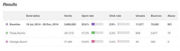
There’s no limit on how many reports you can stack against each other. However, the campaigns must have been sent to one particular audience to be featured in a joint report.
When creating a Comparative Report, you determine the criteria that campaigns should meet. Every campaign that matches the conditions will be added to the report.
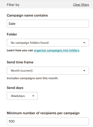
What’s more, future campaigns will be added to the report as well if they meet the criteria. For example, if you choose to consider campaigns sent out over the last month, different reports will be taken into consideration over time.
Once you specify the criteria, you’ll be able to preview the campaigns that were found to meet your conditions. If you’re not happy with the outcome, you can manually select or deselect campaigns or simply adjust the filtering criteria.
Finally, once everything checks out, save the report and wait until it’s prepared. Now, and at any time going forward, you’ll be able to generate a Snapshot of the report by clicking on Finalize Report -> Generate Snapshot.
Mailchimp campaign reports
The most common type of report in Mailchimp is an email campaign report. They provide information on how well your emails are performing. Campaign reports include data as email open and click rates, unsubscribes, social media engagement, campaign benchmarking, and other statistics.
Campaign reports are available for other types of campaigns in Mailchimp, such as landings, social posts, surveys, and even Mailchimp SMS campaigns.
Here’s how to navigate to your Mailchimp campaign reports.
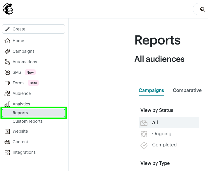
- Click on Analytics in the main menu and click on Reports in the drop-down list.
Choose the campaign you want to analyze, and select View Report. If you can’t find the campaign you are looking for right away, filter the list by type, status, date, or search by campaign name.
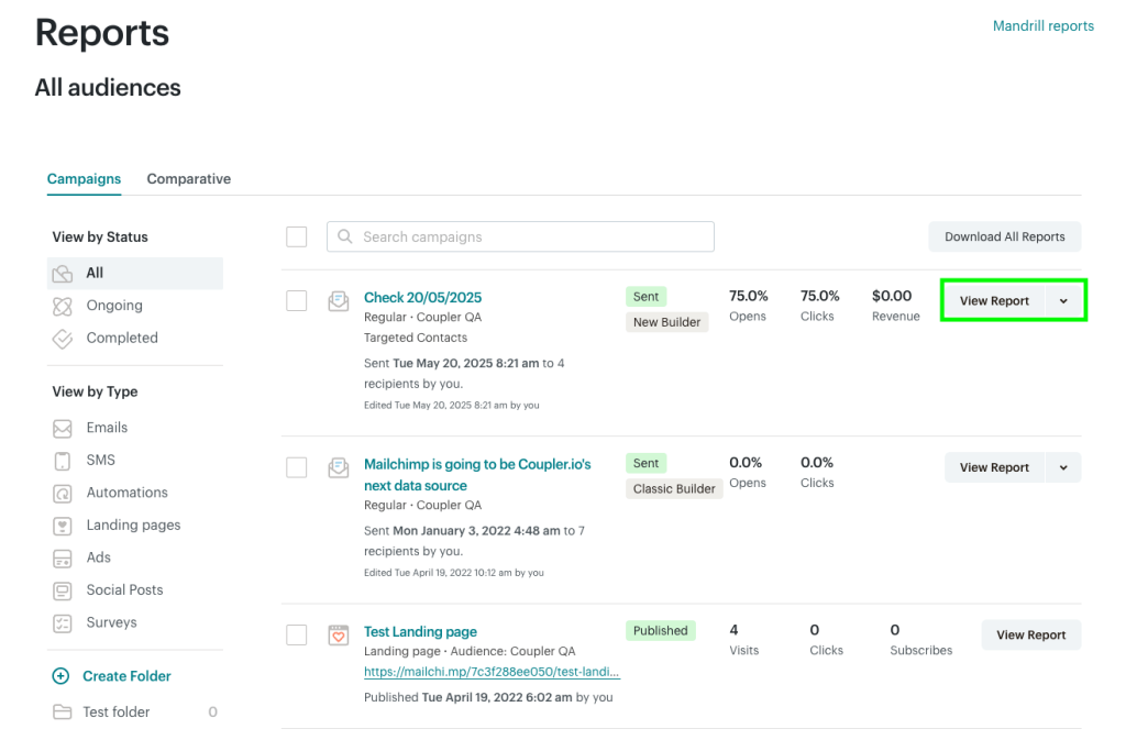
Sample campaign report in Mailchimp
Now let’s explore what a standard campaign report in Mailchimp contains. This type of report shows details such as open rate, total clicks, conversion, revenue, etc. We’ll explain each of these metrics in more detail shortly.
Email reports are the most common type of campaign reports. They are based on one-off campaigns sent out from Mailchimp – newsletters, product updates, sales messages, and virtually anything else you can think of. Automation reports also rely on emails, but we’ll discuss them separately in the Mailchimp automation reports chapter.
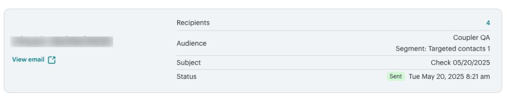
A typical email report starts with:
- Number of recipients
- Audience
- Date and time when a campaign was delivered
- Subject line
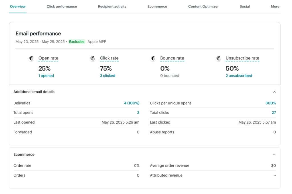
It also includes stats on emails opened, clicked, bounced, and those that led to a recipient unsubscribing. Plenty of related stats are also available: successful deliveries, total opens, clicks per unique opens, and more.
Mailchimp campaign reports metrics
The main benefit of campaign reports is that they provide crucial information on email campaign efficiency. Businesses can make important marketing decisions based on this data. Let’s look at some of the most significant metrics provided in Mailchimp campaign reports.
Open rate is the percentage of emails read by your customers divided by the number of delivered messages. It helps you determine whether your subject lines are compelling enough to generate a click. An email is counted as opened if it was opened at least once. Any further opens of the same message won’t impact the open rate.
For example, if you send out 100 emails and only 1 person opens your message, but they open it 5 times, this will count as only 1 email open, thus a 1% open rate.
Click Rate is the number of clicks recorded on an email, divided by the total amount of delivered emails. It’s also known as a click-through rate or CTR. From a performance standpoint, clicks are usually a key factor in the success of any email campaign as they lead readers to the next stage of a funnel.
For example, you send out 100 emails, and only 25 people open them. 10 out of these 25 people click on at least one link in an email they received. Only these 10 emails will be counted towards the click rate. Thus, we have a 10% click rate and a 25% open rate in this particular example.
Unsubscribe Rate displays the percentage of people who have dropped out of your emails divided by the number of people who have received the email. This should be kept to a minimum. The unsubscribe rate specifically only counts the number of people who chose to unsubscribe from a mailing list.
Bounce Rate is the percentage of emails not delivered compared to the total number of emails sent out. A bounce occurs when an email cannot be delivered to a recipient. Here are some common reasons for that:
- The email address you entered is invalid.
- Rejection by the recipient’s mailbox due to spam, phishing, or other concerns.
- A mailbox provider’s security policy rejects emails from all or select domains.
- A permanent issue with the connection.
Bounces, like spam reports, can be bad for your business reputation. They also hinder your ability to deliver emails and execute effective marketing campaigns. As a result, you should keep an eye on high bounce and spam rates and take immediate action as necessary.
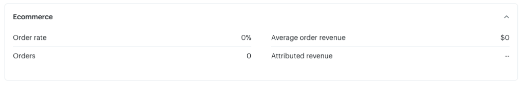
E-commerce metrics. If you have a connected store, you’ll also see the revenue numbers for this particular email campaign: number of orders, order rate, average order revenue, and attributed revenue.
Other key elements of Mailchimp campaign reports
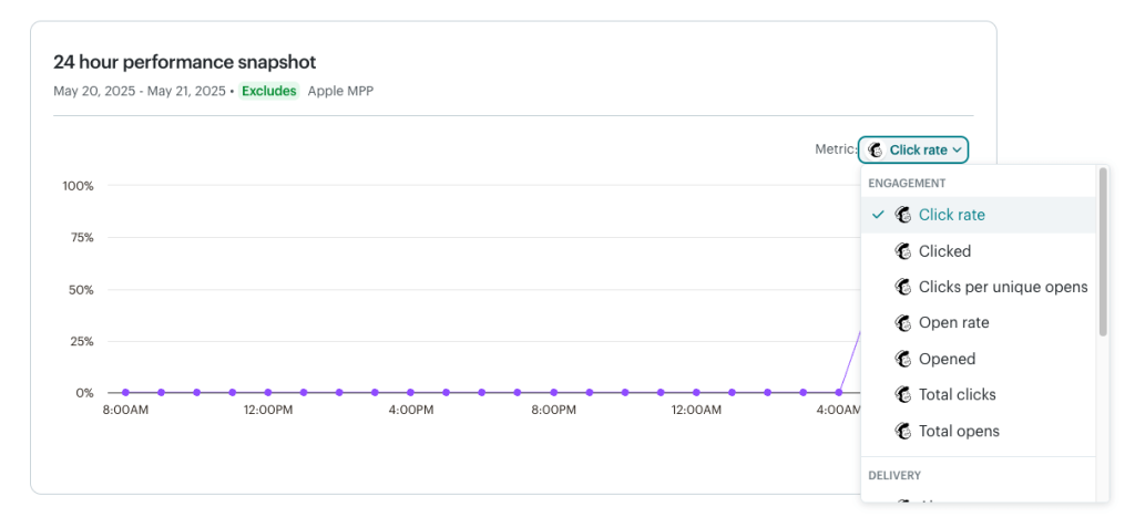
24-hour performance snapshot
This line graph allows you to track the engagement of your email campaign during the first 24 hours after launch. By default, it shows click rate dynamics, but you can filter the graph to show the open rate, total clicks, unsubscribe rate, etc.
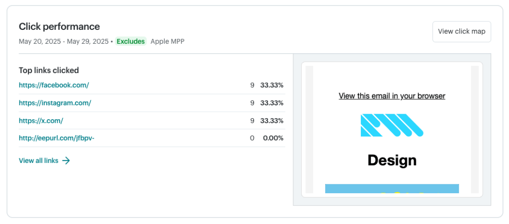
Click Performance
Here you can get a summary of the top clicked links and a click map to analyze which buttons or CTAs your target audience clicked on the most. This can help you identify important links that are being overlooked and optimize their placement in future campaigns.
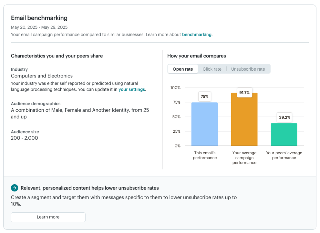
Email benchmarking
This section shows how your campaign stacks against your average campaigns as well as those sent by your peers. It’s useful for benchmarking the performance of your email marketing efforts. You’ll also find a personalized suggestion based on the email’s stats.
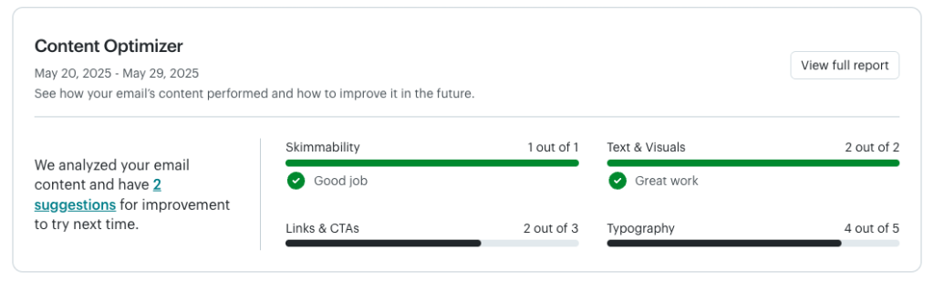
Content Optimizer
The content optimizer points out areas where your campaign over- or underperformed. It rates your email on skimmability, text & visuals, links & CTAs, and typography. This information can help you improve the email content so it converts better with each new campaign sent.
A basic report is available to all users. If you’re on a Standard plan or higher, you can view more detailed reports with specific suggestions for improvements.
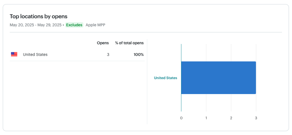
Top locations by opens
The final part of the report provides a breakdown of email opens by user location. It helps you identify where your most engaged audience comes from, so you can create targeted campaigns to boost open rates and clicks.
Mailchimp automation reports
Automation reports are generated by various automations you have in place at any given moment. This could be welcome emails, messages nurturing leads, or chasing those who abandoned their carts. You’ll see the Mailchimp report for each automation by going to Analytics -> Reports and filtering for Automations type of emails.
Automation reports are similar in a way to classic email reports. They also show how many emails were opened, clicked, or bounced. What’s different are the stats depicting how many subscribers completed a sequence, meaning that they reached the designated final stage.
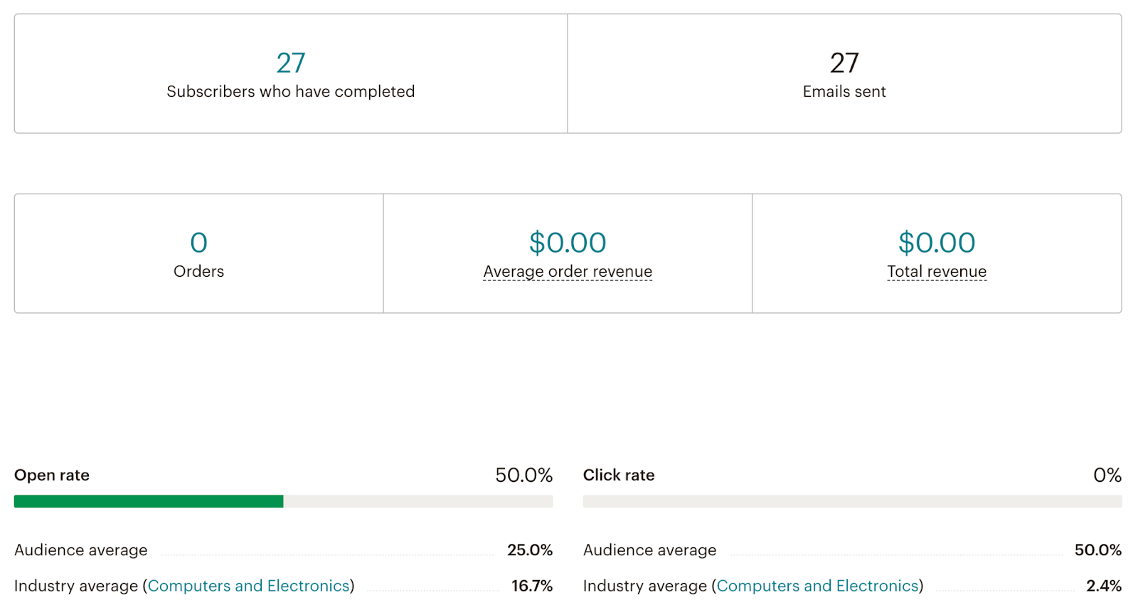
In the bottom section, you can also see the list of emails sent within the campaign and their basic stats. Clicking on View Report next to either takes you to a classic, more detailed email report for this message.
Mailchimp bounce reports
The more emails you send, the more likely you are to encounter delivery problems known as bounces. This is particularly true for new audiences that haven’t heard much from you before or whose addresses haven’t been properly verified.
To find the bounce reports, head over to the analytics reports page. Pick one of the Emails or Automations campaigns and click the View Report button to the right.
While on the report page, click on the number demonstrating bounces for this campaign.
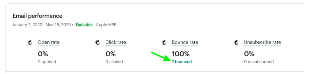
You’ll see a more detailed bounce report. It features once again the total number of bounces as well as a split between hard and soft bounces.
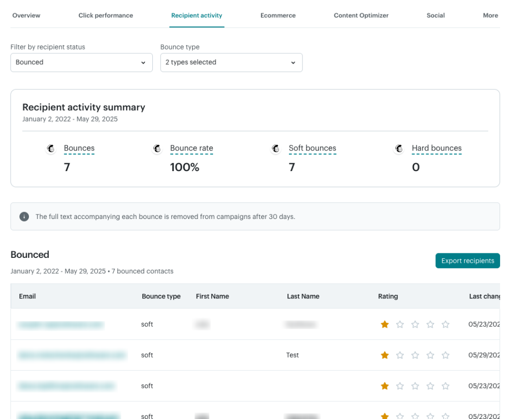
Hard bounces indicate a permanent email delivery. The most common reason is an email address that doesn’t exist, possibly because it was mistyped or was typed in incorrectly on purpose. It’s also not uncommon for email servers to reject emails because of server policy, spam rules, or other limitations.
When an email hard bounces, the contact will be removed from your audience, and no further emails will be sent to them.
Soft bounces, on the other hand, indicate temporary problems – full inbox, message too large, transmission problem, etc. Mailchimp will usually attempt to re-send such messages several times until they eventually hard bounce or are delivered.
Below the numbers for bounces, you’ll find a useful table with the list of contacts that bounced. The bounce type field indicates whether a soft or hard bounce was in play.
Mailchimp audience reports
Audience reports give you a holistic overview of your audiences. Rather than focus on a particular campaign or a sequence of emails, they look at all past interactions with a specific audience.
Although they’re not referred to as reports in the Mailchimp interface, they look very much alike. You’ll find them under Audience -> Audience dashboard.
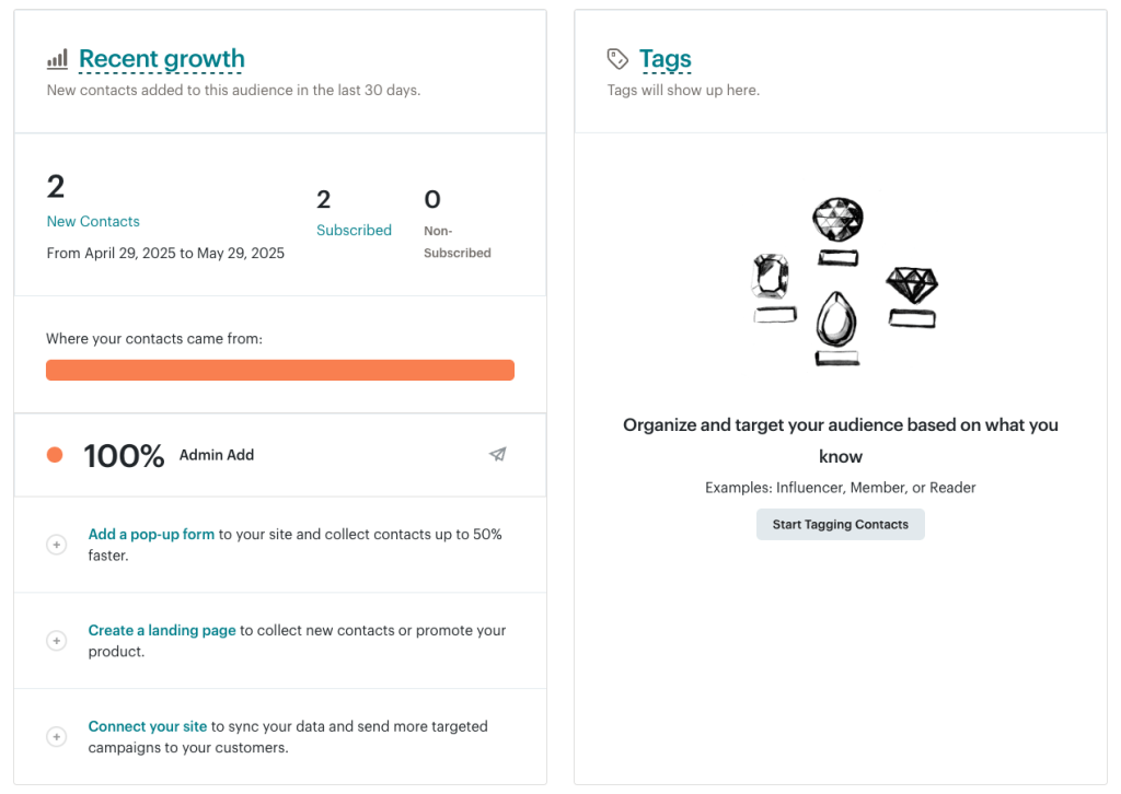
Here, you’ll see the recent additions to the audience and the path that led them to subscription. You’ll also see the overview of tags most commonly associated with an audience.
In the Predicted demographics section, you’ll see an AI-powered evaluation of your subscribers’ age and gender. It can be very useful for more detailed targeting and gaining a better understanding of who you send emails to. It’s a premium feature, though, that requires a Standard plan or higher.
Lastly, you’ll see the engagement stats for your audience and the top locations.
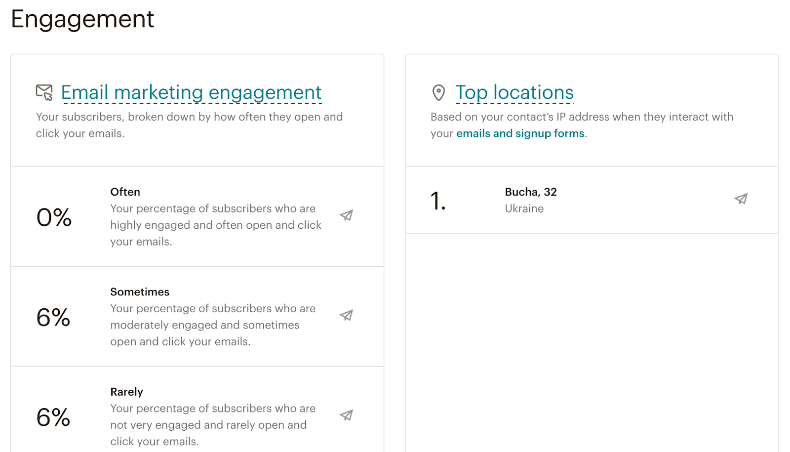
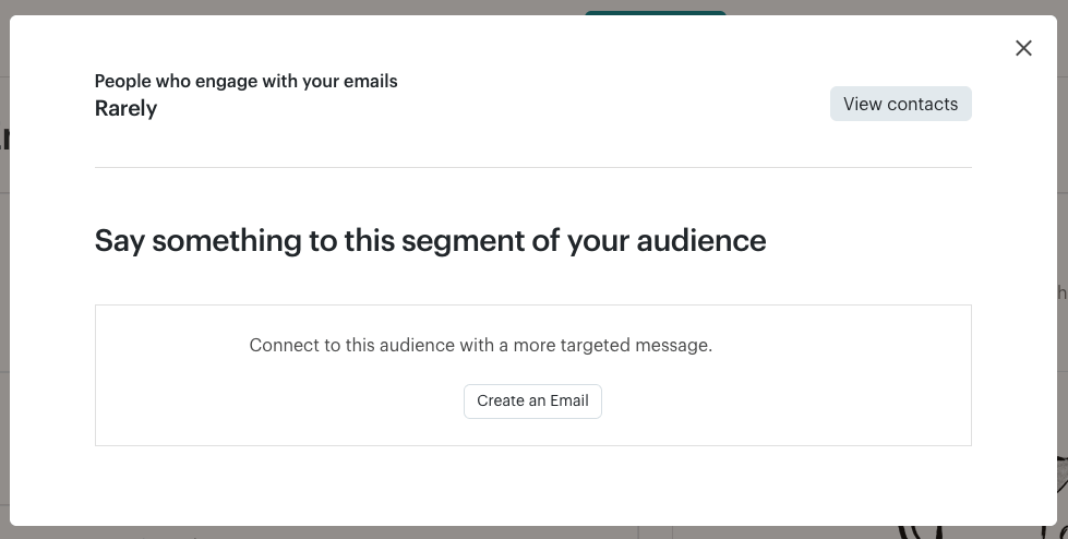
What’s very useful is the ability to target one particular segment of your audience with a campaign. It could be, for example, leads with a particular tag to their name, from a certain country, or those that rarely interact with your emails.
To send a targeted campaign, simply hover over a category and select ‘create an email.’
How to create Mailchimp custom reports
The default Mailchimp reports are good, but you may want to go further by creating a custom reporting solution. You don’t need advanced data analytics skills to get it done. Anyone can, for example, export Mailchimp contacts to Excel and build simple, self-updating reports.
We’ll demonstrate the step-by-step process using Coupler.io – a data integration and AI analytics platform. It allows you to automate data export from 400+ apps, including Mailchimp, to spreadsheets (Google Sheets, Excel), BI tools (Looker Studio, Power BI), data warehouses (Mailchimp to BigQuery, PostgreSQL) and AI tools.
Here is how to connect Mailchimp to Claude.
Here’s how to set it up.
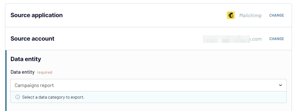
Step 1. Collect Mailchimp data
Select the needed destination for your report in the form below and click Proceed. You will need to sign up for your Coupler.io account for free with no credit card required.
Connect your Mailchimp account and select a data entity to export. From the drop-down menu, you can select from a large variety of entities, including audiences, campaigns, automations, and audience locations.
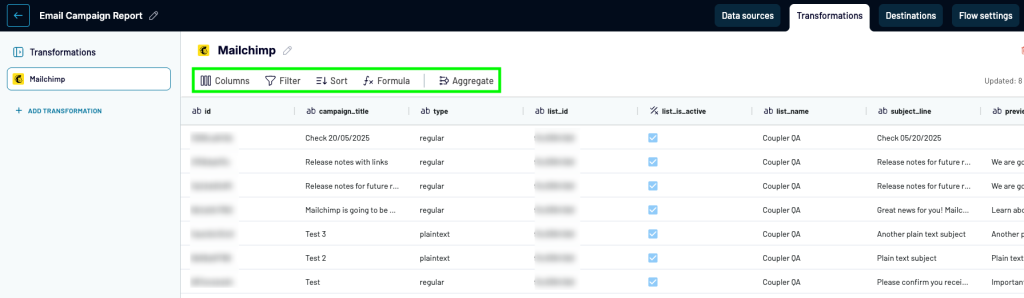
Step 2. Preview and transform your data
In the next step, organize your report before loading it to the destination. You can:
- Hide unnecessary columns
- Filter and sort data
- Edit existing columns and add new ones
- Aggregate data using operations like sum, average, count, min, or max.
- Blend data if you’ve connected more than one data source, be it another Mailchimp account or application.
Step 3. Load data and schedule refresh
Follow the in-app instructions to load data from Mailchimp to your selected destination app. Do not forget to toggle on the Automatic data refresh and configure the schedule for data exports.
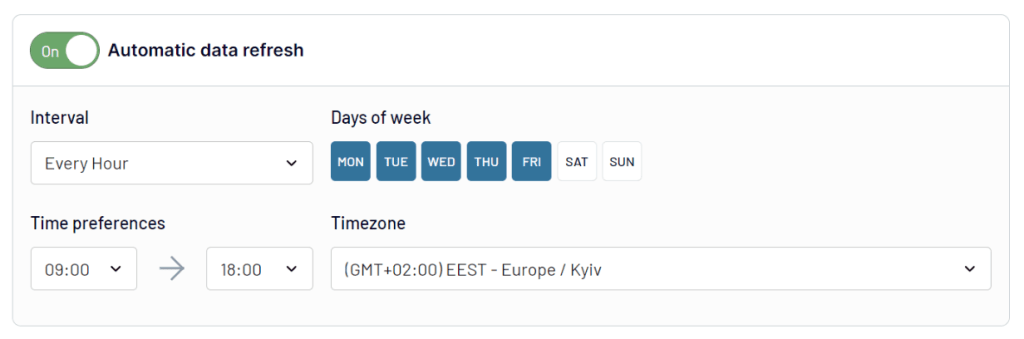
Click on Save and Run to complete the process. With your data in a spreadsheet or a BI tool, you can tailor your report to your liking.
Example: How to create a simple report for Mailchimp in spreadsheets
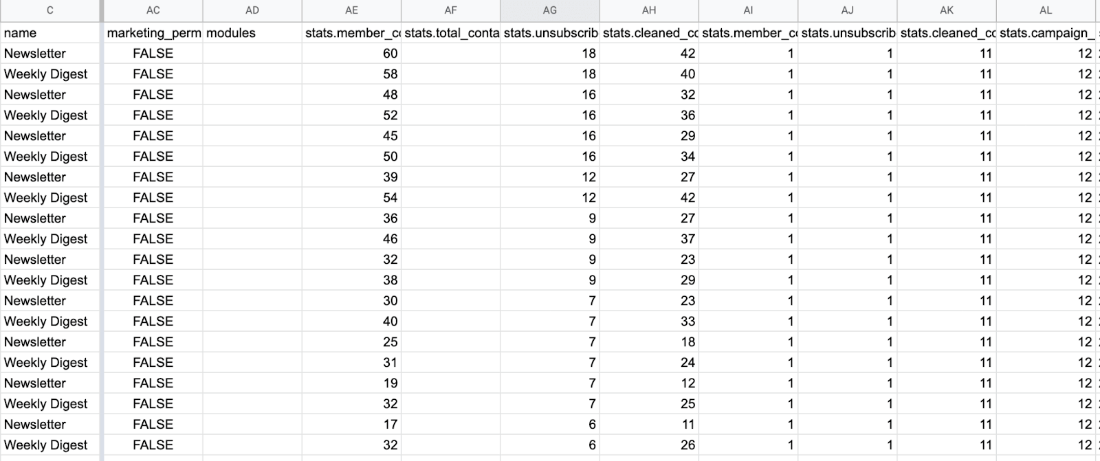
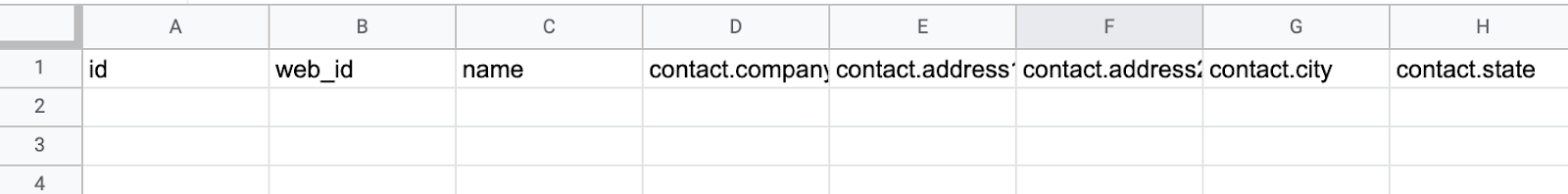
Let’s say we’ve imported information about audiences from Mailchimp to Google Sheets. The importer will bring the list of your audiences with the corresponding stats for each – subscriber count, unsubscribes, cleaned contacts, etc. Open and click rates are also available. In our case, we imported two rows of data for two audiences we have set in Mailchimp.

Coupler.io will bring the latest counts into a spreadsheet with each new data refresh, adding them below the previous results. After some weeks, the spreadsheet will look like this:
This gives us something to work with. For example, we’ve decided to build charts demonstrating the growth of each audience and all audiences combined.
As the first step, we separate stats for each of the audiences. If you only have one audience, skip this stage and get to building reports already.
Otherwise, in a new tab, in the A1 cell, we type in ‘=’ (equal sign) and then point to the A1 cell of the original tab (the one with the Coupler.io import). This will link both cells. Then, we stretch the formula onto the entire row to link the entire menu.
Then, we use the following FILTER formula in the A2 cell:
=FILTER('All Audiences'!A:AU,'All Audiences'!C:C="Newsletter")
All Audiences is the tab where we imported the data. The formula links the data imported there and filters out all the results that are not “Newsletter”.
We can then duplicate the tab and do the same for the other audience we’ve imported – “Weekly Digest.”
Once the data is separated, we can build simple charts, demonstrating, for example, how the audience grows:
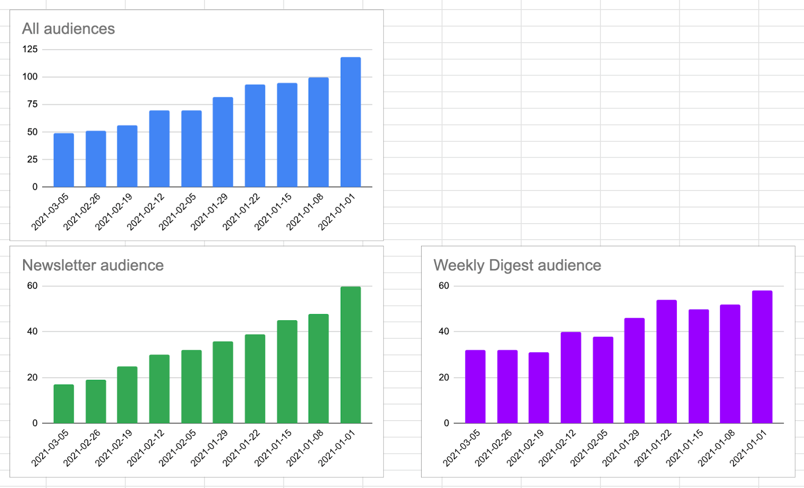
The numbers will also auto-update when the data is refreshed according to your set schedule. This will form a self-updating dashboard you can use to track audience growth dynamics.
Make a Mailchimp monthly report with a few clicks
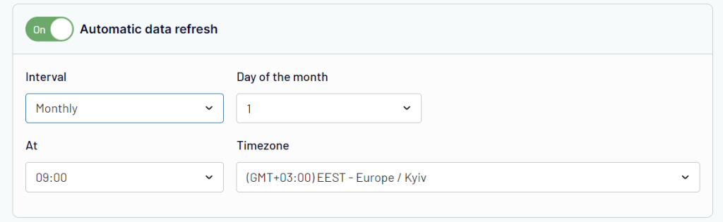
Using Coupler.io, you can adjust the frequency with which the data is imported. If you’re up for fetching data monthly, jump back to the Schedule part of your importer’s settings. Change the interval to Monthly and pick the date and time that works best for you. For example:
Audiences are just one of the data entities you can fetch from Mailchimp. With others, you can pull campaign stats, lists of contacts, automations with their individual stats, and more. All of these can make for an excellent base for a handy, self-updating dashboard in your spreadsheet.
And if you need more than that, it’s easy to plug in, for example, Mailchimp to Power BI or Looker Studio – Coupler.io provides direct integrations for these.
Export of Mailchimp email reports
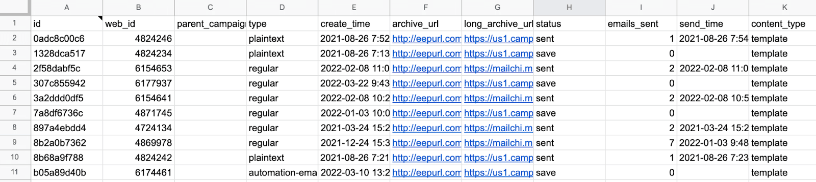
Continuing with the previous example, we’re going to export the thing that Mailchimp users love the most – campaign reports. This will include the list of campaigns, their status, and the vital stats of each campaign, including opens, clicks, total sent, and revenue.
- Set up Coupler.io and connect Mailchimp as we did above. If you have already set up a Mailchimp importer, click the Add new button to create a new importer.
- This time, choose the Campaigns data entity.
- The following fields are optional, but it may be useful to configure them. If you leave them blank, all finished, ongoing, and scheduled campaigns will be imported. Here, for example, we choose to import the campaigns created in April that are currently sending.
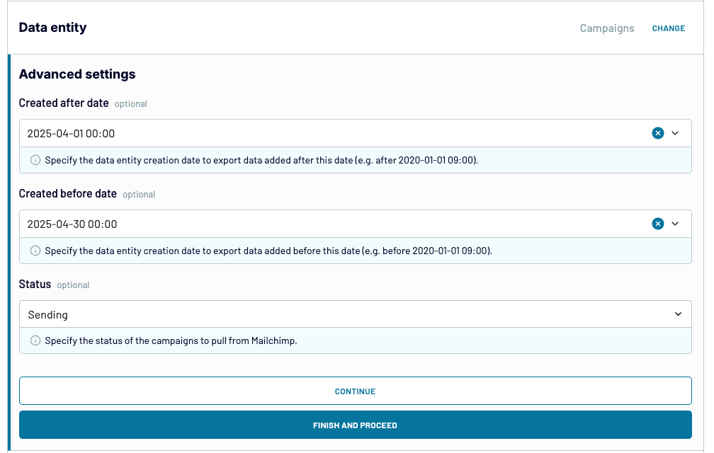
- Alternatively, leave those fields blank and do the proper filtering in your spreadsheet or database. Each campaign is imported with its create_time.
- Set up a destination and optionally a schedule, and then hit the Save and Run button.
Here’s a snapshot of a campaigns report imported with this Mailchimp to Google Sheets integration:
Mailchimp weekly email reports
A report that we exported in the previous chapter rarely makes sense as a one-time activity. Instead, it’s very useful to have email reports updated every week so that you can report on your progress or come to the weekly meeting with the latest information at your disposal.
When importing with Coupler.io, you can schedule reporting for automated data refreshes. To create a weekly report, pick Every Day as an interval. Then, select one of the days below and the time that works for you. For example:
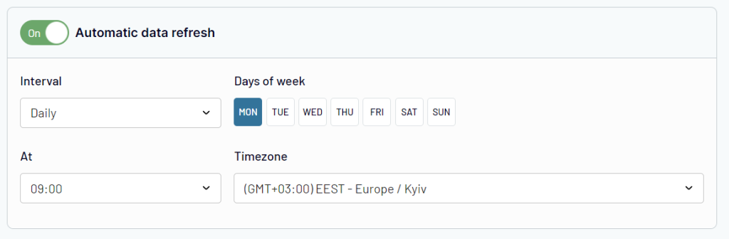
Following this schedule, the data will be refreshed every Monday at 9am.
What are the most important Mailchimp reports?
There’s not one single report that beats them all. Each Mailchimp report contributes in some way to better understanding your audience and how they interact with your emails. However, there are some that can indeed give you a lot of valuable insights you won’t find elsewhere.
One possible candidate is the click map available with campaign reports. It tells you where precisely users click and which areas they avoid on your email templates. Such heatmaps can be invaluable resources for optimizing your templates and testing out new approaches.
What’s more, audience segmentation and the ability to target only a small chunk of an audience is a powerful weapon. For example, looking at the dashboard for an audience of thousands or even millions may not always give you the insights you need. As it’s the quality of that data that can be most useful.
If you, however, segment the audience to see only those that clicked links in either of your last 3 sales emails, you’re possibly looking at high-quality leads. You can see where their interests lie and target them with a personal offer.
Lastly, Mailchimp comparative report makes it easy to compare even dozens of campaigns at the time. They’re excellent if you’re testing new approaches – different link placements, tweaked templates, various types of content – and want to see what resonates best with an audience.
And if you’re not on the Mailchimp plan that allows for accessing these reports, do not despair. Exporting campaign stats into a spreadsheet in a way we described in the Mailchimp custom reports chapter can make for a viable alternative.
Mailchimp reporting – recap
To sum up – there’s no go-to place inside Mailchimp where you can satisfy all your reporting needs. Instead, reports are scattered around the platform and available for virtually any type of campaign you can set up in Mailchimp.
And if you’re hungry for more, you’ll want to export Mailchimp data outside of the platform – for example, to a spreadsheet or even directly to a data visualization tool like Looker Studio. Either option opens up a lot more opportunities for you to understand your data better and derive plenty of valuable insights. This, in turn, can help you send better emails, convert more customers, and eventually boost your revenues and other metrics.
If you need help building a Mailchimp dashboard or setting up some automated data flows, you’ll want to check what Coupler.io data experts can do for you. We’ve worked with hundreds of businesses on data-related projects and can quickly set you up with a custom solution for your needs. If this sounds like something you could take advantage of, be sure to reach out, and let’s have a chat

Automate Mailchimp reporting with Coupler.io
Get started for free