Pipedrive provides its users with the Insights feature to build reports and collect them on a dashboard. This allows you to monitor the health of your activities and track essential metrics.
On the other hand, the reporting functionality in Pipedrive is somewhat limited compared to spreadsheet apps or even data visualization tools. Therefore, more and more users are building custom dashboards outside of Pipedrive. Which of these two options is suitable for your project? Read on to find out.
What is a Pipedrive Insights dashboard?
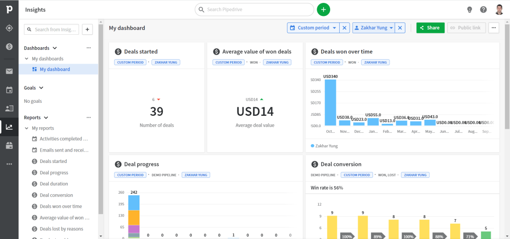
Insights dashboard in Pipedrive is a collection of reports displayed on the board. You can add or remove the reports to customize the collection. On the dashboard, you can apply two filters: User and Period. The filters will change the data displayed on all the reports added to the dashboard.
What is the difference between Pipedrive dashboards and reports?
A dashboard in Pipedrive Insights is a collection of reports. A report, in turn, is a visual representation of your performance metrics. There are several types of Pipedrive reports that depend on the data entity used: Activity, Deals, and Forecast.
| Report type | Description |
|---|---|
| Activity | |
| Performance | How many activities you have planned, added, and completed? |
| Emails Performance | How many emails were sent, received, and opened? |
| Deal | |
| Performance | How many deals were started, won, and lost? |
| Conversion | What is your win or loss rate? |
| Duration | What is the average time of your sales cycle? |
| Progress | Are your deals moving forward in the sales cycle? |
| Forecast and subscription | |
| Revenue forecast | What is your expected revenue? |
| Subscription revenue | What is your subscription revenue? |
So, on your dashboard, you may have one or multiple Pipedrive reports.
Custom report and dashboard templates for Pipedrive
The reports available in Pipedrive are good for basic analytics. However, they won’t let you step over the limits and derive more specific insights. In this regard, building a dashboard outside of Pipedrive provides many benefits.
The most popular solution you can use for this purpose is a Pipedrive dashboard template. Such templates are designed in spreadsheet apps like Google Sheets or Excel or BI tools such as Looker Studio or Power BI. You only need to populate the dashboard template with your Pipedrive data to get a ready-to-use report.
Here are a few custom dashboard templates for Pipedrive by Coupler.io available for free.
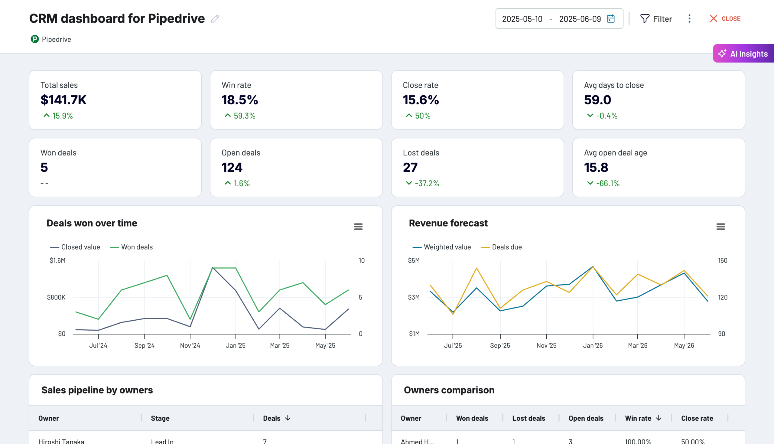
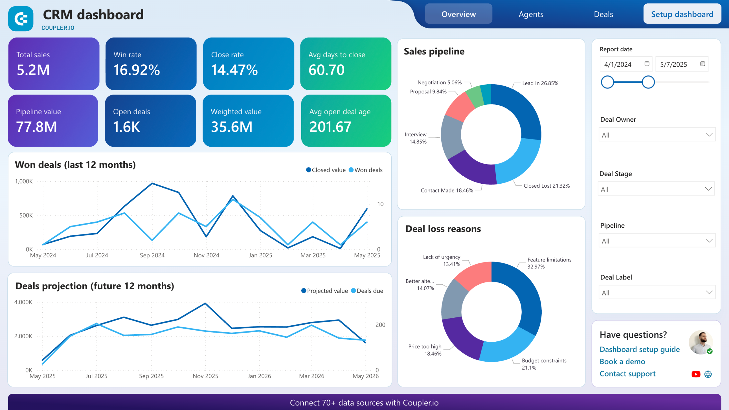
CRM dashboard for Pipedrive
This executive-level dashboard consolidates data from Pipedrive into a unified view that reveals both current performance and future opportunities across your entire sales organization.
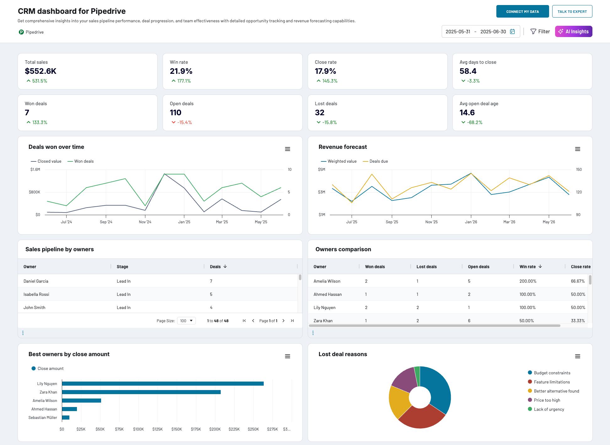
What insights the dashboard provides:
- Pipeline bottleneck identification – The dashboard maps your entire sales process, highlighting stages where deals consistently stall or require extended time periods. It analyzes deal progression patterns by rep, product line, and customer segment, revealing systemic issues that may not be apparent in day-to-day operations.
- High-value opportunity profiling – Through comprehensive deal analysis, the dashboard identifies the common characteristics of your most successful closures, including company size, industry vertical, deal source, and decision-maker profiles. This intelligence enables more strategic prospecting and resource allocation.
- Performance trend analysis – Long-term performance visualization reveals seasonal patterns, the impact of process changes, and correlations between team activities and results. The dashboard tracks both leading indicators (pipeline velocity, activity levels) and lagging indicators (closed revenue, win rates).
- Sales process optimization – Interactive funnel analysis shows conversion rates between each pipeline stage, average time spent in each phase, and drop-off patterns. This granular view helps identify process improvements and training opportunities.
- Team productivity assessment – Comparative performance analysis across sales representatives includes metrics like deal velocity, average deal size, win rates, and pipeline generation. The dashboard helps identify coaching needs and best practice sharing opportunities.
The dashboard is available as a template in Coupler.io, Looker Studio, and Power BI, both equipped with the Coupler.io connector to automate data flow from Pipedrive.


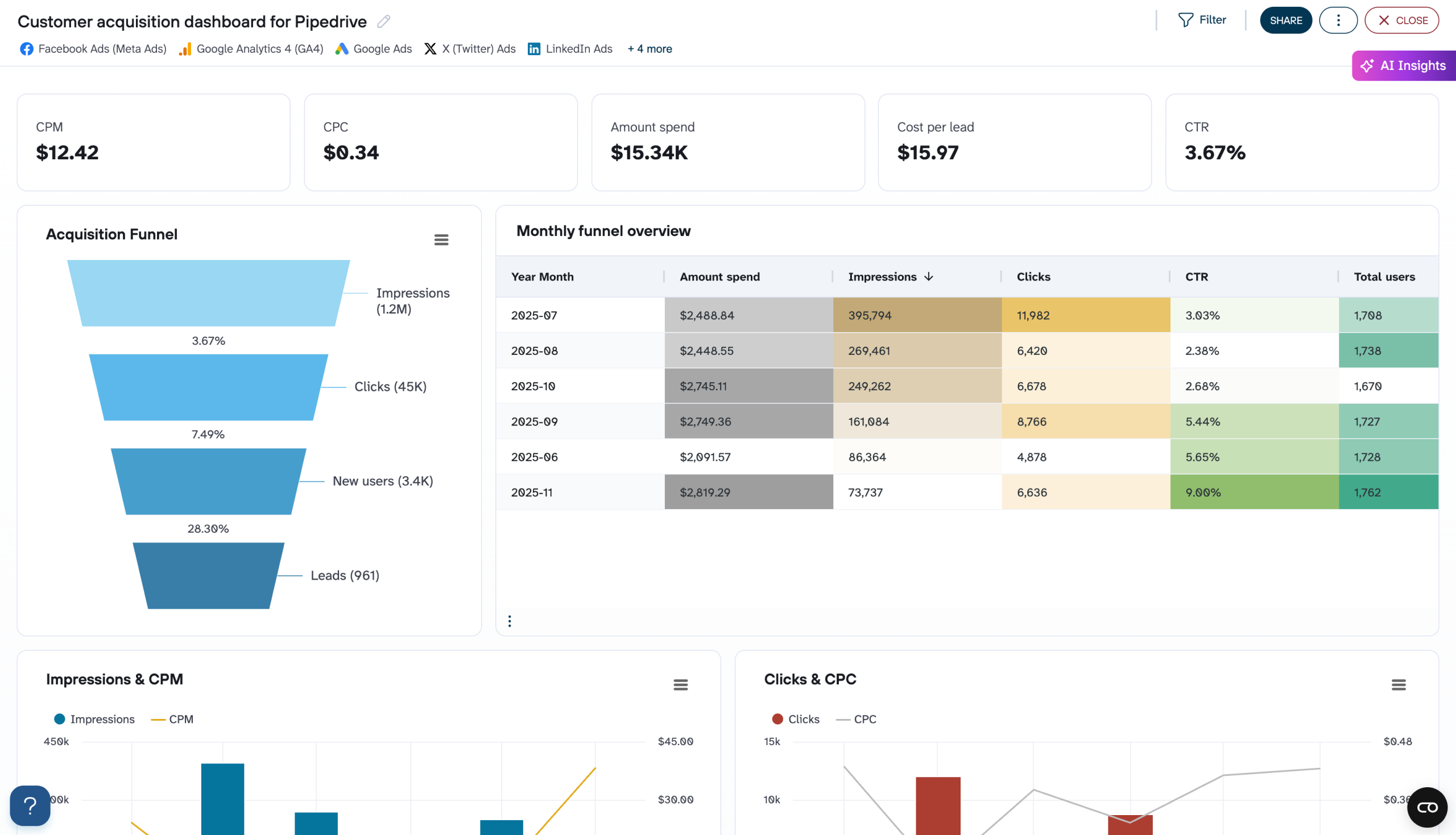
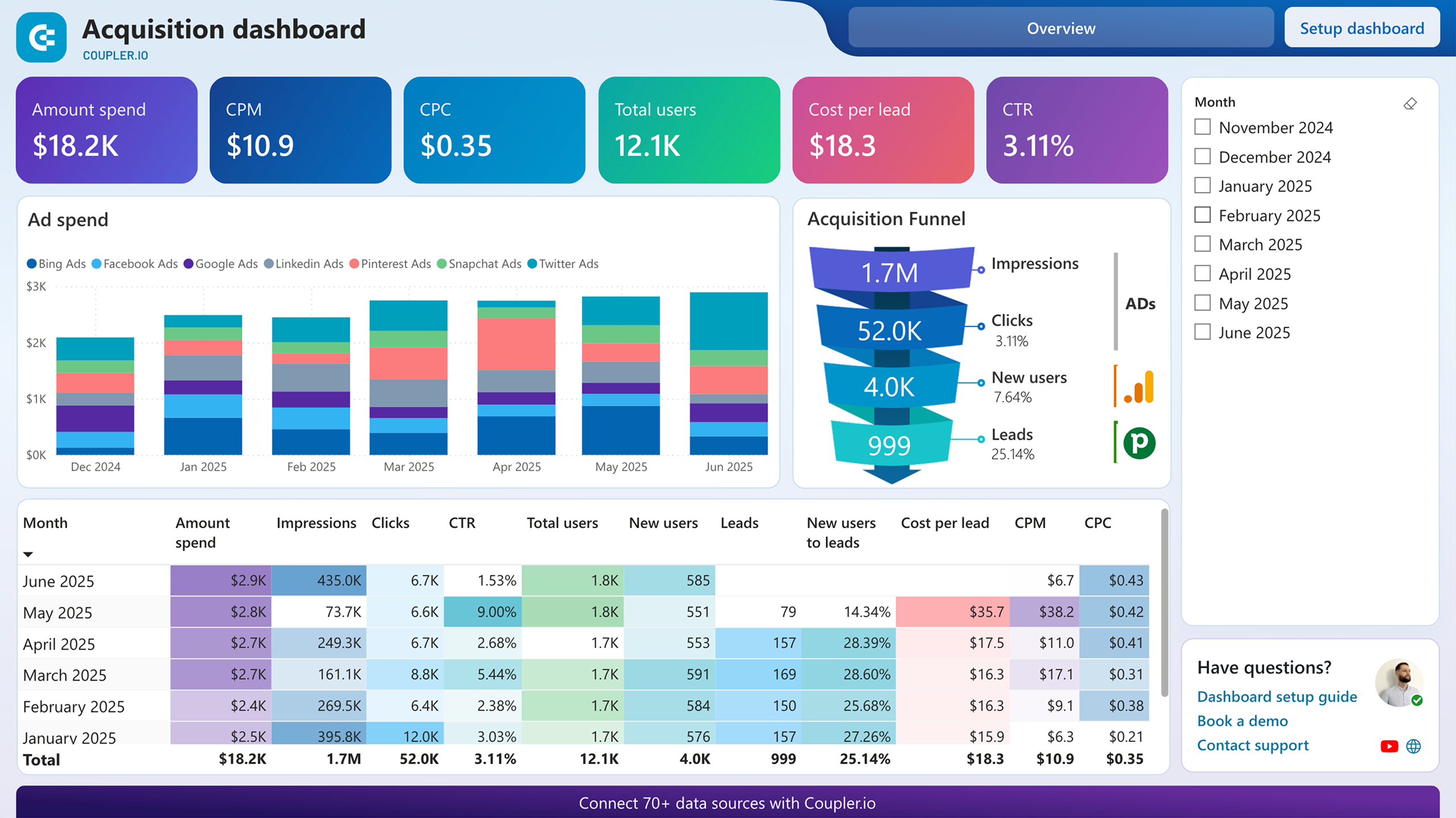
Customer acquisition dashboard for Pipedrive
This sophisticated analytics dashboard creates a comprehensive view of your entire customer acquisition ecosystem. It integrates CRM data from Pipedrive with marketing analytics from Google Analytics 4, advertising platforms, and other customer touchpoint systems. It’s essential for organizations that need to understand the complete customer journey and optimize marketing-to-sales alignment.
Customer acquisition dashboard for Pipedrive
 Preview dashboard
Customer acquisition dashboard for Pipedrive
Preview dashboardWhat insights the dashboard provides:
- Full-funnel conversion analysis – Comprehensive tracking from initial marketing touchpoint through deal closure, showing exactly how prospects move through each stage of your acquisition process. The dashboard identifies conversion bottlenecks and quantifies the impact of optimization efforts across the entire customer journey.
- Marketing attribution and ROI measurement – Advanced attribution modeling that connects marketing investments to actual revenue generation, not just lead creation. The dashboard accounts for multi-touch attribution and lengthy sales cycles to provide accurate ROI calculations for different marketing channels and campaigns.
- Cross-platform performance optimization – Comparative analysis of lead quality and conversion rates across various marketing channels including paid search, social media advertising, content marketing, and direct outreach. The dashboard helps optimize budget allocation based on revenue contribution rather than just lead volume.
- Predictive acquisition modeling – Historical data analysis enables forecasting of future lead volume, deal closure rates, and revenue based on planned marketing investments. This capability supports budget planning and helps predict the sales pipeline impact of marketing strategy changes.
- Channel effectiveness and lead scoring – Detailed analysis of which marketing sources produce leads that progress furthest through your sales pipeline and close at the highest rates. The dashboard helps identify the most valuable lead sources and informs lead scoring algorithms for better sales prioritization.
The dashboard is available as a template in Coupler.io, Looker Studio, and Power BI. Choose the version you like and follow the instructions to set up the Coupler.io connector to automate data flow from Pipedrive.


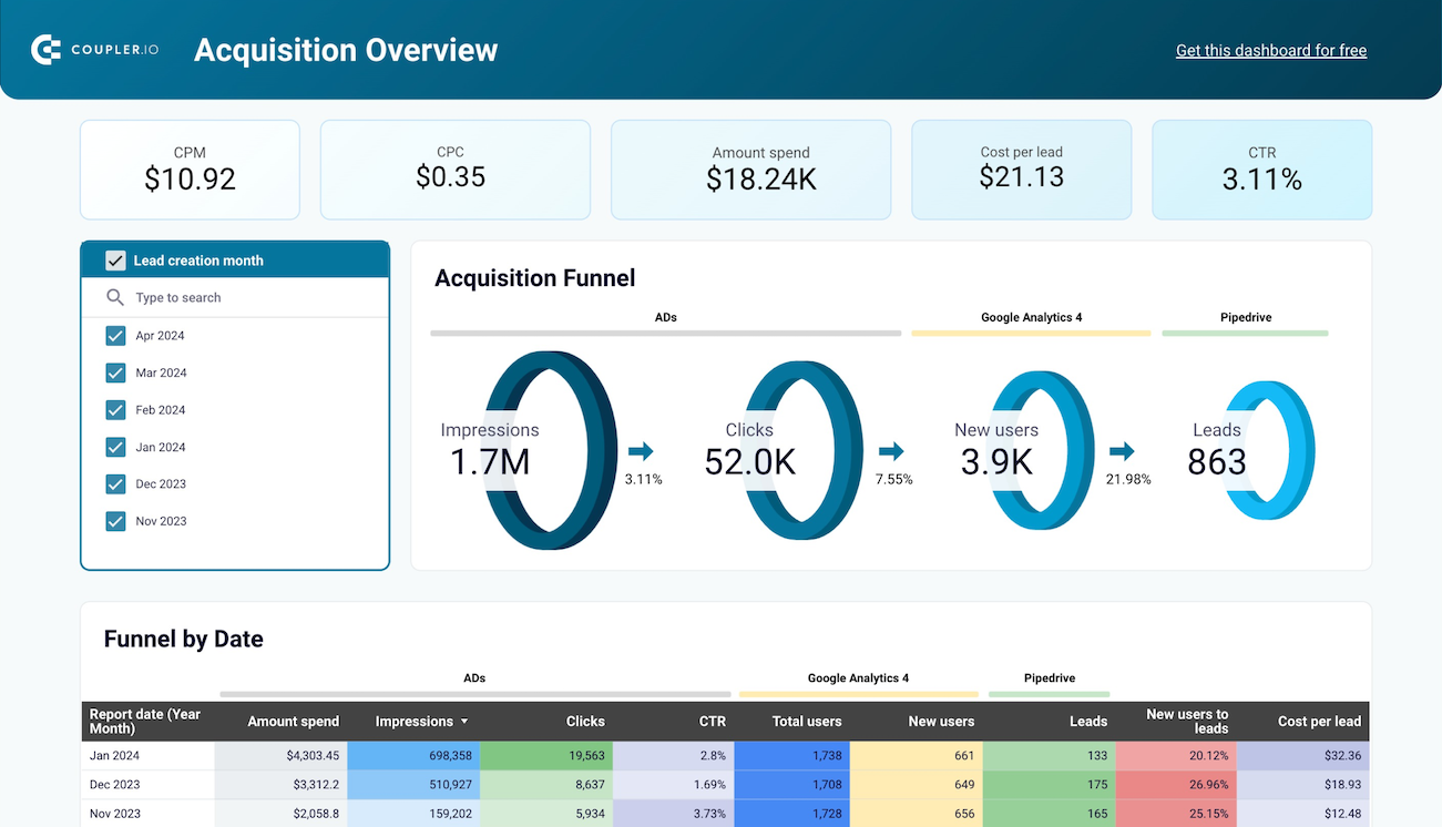
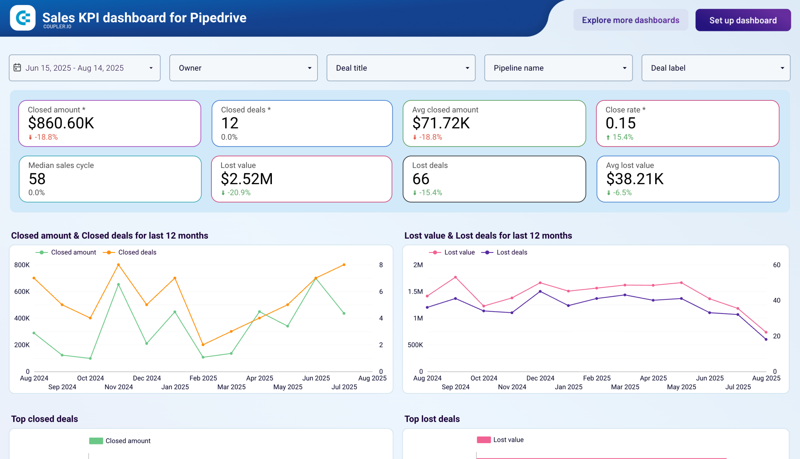
Sales KPI dashboard for Pipedrive
Designed specifically for sales leadership and revenue operations teams, this dashboard focuses on the critical performance indicators that drive business growth. It combines tactical metrics with strategic insights to support both day-to-day management and long-term planning.
Sales KPI dashboard for Pipedrive in Looker Studio
 Preview dashboard
Sales KPI dashboard for Pipedrive in Looker Studio
Preview dashboardWhat insights the dashboard provides:
- Revenue trend monitoring and forecasting – Track closed deal revenue dynamics over multiple time periods to identify growth patterns, seasonal variations, and the impact of market conditions or internal initiatives. The dashboard includes predictive elements that help anticipate future performance based on current pipeline health.
- Lost opportunity analysis and learning – Comprehensive breakdown of unsuccessful deals by loss reason, competitor, deal stage, and sales representative. This analysis reveals patterns in lost opportunities that can inform competitive strategy, pricing decisions, and sales process improvements.
- Sales funnel effectiveness evaluation – Customizable pipeline analysis that accommodates your specific sales stages and methodologies. The dashboard calculates conversion rates, identifies bottlenecks, and measures the effectiveness of different lead sources and qualification criteria.
- Individual and team performance benchmarking – Detailed comparison of sales performance across team members, territories, and time periods. The analysis goes beyond basic metrics to include pipeline generation, deal progression speed, and consistency of performance over time.
- Activity-to-outcome correlation analysis – Links sales activities (calls, meetings, emails, demos) to actual results, helping identify which activities most strongly correlate with successful deal closure. This insight enables more strategic time allocation and activity planning.
To start using this dashboard template in Looker Studio, follow the instructions to connect your Pipedrive account and load data using Coupler.io
How to create a Pipedrive new dashboard
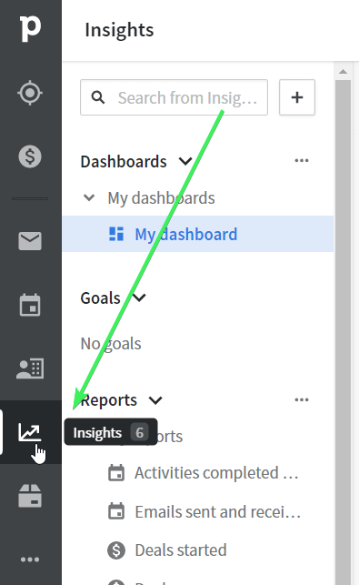
If you’re not looking for custom Pipedrive reporting solutions, you can always benefit from the native one – the Pipedrive Insights dashboard. Let’s check out more about it.
- Go to the Insights tab on the left of your Pipedrive CRM.
- On this tab, you’ll see a standard dashboard named ‘My dashboard‘ with a collection of standard reports. Let’s create a new dashboard. For this, click the + symbol, then select Dashboard.
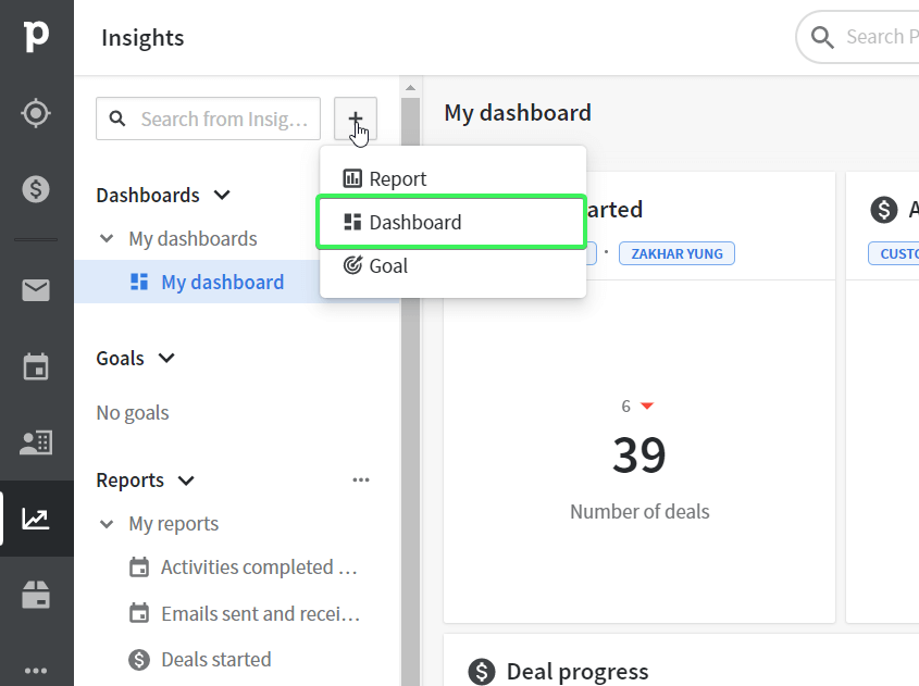
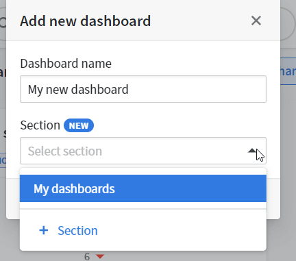
- Give a name to your new dashboard and choose (or create) a section for it. Click Save.
Welcome to your new dashboard!
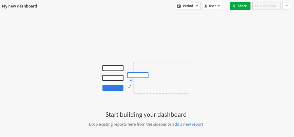
However, it’s blank since there are no reports added to it.
Customize Pipedrive dashboard with reports
Once the dashboard is ready, you need to fill it with the collection of reports. You may start dragging or adding the standard reports or create custom ones.
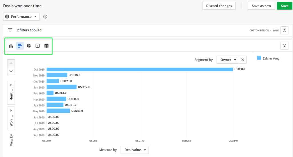
Different visualization options are available for specific types of reports. For example, a deal progress report can be only displayed as a column or bar chart. At the same time, the deals won over time report can be displayed as a:
- Column chart
- Bar chart
- Pie chart
- Scorecard
- Table
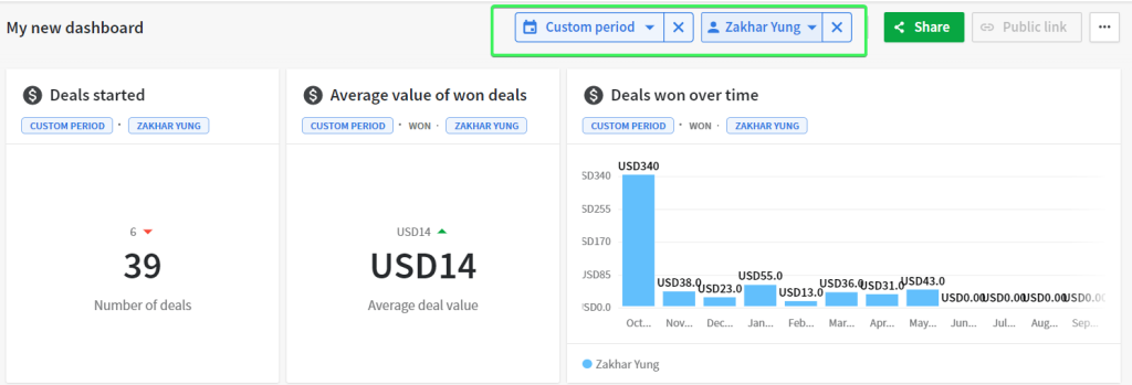
After you’ve added reports to your dashboard, you can apply uniform period and user filters.
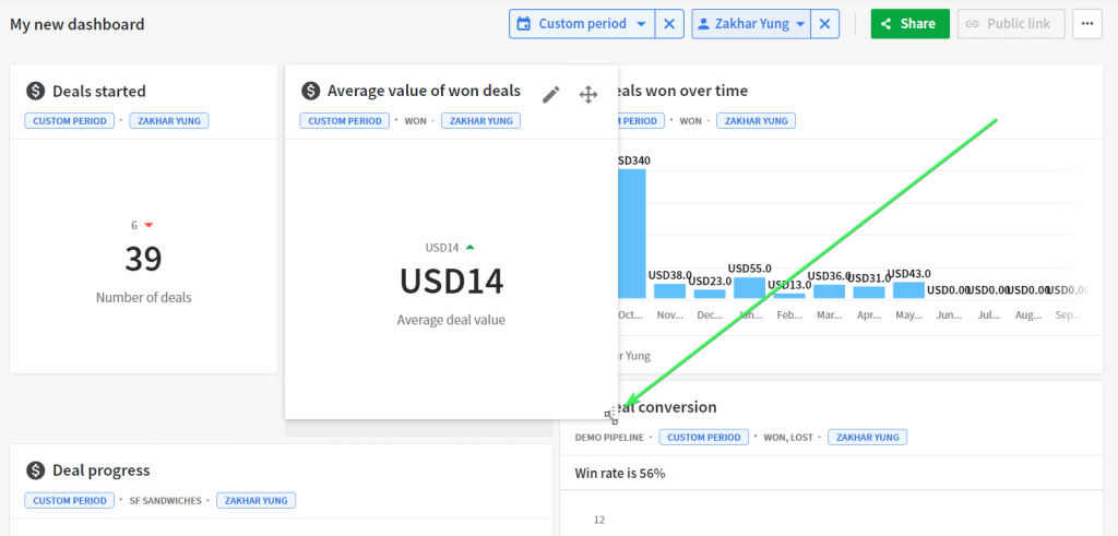
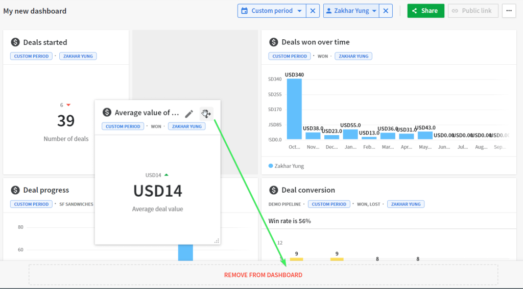
Rearrange, resize, and remove report blocks
Once the reports have been added to your dashboard, you can arrange the report blocks and change their size as you wish.
- To move blocks, click on the move icon in the top right corner, and drag the block to the desired location.
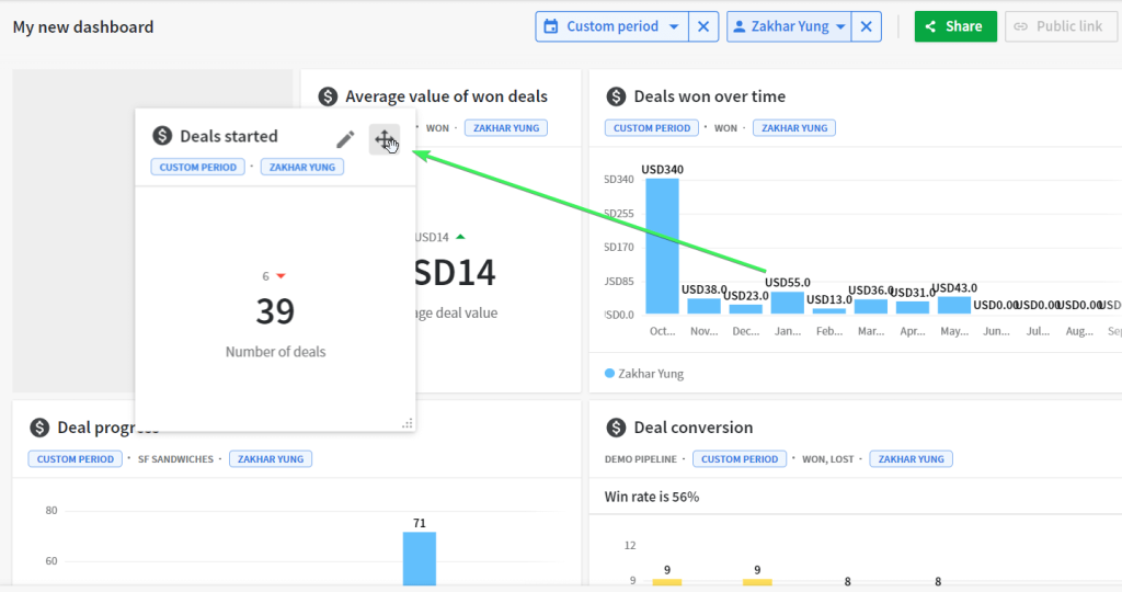
- To resize blocks, drag the resize icon in the bottom right corner.
- To remove a block from the dashboard, click on the move icon in the top right corner, and drag the block to the Remove From Dashboard area at the bottom.
Well, your dashboard is ready, and you’re already getting valuable insights about your pipeline. You’d also like to share these insights with your colleagues who are Pipedrive users or other stakeholders outside of Pipedrive.
Let your Pipedrive users view your dashboard
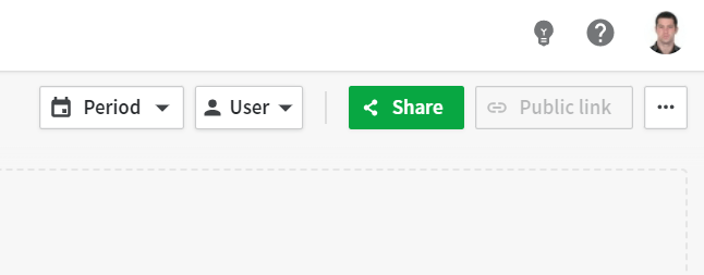
You can share your dashboard with users in your Pipedrive account by clicking the Share button in the top right corner of your dashboard.
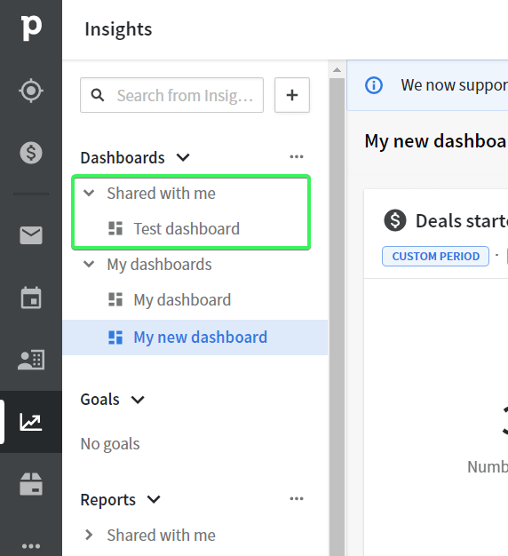
Select the user to share your dashboard with, and he or she will see your dashboard under the Shared with me section.
Note: Users you share the dashboard with can only view your dashboard. Any updates can only be done by the dashboard owner.
How to access a Pipedrive dashboard for external users
The Public link button allows you to share your dashboard with users outside of Pipedrive. You’ll find it next to the Share button.
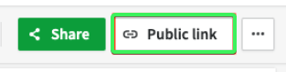
Note: If the Public link button is disabled, you’ll need to ask your admin for permission to share dashboards with external users.

Click the button, create a link, and copy it to send to your non-Pipedrive stakeholders. With this link, they’ll be able to only view your dashboard.
In Pipedrive, you can only give a viewer access to dashboards.
If, for any reason, you need to share a dashboard with editor access, then you should consider building a dashboard outside of Pipedrive.
How to build a Pipedrive dashboard from scratch
We’ve introduced Pipedrive report templates by Coupler.io above. However, you are not limited to these options with this reporting automation platform. In fact, you can create your own reports or dashboards in spreadsheets or BI tools. For this, you only need to connect Pipedrive to the chosen destination. Coupler.io lets you easily do this in a few steps.
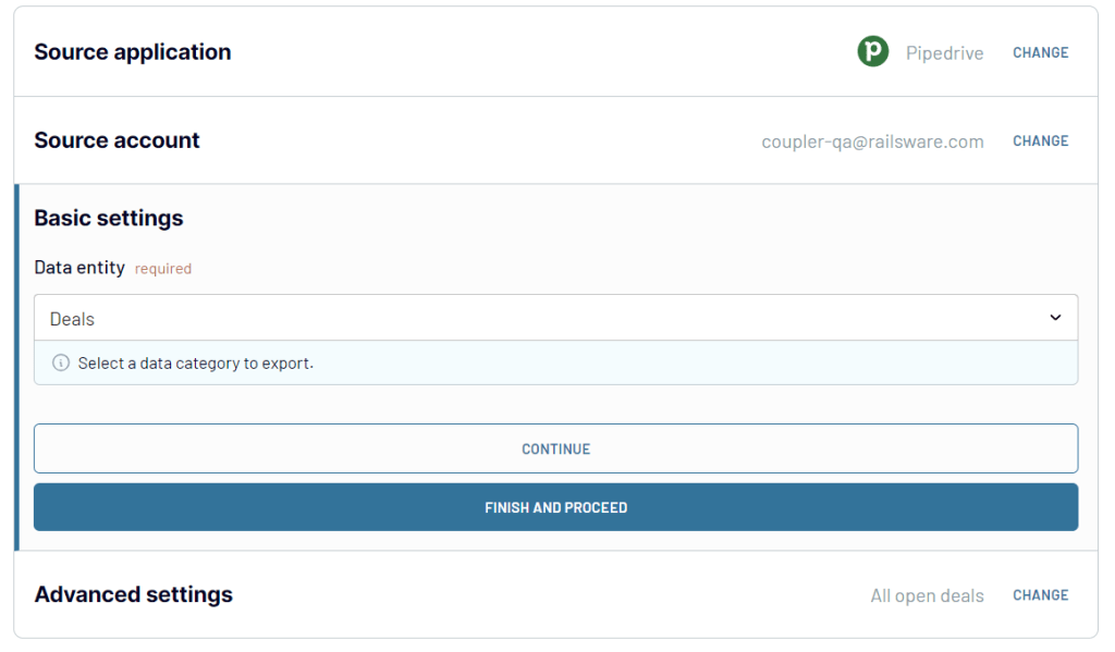
Step 1. Collect data
Select the desired destination app in the form below and click Proceed to create a Coupler.io account for free.
Connect to your Pipedrive account and select the data entity you want to export. For instance, deals, persons, leads, activities, etc.
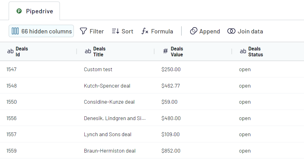
Step 2. Organize and transform data
Next, you can preview and organize the data for your Pipedrive report:
- Hide columns that are not important for the dashboard
- Add, rearrange, and rename columns
- Filter and sort Pipedrive data
- Add formula-based columns or calculate custom metrics
- Blend data from different Pipedrive accounts or different CRMs into one dataset
Step 3. Load and visualize data
Follow the in-app instructions to connect your destination and load data, for example, from Pipedrive to Looker Studio. Once loaded, you can add charts, tables, scorecards, and other visual elements required for your custom Pipedrive dashboard.
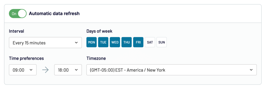
To make your dashboard live, go back to Coupler.io and enable the Automatic data refresh. It will update your dashboard with the latest Pipedrive data according to the specified schedule.
To wrap up: Is the Pipedrive live dashboard not available anymore?
In mid 2017, Pipedrive rolled several old reports into single new ones and combined the company and live dashboard into one. From then onwards, you can create Pipedrive dashboards in the way that we described in this article.
On the other hand, the option of creating dashboards and reports outside of Pipedrive seems to be quite in demand. In addition, the ready-to-use Pipedrive integrations can be used for other purposes as well. For example, the Pipedrive to BigQuery integration would work well to store a backup copy of your records. Choose the option that fits your needs, and good luck with your data!

Automate Pipedrive reporting with Coupler.io
Get started for free