What is a QuickBooks Online dashboard?
QuickBooks Online features a built-in dashboard designed to give you a quick and informative overview of your business finances. With the key metrics at your fingertips, you can make informed decisions about your finances, inventory, and overall business strategy.
The dashboard presents indicators that affect your business and displays this information in different ways. This might include metrics like last month’s profit and loss, your accounts receivable and payable balances, and upcoming bills. The QuickBooks native dashboard goes beyond just displaying numbers. It can highlight areas that need your attention, such as overdue invoices or unmatched bank transactions. The customizable layout allows you to personalize the dashboard.
While QuickBooks enables you to visualize, track, and report on key financial performance indicators, all representations are read-only. This means that you cannot modify filters or time ranges.
Does QuickBooks desktop have a dashboard feature?
Unfortunately, the QuickBooks desktop version does not offer a built-in dashboard feature like QuickBooks Online. However, you can still get a quick grasp of your financial health using the following options:
- The QuickBooks desktop Home Page displays some basic information like upcoming due dates and recent transactions. You can also use the home page Insights to see how your business is doing.
- The Reports Center can become your go-to spot for generating various accounting reports like Profit and Loss, Balance Sheet, and Accounts Receivable/Payable aging reports. By running these reports and customizing date ranges, you can get a snapshot of your financial standing.
Can you create a custom dashboard for your QuickBooks Online data?
A custom QuickBooks dashboard can be created in spreadsheets or BI tools based on the data exported from QuickBooks Online. You only need to choose a respective solution, for instance, Looker Studio, and design a dashboard there. And, of course, you’ll need to load your QuickBooks data. For this, you can use Coupler.io which lets you connect QuickBooks Online to spreadsheets, BI tools, and even data warehouses.
Another option is to get a predesigned dashboard template. This way, you get a working analytics dashboard that needs to be populated with your data. The latter can be done either manually or automatically if the template is equipped with a QuickBooks connector.
QuickBooks dashboard examples for reporting and analytics
Check out these QuickBooks dashboard templates that are free to use and have a built-in connector by Coupler.io. This means that you only need to connect your QuickBooks Online account to populate the dashboard with your data.
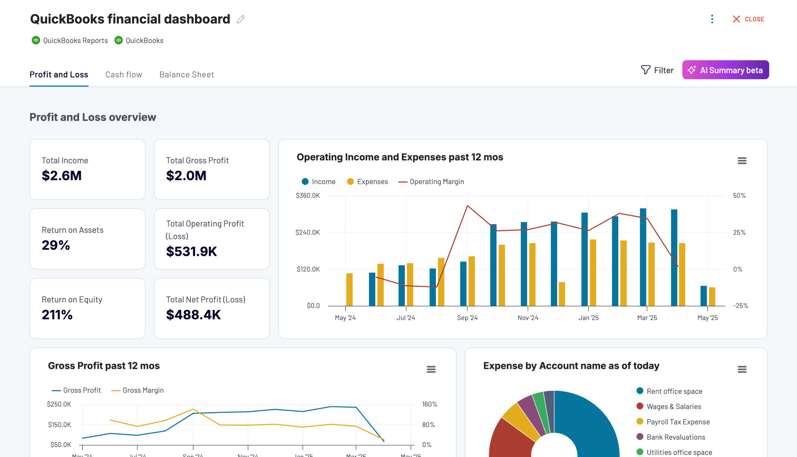
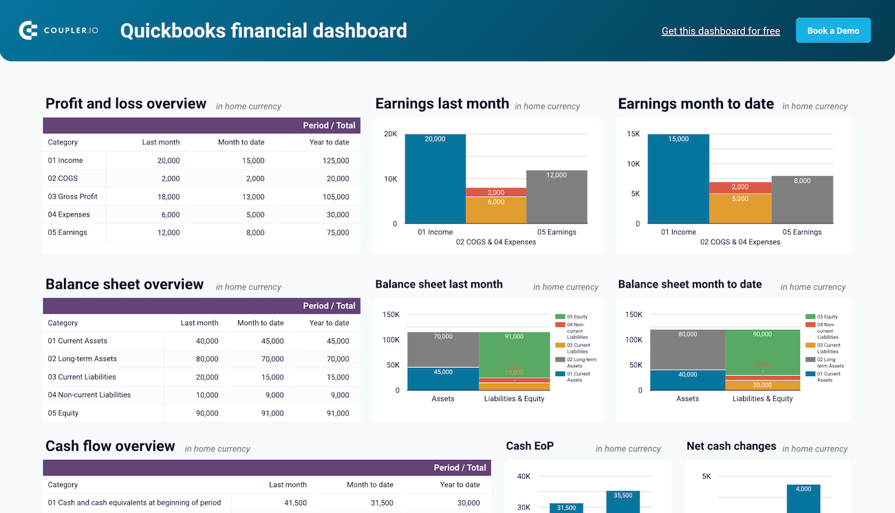
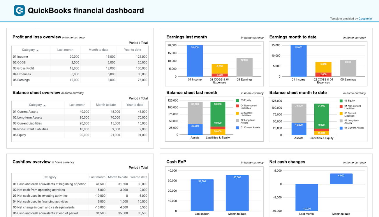
QuickBooks financial dashboard
The QuickBooks financial dashboard delivers insights into your company’s financial performance by consolidating profit and loss, balance sheet, cash flow, and bank account data into one unified view. This overview helps you track earnings, monitor liquidity, and identify financial trends without navigating through multiple separate reports or detailed spreadsheets.
With this dashboard, you can:
- Monitor your profitability by reviewing revenue, expenses, and net income for the last month, month to date, and year to date to quickly spot growth patterns or areas where costs are increasing faster than income.
- Assess your company’s financial position and liquidity through assets, liabilities, and equity snapshots that show changes from the last month to the current period to understand your business health at a glance.
- Track net cash changes over the reporting period to see how your cash position evolves and ensure you’re managing liquidity effectively to avoid shortfalls that could disrupt operations.
- Monitor balances across all linked bank and cash accounts, including multi-currency tracking for foreign accounts, to ensure proper reconciliation and maintain visibility into available funds for daily operations.
The dashboard is available in Coupler.io and as a template in Looker Studio and Google Sheets. You can load your data from QuickBooks in a few minutes due to the built-in connector by Coupler.io.


Check out all free cash flow reporting templates and balance sheet dashboards by Coupler.io
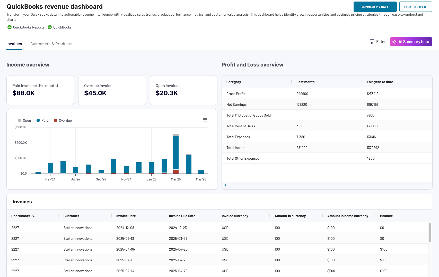
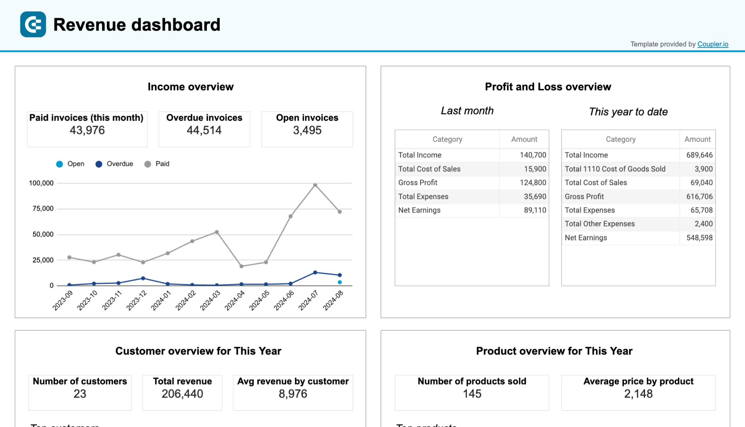
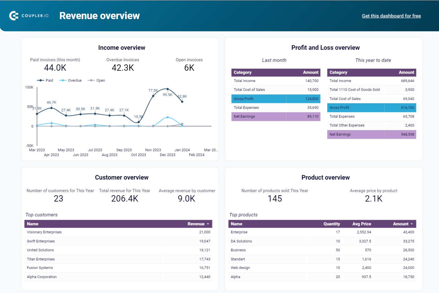
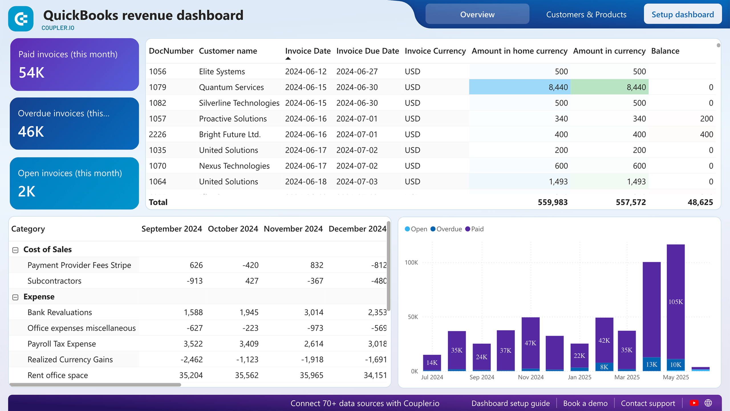
QuickBooks revenue dashboard
The revenue dashboard helps you monitor your income and expenses while providing detailed breakdowns of revenue by customers and products. This visibility into your income streams enables you to identify which clients and offerings drive the most revenue, track growth trends over time, and make informed decisions about sales strategies and customer retention efforts.
QuickBooks revenue dashboard + AI insights
 Preview dashboard
QuickBooks revenue dashboard + AI insights
Preview dashboardWith this dashboard, you can:
- Track overall revenue trends for the last 12 months to identify seasonal fluctuations, peak revenue periods, and unexpected dips that may signal collection issues or changing customer demand.
- Compare revenue and expenses to assess how well your business manages costs relative to income, providing insights for budget planning and identifying whether profitability is improving or declining over time.
- Identify your most valuable customers by revenue contribution to design targeted marketing efforts, develop customer retention strategies, and provide loyalty incentives for high-value clients who drive significant business.
- See which products or services generate the most revenue to understand demand patterns, manage inventory effectively, and adjust sales strategies based on the performance of high or low-performing offerings.
Use this QuickBooks revenue dashboard to identify top-selling products or services, track revenue growth, and pinpoint areas for potential sales improvement. It is available natively in Coupler.io UI (+ AI insights feature) or as a template in Google Sheets, Looker Studio, and Power BI.

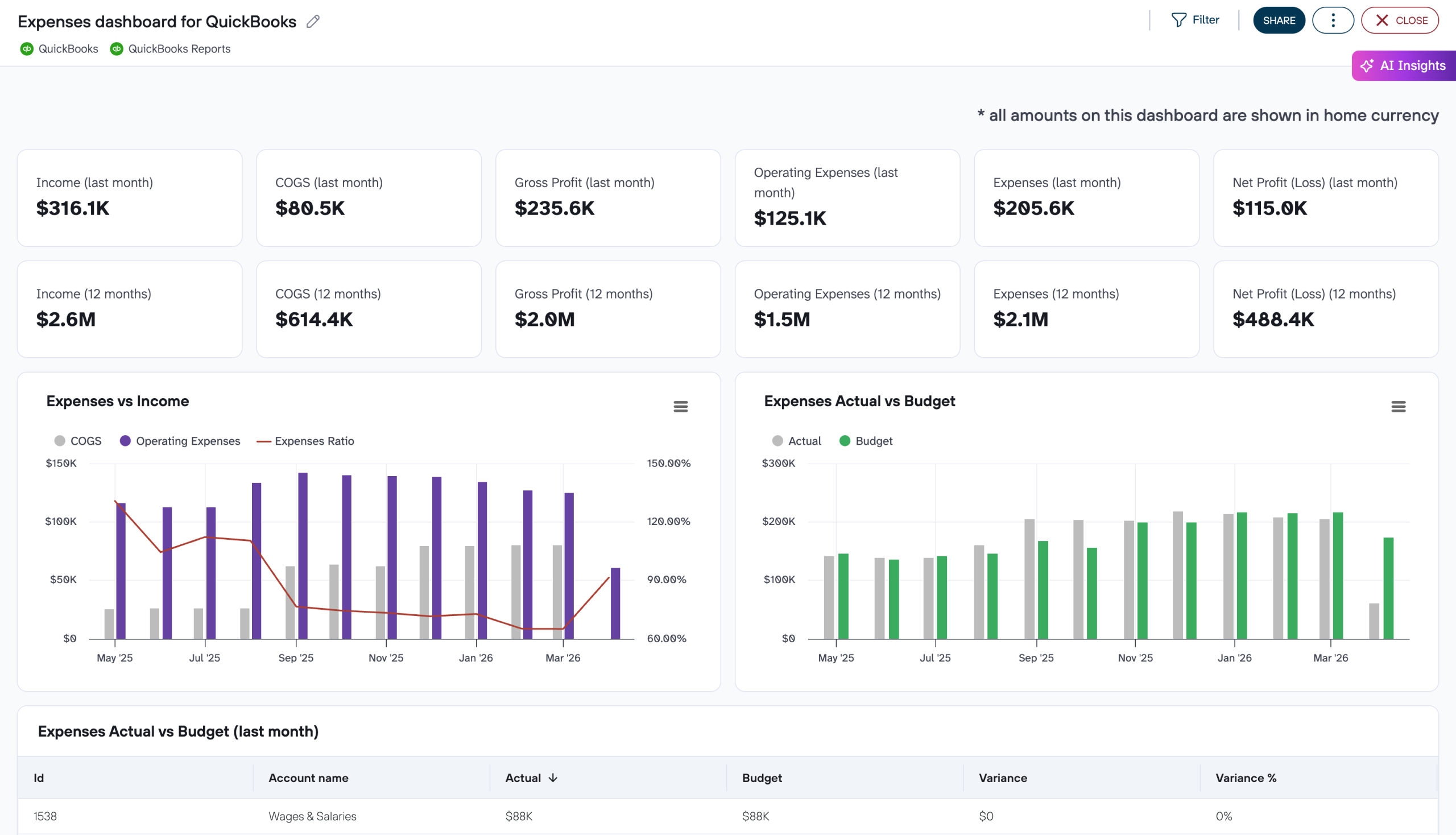
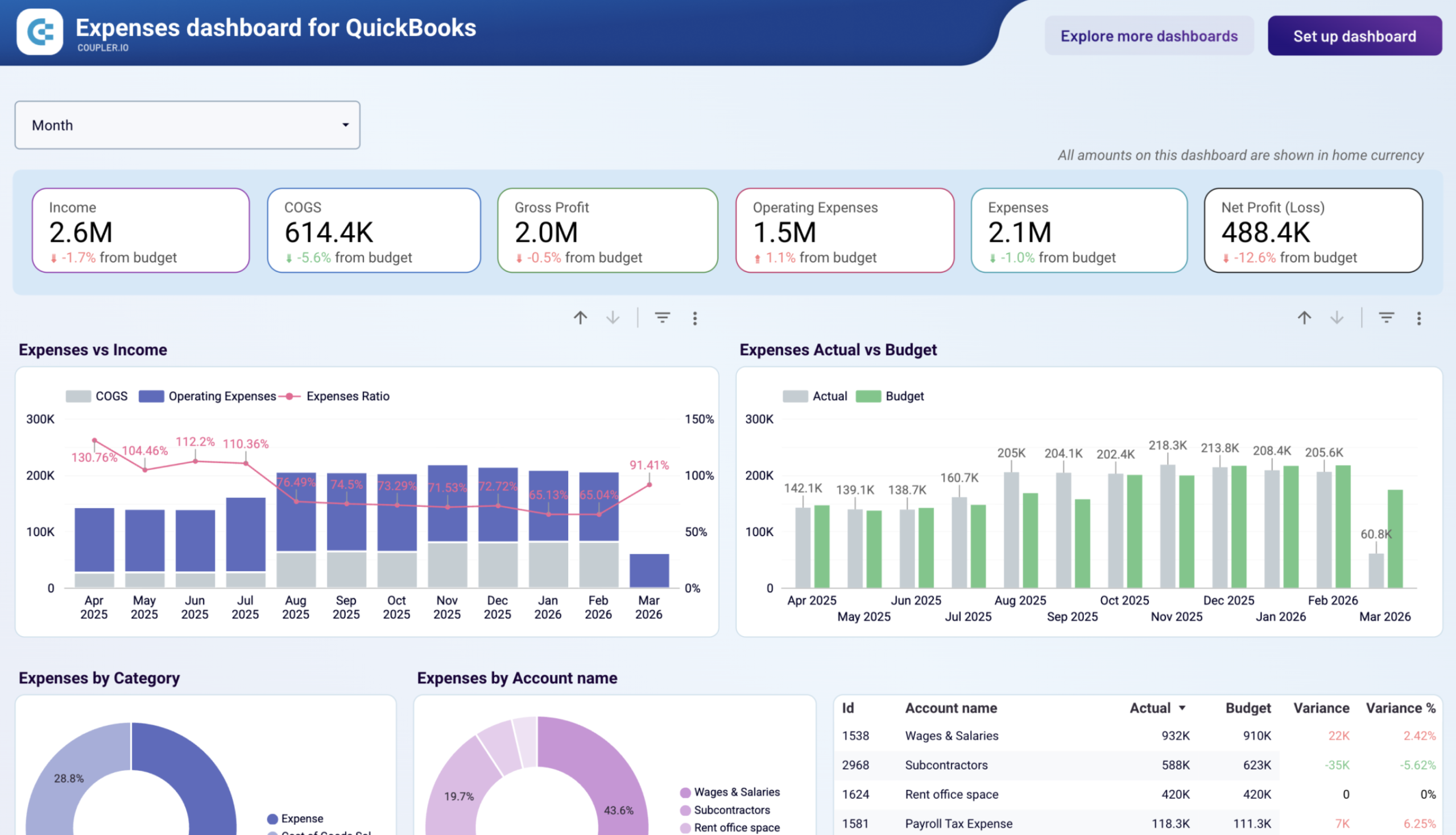
Expenses dashboard for QuickBooks
The dashboard tracks spending against budget across cost categories and accounts and gives finance managers and business owners a clear view of where actual costs diverge from plan. It shows how actual expenses compare to budgeted targets at both the summary and account level, which makes it a practical tool for anyone who needs to explain variances and course-correct during the period.
Expenses dashboard for QuickBooks
 Preview dashboard
Expenses dashboard for QuickBooks
Preview dashboardWith this dashboard, you can:
- Compare actual expenses to budget month by month using the Expenses Actual vs Budget chart to see whether variances are isolated events or a widening trend that requires a budget revision before it impacts your bottom line.
- Identify exactly which accounts drove a budget overrun by reviewing the Expenses by Account name table, which shows absolute variance and variance percentage per account, so you can explain cost discrepancies line by line to leadership.
- Assess vendor concentration and prepare for contract renewals using the Top Vendors by Paid Bills table, which ranks suppliers by spend across the current month, last month, and the trailing 12 months in one view.
- Monitor cash balance, burn rate, and months of runway remaining alongside your expense data to evaluate whether current spending levels are sustainable given available reserves before committing to new costs.
The dashboard is available in Coupler.io and Looker Studio. You can load your data from QuickBooks in a few minutes with the built-in Coupler.io connector by following the setup instructions.
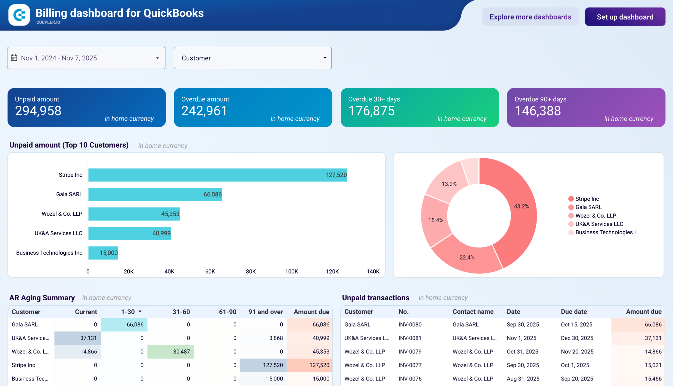
Billing dashboard for QuickBooks
The billing dashboard brings together accounts receivable and accounts payable data to show how customer payments and vendor obligations affect your working capital. By viewing both sides of your cash flow in one place, you can identify timing mismatches between when customers pay you and when you need to pay vendors.
Billing dashboard for QuickBooks
 Preview dashboard
Billing dashboard for QuickBooks
Preview dashboardWith this dashboard, you can:
- See how customer payment delays impact your ability to pay vendors on time by viewing overdue receivables against upcoming vendor bills, helping you decide whether to accelerate collections or request payment extensions from suppliers.
- Determine which customers contribute most to your revenue while simultaneously tracking which vendors consume the largest portion of your cash, giving you clarity on the flow of money through your business.
- Spot patterns in customer payment behavior across multiple months and compare them with your own vendor payment history to identify opportunities for improving cash flow timing through better credit terms or payment scheduling.
- Review all outstanding invoices and unpaid bills together to create accurate cash flow projections and understand your true liquidity position without piecing together information from separate reports.
You can use the Billing dashboard as a Looker Studio template that comes with the Coupler.io connector. Check the setup instructions to link your QuickBooks Online account and load your data into the dashboard.
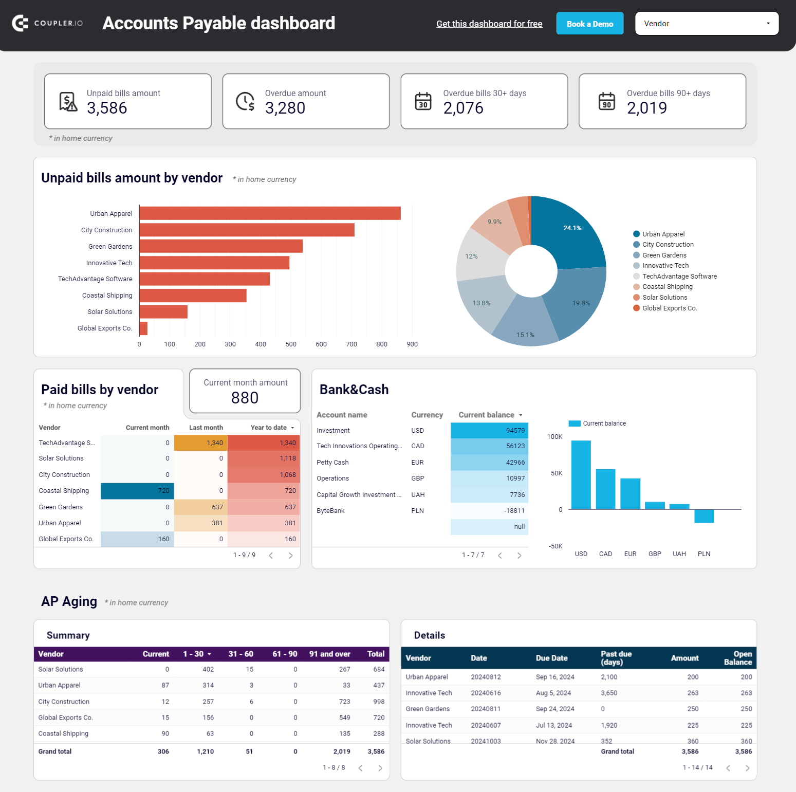
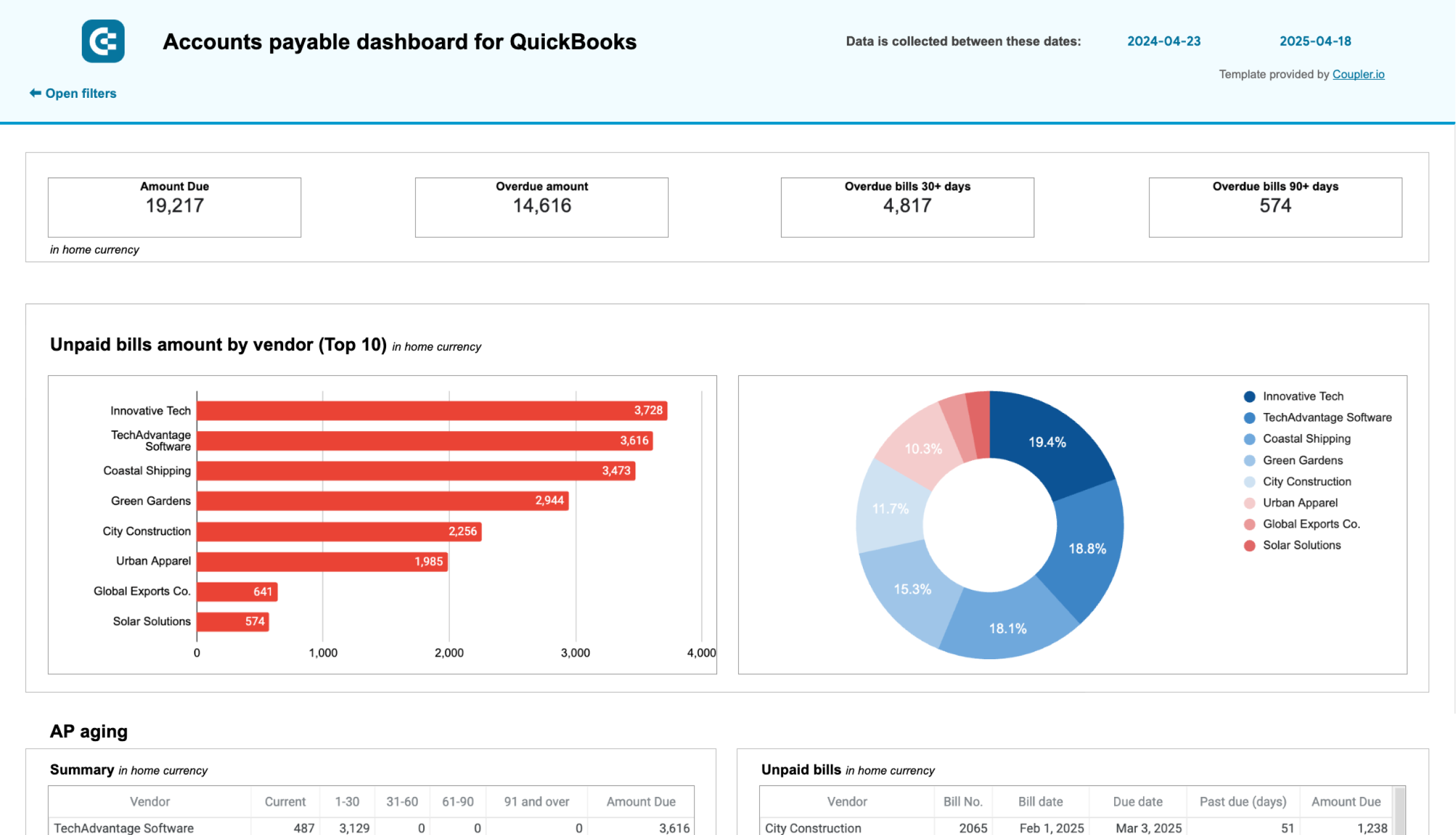
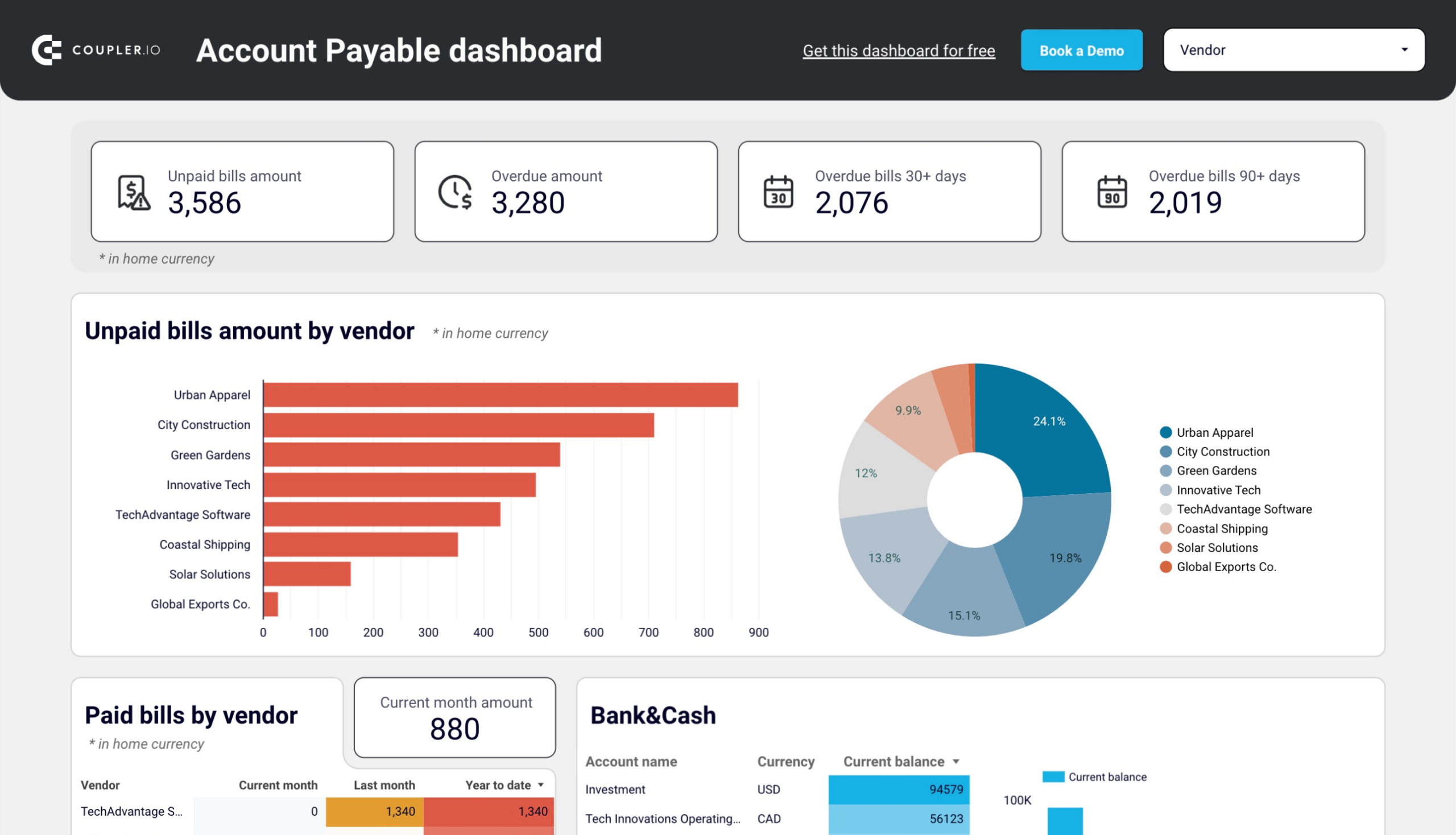
Accounts payable dashboard for QuickBooks
The accounts payable dashboard helps you balance vendor relationships with cash preservation by showing exactly when bills are due and which vendors represent your largest obligations. This visibility prevents late payment penalties while ensuring you don’t pay too early and unnecessarily reduce available cash for other business needs.
Accounts payable dashboard for QuickBooks
 Preview dashboard
Accounts payable dashboard for QuickBooks
Preview dashboardWith this QuickBooks dashboard, you can:
- Track your payment history with each vendor to evaluate vendor relationships, identify suppliers you pay consistently on time, and use this information to negotiate better payment terms or pricing.
- Identify which vendors require immediate payment by reviewing unpaid amounts broken down across current, up to 30 days, 30-60 days, 60-90 days, and 90+ day aging periods to prioritize bills based on how overdue they are and vendor importance.
- See which vendors represent your largest payment obligations and understand spending concentration across your supplier base to identify your major creditors and make strategic decisions about payment priorities.
- Compare your total unpaid bills against current bank balances across accounts and currencies to determine whether you have sufficient funds to cover all obligations or need to prioritize certain payments.
The accounts payable dashboard template is available for Google Sheets and Looker Studio. Try it out yourself by simply connecting your QBO account.
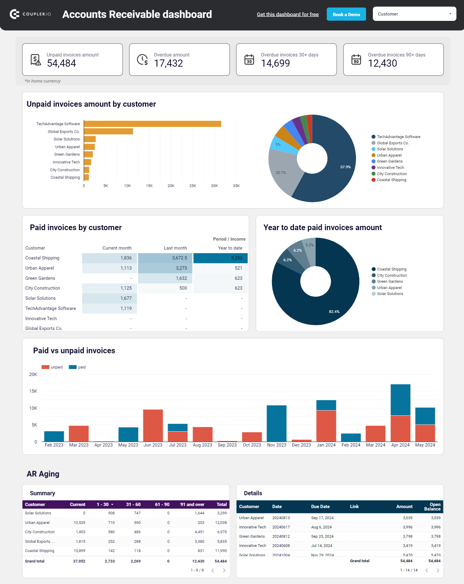
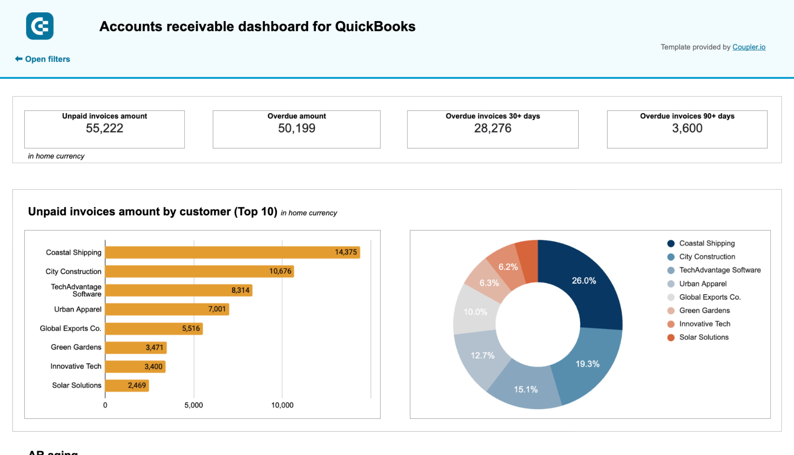
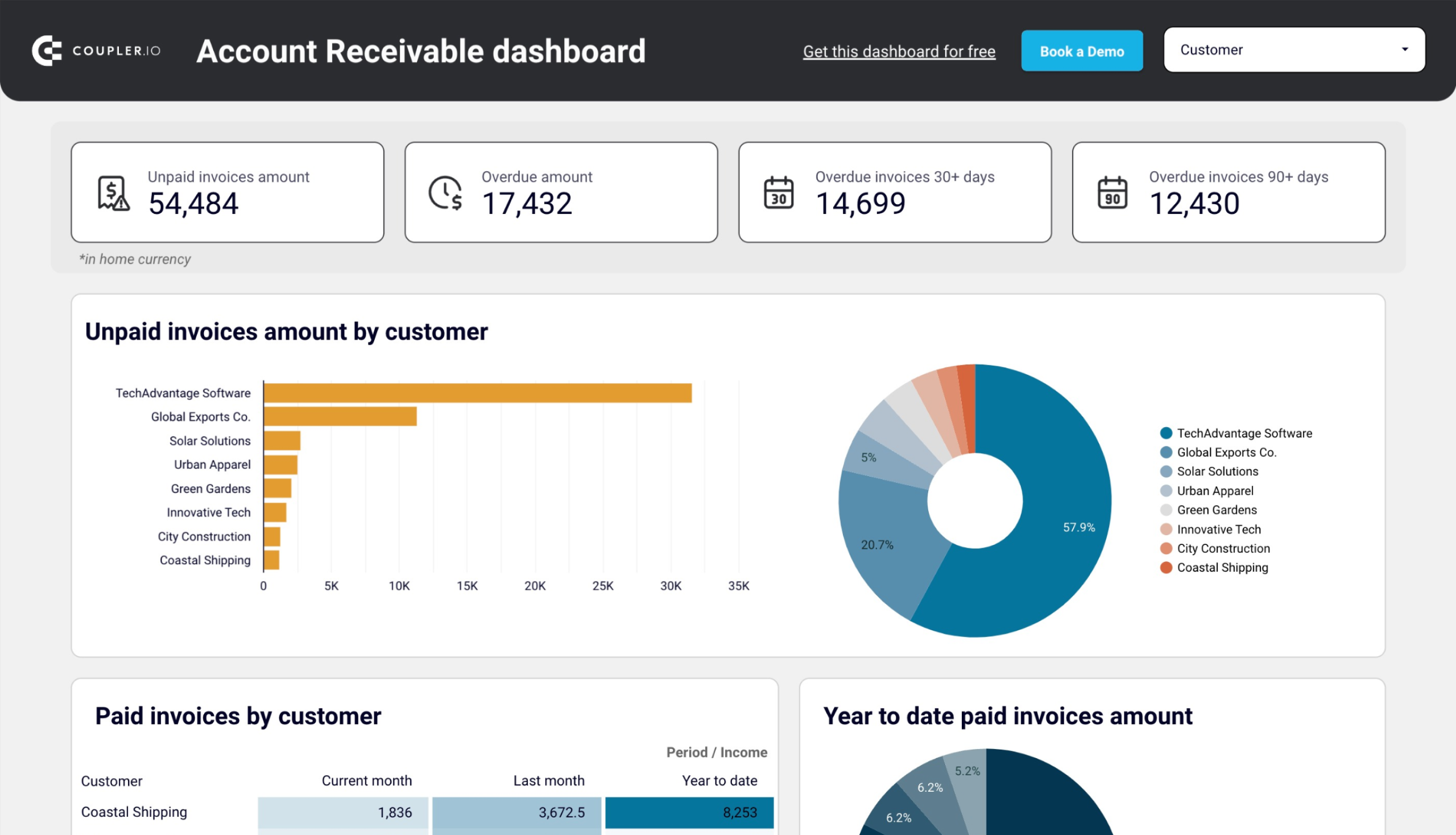
Accounts receivable dashboard for QuickBooks
In addition to the AP dashboard, get one for accounts receivable to keep track of your incoming payments and ensure timely collections. This QuickBooks dashboard template showcases your total accounts receivable balance, a comparison of paid and unpaid invoices, and the aging of your receivables. This lets you identify invoices overdue for a certain period.
Accounts receivable dashboard for QuickBooks
 Preview dashboard
Accounts receivable dashboard for QuickBooks
Preview dashboardUse the accounts receivable dashboard to:
- Identify your major debtors by seeing which customers have the largest unpaid balances and their share of your total accounts receivable to prioritize collection efforts based on the size of outstanding amounts and importance to your business.
- Review the aging of overdue amounts across current, up to 30 days, 30-60 days, 60-90 days, and 90+ day periods to determine which accounts need urgent follow-up before they become difficult to collect or turn into bad debt.
- Track the dynamics of paid and unpaid invoices month by month to identify seasonal patterns in customer payment behavior and understand periods when customers struggle to pay so you can plan for potential cash flow challenges.
- Evaluate customer payment reliability by reviewing historical payment data to distinguish between customers who consistently pay on time and those who chronically delay, helping you make informed decisions about credit terms and payment policies.
The dashboard is available as a template in Google Sheets and Looker Studio. Give it a shot and see how it can contribute to your QuickBooks reporting.
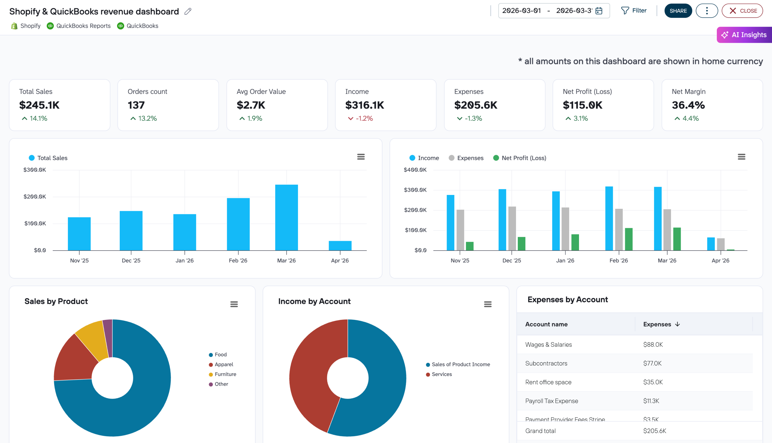
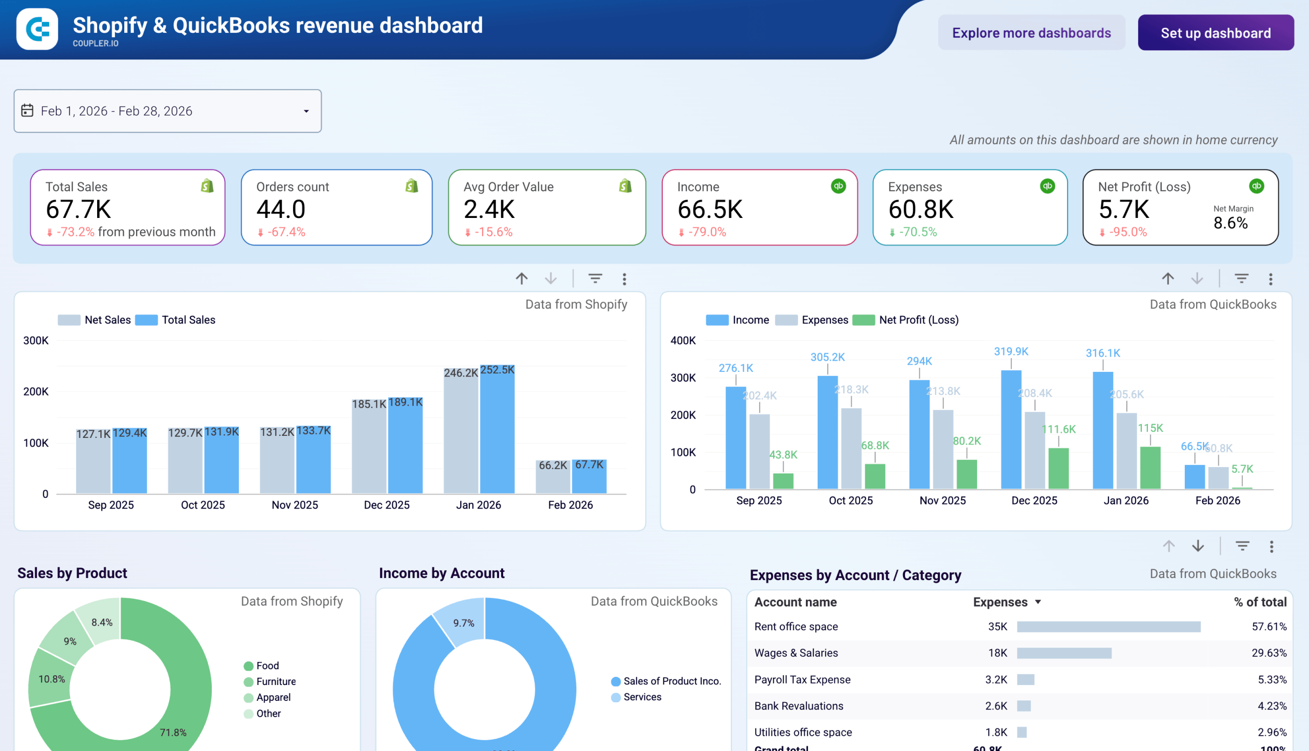
Shopify & QuickBooks revenue dashboard
QuickBooks dashboards show your financial performance, but they don’t tell you what’s happening on the storefront that drives those numbers. The Shopify & QuickBooks revenue dashboard by Coupler.io fills that gap by combining order data from Shopify with financial data from QuickBooks.
Shopify & QuickBooks revenue dashboard
 Preview dashboard
Shopify & QuickBooks revenue dashboard
Preview dashboardWith this dashboard, you can:
- See total sales, order count, and average order value from Shopify next to income, expenses, and net profit from QuickBooks.
- Compare month-over-month changes across both platforms with side-by-side trend charts.
- Use the combined monthly table to reconcile Shopify sales metrics with QuickBooks financials for period-end reporting.
You can use this dashboard right in Coupler.io or as a Looker Studio template. Check the Setup guide for step-by-step instructions.

The native QuickBooks dashboard analytics explained
Let’s get back to the built-in QuickBooks Online dashboard that provides an overview of your business activities right in the software. It includes a collection of metrics that help you analyze your data and track the performance of your operations in a convenient view.
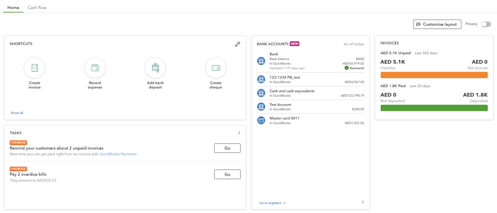
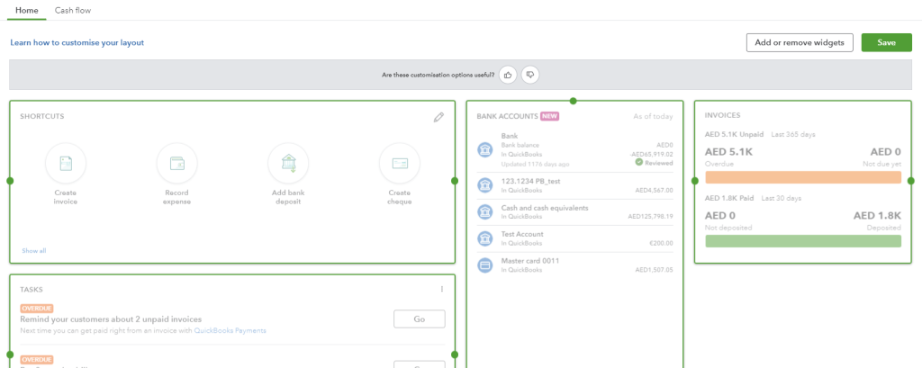
The dashboard is the first thing you see once logged in to QuickBooks. If you’re a new user, the dashboard content will be empty. However, the page will be updated once you start entering transactions. The dashboard displays two tabs: Home and Cash flow.
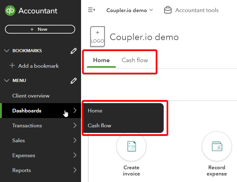
In the Home tab, you will find several widgets. By default, you may have Shortcuts, Bank Accounts, Invoices, Tasks, and Sales. You can add and remove widgets to your liking.
The setup guide will walk you through the process of setting up your company activities, like navigating your account, customizing your invoice template, and setting up your tax information.
Shortcuts are useful for navigating QuickBooks features more easily, eliminating the time to perform tasks you often do. Such tasks include, for example, adding a supplier, an expense, a bill, a new customer, and more.
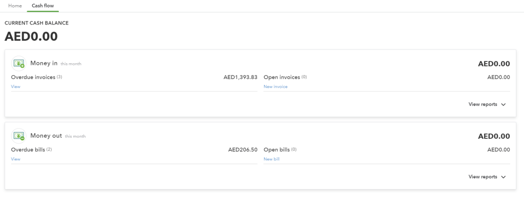
The bank accounts option shows the balance for the current account that you have connected to QuickBooks Online.
The Cash flow tab offers an overview of your current cash balance including money in (open and overdue invoices) and out (open and overdue bills).
The main idea of the built-in QuickBooks dashboard is to bring essential financial data to the forefront. This allows you to quickly assess your business performance. By the way, with the QuickBooks Online mobile app, you can access your dashboard and stay on top of your finances wherever you are.
How do I customize my dashboard in QuickBooks Online
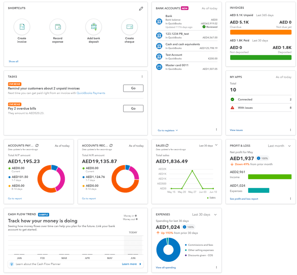
QuickBooks Online dashboard offers a default set of widgets, but you can also personalize the dashboard to prioritize the most relevant information.
Click Customize Layout in the top right corner of the dashboard. After that, you can relocate the widgets and add/remove widgets.
Here are the widgets you can add to your dashboard:
- Accounts Payable
- Accounts Receivable
- Bank Accounts
- Cashflow
- Expenses
- Invoices
- My apps
- Profit & Loss
- Sales shortcuts
- Tasks
Here is what your QuickBooks Online dashboard may look like with all widgets added.
Explore P&L dashboard examples available as free predesigned templates by Coupler.io.
Can I create a custom QuickBooks analytics dashboard from scratch?
As mentioned in a previous section, there is an alternative way to build a dashboard in QuickBooks. A custom dashboard enables you to extend the functionalities and capabilities of QuickBooks to meet the unique needs of your business.
The method of creating a custom dashboard relies on automated exports from QuickBooks using Coupler.io. This reporting automation platform lets you connect QBO to a spreadsheet app or data visualization tool and organize your data before loading it to the destination. Here is what it looks like.
1. Collect data
Select the destination for your data in the form below and click Proceed. You’ll be offered to create a Coupler.io account for free without any payment information required.
We’ve preselected QuickBooks as a data source but Coupler.io also allows you to export existing QuickBooks reports. Choose this option if needed.
With this dashboard, you can:
- Track overall revenue trends for the last 12 months to identify seasonal fluctuations, peak revenue periods, and unexpected dips that may signal collection issues or changing customer demand.
- Compare revenue and expenses to assess how well your business manages costs relative to income, providing insights for budget planning and identifying whether profitability is improving or declining over time.
- Identify your most valuable customers by revenue contribution to design targeted marketing efforts, develop customer retention strategies, and provide loyalty incentives for high-value clients who drive significant business.
- See which products or services generate the most revenue to understand demand patterns, manage inventory effectively, and adjust sales strategies based on the performance of high or low-performing offerings.
<!– wp:heading {“level”:3} –>
<h3 class=”wp-block-heading”>Expenses dashboard for QuickBooks</h3>
<!– /wp:heading –>
<!– wp:paragraph –>
<p>The dashboard tracks spending against budget across cost categories and accounts and gives finance managers and business owners a clear view of where actual costs diverge from plan. It shows how actual expenses compare to budgeted targets at both the summary and account level, which makes it a practical tool for anyone who needs to explain variances and course-correct during the period.</p>
<!– /wp:paragraph –>
<!– wp:acf/image-with-hover-link {“name”:”acf/image-with-hover-link”,”data”:{“hover_image”:78015,”_hover_image”:”field_6785a2717749d”,”hover_image_text”:”Expenses dashboard for QuickBooks”,”_hover_image_text”:”field_678633e57749e”,”hover_image_link_url”:”https://l.rw.rw/dashboards/quickbooks-expenses-dashboard”,”_hover_image_link_url”:”field_678634427749f”,”hover_image_link_text”:”Preview dashboard”,”_hover_image_link_text”:”field_679903b44a5ba”,”hover_image_link_target”:[“true”],”_hover_image_link_target”:”field_679903d54a5bb”},”mode”:”edit”} /–>
<!– wp:paragraph –>
<p>With this dashboard, you can:</p>
<!– /wp:paragraph –>
<!– wp:list –>
<ul class=”wp-block-list”><!– wp:list-item –>
<li>Compare actual expenses to budget month by month using the Expenses Actual vs Budget chart to see whether variances are isolated events or a widening trend that requires a budget revision before it impacts your bottom line.</li>
<!– /wp:list-item –>
<!– wp:list-item –>
<li>Identify exactly which accounts drove a budget overrun by reviewing the Expenses by Account name table, which shows absolute variance and variance percentage per account, so you can explain cost discrepancies line by line to leadership.</li>
<!– /wp:list-item –>
<!– wp:list-item –>
<li>Assess vendor concentration and prepare for contract renewals using the Top Vendors by Paid Bills table, which ranks suppliers by spend across the current month, last month, and the trailing 12 months in one view.</li>
<!– /wp:list-item –>
<!– wp:list-item –>
<li>Monitor cash balance, burn rate, and months of runway remaining alongside your expense data to evaluate whether current spending levels are sustainable given available reserves before committing to new costs.</li>
<!– /wp:list-item –></ul>
<!– /wp:list –>
<!– wp:paragraph –>
<p>The dashboard is available as a Looker Studio template with a built-in Coupler.io connector. You can load your data from QuickBooks in a few minutes by following the setup instructions.</p>
<!– /wp:paragraph –>
<!– wp:acf/dashboards-gallery {“name”:”acf/dashboards-gallery”,”data”:{“dashboards__title”:””,”_dashboards__title”:”field_660034e0cbfee”,”dashboards__item_0_title”:”Expenses dashboard for QuickBooks in Looker Studio”,”_dashboards__item_0_title”:”field_66003556cbff0″,”dashboards__item_0_description”:”Monitor QuickBooks expenses against budget across cost categories and accounts. Track how actual spend diverges from plan each month, identify which vendors drive the largest bills, and assess cash position and runway.”,”_dashboards__item_0_description”:”field_6600355ecbff1″,”dashboards__item_0_background”:”rgba(231, 243, 233, 1)”,”_dashboards__item_0_background”:”field_6600356ecbff2″,”dashboards__item_0_image”:78015,”_dashboards__item_0_image”:”field_6600358fcbff3″,”dashboards__item_0_sources_0_dashboards__source-icon”:”https://blog.coupler.io/app/uploads/2024/06/integrationquickbooks-1.svg”,”_dashboards__item_0_sources_0_dashboards__source-icon”:”field_660035b6cbff5″,”dashboards__item_0_sources”:1,”_dashboards__item_0_sources”:”field_6600359ccbff4″,”dashboards__item_0_dashboards__destination-icon”:”https://blog.coupler.io/app/uploads/2024/05/integrationlooker-1.svg”,”_dashboards__item_0_dashboards__destination-icon”:”field_660035cecbff6″,”dashboards__item_0_first__button-text”:”Try this report”,”_dashboards__item_0_first__button-text”:”field_6606fd946e600″,”dashboards__item_0_first__button-link”:”https://l.rw.rw/dashboards/quickbooks-expenses-dashboard”,”_dashboards__item_0_first__button-link”:”field_6606fdb46e601″,”dashboards__item_0_first__button-target”:”1″,”_dashboards__item_0_first__button-target”:”field_660bd98093f96″,”dashboards__item_0_second__button-text”:””,”_dashboards__item_0_second__button-text”:”field_6606fdf16e602″,”dashboards__item_0_second__button-link”:””,”_dashboards__item_0_second__button-link”:”field_6606fe0b6e603″,”dashboards__item_0_second__button-target”:”0″,”_dashboards__item_0_second__button-target”:”field_660bd9bf93f97″,”dashboards__item”:1,”_dashboards__item”:”field_66003530cbfef”},”mode”:”edit”} /–>
Then connect your QuickBooks account and specify what data you’d like to export: Account, Invoice, Payment, and many more.
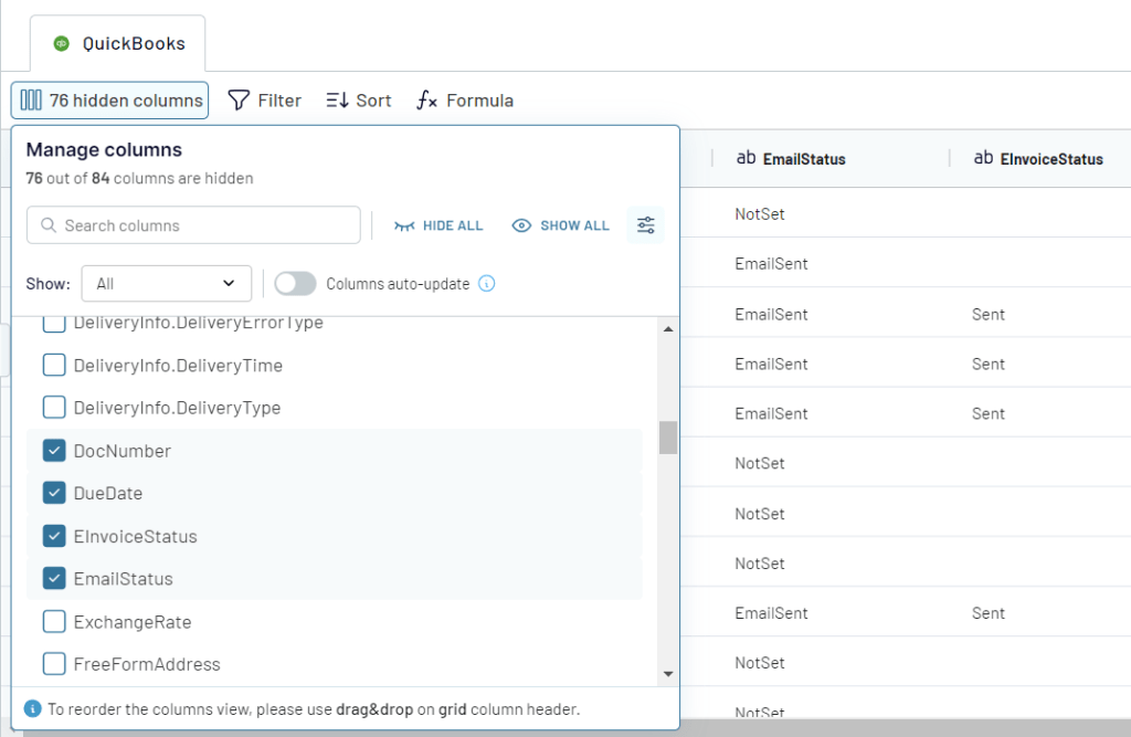
2. Organize data
At the next step, you can transform the selected data set to make it analysis-ready:
- Filter or sort data
- Hide unnecessary columns
- Rename existing columns, change their types, or add new calculable columns
- Blend data with information from other sources be it other data entities, QuickBooks accounts or applications.
3. Load data and visualize
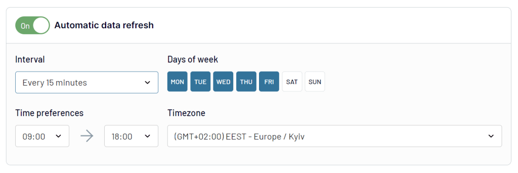
Once the data is ready, connect your destination following the in-app instructions. You can also enable the Automatic data refresh to make your future dashboard self-updating.
With your QuickBooks data loaded to a spreadsheet or a BI tool, you can design your dashboard as you want. Coupler.io supports the following apps for your consideration:
- Spreadsheet apps: Google Sheets, Microsoft Excel
- BI tools: Looker Studio, Power BI, Tableau, Qlik
Which option for a QuickBooks Online dashboard works best?
This article examined the QuickBooks Online dashboard, to help you to get the most out of this software. The platform’s visually appealing and sophisticated dashboard greatly helps take away the pain from business bookkeeping.
However, anyone engaging with financials knows that collecting and organizing data to build dashboards and derive meaningful insight takes a lot of effort. While QuickBooks provides a wealth of features and functionalities, custom dashboards could prove a real boon when you want to save time and do more with your data.