You’re drowning in data but starving for insights.
You spend more time cleaning and preparing data than actually analyzing it. Your morning routine involves jumping between platforms, exporting CSVs, copy-pasting into spreadsheets, and fixing broken formulas. And tomorrow looks exactly the same.
The world of data doesn’t have to be this way. Modern tools and smarter workflows can cut through the chaos—and you don’t need a data science degree or SQL expertise to use them.
This guide walks you through proven ways to reduce analytics complexity and deliver actionable insights faster. I’m talking about real solutions that work—centralization, automation, smart dashboards, and artificial intelligence that actually helps.
Why data analytics feels too complex
The frustration is real. Working with data in modern organizations has become genuinely complicated.
Gartner predicts organizations are abandoning 60% of AI data analytics projects by 2026. They struggle to analyze because of data that’s scattered across silos, riddled with quality issues, and nowhere near AI-ready.
So, why does data analytics feel so hard? Here’s what’s actually getting in your way:
- Your data sets are scattered across multiple platforms.
- Data quality issues like duplicates, missing values, and inconsistent formats are everywhere. These need serious data cleaning before anyone can use it.
- Large amounts of data overwhelm traditional tools.
- Hours wasted on manual data cleaning before you can even start analyzing.
- Stakeholders want answers today, but reports take days to build. By the time you deliver, the data is already outdated.
- Machine learning and algorithms feel out of reach, especially for beginners.
- Building useful dashboards with graphs and charts demands design skills you may not have.
The solution to these problems isn’t working harder—it’s working smarter.
When you simplify your analytics workflow, the whole picture shifts:
- Clean data sets in minutes instead of hours.
- Dashboards refresh automatically.
- Actionable insights reach stakeholders while they’re still relevant for decision-making.
- Systems grow with your data needs—new data sources and metrics integrate seamlessly without rebuilding workflows.
- Real-time access to key metrics becomes normal across teams.
- Data literacy improves company-wide, helping everyone understand and use insights.
Now let me walk you through exactly how to make it happen.
How to simplify data analytics: 7 steps
These seven steps give you a practical roadmap to streamline your workflow and handle complex data without hassles.
- Centralize your data sources
- Automate data flow
- Build clear, actionable dashboards
- Automate reporting
- Use no-code and low-code tools
- Standardize metrics and data sources
- Leverage AI for conversational analytics
Let’s walk through each one.
Step 1: Centralize your data sources
Your data sets are scattered everywhere. Customer info lives in your CRM, website performance sits in Google Analytics, financial reports are in QuickBooks, and marketing metrics hide across different ad platforms.
This setup naturally creates silos. Teams stick to the tools they use daily. Since the tools don’t share data with each other, teams can’t easily share insights either. Nobody sees how their numbers connect to what other departments are tracking.
The trouble hits when you need complete answers. How did marketing impact sales? You can’t just check one place. You jump between tools, export CSV files, paste numbers into spreadsheets, match date ranges, and decode which column names mean the same thing across platforms. Hours vanish just assembling the pieces.
The solution
Create one central repository where all your data sets live together. Make this the single source of truth that all teams access. Here’s how to do it:
1. Map your data landscape. List every platform you use for marketing, sales, finance, and operations. Include everything from major systems like your CRM to smaller tools like survey platforms.
2. Choose your central repository. Pick where all your data will live based on your needs:
- Spreadsheets (Google Sheets, Excel): Work well for smaller operations with basic needs.
- Data warehouses (BigQuery, Snowflake): Handle larger volumes and complex data.
- Business Intelligence tools (Tableau, Power BI): Combine storage with visualization capabilities.
3. Connect your data sources. Use data integration tools like Coupler.io that pull data from 390+ platforms and feed everything into your chosen repository automatically.
Connect over 400 data sources to over 15 destinations
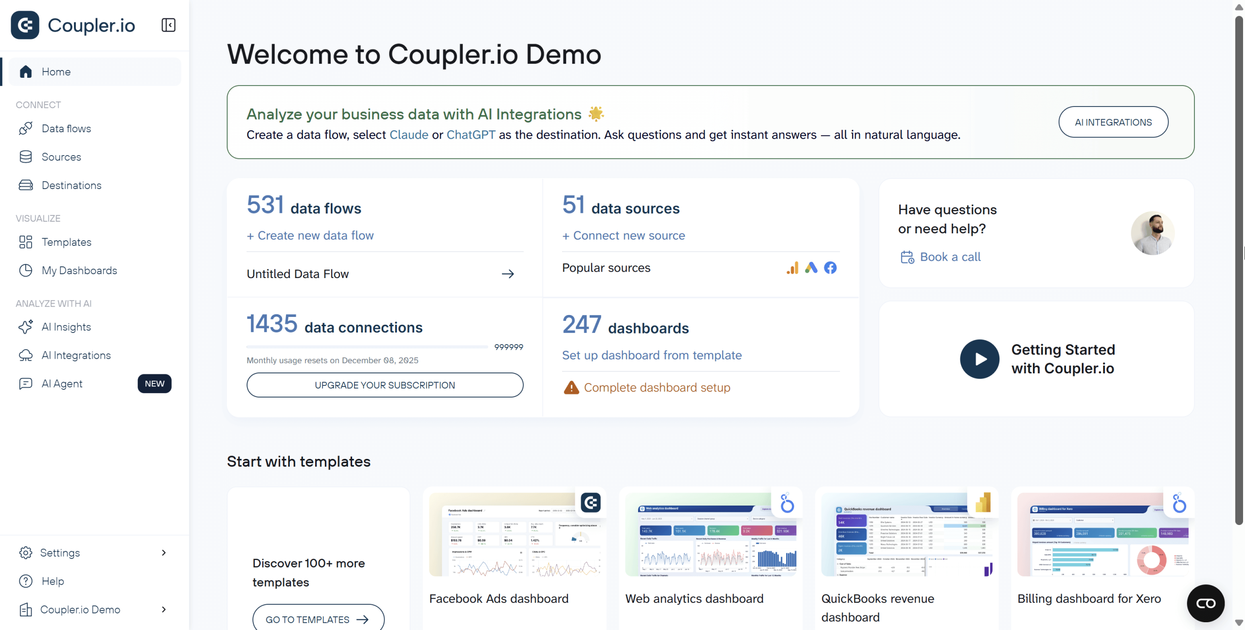 Try Coupler.io for free
Connect over 400 data sources to over 15 destinations
Try Coupler.io for freeThe impact
Time savings are immediate. Your team stops spending hours collecting data from different platforms and starts actually analyzing it. They find insights, spot trends, and answer real questions instead of playing data detective.
Cross-functional insights become possible. Marketing finally sees how campaigns affect sales pipeline velocity. Sales understands which lead sources convert best. Finance can track customer acquisition cost against lifetime value. These connections were always there—now they’re visible.
Communication improves across teams. When everyone pulls from the same central repository, they’re speaking the same language. Meetings shift from “let me pull those numbers” to “here’s what the numbers mean.”
Trust in data grows. One source of truth means no more conflicting reports. No more “which version is correct?” debates.
It’s important to note that centralization is your foundation when you work with multiple platforms. You can’t simplify complex data analysis until you first bring everything together in one place.
Step 2: Automate data flow
Getting data from source to destination sounds simple, but it’s messier than you think.
Your raw data might come in different formats. One platform may export dates as “Nov 20, 2025,” while your CRM uses “2025-11-20.” Revenue gets labeled “Total Sales” in one system and “Income” in another. Duplicates appear when the same customer exists in multiple systems. Missing values create gaps. Formatting errors break calculations.
Then there’s the data loading challenge. You need to map each field correctly to your destination. Which column goes where? Should you append or update?
Handling this manually drains hours every day. You extract, transform, and load. Tomorrow, you repeat. One simple mistake could make your data analysis sit on bad data.
The solution
Build automated pipelines that handle the complete flow from messy raw data to clean, analysis-ready information. This is where ETL (Extract, Transform, Load) comes in.
Learn what is ETL in our dedicated blog post.
An automated ETL pipeline works this way:
- Extract: The pipeline connects to sources automatically and pulls data on schedule. Hourly, daily, whatever you need. No more manual downloads or exports.
- Transform: The magic happens here. The pipeline standardizes dates, unifies field names, removes duplicates, fills gaps, and structures everything consistently. You set the transformation rules once, and they apply automatically to every data refresh.
- Load: Clean data lands in your repository with correct mappings every time. New records append, existing records update based on your rules, and nothing gets lost or duplicated.
Tools like Coupler.io simplify the entire process. It not only connects to 390+ data sources, but handles the complete ETL process through a visual interface. No coding required. You simply connect your sources, set your transformation rules, choose your destination, and schedule automatic refreshes.
Extract, Transform and Load your business data
 Try Coupler.io for free
Extract, Transform and Load your business data
Try Coupler.io for freeETL or ELT?
You might also hear about ELT (Extract, Load, Transform). The difference is simple: timing.
ETL transforms data before loading it. ELT loads data first, then transforms it. Which should you use?
| Choose ETL when you’re working with: | Choose ELT when you need: |
| Small to medium data volumes Standard analytics and reporting needs Limited storage capacity | Fast storage of large amounts of data Historical data analysis Frequently changing data sources |
For most situations, ETL is the way to go. You get clean, structured data ready to analyze right away, and you don’t need expensive cloud infrastructure to make it work.
The impact
Automating the data flow reduces complexity across your whole operation.
Time savings compound quickly. Teams typically spend 5-10 hours weekly on manual data tasks—exports, reformatting, copying, pasting. Automation reclaims that time for actual analysis. United Way NWI saved 80 hours monthly just by automating their marketing data flows with Coupler.io.
Data quality becomes consistent and reliable. Manual processes introduce errors every time someone copies data, mismatches a date format, or skips a transformation step. Automated pipelines apply the same rules identically every time. No copy-paste mistakes. No missed steps. No human error. Your analysis sits on solid information you can trust.
Scalability becomes effortless. Need to add a new data source? Connect it to your existing pipeline. Need to increase refresh frequency? Change one setting. Manual processes break down as data volumes grow. Automated pipelines just keep working.
Your focus shifts from preparation to analysis. When pipelines handle the grunt work, you spend your time finding insights, answering business questions, and driving decisions instead of fixing broken exports.
Step 3: Standardize metrics and data sources
Your data is centralized and flowing automatically. But before you build dashboards and reports, you need to align on what the numbers actually mean.
Even with clean, centralized data, the numbers still don’t match across teams.
Marketing says revenue is $500K. Sales says it’s $480K. Finance reports $520K. Everyone pulls from the same central repository, so why the difference?
The answer comes down to definitions. Marketing counts revenue when deals close, while sales counts it when contracts are signed. Finance counts it when payments actually arrive. Each team is technically correct based on their own definition, but the numbers never align.
This problem multiplies across other metrics. What counts as an “active customer”? Is it someone who logged in this month, someone who made a purchase, or someone who hasn’t churned? Different teams have different answers, which leads to different numbers.
Here’s the risk: if you build automated dashboards and reports without standardizing first, you’ll just automate the confusion. The “$500K vs $480K vs $520K” problem will appear in every report, every dashboard, every meeting.
The solution
Standardize your metrics definitions and data sources. Create one agreed version of truth that everyone follows.
Here’s how to do it:
Document every key metric. Create a shared document that explains what each metric means and how it’s calculated. For example:
Active Customer: Any customer with at least one login AND one transaction in the past 30 days. Excludes test accounts and internal users. Measured at month-end.
Clarify what’s included, what’s excluded, and what time period applies. Make sure everyone can access these definitions. For larger teams, it helps to assign an owner for each critical metric who can answer questions and approve updates.
Pick one official source for each metric. For example, decide that Revenue comes from QuickBooks, not your CRM. Customer count comes from your authentication system, not Google Analytics. This prevents teams from pulling the same metric from different places and getting different numbers.
Use standardized templates. Use pre-built reports and dashboards with approved metrics already configured. When teams use these templates instead of building their own, consistency follows naturally. The template ensures everyone calculates “conversion rate” the same way from the same source.
Enforce through governance. Make standardized reports the default option. When someone requests a custom report, ask if an existing template works first. You’re not blocking creativity—you’re preventing accidental inconsistency.
Review and update regularly. Business evolves, and definitions may need updates. Schedule periodic reviews to keep your standards current.
The impact
Reports finally align. When everyone uses the same definitions from the same sources, marketing’s revenue number matches finance’s revenue number. Meetings shift from reconciling conflicting metrics to discussing what those numbers actually mean and what to do about them.
Trust grows across teams. The “I don’t trust your numbers” skepticism disappears. When the CFO and CMO both pull from standardized reports, they’re speaking the same data language. Cross-functional collaboration improves because everyone works from shared truth.
Decision-making accelerates. Without metric debates eating up meeting time, discussions move straight to action. “Should we increase ad spend?” becomes a conversation about strategy, not about which revenue number to believe.
Scaling becomes manageable. As your organization grows and more people build reports, standardization prevents chaos. New team members learn the official definitions. New reports inherit the standards automatically. Your data ecosystem stays organized instead of fragmenting into dozens of conflicting versions.
This is how you achieve true unified analytics: one definition, one source, one number everyone trusts. Now you’re ready to build dashboards and reports on this solid foundation.
Step 4: Build clear, actionable dashboards
Your data is centralized and flowing automatically. Now you need to see and understand it.
Most teams face dashboard overload. They open a dashboard and see dozens of metrics staring back – revenue, conversion rates, customer satisfaction, bounce rates, ad spend, email opens, support tickets. Everything’s there, but which numbers actually matter right now? Where should you focus? Which metrics signal real problems versus normal fluctuations?
Even when you spot something important, the dashboard doesn’t provide clear next steps. Your team spends time trying to figure out what to do next instead of actually taking action.
The solution
Create dashboards that answer specific questions at a glance and guide users toward action.
Start with questions, not metrics. What decisions do users make daily? What numbers drive those choices? Build dashboards around these questions instead of displaying every available metric.
Limit what you show. Focus on five to seven key metrics per view. If everything looks important, nothing stands out.Put key metrics at the top in the largest size, followed by supporting data. Details live at the bottom or on secondary pages.
Choose the right visualization for each metric:
- Line charts for trends over time
- Bar charts for comparisons
- Pie charts for parts of a whole
- Bold KPI cards for single important numbers
Make it interactive. Let users filter and drill down with controls that are obvious and easy to use. Default date ranges to what’s most useful—for example, “last 30 days” works well for operational metrics.
Add benchmarks and context. Show current numbers alongside targets or historical averages. “Amount spent: $55K” means little on its own. “Amount spent: $55K (up 20% versus last month)” tells the full story.
Explore over 160 dashboard templates available for BI tools
 Try Coupler.io for free
Explore over 160 dashboard templates available for BI tools
Try Coupler.io for freeLeverage AI for deeper insights. Modern tools can guide users to what matters by highlighting key metrics, surfacing anomalies, and explaining insights automatically. Instead of just showing charts, AI delivers actionable insights—suggesting next steps and generating hypotheses that help non-experts make better decisions.
Use dashboards powered by AI insights
 Try Coupler.io for free
Use dashboards powered by AI insights
Try Coupler.io for freeThe impact
When dashboards guide instead of overwhelm, your team stops guessing what matters.
Decision-making speeds up because priorities are immediately clear. People stop scanning dozens of metrics trying to figure out what matters. The most important numbers are right there, contextualized and ready to act on.
Context builds confidence. When you see that revenue is up 15% versus last month and 8% ahead of target, you understand whether performance is good, bad, or normal. Well-designed dashboards teach while they inform. Data literacy grows naturally.
Action becomes the default. Clear thresholds and benchmarks move teams from “What does this mean?” to “Here’s what we should do.” When metrics exceed targets or fall below thresholds, the appropriate response is obvious.
AI amplifies the impact. It flags issues automatically and surfaces insights that would take hours to find manually. Anomalies don’t hide in the data until someone stumbles across them. Non-experts can make smart decisions without waiting for you to interpret everything.
This is how your organization becomes truly data-driven—not by having more data, but by making it easier to understand and act on.
Step 5: Automate report creation using templates
You have actionable dashboards built on clean, standardized data. However, creating new reports still requires manual work.
Sales asks for a weekly performance report. Marketing needs campaign summaries. Finance wants monthly overviews. Each request means starting from scratch—or at least copying an old report and adjusting it.
The process eats up time. You pick which charts to include, arrange the layout, connect data sources, and format everything to look professional. Then, you do it all again next week when another team makes a similar request.
Even with clean data and good design principles, the creation process is manual and repetitive.
The solution
Automate report and dashboard creation using templates.
Start with ready-to-use templates. Coupler.io offers two different types of templates to automate reporting.
- Data set templates automate data preparation. Pick a template like “PPC campaign performance” and connect your accounts. The template pulls the right metrics, blends multiple sources, and runs calculations automatically.
Get the clean and organized data sets right away
 Try Coupler.io for free
Get the clean and organized data sets right away
Try Coupler.io for freeYou get a clean, well-organized report table with exactly the metrics and dimensions you need. Send it to any of 15+ destinations in Coupler.io—spreadsheets, BI tools, data warehouses. Then create your own visualizations in your preferred tool.
- Dashboard templates skip straight to visualization. These come with charts and layouts already built. Pick a template for sales, marketing, or finance. Then, connect your data sources. Done. Your visual report appears instantly in Coupler.io’s Dashboard or your chosen BI tool.
Explore over 160 dashboard templates available for BI tools
Try Coupler.io for free
Explore over 160 dashboard templates available for BI tools
Try Coupler.io for freeBoth eliminate the manual work of creating reports from scratch. Pick whichever fits your workflow better.
Customize the templates. Tweak the details to match your exact requirements. For example, adjust which metrics appear, change date ranges, and swap bar charts for other visualizations.
Schedule automatic refresh. Set up a data refresh schedule so your reports always show up-to-date numbers without manual updates.

Let AI generate insights. Modern tools now include AI capabilities to create natural language summaries, highlight anomalies, and surface key takeaways automatically. Instead of manually interpreting every chart, you can ask questions in plain language and get answers instantly.
Automate report delivery. If needed, schedule reports to send via email or Slack on a regular basis, so stakeholders receive updates without asking.
The impact
Time savings multiply quickly. Building reports manually takes 2-4 hours each. If you create five reports weekly, that’s 10-20 hours gone—half your workweek. Automation reclaims that time for actual analysis instead of report assembly.
Stakeholders get information when they need it. Fresh data arrives on schedule. They stop asking “Can you send me the latest numbers?” because the numbers arrive automatically. Decisions happen faster because nobody waits for updates.
Consistency improves across your organization. Every report follows the same format. Metrics get calculated identically every time. Historical reports stay organized and comparable, making trend analysis actually possible.
AI-generated insights make reports self-explanatory. Plain-language summaries and highlighted anomalies mean non-experts can act on data without waiting for your interpretation. Reports shift from static documents to actionable intelligence.
Step 6: Use no-code and low-code tools
Traditional data analytics requires technical skills most business teams don’t have—and shouldn’t need.
- SQL to query databases.
- Programming languages to transform data.
- Coding knowledge to create visualizations.
- Expertise in algorithms to build models.
These barriers mean business teams can’t get answers without technical help.
So when marketing needs to analyze campaign performance, sales wants to track pipeline velocity, or operations needs to forecast inventory, every request goes into a queue. Technical teams and analysts become the gatekeeper. Insights slow down. Decisions wait. By the time they get answers, the opportunity may have passed.
The solution
No-code and low-code tools remove these barriers. They let anyone work with data regardless of technical background.
Understanding the difference
- No-code tools require zero coding. Everything works through visual interfaces, drag-and-drop builders, clickable flows, and pre-built templates. If you can use a spreadsheet, you can use these tools.
- Low-code tools handle most tasks visually but may need simple formulas or expressions for advanced features. Think Excel formulas, not Python scripts.
Tools by use case
For data integration and automation:
- Coupler.io: Connects 390+ data sources without code. Visual interface for building data flows, transformations, and automated reporting. Ideal for marketing, sales, and operations teams who need data centralized but lack technical resources.
For visualization and dashboards:
- Klipfolio: Drag-and-drop dashboard builders. Connect data sources and build visualizations without writing code.
- Looker Studio (free): Google’s BI tool with templates and visual builders. Good starting point for teams on a budget.
- Power BI, Tableau: More powerful with visual interfaces, but advanced features (calculated fields, complex transformations) require formula knowledge—making them low-code rather than true no-code.
For basic analysis:
- Google Sheets, Excel: Built-in pivot tables, charts, and basic functions. Great for smaller data sets and simple analysis without learning new tools.
The impact
Business teams become self-sufficient. Marketing pulls their own ad performance data instead of submitting tickets. Sales builds their own pipeline reports instead of waiting. Operations tracks inventory in real-time without technical help. Questions that took days now get answered in minutes.
Technical teams focus on high-value work. Data analysts and engineers stop handling routine requests. They focus on complex problems instead: building predictive models, optimizing data architecture, solving strategic challenges. One Coupler.io customer freed up 80 hours monthly for their analytics team just by automating routine data requests.
Decisions happen faster. When anyone can explore data, insights don’t wait in a queue. Teams test hypotheses, spot trends, and adjust in real-time. The gap between question and action shrinks from days to hours.
Data literacy grows naturally across your organization. When people interact with data directly, they develop intuition about what metrics mean, how they connect, and what drives changes. This understanding spreads through teams organically.
Here’s the key: no-code tools don’t replace technical expertise. They free it to focus where it matters most while empowering everyone else to get the answers they need.
Step 7: Leverage AI for conversational analytics
You’ve centralized your data, automated your pipelines, standardized your metrics, built clear dashboards, automated reporting, and empowered teams with no-code tools. Now you have a solid analytics foundation. But sometimes you just want a quick answer without building a new report.
Traditional analysis takes time. Even with good dashboards, you’re limited to what’s already been built. Spotting unexpected patterns means digging through multiple views. Following a hunch requires manual work. The exploratory, curious side of data analysis gets slowed down by process.
What if you could just ask a question and get an answer instantly—like having a conversation with your data?
The solution
Conversational analytics lets you explore data through natural dialogue. You ask questions in plain language. The AI queries relevant data, runs the analysis, and responds in seconds.
Instead of clicking through dashboards or building queries, you have a conversation:
- “Which campaigns brought the most revenue last quarter?”
- “Why did churn spike in March?”
- “Show me sales trends by region.”
The AI answers your question, and you can follow up naturally with more questions. One insight sparks your next question. You explore naturally through conversation instead of building multiple reports or switching between tools.
How conversational analytics works
Modern LLM tools like ChatGPT, Claude, and Gemini make this possible. But implementation requires thoughtful setup:
1: Prepare your data context
AI needs clean, structured data with clear field names and definitions.
This is where your earlier work pays off—centralized data (Step 1), automated pipelines (Step 2), and standardized metrics (Step 3) create the foundation that conversational AI needs.
2: Use a secure integration layer
Never send raw data directly to LLM platforms. Once your data leaves your control, you can’t guarantee security.
Use tools like Coupler.io as a secure intermediary layer. Here’s how it protects your data:
- Your sensitive data stays in Coupler.io (SOC 2 certified, GDPR and HIPAA compliant)
- You control exactly what filtered, aggregated data gets shared with AI
- Raw customer records, financial details, and PII never touch external AI platforms
- The AI receives only the context it needs to answer your specific question
Integrate your data with AI using Coupler.io
 Get started for free
Integrate your data with AI using Coupler.io
Get started for free3: Start with guided prompts
Generic questions get generic answers. Effective conversational analytics requires strategic prompting:
- Be specific: “Show me conversion rates by traffic source for paid campaigns in November” beats “What’s our conversion rate?“
- Provide context: “Our target conversion rate is 3%. How does this month compare to the target and last month?“
- Ask for insights, not just data: “What factors might explain the drop in mobile conversions?“
- Request actionable next steps: “Based on this analysis, what should we test first?“
4. Iterate and refine
Conversational analytics shines in exploration. Follow up naturally:
You: “Which products had the highest return rate last quarter?”
AI: “Product A: 15%, Product B: 12%, Product C: 8%…”
You: “Why is Product A’s return rate so high? Show me the customer segment.”
AI: “Product A returns are concentrated in the 18-25 age segment…”
You: “What were the most common return reasons for that segment?“
This natural flow would require building multiple custom reports traditionally. Now it’s a 60-second conversation.
Tools and platforms
- ChatGPT, Claude, Gemini: General-purpose LLMs that can analyze data when properly integrated.
- Coupler.io: Secure data layer that connects your sources to AI tools while protecting sensitive information.
- Tableau Pulse, Power BI Copilot: BI tools adding native conversational features, though they lock you into their ecosystem.
The impact
Conversational analytics represents the culmination of everything you’ve built. Without centralized, clean, standardized data, AI gives unreliable answers. With that foundation in place, conversational analytics becomes transformative.
Exploration becomes instant. Questions that would take 30 minutes to answer manually—pulling data, building visualizations, calculating comparisons—now get answered in 30 seconds. You spend time thinking about insights instead of preparing to find them.
Pattern discovery happens naturally. Traditional analysis requires you to form hypotheses first. Conversational analytics lets you explore freely. Ask “What patterns am I missing in my dashboard?” and AI surfaces correlations, anomalies, and trends you weren’t specifically looking for.
Non-experts become data explorers. Your marketing manager doesn’t need to know SQL or understand dashboard filters. They ask questions like they’d ask a colleague: “Why did our email performance drop?” The AI translates natural language into analysis.
Decision cycles compress dramatically. Meetings shift from “Can someone pull those numbers?” to real-time exploration. Questions arise, get answered immediately, and spark follow-ups—all in the same conversation. What used to take days now happens in minutes.
The future isn’t choosing between dashboards and AI. It’s using AI to make your dashboards smarter and your exploration faster. Steps 1-6 make Step 7 possible. And Step 7 multiplies the value of everything that came before.
How Coupler.io helps you simplify data analytics
Seven steps might sound like a lot. The good news is that they build on each other, and many share the same foundation: clean, connected, accessible data.
Coupler.io helps you build that foundation. It plays a role in all seven strategies—handling some directly, like data centralization and automated pipelines, while feeding the right data to BI tools and AI platforms.
Where Coupler.io fits in each step:
- Step 1 (Centralize) – Connects all your sources into one place.
- Step 2 (Automate flow) – Handles the complete ETL/ELT pipeline.
- Step 3 (Dashboards) – Feeds clean data to your BI tools. It also has an “AI Insights” feature built in its Dashboard that helps generate insights and summaries.
- Step 4 (Automated reporting) – Provides report templates with automatic refresh.
- Step 5 (No-code) – Works entirely without coding.
- Step 6 (Standardize) – Provides templates with consistent metrics.
- Step 7 (AI analytics) – Acts as a secure layer between your data and LLMs.
Here’s how it works:
1: Create your data flows. Log into Coupler.io to start creating a new data flow. It supports 390+ data sources: CRMs, ad platforms, accounting tools, spreadsheets, databases—you name it. Select your sources and authenticate. You can also start with ready-to-use data set templates that pull the right metrics automatically.

2: Organize your data. Your raw data rarely arrives ready to use. Coupler.io handles data cleaning automatically. It standardizes formats, removes duplicates, and structures everything consistently. You can also apply filters, create calculated fields, and combine data from multiple sources into one unified view.
Click Data sets to view and transform your data:

3: Load into your preferred destination. Send your clean data wherever you need it. Export to Google Sheets, Excel, BigQuery, Looker Studio, Power BI, Tableau, or other destinations. You can also connect directly to AI tools like ChatGPT and Claude for conversational analytics—with full control over what data gets shared.
4: Set up automatic refresh. Configure your data to refresh on schedule. Hourly, daily, weekly—whatever fits your needs. Your dashboards, reports, and AI tools always show current information without manual updates.
Now, the foundation of your “simple” data analytics is ready. Coupler.io is one platform supporting your entire analytics workflow.
Automate data flows for analytics with Coupler.io
Get started for freeReal success stories: How companies streamline data analytics
Understanding steps is useful, but seeing them in action makes all the difference.
The three organizations below faced the same challenges you’re probably dealing with right now—scattered data, manual reports eating up hours, and stakeholders waiting too long for answers. Each one took a different approach to fix their workflows and got measurable results they didn’t have to guess at.
Case study 1: Fable – Saving $60K annually with centralized data

The problem: Fable sells mushroom-based meat alternatives across Australia, UK, and US. Each region ran its own inventory system (separate Fishbowl instances) and financial system (separate Xero entities).
This fragmentation caused real problems. Inventory data sat scattered across files and people. Products approached expiration before anyone noticed. Financial reporting meant manually gathering data from different entities, converting currencies, and piecing everything together. Data often didn’t align. The process was slow and error-prone.
The solution: Fable used Coupler.io to automate data collection from all their inventory and financial systems into BigQuery, then connected everything to Power BI. Three live dashboards now display the complete picture: inventory levels across all locations, consolidated finances in a single currency, and customer order history—all updating daily without manual work.
The results: Product expiration dropped to 0%. Budget variance fell to 6-8%. Fable saved one full-time data analyst worth of work—over $60K yearly. Stakeholders now pull their own reports instantly.
Case study 2: United Way NWI – Automating marketing reports to save 80 hours monthly

The problem: United Way Northwest Indiana is a non-profit helping residents facing homelessness, addiction, and financial hardship. Their marketing data lived in silos—Facebook Ads, Google Ads, Google Search Console, and GA4 all tracked separately. Manual data collection consumed roughly 80 hours per month. Their spreadsheets were filled with formula errors and sometimes had no visualization at all. Stakeholders received inconsistent reports, leading to confusion and poor decision-making.
The solution: Coupler.io connected all ad platforms and analytics tools into pre-built Looker Studio dashboard templates. PPC reports, search console data, and GA4 metrics now flow automatically into ready-made dashboards—no manual exports needed. Setup took three weeks.
The results: United Way NWI saved 80 hours monthly and $20,000 yearly on manual labor. Stakeholders from marketing to board members now access intuitive data visualization in real-time. The organization expects to redirect those savings toward an additional $50,000 in donations through faster, smarter campaign decisions. Using plug-and-play templates let them automate data analytics without building reports from scratch.
Case study 3: ULTRA\OPS – Automating data flow to cut dashboard build time by 90%

The problem: ULTRA\OPS is a digital consultancy that built a custom campaign management app in Airtable for an advertising client. The client needed to analyze campaign performance across platforms like Meta, TikTok, and DV360. But Airtable’s native reporting couldn’t handle their data needs. Building a custom API connection would be complex data work—expensive and time-consuming. Manual exports weren’t scalable.
The solution: ULTRA\OPS used Coupler.io to automate data flow from Airtable directly to Looker Studio. Setup took one day—creating views, configuring data flows, and building dashboards.
The results: Development time dropped 90%. The client went from static views to enterprise-grade data visualization overnight. The pipeline runs on autopilot. By choosing to automate data collection instead of custom coding, ULTRA\OPS delivered advanced business intelligence dashboards faster and cheaper.
Can AI make a path to easy data analytics?
Short answer: yes, but not alone.
Throughout this guide, you’ve seen how AI fits into the bigger picture. Smart dashboards highlight anomalies and generate summaries automatically. Conversational analytics let you ask questions in plain English and get answers in seconds. These tools turn hours of manual exploration into quick conversations with your data.
But AI works best when your foundation is solid. That means centralizing your sources, automating your pipelines, and standardizing your metrics first. Without that groundwork, even the smartest AI tools struggle to deliver reliable answers.
The best results happen when you combine approaches:
- Automate the tedious work so your team focuses on analysis
- Build clear visuals that guide decision-making
- Invest in data literacy so everyone can interpret insights
- Layer in AI to accelerate exploration and surface hidden patterns
Start with one step. Build from there. You don’t need all seven at once—even two or three will make a difference.