Supply is the quantity of products or services available to consumers. Demand is the quantity of products or services that consumers are willing to pay for. The analysis of demand and supply is meant to examine the interaction between buyers and sellers, and answer such questions as:
- Can you cover the consumer’s needs in a product/service?
- Are the prices of a product/service affordable to consumers?
- What is the time of peak demand for a product/service?
- How to achieve equilibrium – the point where demand equals supply?
- and many others.
To perform this analysis, you need two things: data and a tool for calculation. In this blog post, we’ll show how you can analyze supply and demand in Google Sheets, and which formulas/functions can do the job. Here we go!
Demand and supply analysis example in Google Sheets
As an example, we’ll take the data of a vehicle for hire or taxi service, like Uber or Bolt. The equilibrium point for such services is when the number of drivers available equals the number of users looking for a ride. To develop an analysis of the data, first we need to import it to a spreadsheet.
Import data to Google Sheets
You can import data manually or automatically. The manual way is from the following menus:
File => Import => Upload => Select a file from your device
For automatic data import, you’ll need Coupler.io. It is a solution to automate exports of data to Google Sheets, Excel, or BigQuery from various sources, including CSV, BigQuery, Airtable, and many more.

In our case, the data we need is stored in two CSV files. Here is a detailed guide on how to import data from a CSV file on Google Drive.
We’ve set up two CSV importers to import data from two separate CSV files. Here is what we’ve got:
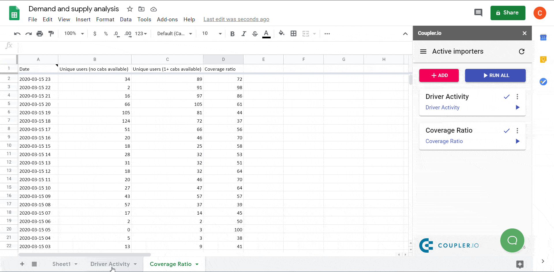
Now we can solve a few tasks within the supply and demand analysis.
Task 0: Merge sheets into one
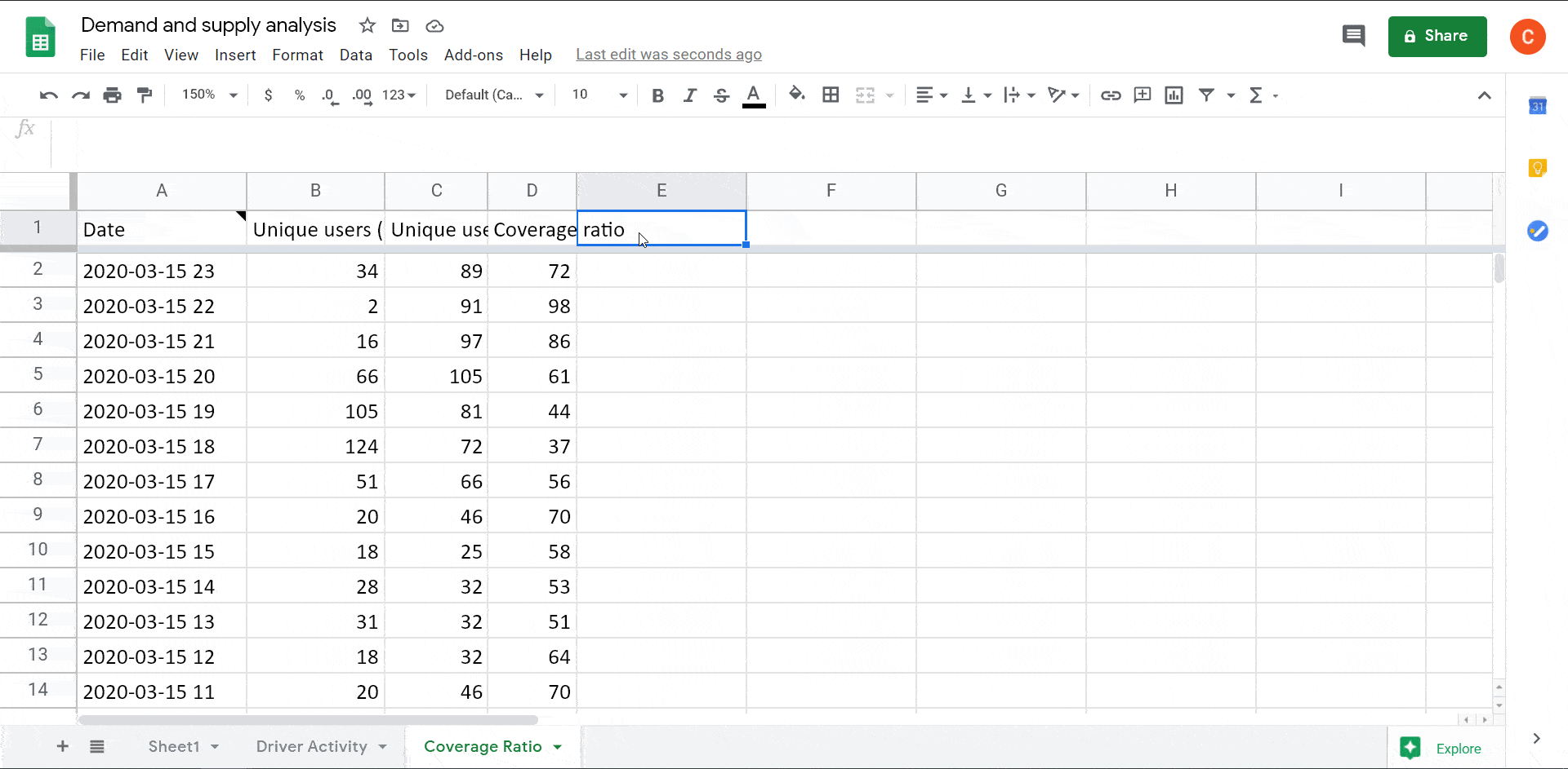
It’s a data preparation task to merge the imported data into a single sheet. Also, the date values are in “yyyy-mm-dd hh” format (e.g., 2020-03-15 13). Let’s split the Date column into two new columns (Time and Date), as well as make a separate column with weekday values.
Splitting the date-time values into date and time
Add names to the columns E and F of the Coverage Ratio sheet, named Date and Time respectively. Apply the following formula to the E2 cell:
=arrayformula(
   if(
      isblank(A2:A),,split(A2:A," ")
   )
)
If your date values are in numeric format like this: “43905“, apply the Date format to the E column.
Read more about splitting data in Google Sheets.
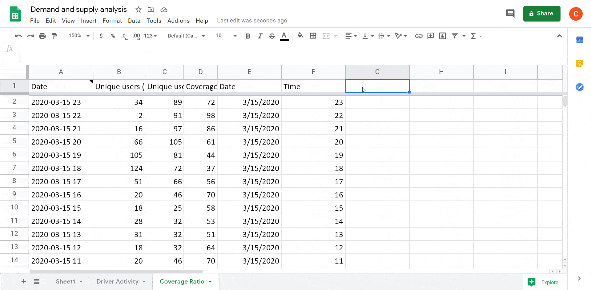
Create a column with weekday values
Name the G column in the Coverage Ratio sheet, and apply the following formula to the G2 cell:
=arrayformula(
   if(
      isblank(E2:E),,text(weekday(E2:E),"dddd")
   )
)
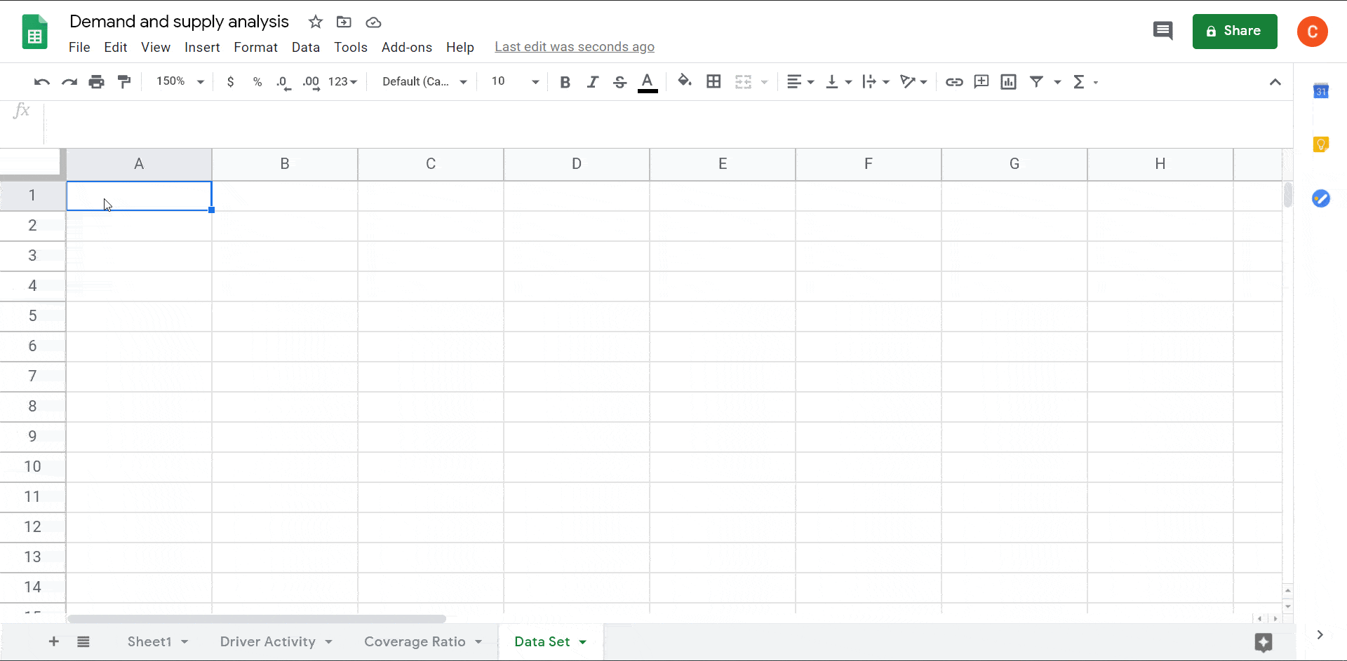
Merge data from two sheets into one
Now we need to create a separate sheet (Data Set) and reference columns from both sheets (Coverage Ratio and Driver Activity) in a specific order. Let’s do this using the QUERY Google Sheets function as follows:
=query(
{'Coverage Ratio'!A1:G,'Driver Activity'!A1:I},
"select Col5,Col6,Col7,Col2,Col3,Col4,Col9,Col10,Col11,Col12,Col13,Col14,Col15,Col16"
)
Now we can analyze our data.
Task 1: Curve of average supply and demand
First, we need to define what the Supply and Demand is, and convert these metrics into common units – minutes.
Supply formula example
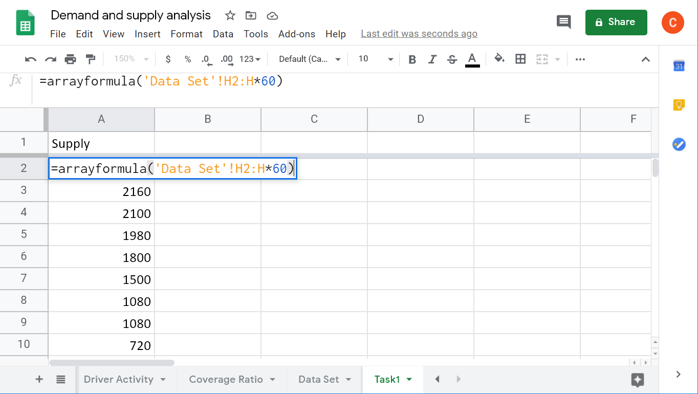
Supply is the maximum amount of time that drivers can offer. We have these values in the column “Available online (hours)”. So, to convert these values to minutes, apply the following ARRAYFORMULA:
=arrayformula('Data Set'!H2:H*60)
'Data Set'!H2:H– Available online (hours) column
Read more about Google Sheets ARRAYFORMULA.
Demand formula example
Demand is defined as the number of users who used the app to order a ride (columns: nocabs available and 1+ cabs available) multiplied by the amount of time required, i.e. an average ride duration.
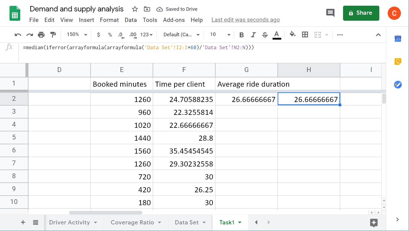
Average ride duration
The average ride duration is the median of the ride time per client. To calculate the time per client, we need to convert the number of Booked hours into minutes and divide into Completed rides. Here is the formula:
=median(
   iferror(
      arrayformula('Data Set'!I2:I*60/'Data Set'!N2:N)
   )
)
arrayformula('Data Set'!I2:I*60)– Booked hours converted into minutesiferror(arrayformula(E2:E/'Data Set'!N2:N))– Time per one client
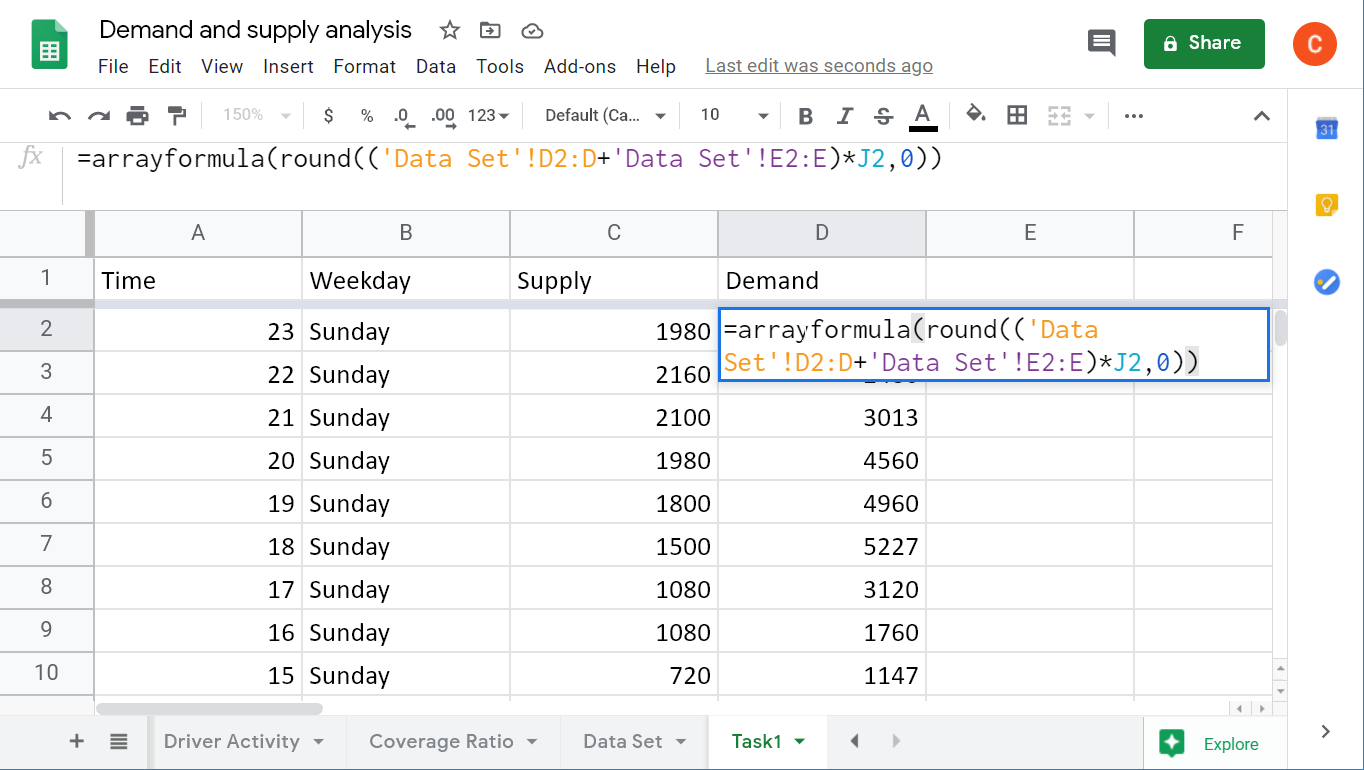
Demand
With the average ride duration calculated, we can apply the following formula to define the Demand:
=arrayformula(
   round(('Data Set'!D2:D +'Data Set'!E2:E)*J2,0)
)
('Data Set'!D2:D +'Data Set'!E2:E)– the sum of users who did find any available drivers (no cabs available) and those who found one or more available drivers (1+ cabs available)J2– average ride duration
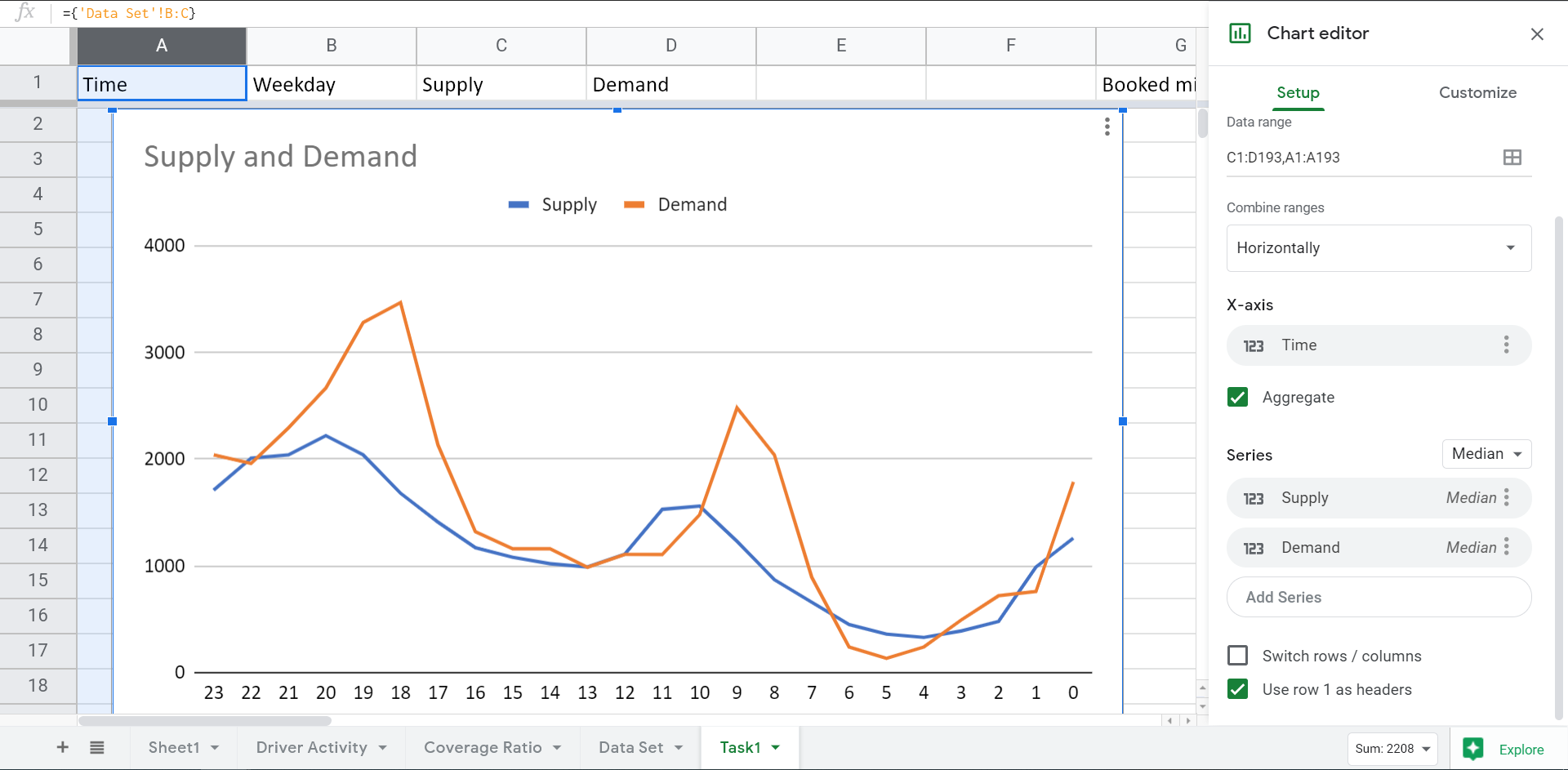
Supply and demand curve
With the power of Google Sheets, we can insert a Line chart with the Supply (C1:C193) and Demand (D1:D193) series, as well as Time (A1:A193) as the X-axis.
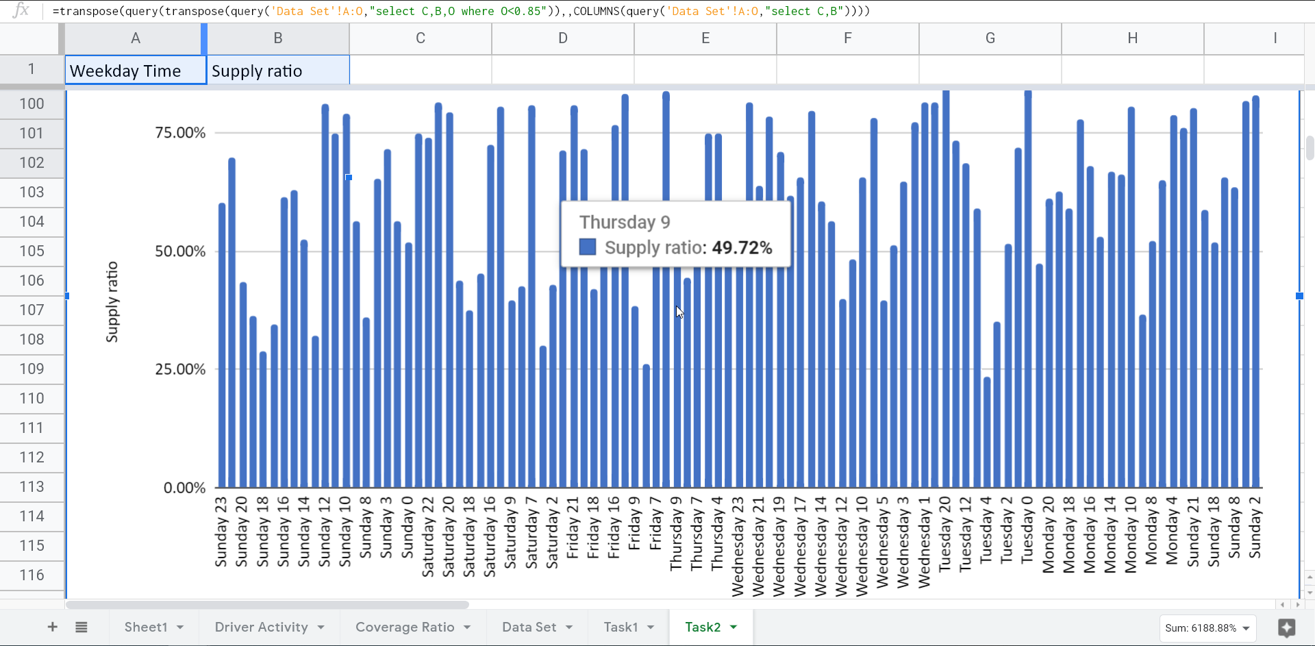
Task 2: Visualize the undersupplied hours
To define the hours with the lack of supply during a weekly period, we need to calculate the Supply Ratio. This is the ratio between the supply and demand. Let’s calculate this metric in the Data Set sheet using the following formula:
=arrayformula(Task1!C2:C/Task1!D2:D)
Task1!C2:C– SupplyTask1!D2:D– Demand
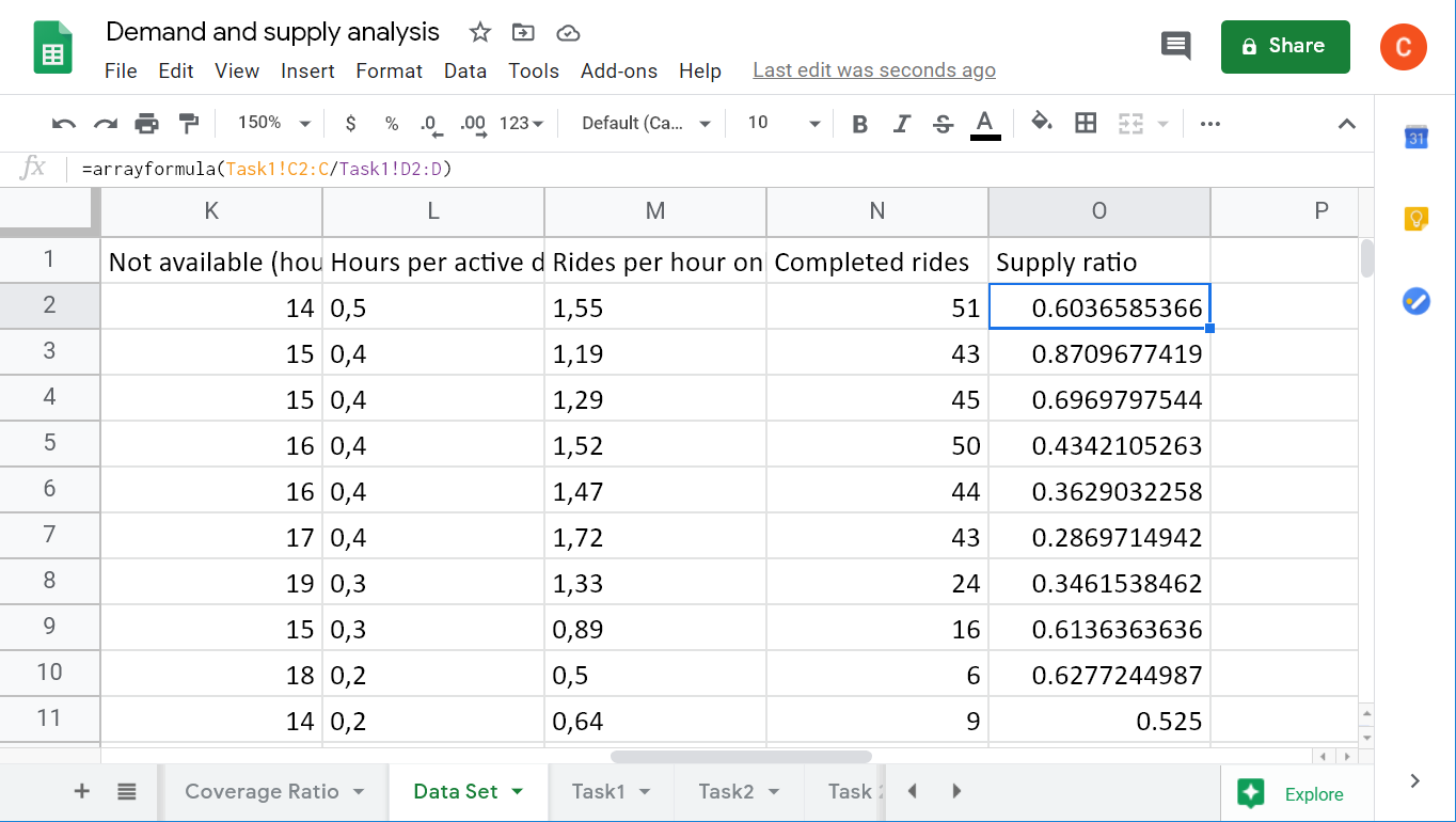
Format the column as a percentage if needed.
Now, we need to choose the periods where the Supply Ratio is less than 85% to filter for undersupply, and show only critical numbers. Since we’re going to visualize the undersupplied hours, let’s combine the Weekday and Time columns. Here is a complex formula to do filtering and merging at one time:
=transpose(
   query(
      transpose(
         query('Data Set'!A:O,"select C,B,O where O<0.85")
      ),,
      columns(
         query('Data Set'!A:O,"select C,B")
      )
   )
)
transpose(query('Data Set'!A:O,"select C,B,O where O<0.85")– transposes the columns Weekday, Time, and Supply ratio filtered by the Supply ratio < 0.85columns(query('Data Set'!A:O,"select C,B"))– returns the number of queried columns (Weekday and Time)- The major transpose function transposes the columns, which have been transposed initially, and merges two of them (Weekday and Time)
After that, we can insert a Column chart to visualize the undersupplied hours:
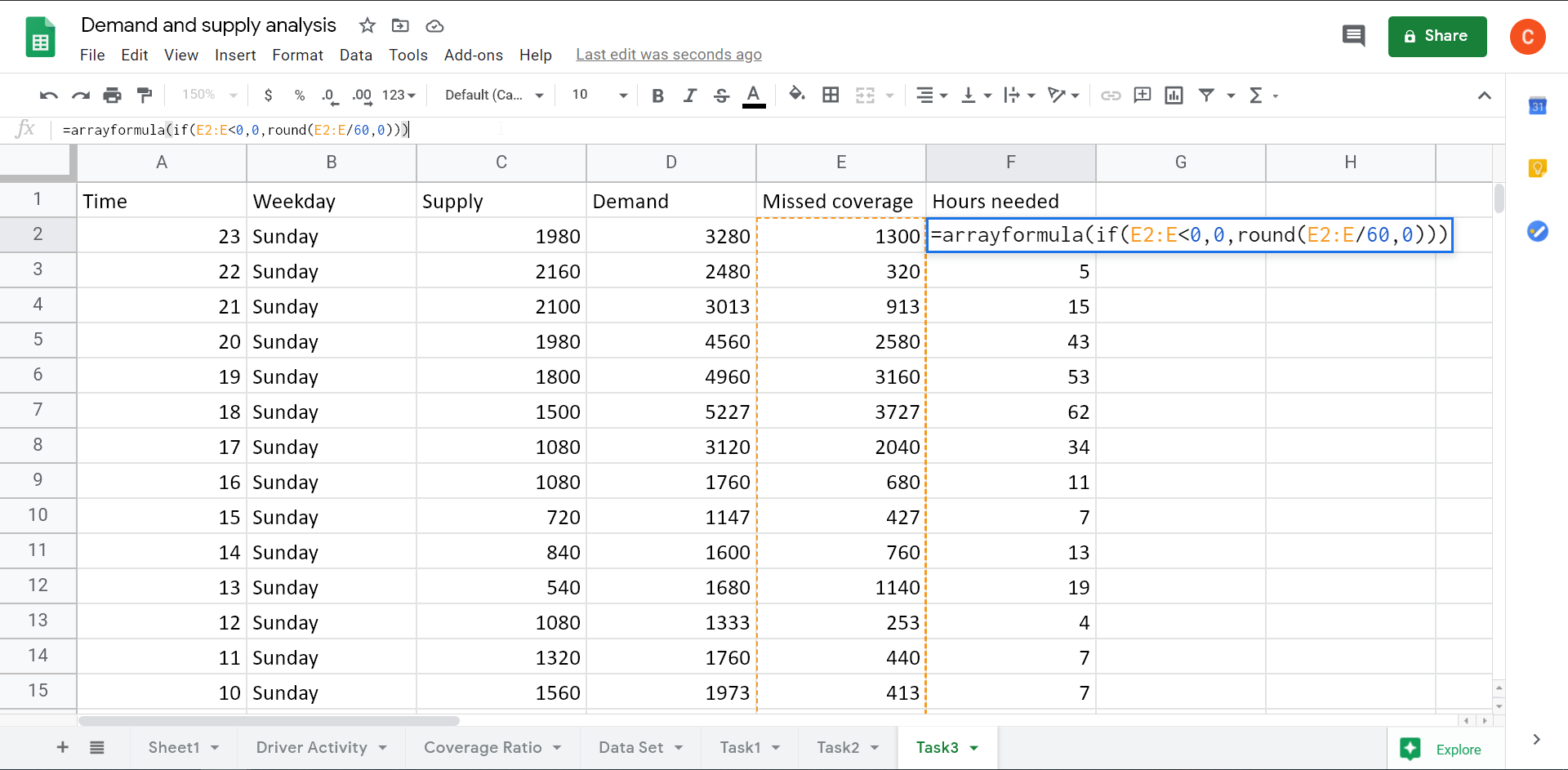
Task 3: Estimate the number of hours needed to ensure a high Coverage Ratio during the peak hours
If you check the data set, you’ll see that there is a mismatch between the Coverage Ratio (the source metric) and the Supply Ratio (the calculated metric). So, let’s stick to the Supply Ratio for this task. To calculate the hours needed, we need to determine the missed coverage (in minutes), which is the difference between demand and supply. Here is the formula:
=arrayformula(Task1!D2:D-Task1!C2:C)
Task1!D2:D– DemandTask1!C2:C– Supply
Based on this metric, we can estimate the hours needed:
=arrayformula(
   if(A2:A<0,0,round(A2:A/60,0))
)
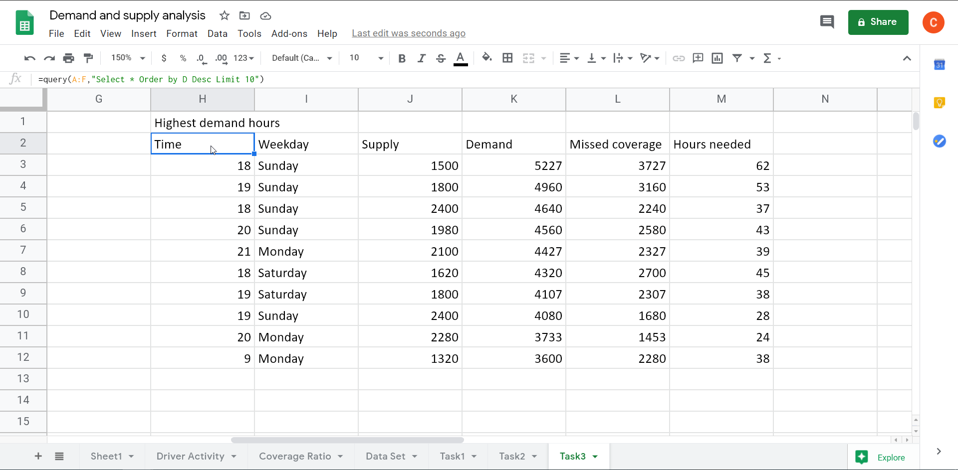
And here are the top 10 hours with the highest demand:
=query(A:F,"Select * Order by D Desc Limit 10")
Supply and demand analysis findings
All the calculations we made would be useless if they did not lead to valuable conclusions. In our case, they do. According to the supply-demand analysis, extra attention should be paid to early morning hours on weekdays, when the demand is considerably higher than the supply. Therefore, users will pay more than usual: we cover the demand by increasing drivers’ rate during that time. There is an opportunity to switch drivers from midday (period of oversupply) to mornings and evenings (period of undersupply).
You’ve probably noticed some other findings. Feel free to provide them in the comments section. We hope that this example of supply and demand analysis will be useful for your data analyses. Good luck!