Improving Performance With Dashboard Reporting: Dashboard Types, Examples, and Best Practices

Reports are an essential part of all major business processes. From sales and marketing reports to financial reports – summarizing data for review can help you make your organization more efficient.
In this article, we’ll explore the main dashboard types, interactive dashboard examples, best practices for dashboard reporting, and introduce some free dashboard templates.
What is dashboard reporting?
This is a method of presenting data in an organized way with a series of visualizations, such as tables, charts, and graphs. Professionally built dashboards can be essential analytical tools that allow businesses to quickly identify trends, spot existing patterns, and make predictions for the future. In general, dashboards help organizations better understand their performance, monitor progress, and obtain valuable insights.
Dashboards can also be powered with AI to provide summaries, recommendations, or even conversational analytics. Learn more about AI reporting in our blog post.
Main types of dashboards to use
Data visualization can take many forms depending on your goals. If you need to track key metrics to analyze business performance, you can use a table with scorecards and bar charts, for example. Or, if you want to analyze where your most active or promising audience is located, you can include map charts in your report.
Different dashboards serve different purposes, and the best way to build useful custom dashboards is to analyze your primary goals. Once this is done, you can decide which metrics and KPIs should be included and how to better present them.
Types of dashboards by purpose
| Type | Description |
|---|---|
| Operational dashboard | Provides an overview of key performance indicators and metrics to support high-level decision-making, with a focus on tracking progress toward long-term goals. |
| Strategic dashboard | Provides an overview of key performance indicators and metrics to support high-level decision-making, with a focus on tracking progress towards long-term goals. |
| Analytical dashboard | Emphasizes data analysis and exploration, often incorporating advanced visualizations and tools to uncover insights and relationships between various data points. |
Here’s an example of an operational dashboard – Revenue overview dashboard for QuickBooks. Like all operational dashboards, it provides a concise overview of the process, highlighting it from various perspectives. In particular, the dashboard helps you monitor the operating activities by giving a month-by-month overview of invoices, products, and customers.
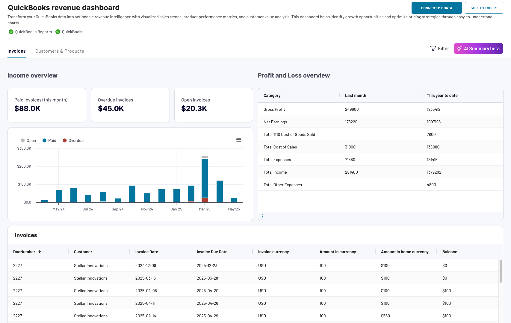
This revenue overview dashboard is available natively in Coupler.io (equipped with AI insights) and as a free template in Looker Studio, Power BI, and Google Sheets. To get the dashboard, open the template and navigate to the Readme tab to see how to use it.


Types of dashboards by features
| Type | Description |
|---|---|
| Interactive dashboard | Allows users to interact with data and visualizations, making it possible to drill down into specific details or to explore data from different perspectives. For example, you can switch between different time ranges, and the dashboard will show the information related to the specified period. |
| Self-updating dashboard | Automatically refreshes your metrics in real-time without any manual effort. This can be especially useful if your dashboard needs to represent data collected from multiple sources – in this case, automatic updates can save you a significant amount of time. We’ll explain how to build such a dashboard later. |
| Static dashboard | Displays static data and metrics without allowing for interaction or real-time updates. An example can be a visualization created by a designer in such apps as Figma or Photoshop. Basically, this is a static image, often made to be used in a deck, e-book, or other assets. |
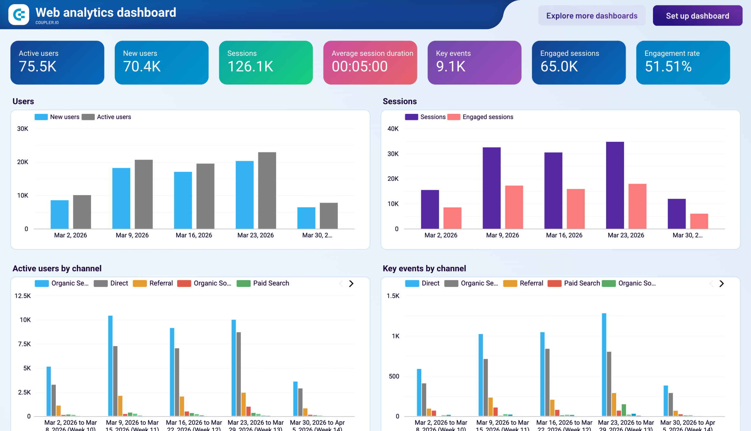
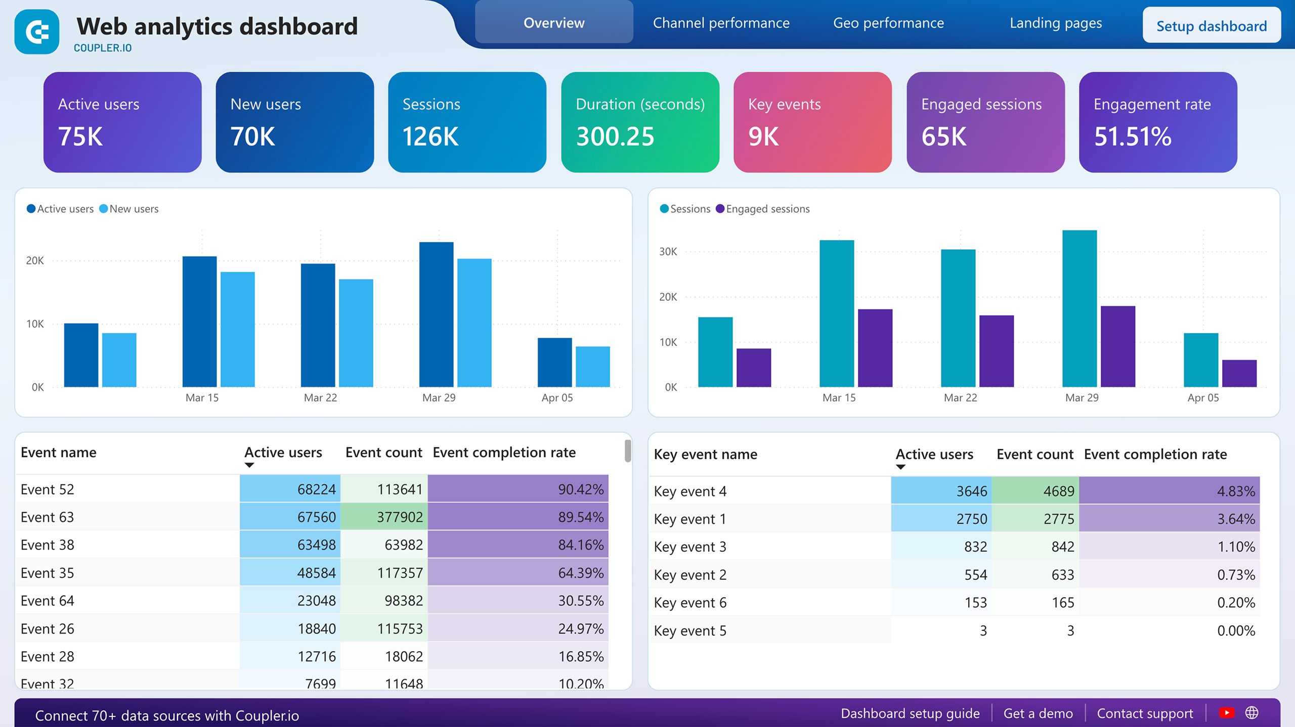
Here’s an example of an interactive self-updating dashboard for web analytics. It allows you to monitor incoming traffic and user activity on your website. Thanks to the interactive elements, you can switch between different periods, compare performance by channel, and filter results by country, campaign, traffic source, device category, etc.
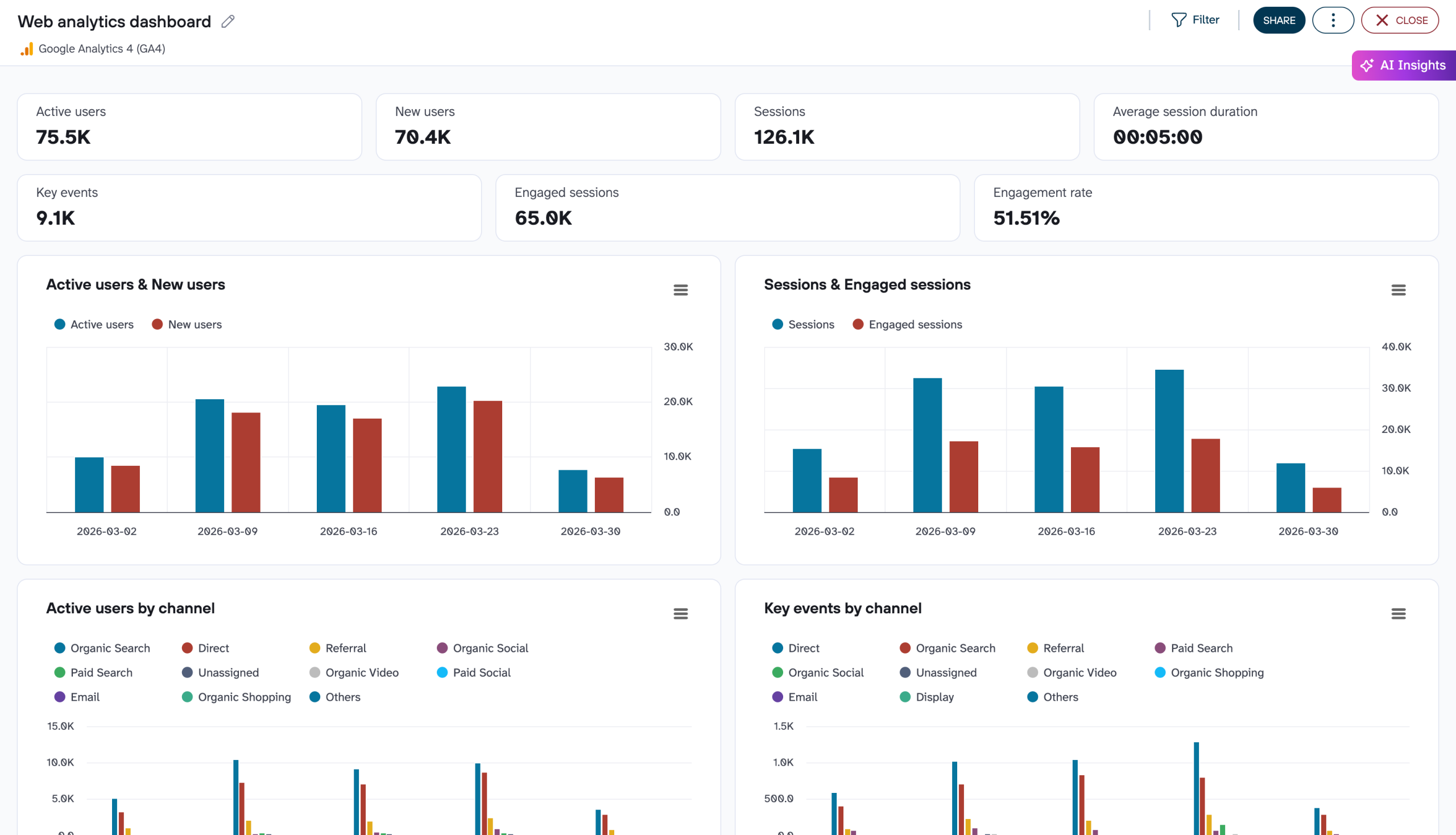
The dashboard is automated with the help of Coupler.io, a data analytics and automation platform. Thanks to this, it updates automatically on a schedule. You can use it right in Coupler.io or in one of the external reporting tools.


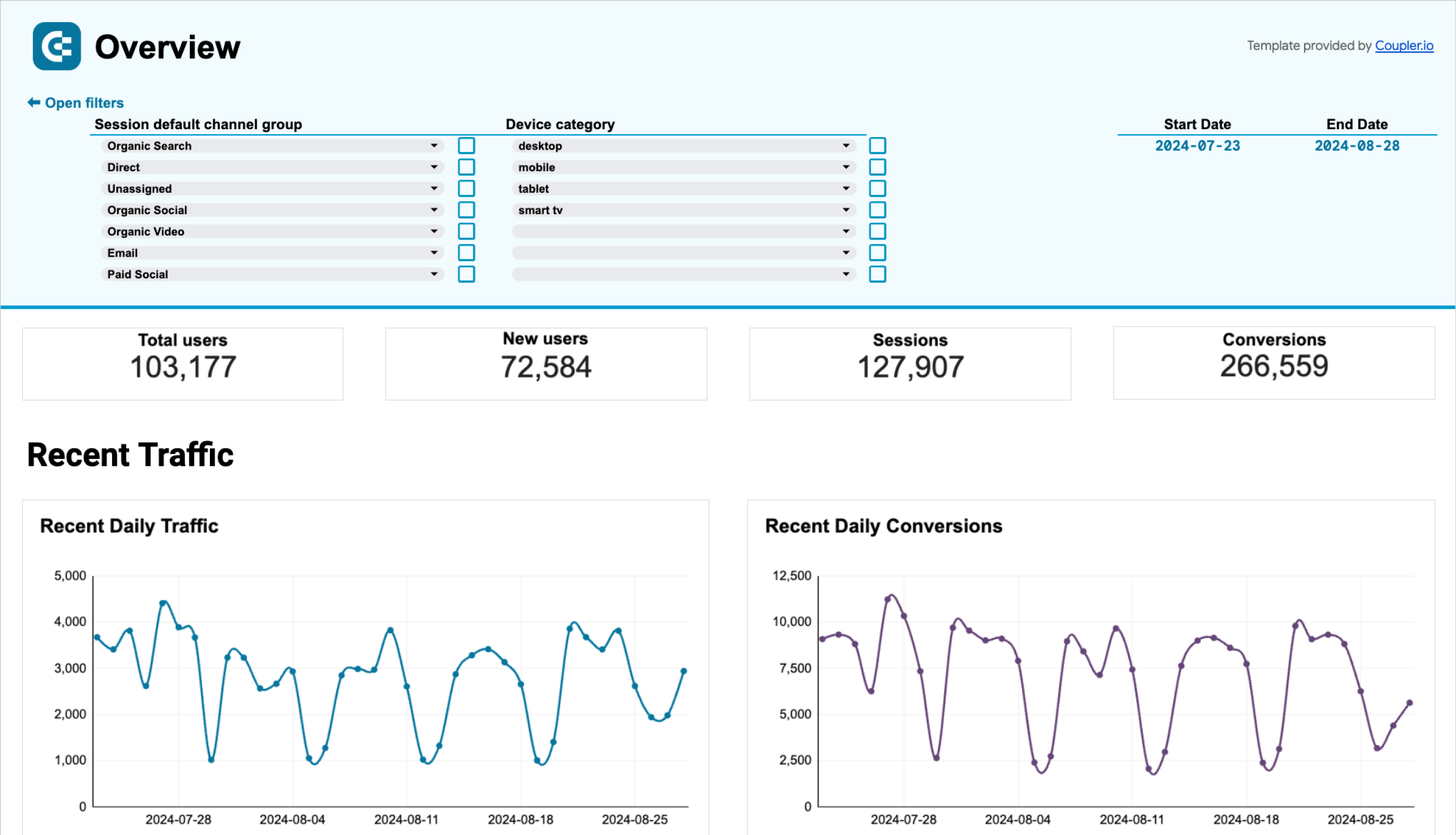
You can also check our guides on marketing data visualization and business data visualization to drill down into this topic and see how you can create custom web analytics dashboards for any purpose.
Types of dashboards by field
| Type | Description |
|---|---|
| Financial dashboard | Presents financial data and metrics, such as revenue and sales data, balance sheet information, gross margin analysis, and expense tracking. |
| Marketing dashboard | Tracks and analyzes marketing campaign performance. For example, it can be used to monitor website traffic, social media engagement, conversion rate, SEO metrics, and so on. |
| Sales dashboard | Displays sales data – for example, information related to pipeline management, lead generation, and revenue forecasting. |
| HR dashboard | Provides an overview of human resources metrics such as employee turnover, engagement, and recruitment metrics. |
| Project management dashboard | Gives an overview of project progress, including task completion, budget tracking, and resource utilization metrics. |
| IT dashboard | Displays key performance indicators for IT operations and infrastructure, including network performance, server utilization, and progress on the IT department’s ongoing tasks. |
If we classify dashboards by the area of expertise they are related to, this list can be continued. The only difference between all these dashboards is the type of data they represent.
One dashboard can fall under two or more categories. For example, operational dashboards can be interactive, marketing dashboards can also be analytical, or sales dashboards can be both strategic and self-updating.
How to create dashboards
Creating dashboards doesn’t have to be complicated or time-consuming. Whether you’re a data analyst, business owner, or marketing professional, there are a few approaches you can take to build informative dashboards that deliver key insights at a glance. The three main methods are:
- Create a dashboard on your own from scratch
- Use a dashboard template
- Request a service to build a dashboard for you.
DIY using connectors and BI tools
Anyone can create a dashboard from scratch. All you need is a BI tool for visualization and a way to connect data from different sources. Most automated reporting tools provide built-in connectors that allow you to pull data from several apps directly into a dashboard. However, the number of sources they support is usually limited. Partner connectors like Coupler.io offer a way around that, letting you extract data from a wider variety of apps (e.g., QuickBooks, Excel, or HubSpot).
The setup process is quite straightforward. First, use the pre-built native/partner connectors to collect data from multiple sources. Your data will then be automatically synced with a BI tool of your choosing, where you can design a dashboard based on your own specifications.
Popular BI tools include:
- Looker Studio
- Tableau
- Power BI
- Google Sheets
Templates
A faster and simpler option is to use dashboard templates with pre-designed visualizations. That way, you won’t need to create charts and graphs from scratch. It’s a matter of choosing a template that matches your needs and connecting your data.
As a bonus, templates typically come equipped with connectors, meaning you won’t need to manually load data from your apps into the dashboard. Coupler.io is one such connector that simplifies and automates data imports to templates. The whole setup process can take less than 10 minutes.
Custom services
If neither of the above methods fits your needs, you can always enlist help from data experts. There are customized services for dashboard creation that will build a dashboard based on your preferences, ensuring you always have the latest data at your fingertips.
Coupler.io offers this service too. You can reach out to our team for a consultation and a quote, and we’ll help you get the most out of your data with a customized reporting solution.

Go data-driven with data analytics services by Coupler.io
Get in touchDashboard reporting examples
In this section, we’ve gathered some data reporting dashboard examples that might be useful for you.
Marketing dashboards
All-in-one marketing analytics dashboard (+ free template)
The all-in-one marketing dashboard lets you evaluate the performance of your marketing channels in a single interface. It displays data from Google Analytics, Google Search Console, advertising platforms, social media apps, email, and YouTube. You can analyze the results of each channel and understand how your combined efforts generate leads and revenue.
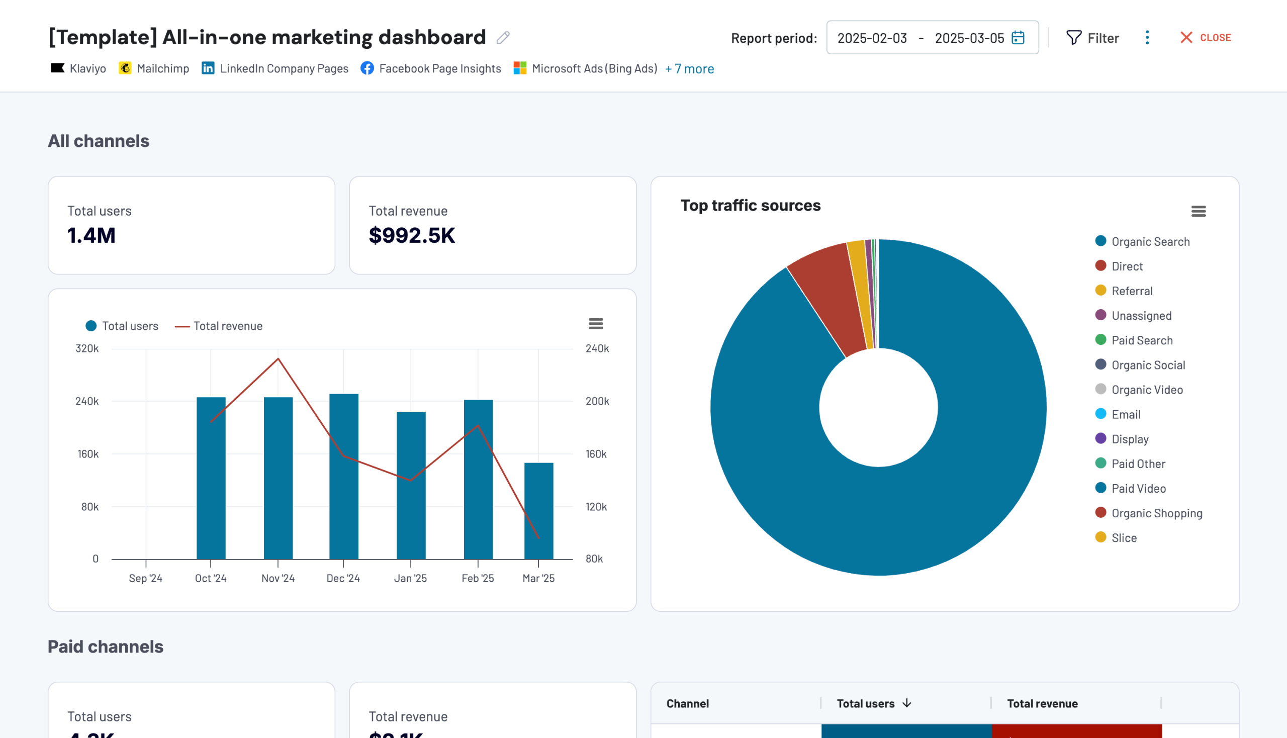
What you can do with this dashboard:
- Analyze top traffic sources to identify the best acquisition channels to invest in.
- Track how different channels contribute to your overall business goals.
- Adjust your marketing strategy based on emerging trends within the data.
- Use filters to compare platform performance and optimize your marketing spend for lead generation.
This reporting dashboard is available in the Coupler.io UI and as a template in Looker Studio. Get a free copy of your data with a Coupler.io account.
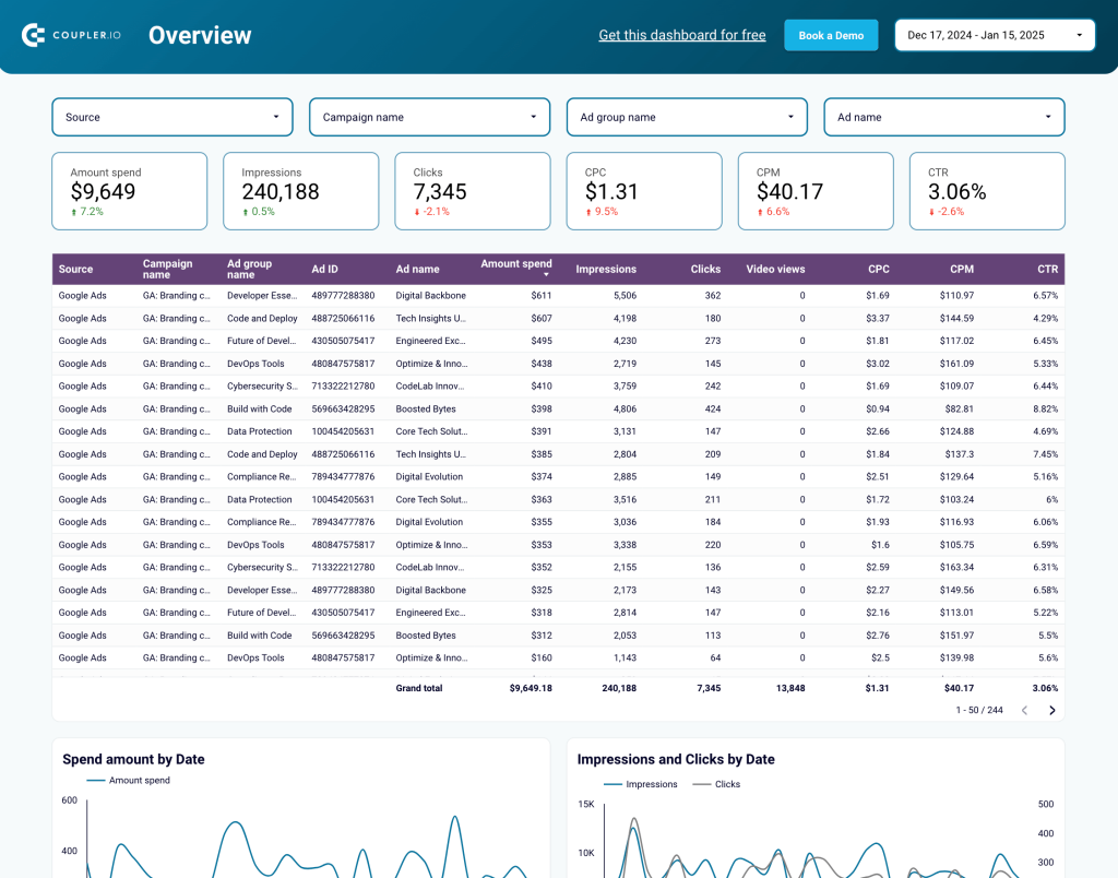
Google Analytics PPC dashboard in Looker Studio (+ free template)
The Google Analytics PPC dashboard allows you to report on the website traffic you receive from your paid ads campaigns. It pulls data from your GA4 account and the platforms where you run ads, such as Google, Facebook, LinkedIn, Bing, and more. You can filter by date, campaign, and source to dig deeper into the factors impacting your traffic performance.
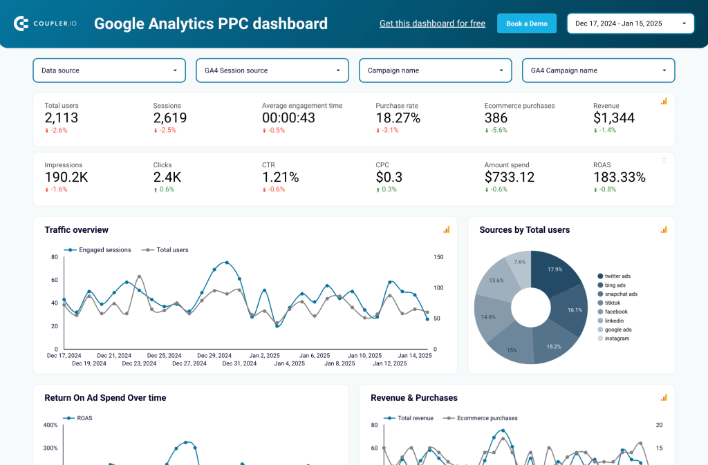
What you can do with this dashboard:
- Gain insights into traffic, ROAS, spend, and purchases to spot trends and improve strategy.
- Compare ad platforms on metrics like impressions, clicks, and CPC to tweak your campaigns.
- Monitor all key performance metrics in one place and make data-driven decisions to improve ad traffic outcomes.
The dashboard also has a second page, where you can analyze the results of individual campaigns. Filter the tables by source to identify the best-performing platforms.
To get a copy of this dashboard for your data, simply log in or set up a Coupler.io account for free. The report can be configured to update on a schedule and you can easily share it with stakeholders. Find it in Looker Studio.
PPC dashboards
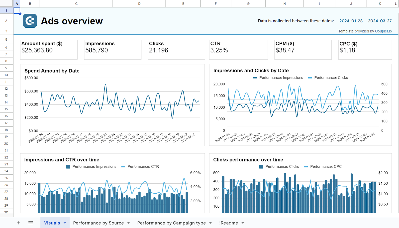
PPC multi-channel dashboard (+ free template)
This dashboard report lets you track the performance of different advertising channels in one place. It provides a detailed overview of campaign metrics (clicks, impressions, CPC) and allows you to monitor spending over time. You can connect up to seven sources for analysis, including Google Ads, Facebook Ads, TikTok Ads, and more.
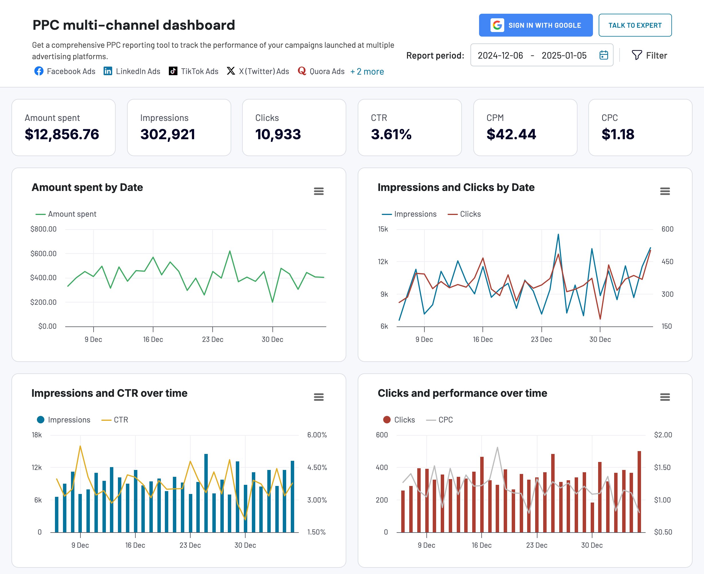
The dashboard is ideal for tracking your paid marketing efforts across channels. It lets you:
- Combine campaigns from different channels to compare the cost and impact.
- Maximize the return on your ad spend by monitoring which platforms bring the most/least engagement.
- Compare critical metrics like impressions and CTR to identify areas for campaign optimization.
- Filter by date to check today’s numbers or pinpoint annual trends.
This report only takes a few minutes to set up with your own PPC data. It’s also available for free in your favorite BI tool:


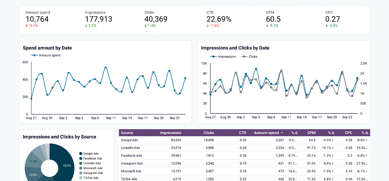

Multi-channel creatives dashboard in Looker Studio (+ free template)
With this dashboard, you can consolidate data from your advertising channels (e.g., Facebook, Google, LinkedIn) and compare the performance of specific campaigns. It helps you evaluate the success of ad creatives based on actionable metrics like impressions, clicks, CTR, CPM, CPC, and spend amount.
What you can do with this dashboard:
- Analyze key metrics side-by-side to uncover trends or anomalies in your campaign data.
- Identify your most engaging creatives based on CTR and find out which creatives drive the most clicks.
- Get a visual performance overview of the connected ad platforms (on a separate page).
- Examine the graphs and tables for each channel to understand which campaign tactics drive success for your team.
You can get a copy of this dashboard for Looker Studio or Google Sheets. Sign up for a free Coupler.io account to start using it right away:
Social media dashboards
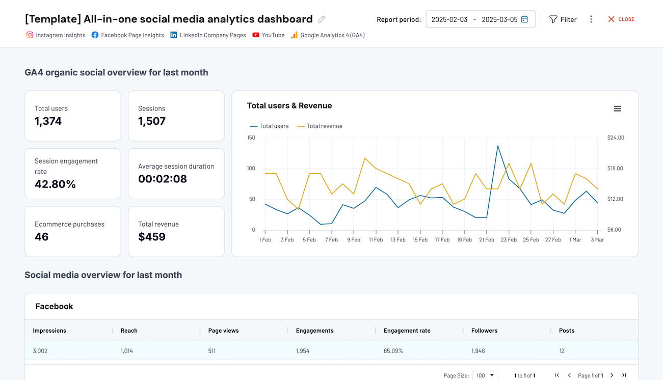
All-in-one social media analytics dashboard in Looker Studio (+ free template)
This dashboard provides a simple way to report on the performance of your social media channels. It pulls data from your Facebook, Instagram, LinkedIn, and YouTube accounts to show results for the last 30 days. With integrated data from GA4, you can see how these social channels drive traffic for your business and monitor their combined results.
All-in-one social media analytics dashboard
 Preview dashboard
All-in-one social media analytics dashboard
Preview dashboardWhat you can do with this dashboard:
- Monitor key metrics like total users, ecommerce purchases, and total revenue to understand how your social media efforts drive business results.
- Compare the performance of different SoMe channels to improve budget allocation for new campaigns.
- Analyze individual channel performance by impressions, reach, engagements, and identify patterns in audience behavior.
You can use the dashboard right in the Coupler.io interface or as a Looker Studio template. Follow the instructions to connect your social media accounts and start analyzing your data. It only takes a few minutes to set up the template and schedule automated updates:
Learn more about the mechanics of omnichannel reporting in a separate article.
LinkedIn company page performance dashboard in Looker Studio (+ free template)
The LinkedIn company page performance dashboard allows you to track the performance of your company’s presence on LinkedIn. You can monitor impressions and follower growth, understand how your content resonates with your audience, and derive other insights to optimize your LinkedIn presence.
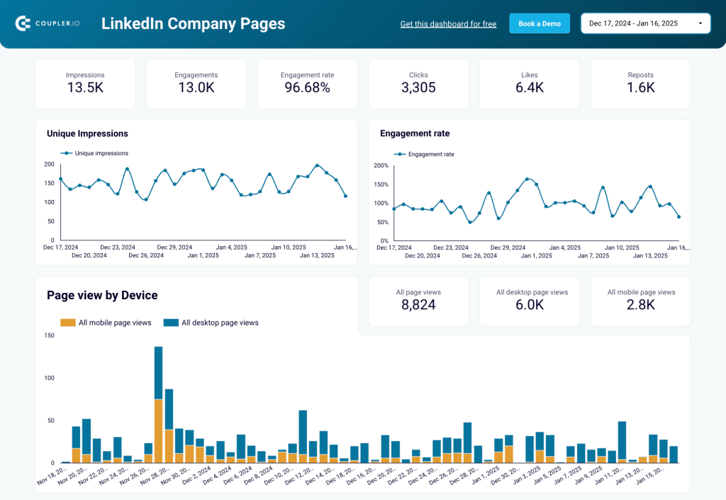
Here’s what else you can do with this dashboard:
- Identify top-performing posts by impressions, engagement, and content type.
- Track how impressions and engagement rates change over time to see the impact of your marketing activities on LinkedIn.
- Check whether your audience views your page on mobile or desktop to optimize their experience.
- Find out which regions drive the most traffic to your page and adjust your marketing budget accordingly.
On a separate page, you can compare trends in organic and paid follower growth, and uncover the distribution of your followers by industry, region, and seniority. This can help refine your messaging and LinkedIn targeting strategies.
This dashboard is available for free in Looker Studio with a free Coupler.io account. It takes less than 5 minutes to connect your data and start analyzing your LinkedIn data:
Sales dashboards
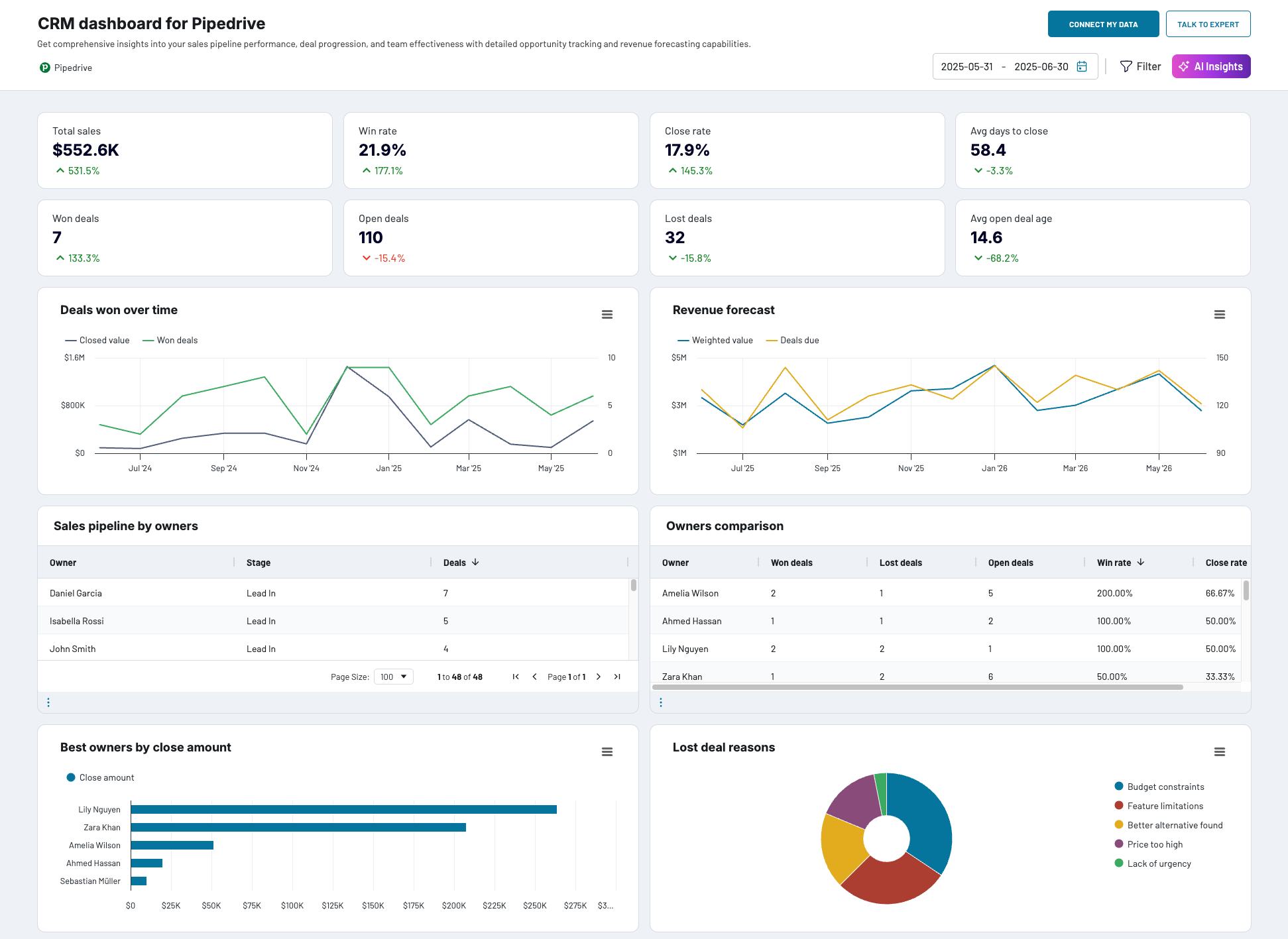
CRM dashboard for Pipedrive (+free template)
This CRM dashboard is a handy tool for keeping track of your sales department’s results. It integrates with your Pipedrive account to display key sales metrics, such as total sales, win rates, close rate, pipeline value, and more. You can filter by deal owner, pipeline stage, name, and label to drill down into your data and understand the factors impacting success.
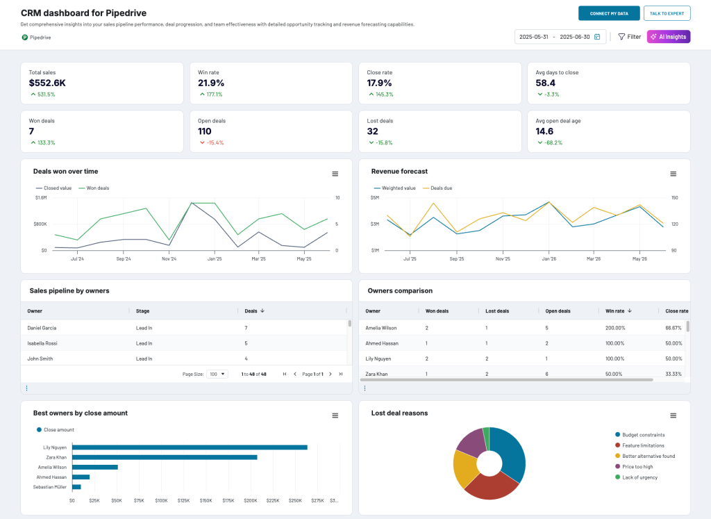
What you can do with this dashboard report:
- Analyze unclosed deals by owner, type, revenue, stage, and win probability to identify issues and secure immediate revenue.
- Assess reasons for lost deals to adjust and improve your sales communications.
- Identify the best won deals to understand which companies generate revenue, their decision-makers, and industries, and determine the critical closing time for lost or blocked deals.
- See which sales agents close the most deals to optimize team allocations and increase revenue.
This template is available in Coupler.io, Looker Studio, and Power BI. Make a free copy, connect your Pipedrive data, and start analyzing your sales pipeline in just a few minutes:

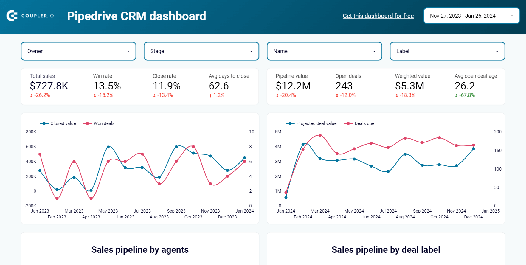
Sales dashboard for Pipedrive in Looker Studio (+ free template)
Here is another dashboard example for sales reporting with Pipedrive. It has similar features to the previous template, but provides two additional pages of insights, focusing on sales pipeline and team performance. You can get a quick overview of important metrics (closed deals, lost deals, etc.) and assess critical aspects of your sales process.
Here’s what else you can do with this dashboard:
- Analyze deals and closed revenue to spot seasonal patterns or links to activities like marketing campaigns, conferences, or team growth.
- Identify reasons for lost deals by owner, deal type, region, or label to improve sales conversion rates.
- Create a customizable pipeline funnel with up to 5 stages and filter by owner, pipeline, or deal type to improve performance.
- Compare your team’s performance and find reasons for poor results.
This report updates on a schedule of your choosing – as often as every day or every 15 minutes. To get a free copy in Looker Studio, log in or set up a free Coupler.io account:
Learn more about how to build a Google Sheets sales dashboard
Financial dashboards
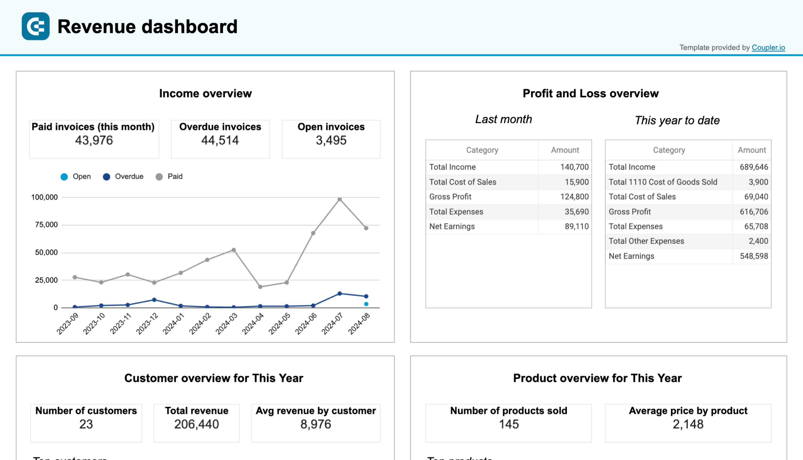
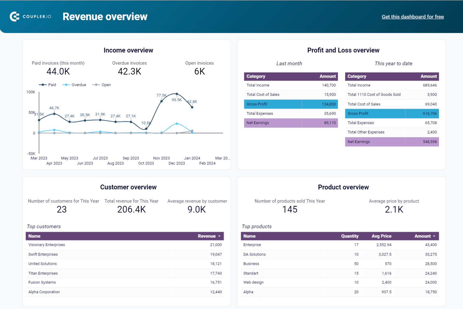
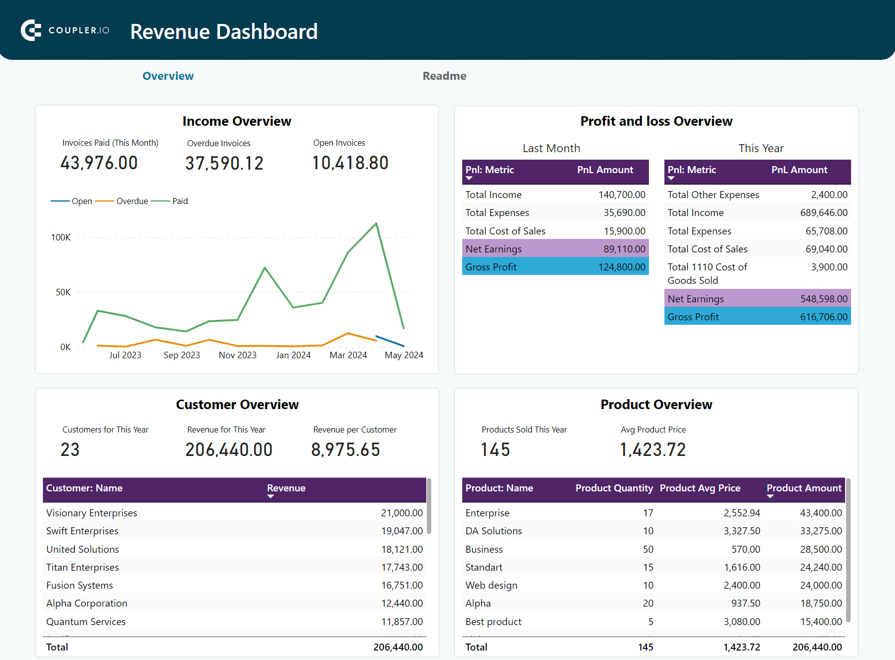
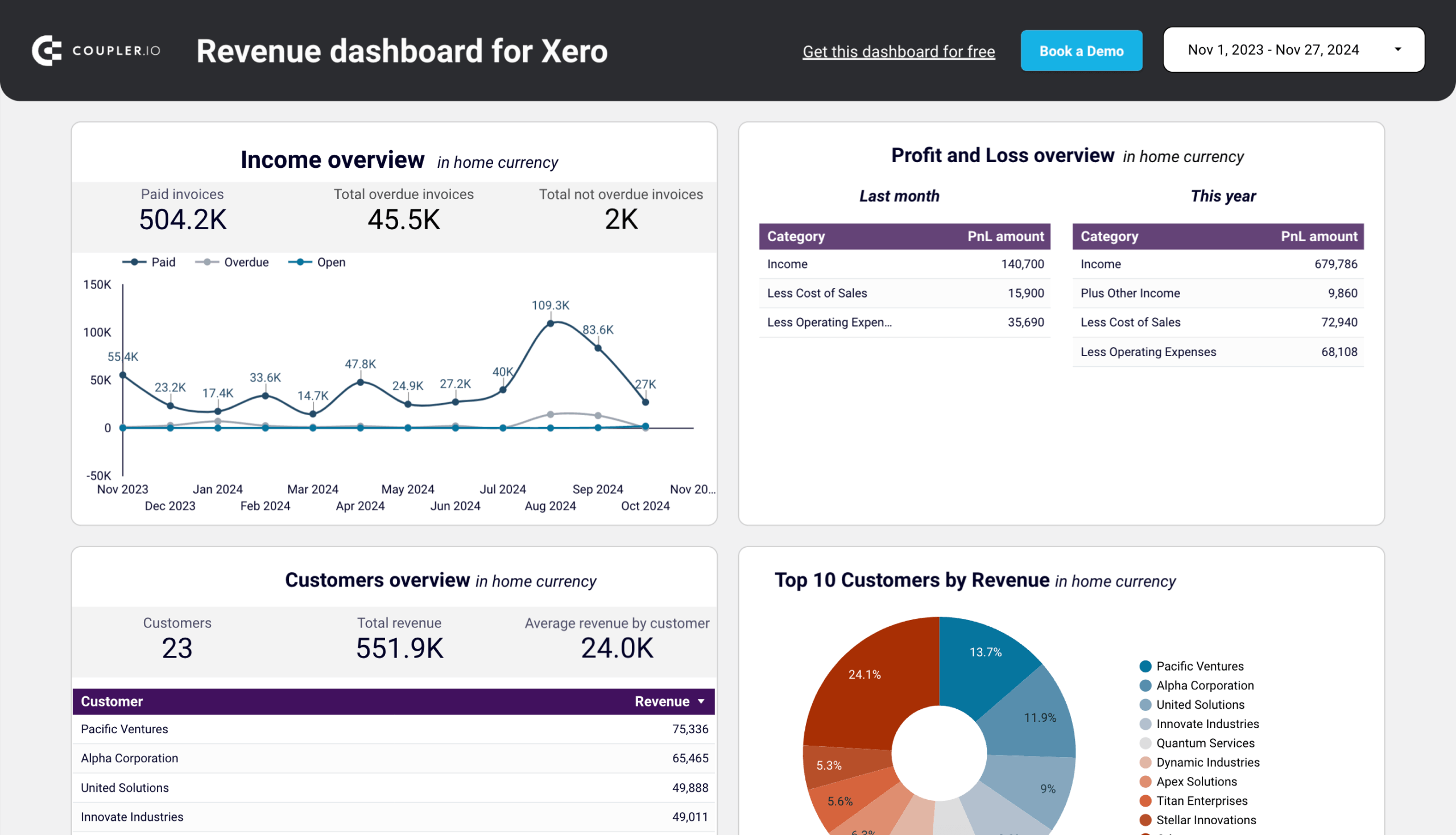
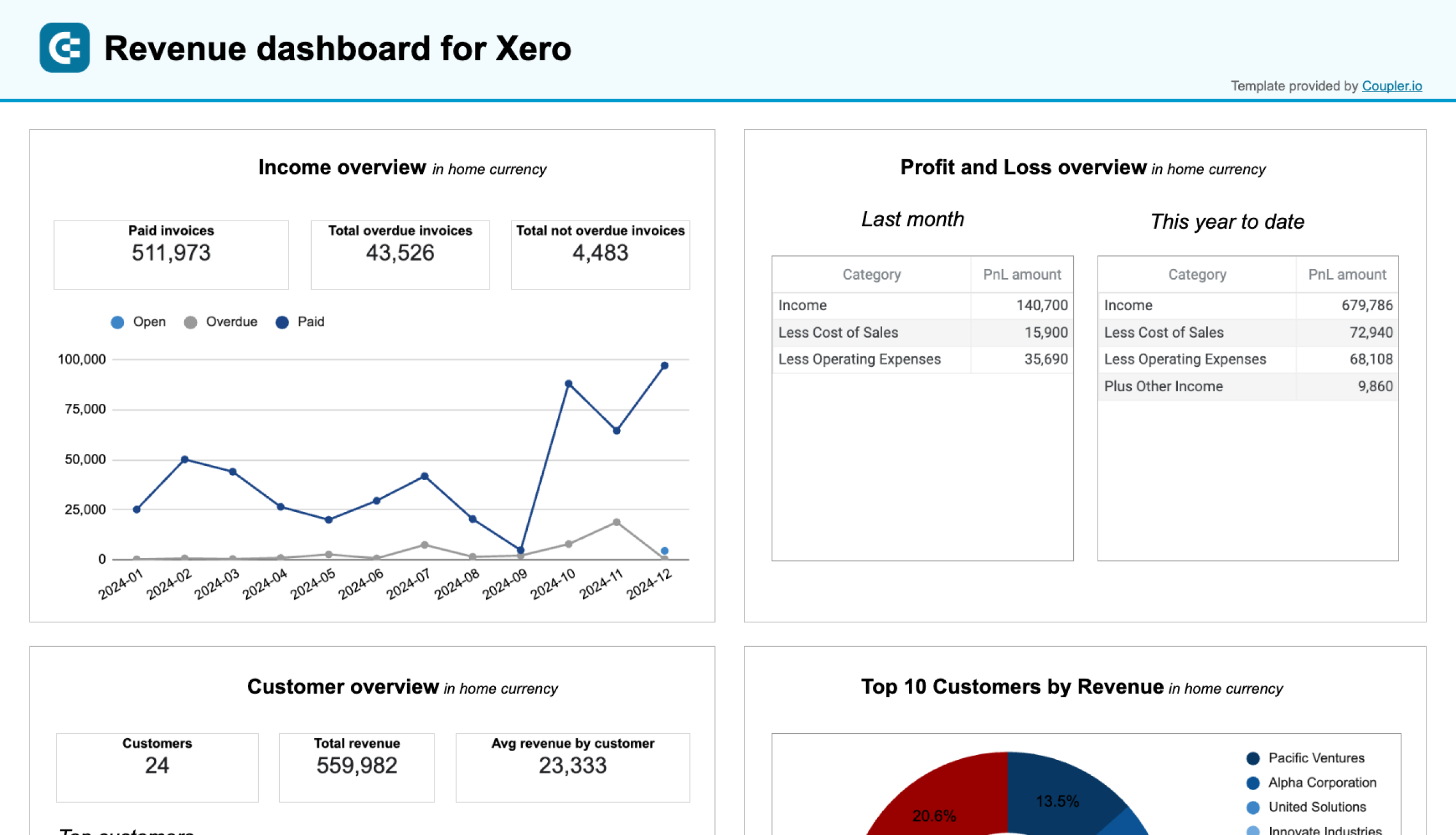
Revenue dashboard for Xero (+ free template)
This revenue dashboard template helps you monitor your income and expenses. It pulls data from your Xero account to display revenue distribution by customers and products in a single interface. The report also depicts key revenue metrics (income, expenses, overdue invoices, etc.), top customers, and best-selling products.
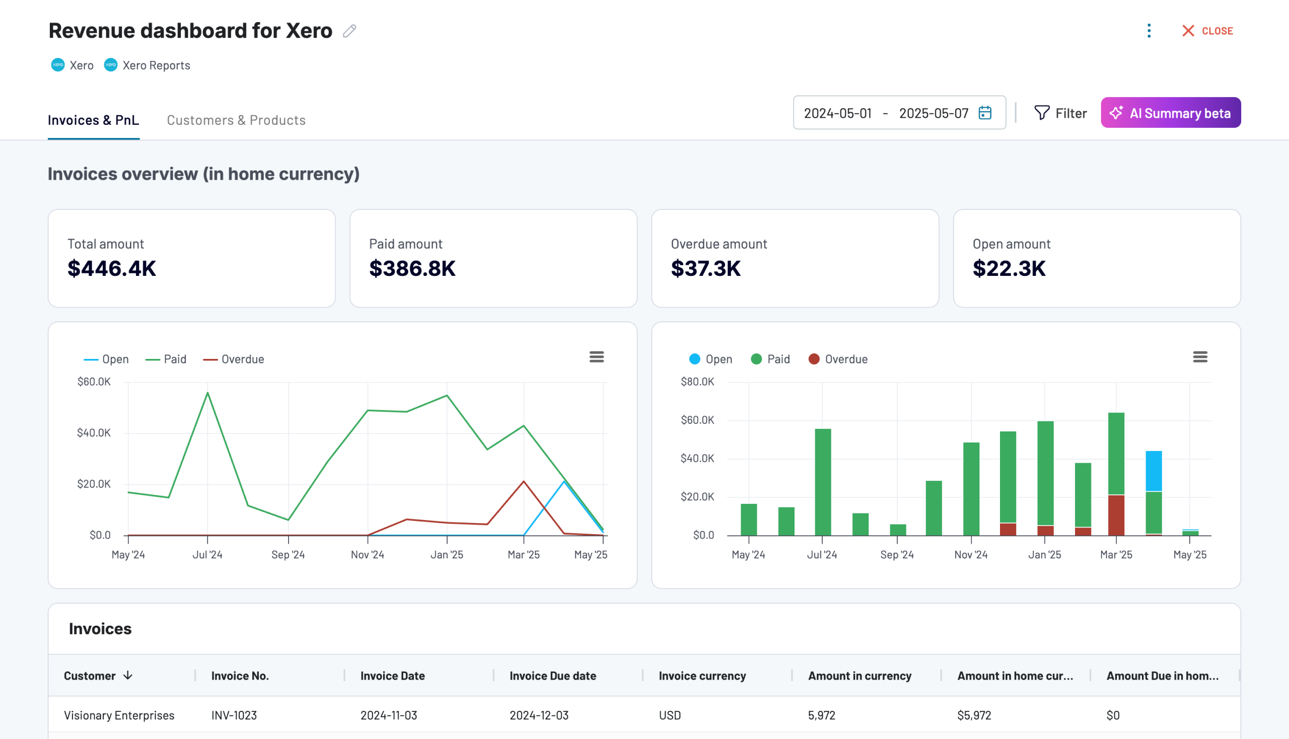
What you can do with this Xero dashboard:
- Track revenue trends over 12 months to spot seasonal fluctuations, regular peaks, and unexpected dips.
- Identify high-value customers to refine your sales targeting and retention efforts.
- Optimize your sales strategy based on top-selling product data.
- Review P&L stats to assess how well your business is managing costs relative to income.
The dashboard is available in Coupler.io and as a Looker Studio and Google Sheets template with a built-in Xero connector. It only takes a few minutes to set up with your own data. Simply connect your Xero account with Coupler.io to grab a free copy:

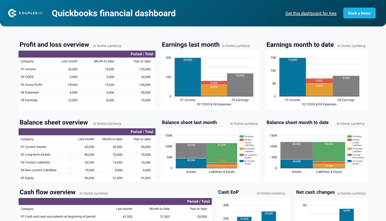
QuickBooks financial dashboard (+ free template)
Here’s an example of a financial dashboard designed for small business owners, financial managers, accountants, and bookkeepers. It connects directly to your QuickBooks Online account to provide a snapshot of your business’s financial health.
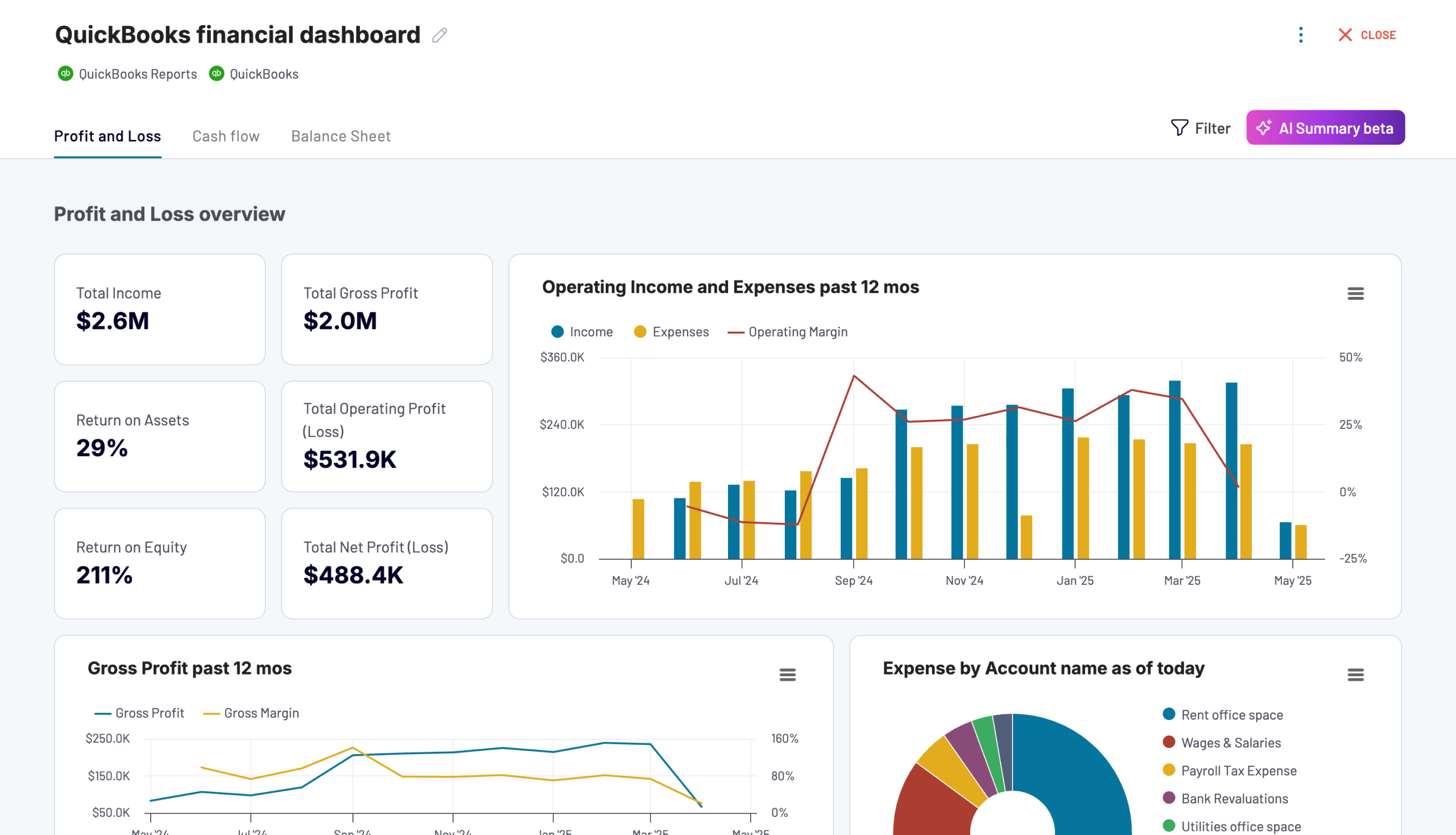
What you can do with this dashboard:
- Track profitability by reviewing revenue, expenses, and net income. Compare earning trends to spot growth patterns or areas for improvement.
- Assess your company’s financial position by reviewing assets, liabilities, and equity, with charts to track changes over time.
- Monitor changes in net cash to ensure effective liquidity management.
- Manage day-to-day operations by reviewing bank and cash account balances, particularly multi-currency transactions from foreign bank accounts.
Again, this dashboard reporting template is available for free and can be connected to QuickBooks with a Coupler.io account. You can also use it in Looker Studio or Google Sheets:
SEO dashboards
Landing page performance dashboard in Google Sheets (+ free template)
Dashboards don’t always have to be complex and interactive. This is an example of an SEO dashboard that focuses specifically on website landing page performance. It loads data from your GA4 and GSC accounts to provide a breakdown of page performance by key metrics like clicks, total users, CTR, purchase revenue, and several more.
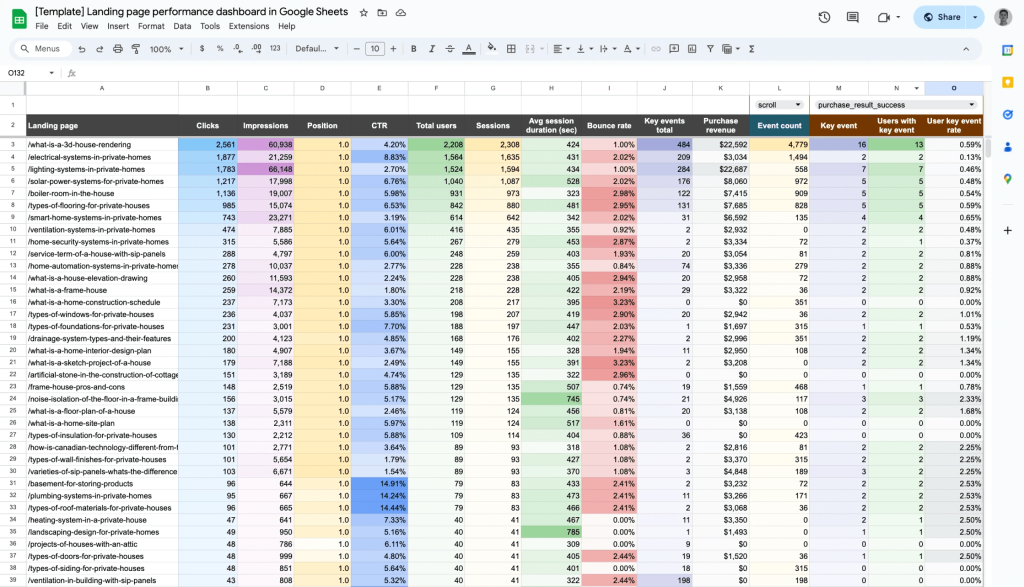
What you can do with this reporting template:
- Combine data from different SEO tools to understand user behavior and optimize your landing pages for your audience.
- Improve rankings and visibility by analyzing metrics like average position and CTR.
- Identify high-performing pages that drive revenue and optimize underperforming ones.
- Resolve drop-offs by addressing high-traffic pages with low conversions or clicks.
The dashboard template is available for Google Sheets and Looker Studio. Like with the other examples, you can easily connect your data and configure the report to refresh every day, week, month, etc. Check it out:
SEO dashboard for Google Search Console (+ free template)
This dashboard integrates with your Google Search Console account to provide a quick overview of your SEO performance. It’s a valuable tool for tracking main performance metrics and making optimizations to your website content.
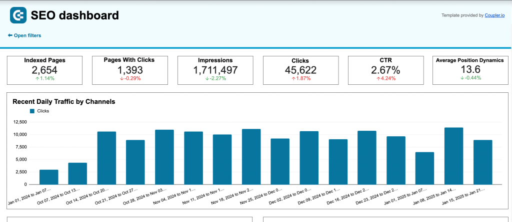
What you can do with this dashboard:
- Check the overall health of your SEO channel with scorecards and graphs displaying key metrics (clicks, impressions, etc.)
- Examine page performance by device – desktop, mobile, tablet – based on total impressions, clicks, and CTR.
- Analyze your best and worst performing pages by click dynamics, including growth vs loss percentage. Use this data to prioritize content updates and improve rankings.
- Analyze average position dynamics over years to track website growth and stability.
It takes less than 5 mins to get a free copy of this dashboard with a Coupler.io account. There is also a filterable version for Looker Studio, so you can choose the tool that best suits your needs:
Tools to create reporting dashboards
Let’s summarize the three types of tools you need to build a dashboard report:
Data sources and integrations
Creating an insightful dashboard starts with consulting the software where your data is stored. Marketing, CRM, finance, and HR tools can all be sources of data. Consider also your product databases (e.g., BigQuery) and spreadsheet apps like Excel. It’s important for those sources to have proper API connections to seamlessly integrate with a reporting tool.
For instance, the Google Sheets and Microsoft Excel integrations by Coupler.io can connect to several different destinations for dashboard reporting. More on that later.
Connectors to automate data load
Connectors are essential for eliminating manual work in dashboard reporting. They will pull data from different sources and ensure your dashboard remains up-to-date automatically. Many data visualization tools provide built-in connectors, however, they only support a few sources and there can be delays in data refresh. It’s best to go for a comprehensive solution like Coupler.io that can load data from dozens of sources without issue.
Spreadsheets and BI tools to create reports
Finally, you need a tool that will allow you to customize the visual aspect of a report. As we mentioned earlier, you can choose from options like Looker Studio, Power BI, Tableau, etc., depending on your needs and budget. If you plan to create a simple dashboard with only a couple of tables or graphs, you can also do that in spreadsheet software like Google Sheets or Excel.
For more in-depth instructions on how to build dashboards in spreadsheets, check out the step-by-step guide on how to create a Google Sheets dashboard and get inspired by Google Sheets dashboard examples.
Best practices for dashboard reporting
Let’s now explore some tips and best practices that can help you streamline your dashboard reporting process and build useful and insightful visualizations.
Keep in mind the main dashboard reporting requirements
- Relevance. The dashboard should only display the right data and metrics that are relevant to the intended audience and their decision-making needs.
- Accuracy. Data and metrics displayed on the dashboard must be accurate, up-to-date, and consistent. Various dashboard reporting tools can help you with this.
- Clarity. Data and metrics should be presented in a clear, concise, and easy-to-understand format, using appropriate visualizations and charts.
- Customization and interactivity. The dashboard should allow users to customize and filter the data they see, to better meet their specific needs and requirements.
- Security. The dashboard should ensure that sensitive and confidential data is secure, with proper access controls and data protection measures in place.
If you want to drill down into details, please check our guide on data visualization best practices. You will learn how to organize your data visually, ensure that the dashboard is tailored to your audience’s needs, and more.
Automate dashboard reporting to boost efficiency
Even the most comprehensive, beautifully-designed dashboard won’t be practical if you have to update it manually. For instance, making regular manual updates to a multi-source marketing dashboard would be time-consuming and complicated. Reporting software like Coupler.io solves this by refreshing all your metrics automatically, ensuring your dashboard always displays near real-time data.
We mentioned earlier how Coupler.io allows you to connect data from 60+ sources to a BI tool like Looker Studio. Again, this whole process is automated, meaning you don’t have to jump between accounts or download CSV files to collect data. Everything can be prepared within a single interface.
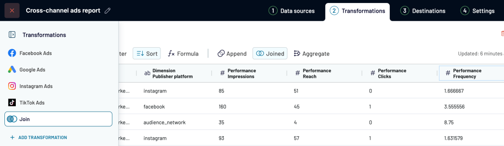
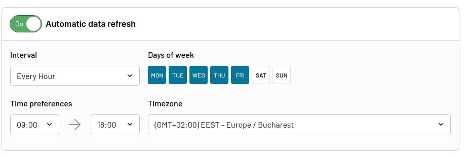
For example, if you want to create a cross-channel report, Coupler.io lets you organize the data before visualizing it in a dashboard. You can preview, edit, aggregate, and blend data from different apps into one dataset. There is also the option to automate updates by choosing the days of the week, time range, and refresh interval (up to every 15 minutes).
Stick to the basic design rules
There’s no need to be a designer to create a useful and insightful dashboard – after all, data matters more than beauty. However, there are some basic design principles you should keep in mind.
- Use only one to two main colors, and then add darker and lighter shades of the same colors to show gradations. For example, you can select blue to represent sales leads on your graph. In this case, you can use dark blue to show high-quality leads and light blue for low-quality ones.
- Only use one color for each data type. For instance, if your dashboard contains several graphs representing sales leads, then you should use the same color for both graphs. This makes it easier for the audience to quickly find relevant information and understand it at a glance.
- Maintain proportions. For example, if you have a bar chart comparing 50 deals in January to 100 deals in February, the second bar must be exactly twice as long as the first one. In other words, the sizes of visual elements should correspond in the same way as the numbers they represent. If this is not the case, your custom reporting dashboard will be misleading, and data could be interpreted incorrectly. See more misleading data visualization examples.
- Label all visual elements on your dashboard as clearly as possible. Your audience should be able to easily understand what exactly is represented by each chart, graph, scorecard, or other elements. In addition to this, all numbers should be accompanied by units so that it’s absolutely clear whether your graph depicts millions or billions, kilograms or kilometers. In general, your dashboard shouldn’t contain unlabeled elements.
All these rules are simple but very important for building a useful data reporting dashboard that presents information clearly and facilitates decision-making.
FAQ: what should you know about dashboard reporting?
What are the benefits of dashboard reporting?
Although some reports still take the form of endless data lines and columns without any color or graphical elements, dashboard reporting is quickly gaining popularity thanks to the enormous benefits it offers to businesses, such as:
- Data-driven decision-making. Dashboards provide real-time insights and visual representations of key data and metrics, which can help teams and executives make informed business decisions more quickly and accurately.
- Increased efficiency. If you automate the collection and presentation of data with dashboard software, even a simple online reporting dashboard can provide enormous value. It will save significant time and increase efficiency compared to manual reporting methods.
- Better data representation. Visual format makes data easy to understand, and it’s one of the main benefits of dashboard reporting. It allows you to highlight the most important metrics, show correlations, and interactively switch between different filters to explore your data from various angles. It helps users quickly identify patterns, trends, and outliers in the data.
- Increased transparency. Dashboards can turn raw data into clarity, making every process, campaign, or activity fully transparent for everyone. When all the stakeholders have access to real-time data and performance metrics, there is no place for any obscurity or confusion. This provides an excellent basis for obtaining business insights.
- Better collaboration. By providing a centralized and accessible view of data, dashboards can help improve collaboration and communication between different departments and stakeholders.
What is the purpose of dashboard reporting?
Dashboards allow you to transform vast amounts of raw data into concise and clear visualizations that are easy to understand. The main purpose of dashboard reporting is to make data accessible, transparent, and easy to work with. This allows professionals to use data to its fullest on a daily basis and provides a basis for informed decisions. We can say that the ultimate goal of dashboard reporting is making an organization more data-driven and efficient.
What should you include in a reporting dashboard?
- Key performance indicators (KPIs). This is the core of your dashboard report as this is the most important information. Usually, this is total revenue, the number of new and closed deals or purchases, and so on.
- Visual elements. Of course, your dashboard should include elements that, basically, make it a dashboard – various charts and graphs, tables, diagrams, scorecards, and so on.
- Interactive elements. A good dashboard should be functional and make it easy to work with data. Add elements such as drop-downs or hover-over details that give additional information about a specific data point.
- Goal tracking graphs. Apart from showcasing key metrics, you will need to include at least one graph showing progress. It can be progress in stages or just progress over time. Such a graph can also include specific goals you are working towards.
- Filters and segmentation options. Give your users instruments to drill into details and explore data from various angles. Include time filters and other filtering options. Allow users to split data by various categories and sub-groups, such as geography, period, product, demographics, campaign, and so on.
- Data source indicators. If your report features data from several sources, make sure all data blocks are labeled correspondingly. For example, add labels like “Google Analytics” or “Bing Ads”. It should be easy for the viewer to see where data comes from.
- Access to historical data. It should be easy to apply filters and view the same data from past periods to make comparisons.
What’s the best way to organize dashboard reporting?
The answer depends on your company’s size and the amount of data you collect on a daily basis. For small to medium businesses, the optimal way to organize the dashboard reporting process will be by creating dashboards in-house. This process can be easily automated with the help of dashboard reporting tools and data integration solutions such as Coupler.io. Affordable pricing makes it a good fit even for small companies.
Automate dashboard reporting with Coupler.io
Get started for free