For a Google Sheets newbie, a pivot table may sound like something too complicated, even intimidating to dive into, but fear makes mountains out of molehills, you know. Actually, learning how to deal with pivot tables is much easier than it seems. Once you get the feel of the fundamentals, you can become a reporting guru or an office expert.
So let’s get wise to pivot tables in Google Sheets and turn the molehills back to their original size. You can also check out our video tutorial to master pivot tables in Google Sheets in a few minutes.
What is a pivot table in Google Sheets?
Before walking you through the process of creating pivot tables, let’s make sure you understand exactly what they are, and why you might need them.
A pivot table is a tool to summarize, sort, reorganize, group, count, total or average data stored in a database. More generally, it lets you sort your data in different ways so you can draw helpful conclusions easier.
To be clear: you’re not adding to, subtracting from, or otherwise changing your data when you make a pivot table. Instead, you are simply reorganizing your data. The “pivot” part stems from the fact that you can rotate (or pivot) the data in the table to view it from a different perspective.
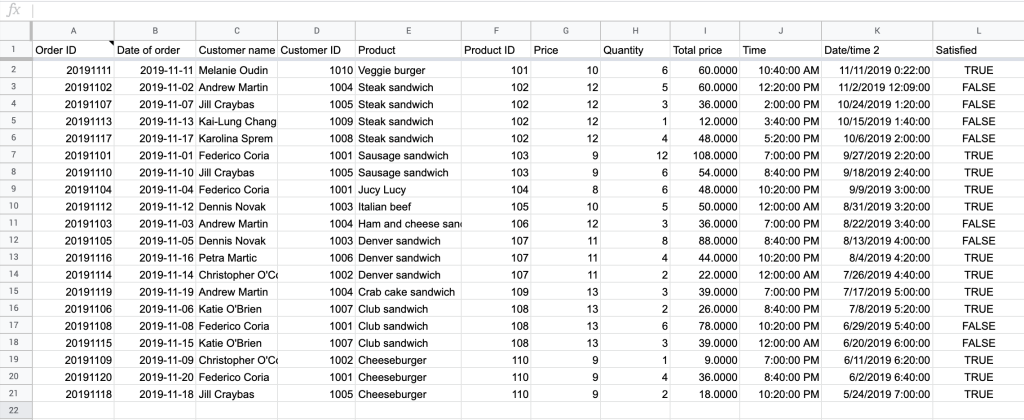
Basically, a Google Sheets pivot table lets you go from something like this:
which is a massive amount of data and difficult to follow, to something like this:
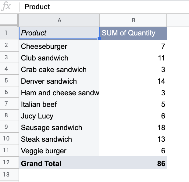
This is a whole new view of your information, which makes much more sense now.
Benefits of using Google Sheets pivot tables
Well, you might wonder why you’d want to learn one more data summarizing tool if you’ve already mastered QUERY, ARRAYFORMULA and other Google Sheets functions. But as Einstein stated, “Analyzing data without a pivot table is like hammering a nail with a noodle.” No, obviously, Einstein didn’t actually say that – but it gets the point across. Why spend minutes for something that can be done in seconds?
With that said, here are a few characteristics of pivot tables that make them extremely popular among Google Sheets users. Pivot tables are:
- Powerful. They allow you to derive new insights and answer important questions about your data, boosting your overall decision-making.
- Beautiful. You can apply custom styles, conditional formatting, and even create charts and graphs, which are a joy to see and manipulate.
- Fast. You can build customized views, add filters, or calculate new fields in a blink of an eye.
- Accurate. By automating calculations through a pivot table, you can minimize human error and avoid mistakes you would’ve made trying to approach the same problem manually.
- Flexible. You can shape table layouts, create dynamic views and reports, and update any of these with the click of a button.
So here you go. Powerful, beautiful, fast, accurate, and flexible. I hope I’ve sold you on the idea.
How to create a pivot table in Google Sheets
So, let’s proceed with a real-life example based on an Airtable dataset. Despite all its benefits, Airtable still doesn’t allow complex calculations or custom reporting, unlike Google Sheets. So, we imported the data set from Airtable to Google Sheets to be able to process the data in a more flexible way and create a pivot table afterwards.
For this, we used Coupler.io – an all-in-one data integration and analytics platform capable of automatically pulling data from business apps you use – for example, Airtable, Facebook Ads, HubSpot, Google Analytics, and more.
Here’s a sample import from Airtable:
Then, we jumped to Google Sheets to create a pivot table. Here’s how to do it:
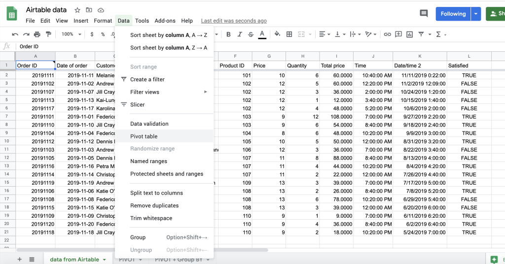
- Click the menu Data > Pivot table.
- You will see a dialogue window, asking whether you want to create a pivot table in a new sheet or in the existing sheet.
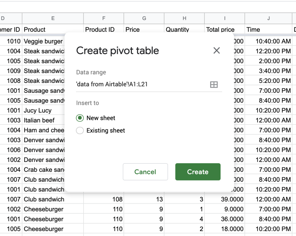
- If you choose “New sheet”, this will create a new tab in your sheet called “Pivot Table 1” with a blank Pivot Table that you can start filling in.
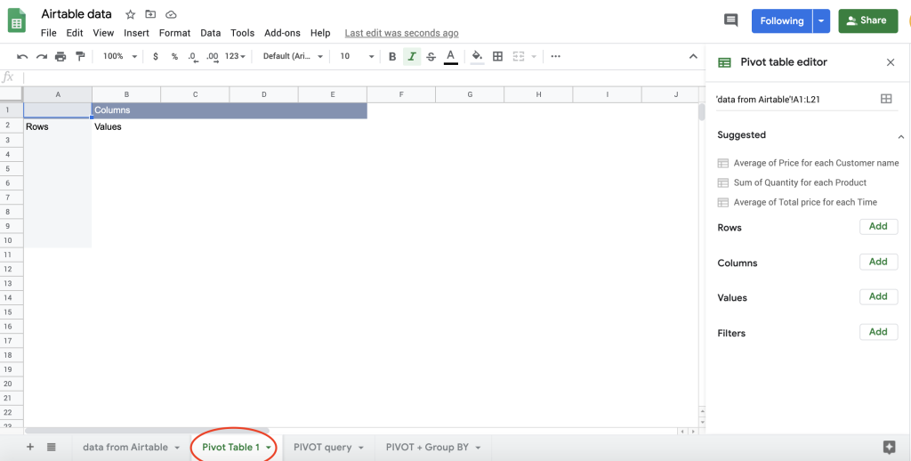
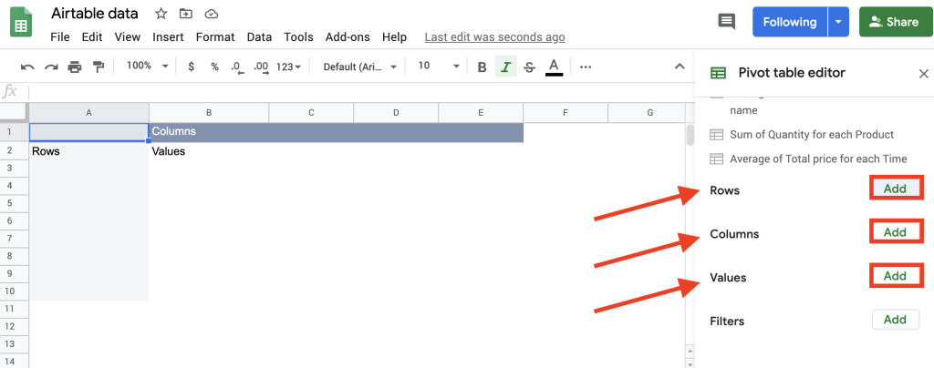
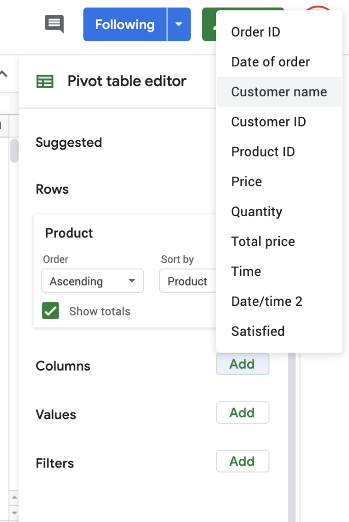
- To create a customized pivot table, click Add next to Rows, Columns, or Values to select the data you’d like to analyze.
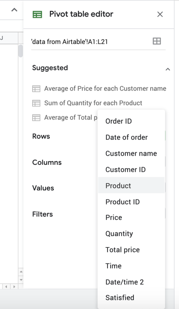
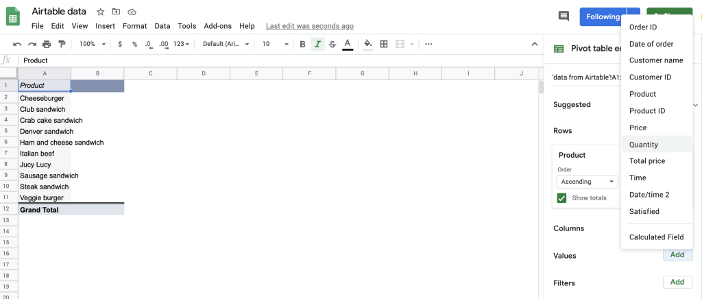
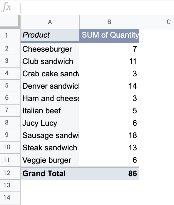
In our case, we choose “Product” for the Rows field.
- The next thing to add is value. Let’s say we want to find out the quantity sold of each product. So, we choose “Quantity” in the Values area.
And Google Sheets builds the following pivot table.
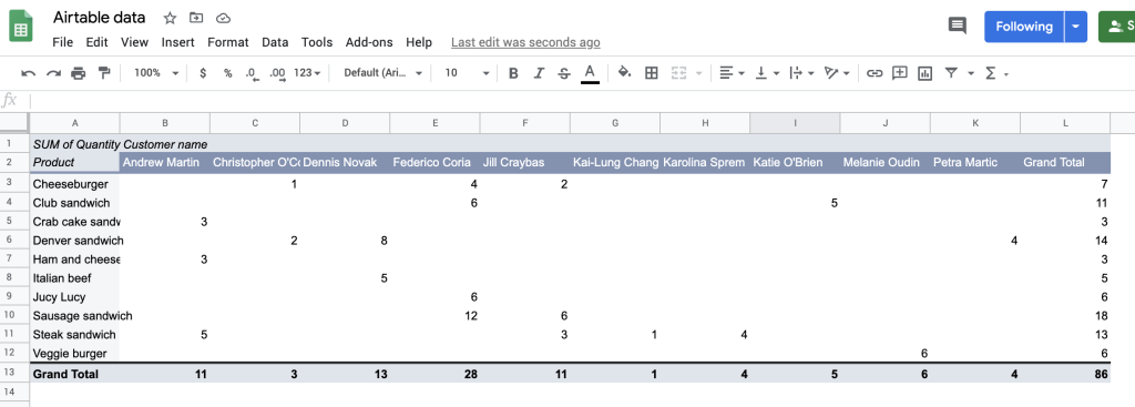
- To carry on analysing and summarizing even further, you can add the Columns field as well. To understand what each customer usually orders and how much, we choose “Customer name” in the Columns field.
The pivot table engine returns exactly what we need.
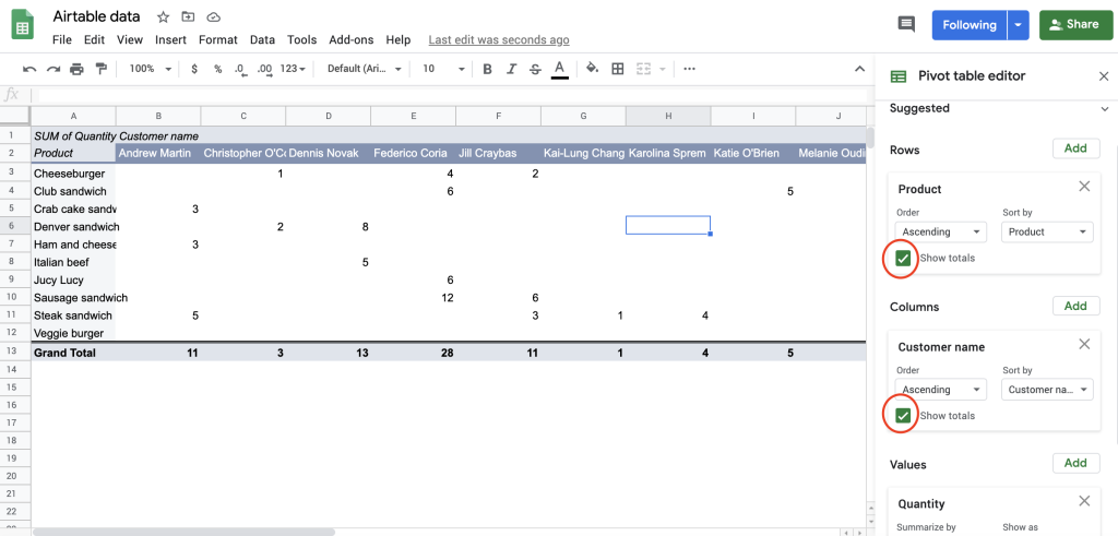
In case you do not need totals, simply uncheck the boxes.
That’s the whole story! Simple and beautiful. But most importantly, you gain absolutely fresh insight into your business data.
Let Google build pivot tables for you
When creating a Google Sheets pivot table, a spreadsheet automatically suggests some pre-built pivot table options in the editing window.
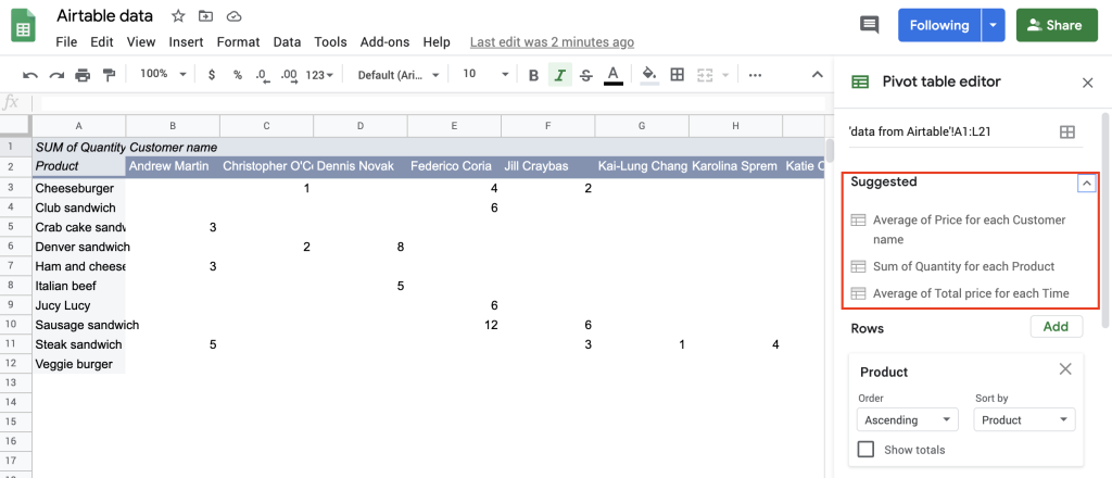
If you click, for example, “Sum of Quantity for each Product”, it will create a table even faster with minimal effort, as you won’t need to choose Rows, Values or Columns.
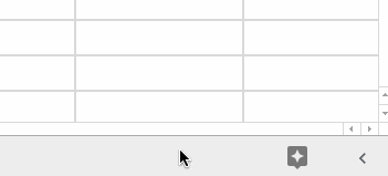
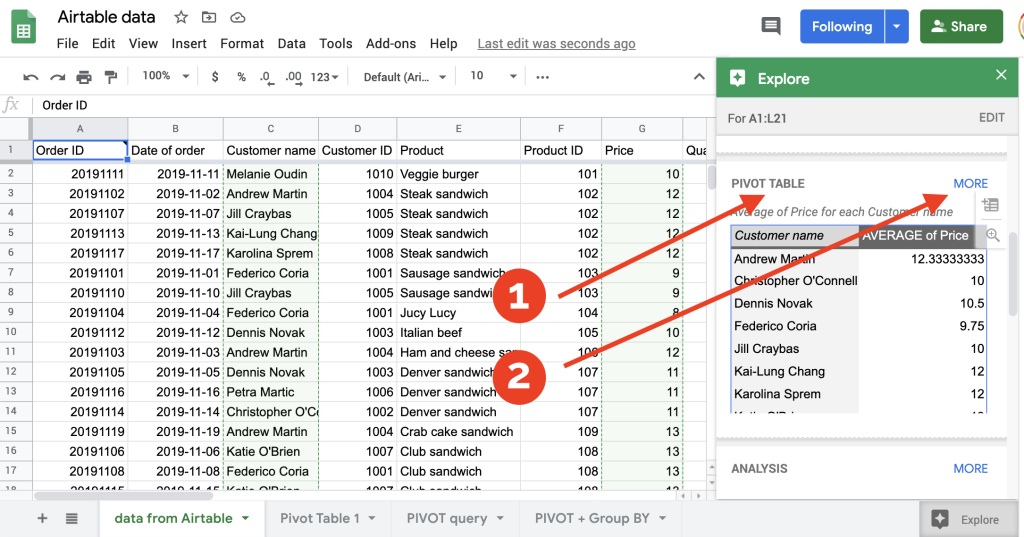
Another advantage of Google Sheets is that it offers the Explore tool to automatically build pivot tables. You can access it from the star-shaped button in the bottom-right of your spreadsheet or press Alt+Shift+X (Option+Shift+X for Mac) Google Sheets shortcut.
This will open a dialog window where you can select:
- A suggested pivot table
- Or open more options if the suggested one is not the one you are looking for.
Whatever the built-in capabilities are, it is still better to learn to create your own pivot tables, as their biggest advantage is in their flexibility.
How to prepare data for use with a Google Sheets pivot table?
Before you create your own pivot table, you need to make sure your data is properly formatted. It’s like stretching before exercising. It’s better not to skip this step – otherwise, you may run into some trouble later. Pivot tables in Google Sheets enable you to summarize and reorganize your data dynamically, but you can’t summarize just any dataset. In most cases, your data needs to be laid out as a data list. Make sure that:
- Your columns are named properly. Well, this may sound like advice from Captain Obvious, but if your columns have good descriptive names, they are going to be easier to work with later. Plus, the headings should take a single cell.
- There are no blank rows in your dataset. The pivot tables engine really needs to know exactly where your data starts and ends. If Google Sheets encounters a blank row anywhere in your list, it will figure this as the list end and skip any data that follows. It’s OK to have blank cells but it’s not OK to have blank rows.
- You have no extra data in any cells around your data list.
- There are no subtotal or grand total rows in your table.
Once you have your data source arranged, go ahead and create your first pivot table.
How to edit a Google Sheets pivot table?
Chances are a pivot table that Google Sheets creates for you won’t meet your requirements right off the gates. You may need to sort data in some custom order, apply filters, and even pivot that pivot table. All of that is possible and easy to add to pivot tables in Google Sheets.
Order and sort data in a Google Sheets pivot table
When you click on your Google Sheets pivot table, an editor appears to the right of the screen, allowing it to tweak the settings. There, you may notice that there are different sort options, Order, and Sort by.
The Order indicates the order in which the field’s contents will be sorted. There are two choices here, Ascending or Descending.
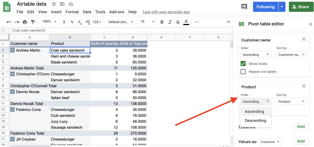
You can then sort by either “Product”, “SUM of Quantity” or “SUM of Total price”.
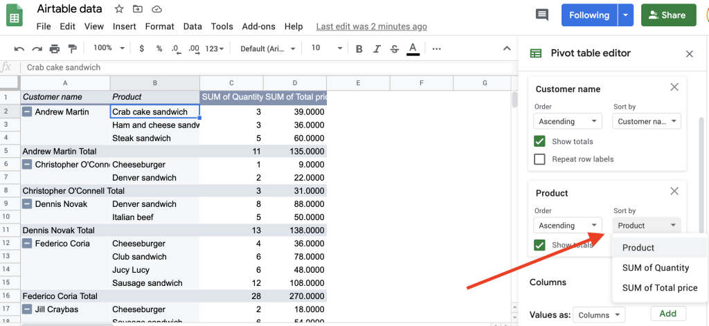
Sorting a pivot table moves the data you want to highlight to the top, enabling you to focus on values that matter most at that time.
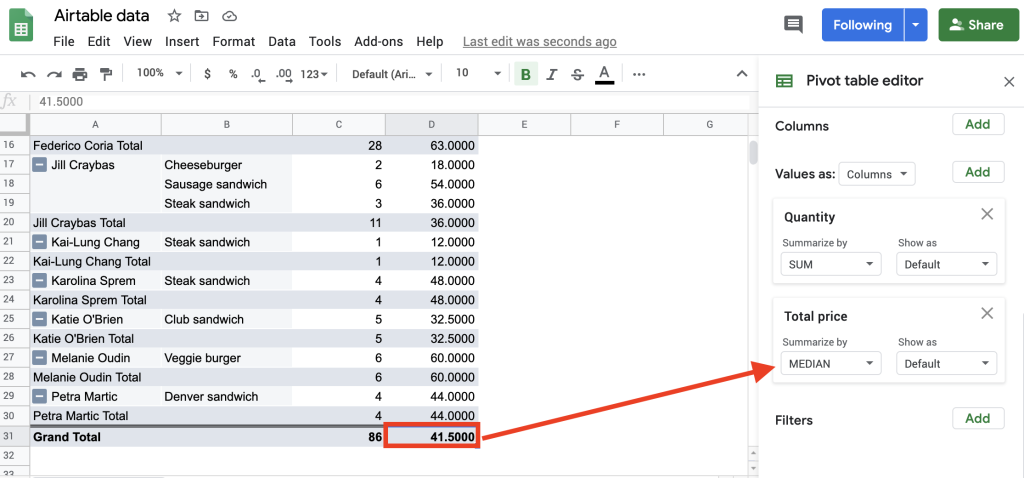
Change the aggregation type of a Google Sheets pivot table
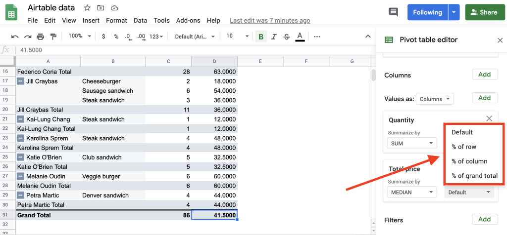
When analyzing your data using a pivot table in Google Sheets, you may want to know more than the SUM of your values, which is set by default.
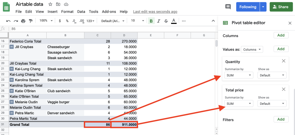
You can change the aggregation type, for example, from SUM to AVERAGE or MEDIAN, and get fresh insights into the data:
Again, your values usually have a default view:
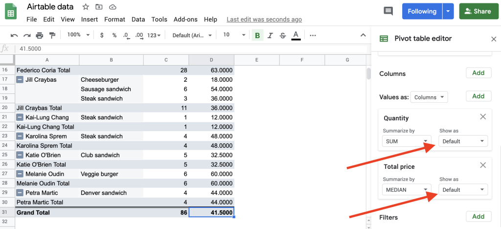
But other options are available as well. You can summarize by “% of row”, “% of column” or “% of grand total”.
Take some time to experiment with the available summary operations and settings. With these options, you’ll be able to extract more meaning from your data.
Apply filters to a Google Sheets pivot table
Pivot tables help you summarize large amounts of data, but you can also limit the data by creating a filter. Pivot table filters are practically the same as ordinary filters. To master this Google Sheets function, read our complete guide How to use FILTER Function in Google Sheets.
So, to filter your data, go to the control panel, click “Add” in the Filter area and choose one of the options.
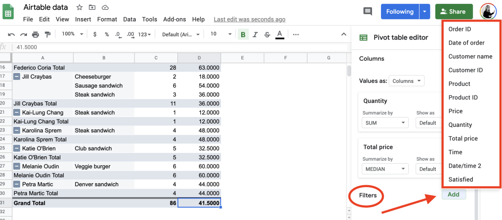
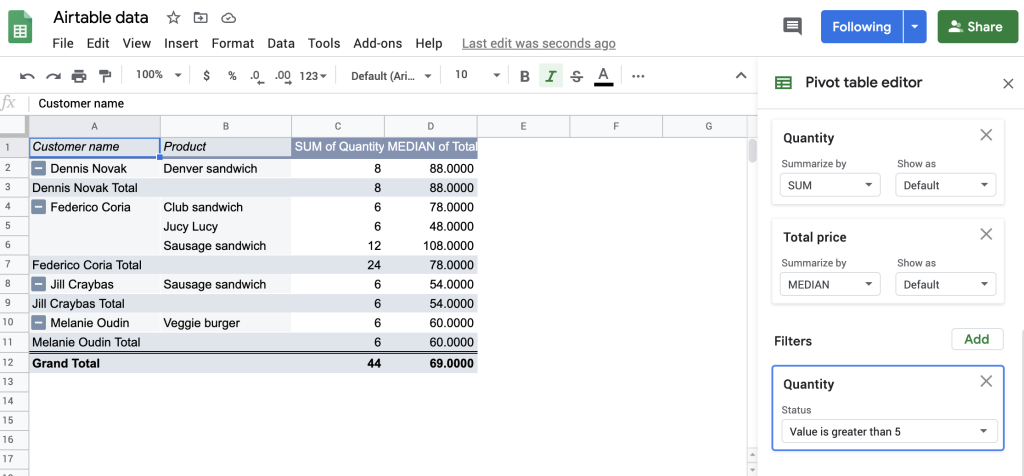
Let’s say we want to filter by “Quantity”. As in the ordinary filter, we can filter either by condition or by value.
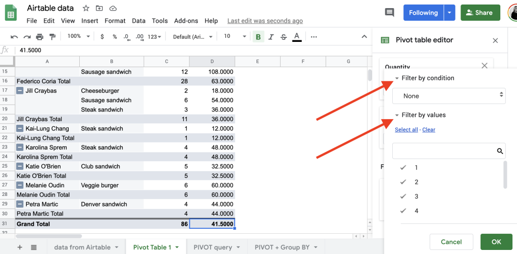
If the data you want to display in your pivot table fits a rule, for example, such as “all values greater than 5“, you can define that rule and filter by it.
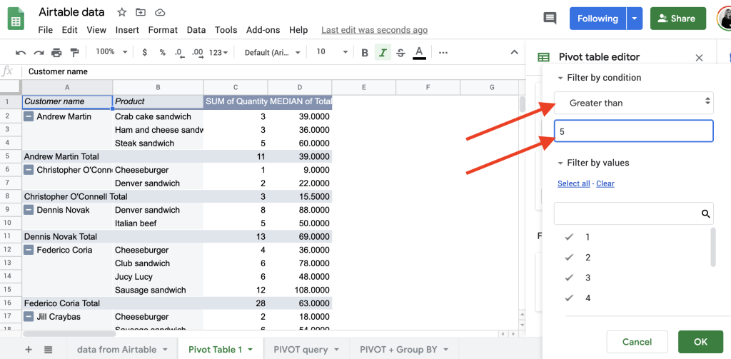
For example, in our case, we want to find customers who bought more than 5 products. Such arrangements can also show us the customers’ preferred products.
Pivot a Gooogle Sheets pivot table
The real power of a pivot table comes out when you want to rearrange your data dynamically; that is, to transform columns into rows, or rows into columns, and group by any of your data fields.
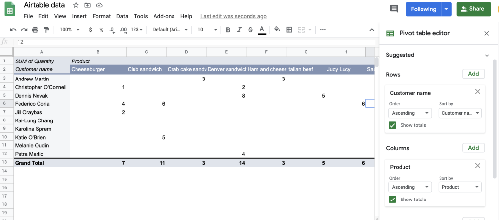
For example, in our last pivot table, we have “Products” as the Row header and “Customer name” as the Column header.
Now, let’s say you want to change that arrangement; for example, by setting “Products” as the Columns header and “Customer name” as the Rows header. To do that, go to the pivot table editor. If you happen to not see the task panel, you can restore it by clicking any cell other than the active cell within the pivot table.
Then all you have to do is to drag the existing fields to new positions. For example, to swap “Product” and “Customer name”, drag “Customer name” from the Columns area up to the Rows area, and “Product” down to the Columns area.
Here’s the new arrangement.
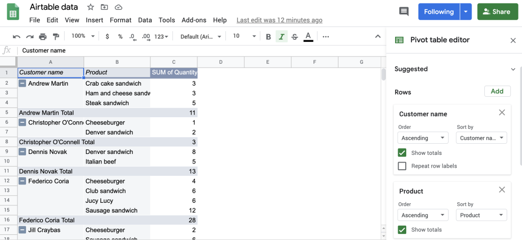
Let’s try another combination. If the previous table layout is not convenient for you to examine, you can make it more visually appealing by having both “Product” and “Customer name” in the Rows area. In the blink of an eye, Google Sheets pivots the pivot table; the new view can make a great deal of difference.
Now, let’s say you want to remove “Quantity”, and instead include “Total price”. To remove the “Quantity”, go to the Values area and click the close button. Now, “Quantity” is removed. Then, you can click “Add” and choose “Total price” from the drop-down list.
Or you may want to analyze both “Quantity” and “Total price”. Everything is possible with pivot tables, just follow the already familiar algorithm of adding new values and presto!
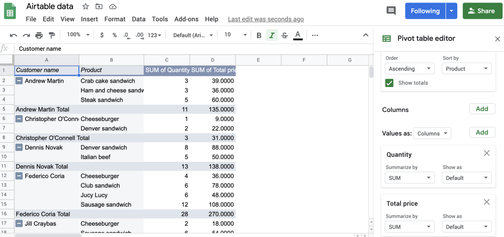
As you can see, changing a pivot table’s arrangement shifts the data’s emphasis, enabling you to examine the data from a different perspective quickly and easily.
How to refresh a pivot table in Google Sheets
Normally you don’t need to refresh pivot tables in Google Sheets – they will update automatically once the data in the range changes. However, you may come across two common issues that may require you to refresh the pivot table settings a bit to see the desired outcome.
Newly added data is outside of the pivot table range
When you select a piece of data and choose to turn it into a pivot table, the range for the pivot table will be set accordingly. In the example below, we highlighted the entire table and created a pivot table based on the selection. The pivot table range became A1:C7.
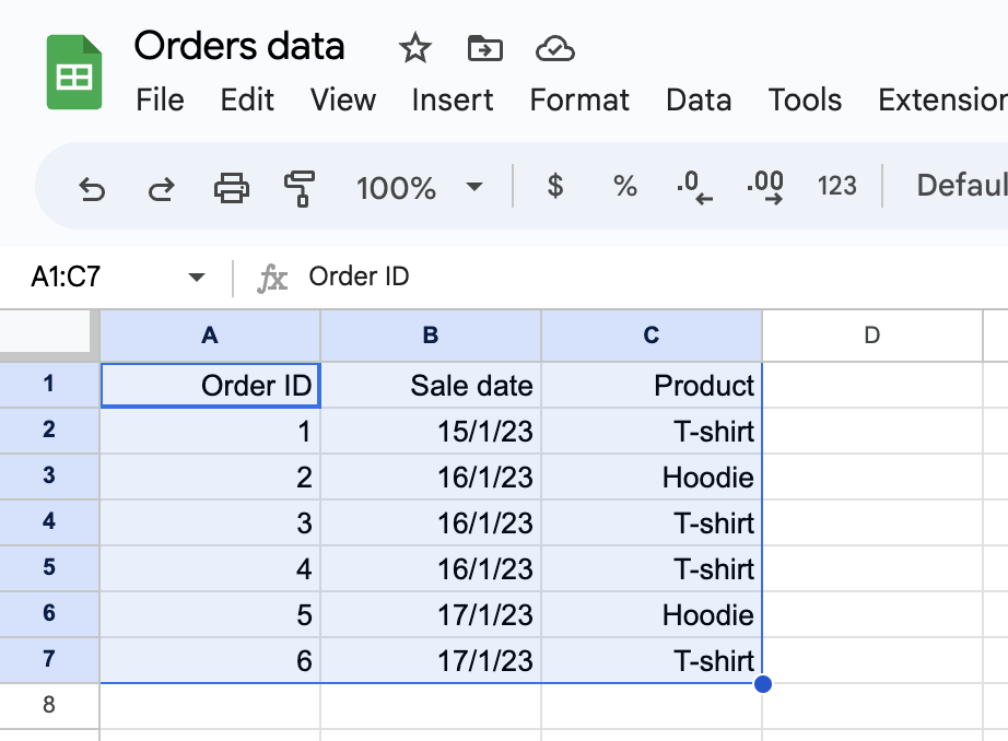
Now, a new order may arrive and go into row 8. It won’t, however, be included in the existing pivot table as it falls outside of its range.
What you can do, of course, is adjust the range for a pivot table in Google Sheets. You don’t want to be doing it every time you add new data, though. For that reason, a good practice is to adjust the pivot table range right after creating it, to include, for example, 1000 rows. When you’re nearing that number of rows in a table, add another 1000, and so on.
A tiny inconvenience with this approach is that an extra row will appear in the Google Sheets pivot table, with some possible #DIV/0! errors.
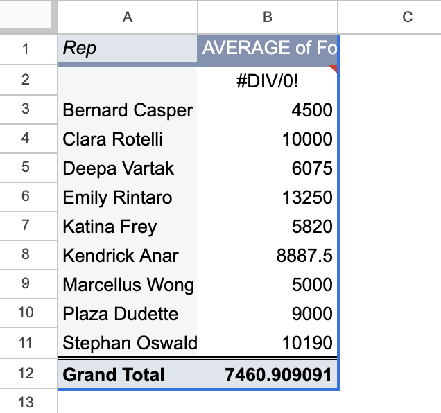
You can, however, hide this row by applying a specific filter – hiding rows where the value in the Rep column (in this example) is empty.
Review the filters
When adding new data, you may find it to be automatically excluded from a pivot table even though it’s within its range. It commonly happens because of filters.
By default, if existing filters in a pivot table exclude some results, any new additions will also be excluded. For example, in the following table, we’re excluding all orders for hoodies.
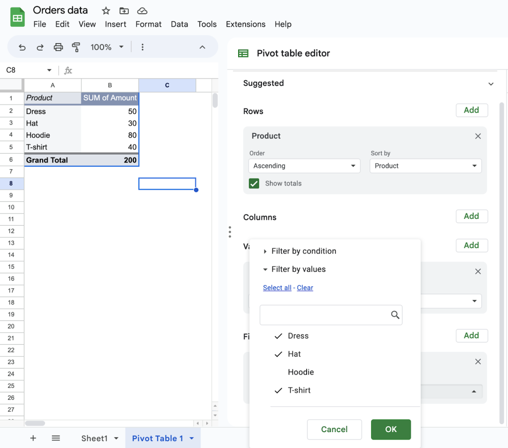
If a new order was placed for, let’s say, gloves, it would also be filtered out of the pivot table by default.
To address this issue, it’s best to delete the existing filters before adding new data and re-add them once the data is finalized. Alternatively, consider adding a different set of filters that won’t exclude individual results. For example, if you filter for orders with a value of $30 or more, any new row meeting this criteria will be immediately included in the pivot table.
Digging deeper with Google Sheets pivot tables
So, as you may have guessed, pivot tables are a powerful and flexible tool and a very broad topic. The more that you’re willing to look into how they work, the better they can serve you in your own analysis. For some purposes, you even may need to create pivot table in Power BI instead of Sheets.
Depending on what you need your Google Sheets pivot table for, you might also combine your pivot table with other Google Sheets functions and options.
For example, you may need to incorporate data from another source. If this is the case, you may need to apply a VLOOKUP or XLOOKUP function to collect information from elsewhere in your Sheet.
If you don’t have the data yet in Sheets, you may want to incorporate Coupler.io into your workflows. It can help you turn your spreadsheet into a control center for your business.
Without any coding, you can set up automated imports from your sales, marketing, accounting, and other apps. What’s more, you can set up a schedule for data refreshes and connect your sheets to visualization tools like Looker Studio with just a few clicks.

Automate data export with Coupler.io
Get started for free