What is a data visualization dashboard?
A dashboard is a tool that presents data in a visual format. It offers a simple way to analyze different types of information in one place, usually on a single screen. For example, graphics such as pie charts, scorecards, geo maps, and scatterplots are commonly used in dashboards to express information in an engaging and cohesive way.
Dashboards for data visualization have an overarching goal – to help you make sense of your data and achieve a set of goals. Yet, every dashboard is created with an individual purpose in mind. For instance, you may have dashboards that allow you to visualize different aspects of your marketing performance, or dashboards that provide insight into your company’s financial health.
Bad vs good dashboard
What are the key differences between a well-made or a poorly-designed dashboard? Let’s explore them.
Bad dashboard:
- Cluttered layout – too many data points and visuals crammed into a single screen.
- Information overload – no prioritization of key metrics, provides too much data for you to process at a glance.
- Hard to read and navigate – contains poorly-labeled graphics or an excessive amount of text.
- No automatic updates – doesn’t refresh your data on a regular basis, requires manual updating.
Good dashboard:
- Has a clear focus – displays just enough information to help you monitor progress and make decisions.
- Keeps things simple – sticks to the most important metrics and minimal graphics, easy to scan quickly.
- Can be interactive – allows you to drill down into details or filter data by period, location, etc.
- Presents fresh data – updates automatically on a customizable schedule (e.g., every day, once a week, or every 15 minutes).
What is the purpose of using a dashboard for data visualization?
The purpose of using dashboards is to present complex data in an easy-to-understand and actionable format. Dashboards provide a way to organize and display data clearly and concisely, allowing users to identify key trends, patterns, and insights quickly. This will let them make more informed decisions driven by data and improve their organization’s performance.
As with so many modern tools, data visualization dashboards are the result of technological evolution and the need to simplify processes. People who work in sales can testify that the possibilities have broadened in the past decade alone and that reporting systems can’t keep up with the amount and variety of available data. This industry isn’t the only one that has seen a significant leap in data sources. SEO specialists, UX designers, and anyone in the cryptocurrency business have many more tools and information at their disposal than ever before.
Overall, the main purpose of using data visualization dashboards is to provide an easy way to access and understand important data for the stakeholders.
The more data sources, the more places to look for information, and the room for errors is wider. If you have a spreadsheet stuffed with thousands of rows, it is difficult to read and comprehend the insights it contains. Data visualization dashboards solve this pain point by digesting the most important business metrics in a visual collage to be overviewed daily.
Data visualization: benefits of using dashboards
Let’s look at the main benefits of using data visualization dashboards.
Help decision-makers— Managers from junior to senior levels need to overview data to make well-informed decisions. The higher the management level, the more complex reports become, and it gets more difficult to keep track of important metrics. But dashboards offer visual cues that help track changes on a daily basis. For instance, switching to automated dashboards allowed United Way NWI to save 80 hours a month on manual exporting and accelerate their decision-making timelines.
Save company time— The reports managers need to review are usually put together by one or more team members or by the managers themselves. Creating automated dashboards saves time, as the BI apps do most of the work instead of having to drag-and-drop datasets around. For example, our client ClaritySeed saved over 40 hours a month by automating their marketing reporting. They invested the saved time into data analysis (the important stuff) and now deliver reports 5 hours faster than before.
Improve collaboration— Most of the tools we talked about feature private and public dashboards. Data can be centralized and shared with the team and clients. This way, everyone will be on the same page, and they’ll be able to access important documents faster. The most significant issues most companies face are linked to bad communication and misplaced information. A unique view that gathers vital data visualizations can help prevent both these problems.
Preventing business-threatening issues— Avalanches can start small and become deadly and devastating. The same goes for business records that aren’t spotted on time. Dashboards help you keep watch over critical metrics and identify poor performance signals. For example, another of our clients – Tradezella – retained 2.5-times more customers after creating a custom product dashboard that updates every morning. This automation allows them to reach out to and convert more subscribers into paying customers.
Data visualization dashboard examples by type
You can use different types of dashboards for your own business needs. Generally, there are four types of dashboards: operational, tactical, strategic, and analytical. However, we enhanced our list to give you a wider picture of what data visualization dashboards you can encounter.
- Operational dashboards
- Tactical dashboards
- Strategic dashboards
- Analytical dashboards
- KPI (Key Performance Indicator) dashboards
- Scorecard dashboards
- Geographic dashboards
- Executive dashboards
- Mobile dashboards
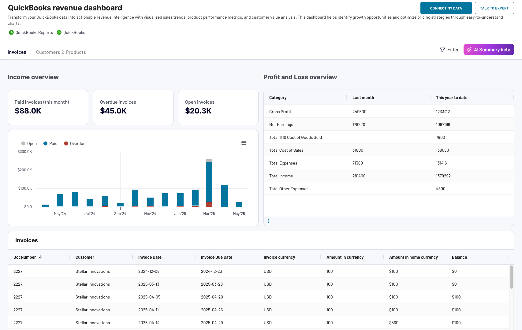
Operational dashboards
Operational dashboards provide real-time information about the performance of day-to-day operations in an organization. They often present data in the form of graphs, charts, and tables, and can be tailored to show specific information that is relevant to the user.
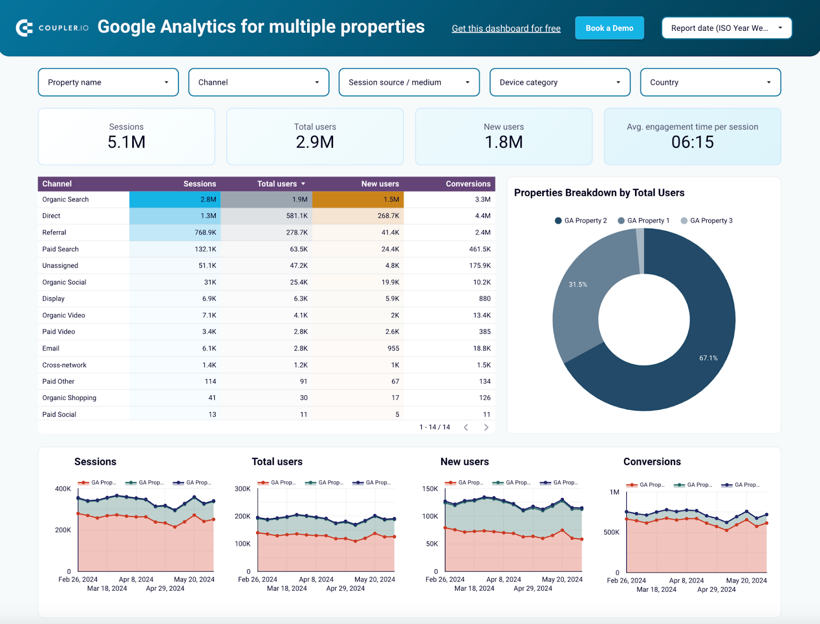
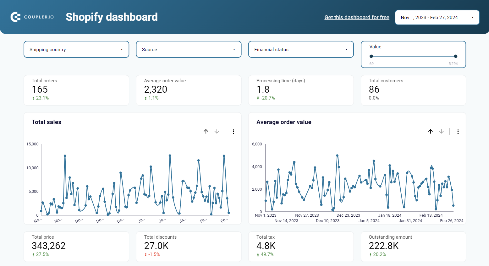
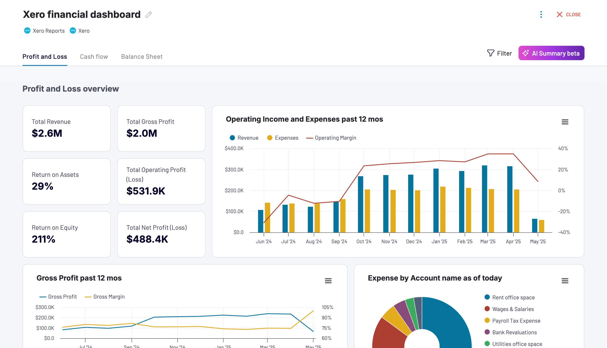
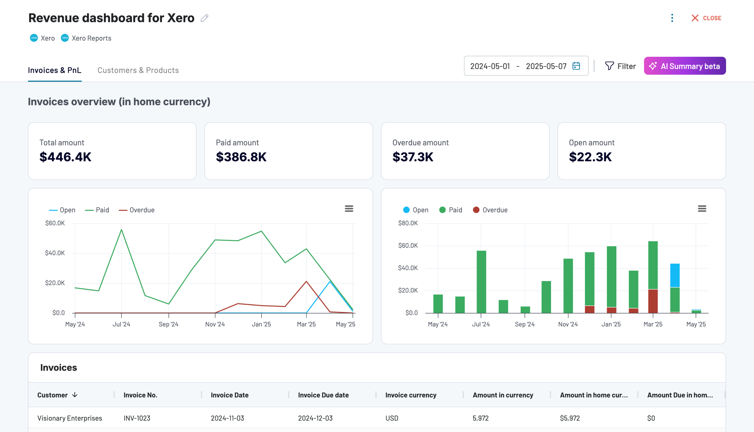
Here is an example of an operational dashboard – the revenue dashboard for QuickBooks.
QuickBooks revenue dashboard + AI insights
 Preview dashboard
QuickBooks revenue dashboard + AI insights
Preview dashboardDashboards of this type are usually very detailed and are used to monitor operations with a short time horizon. You can use an operational dashboard in all areas to keep an eye on metrics.
Here is the information that may be displayed on an operational dashboard:
- Sales figures
- Production metrics
- Inventory levels
- Service levels
- Employee performance metrics
- Machine or equipment performance data
- Customer service metrics
- Website or social media metrics
Tactical dashboards
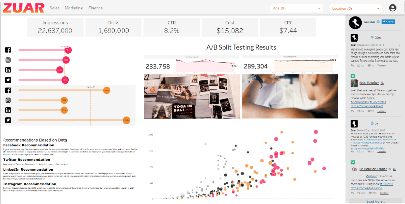
Tactical dashboards are more analytical compared to operational ones and allow users to quickly identify trends and patterns.
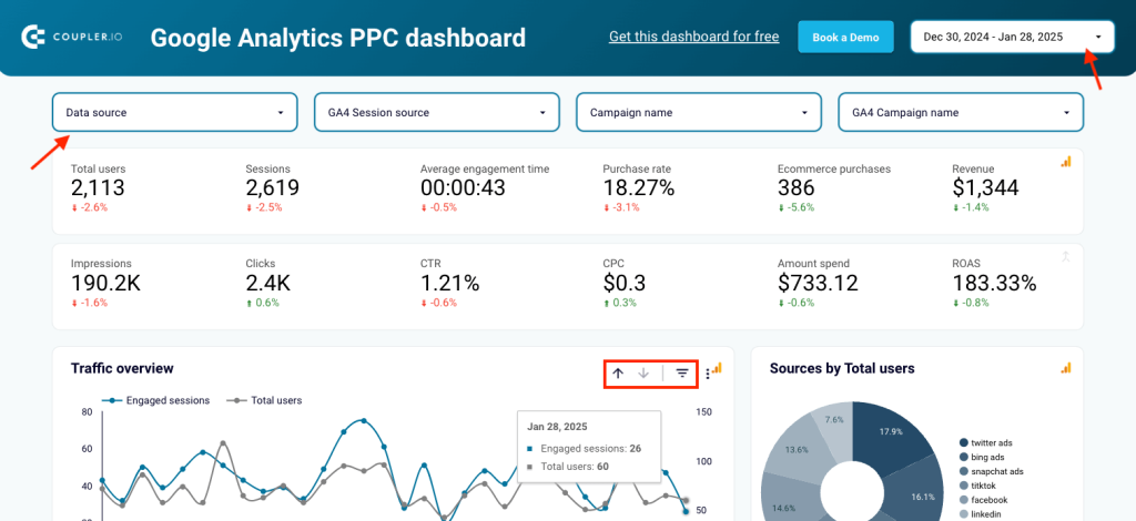
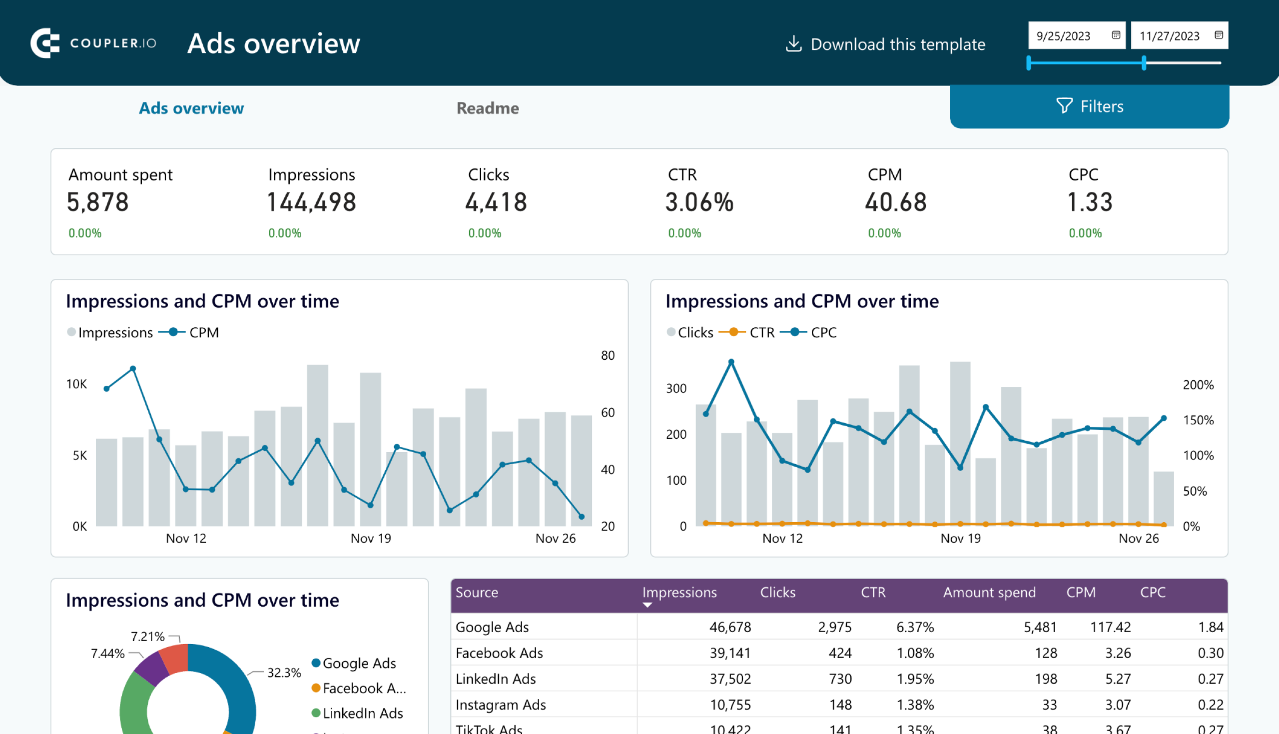
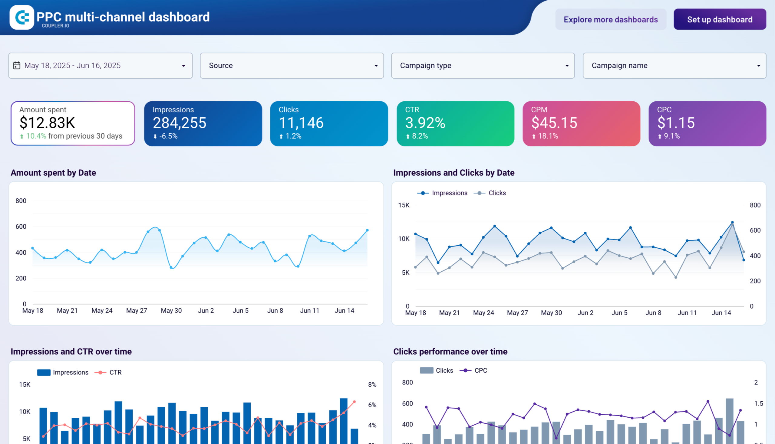
Here is an example of a tactical dashboard: PPC monthly budget dashboard in Google Sheets.
PPC monthly budget dashboard in Google Sheets
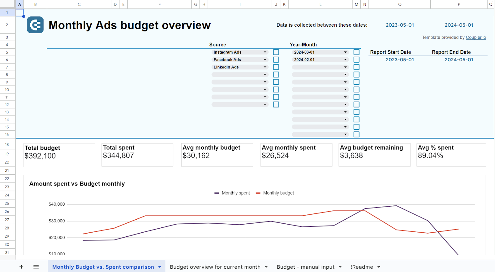 Explore dashboard
PPC monthly budget dashboard in Google Sheets
Explore dashboardThe insights from these data analytics dashboards can be applied to tweaking strategic goals or adjusting operational goals.
For example, sales operational dashboards track how sales records of a certain product or group of products fluctuate from day to day. A sales tactical dashboard compares weekly or monthly results to their respective forecasts.
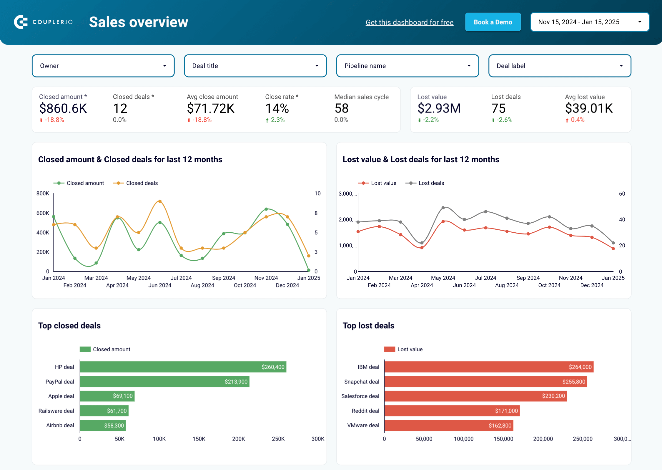
Strategic dashboards
Strategic dashboards provide high-level information about the overall performance of an organization. They are typically used for KPI tracking which is critical to the success of the business.
Here is what a strategic management dashboard may look like.
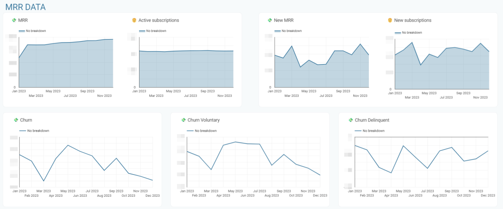
Strategic dashboards are different from operational and tactical dashboards as they provide a higher level view of the organization.
A SaaS strategic management dashboard overviews customer base, lifetime value, acquisition cost, and MRR. In marketing, such a dashboard is focused on the success of marketing campaigns in terms of newly acquired customers and the costs vs. the generated sales. We’ve even created a separate blog post dedicated to marketing data visualization. Some examples of information that may be displayed on a strategic dashboard include:
- Revenue and profit margins
- Active subscriptions
- Customer satisfaction rates
- Monthly recurring revenue
- Churn rate
- Production efficiency
- Inventory levels
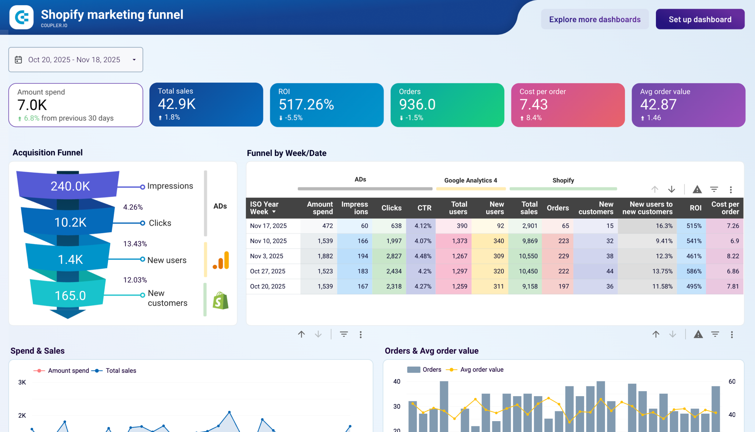
Analytical dashboards
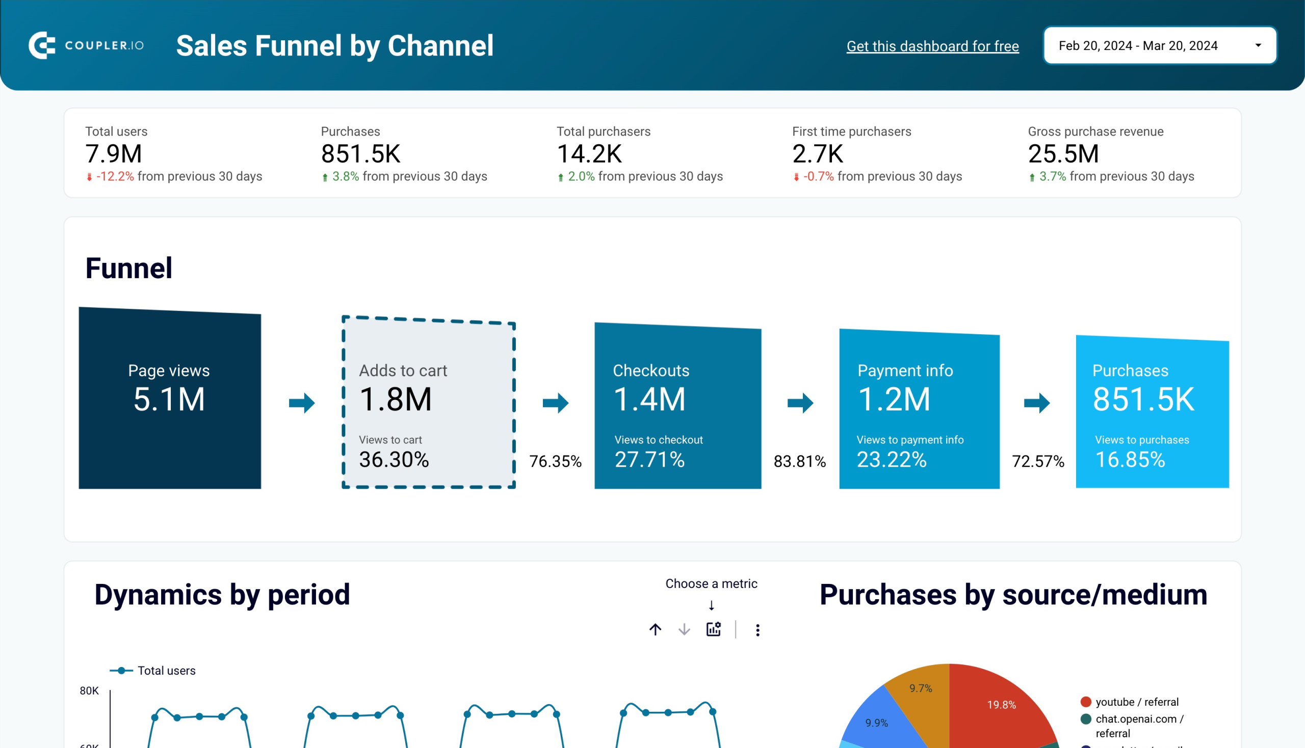
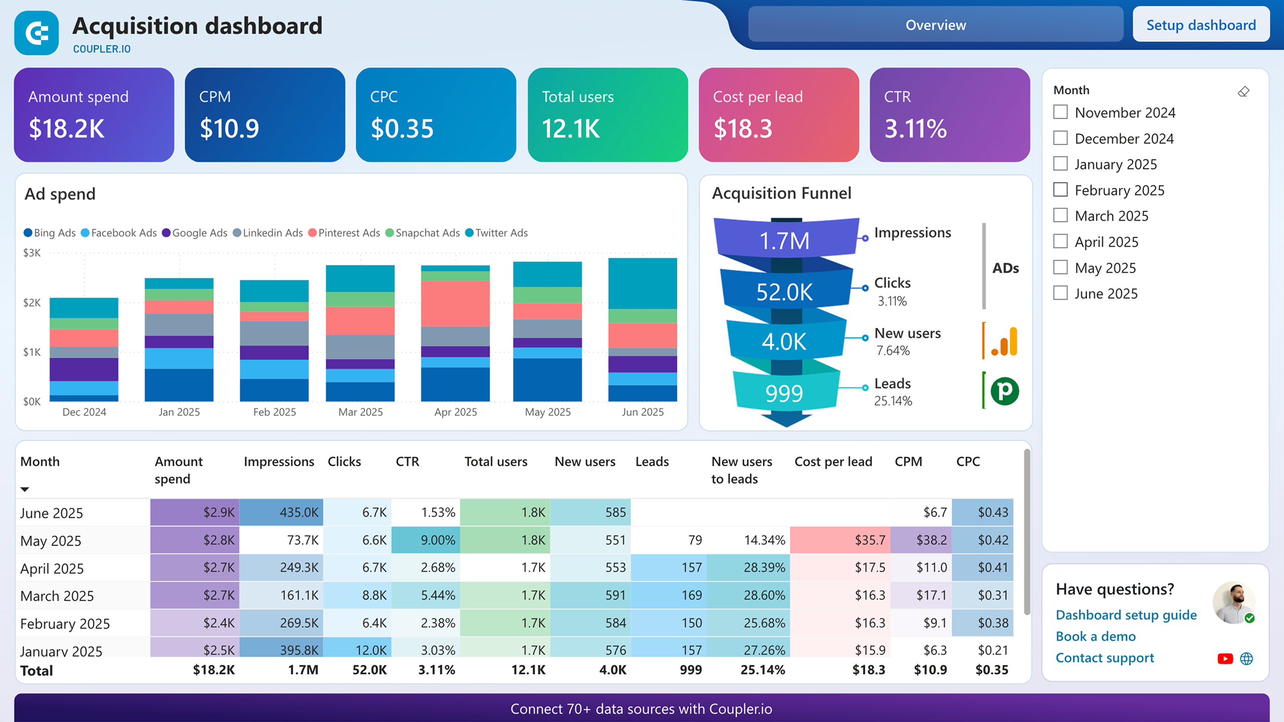
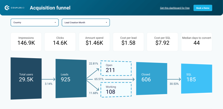
Analytical dashboards provide detailed information about specific areas of the business. They are often used as an information bridge between operational and strategic levels, just like tactical management.
Unlike tactical dashboards, however, analytical ones deal with specific topics like marketing, finance, sales, etc. For instance, you can get an analysis of the acquisition funnel for an ecommerce store.
Shopify marketing funnel analytics dashboard
 Preview dashboard
Shopify marketing funnel analytics dashboard
Preview dashboardSome examples of information that may be displayed on an analytical dashboard include:
- Detailed sales figures by product or region
- Trends in customer behavior
- Employee performance metrics
- Production efficiency metrics
- Inventory levels
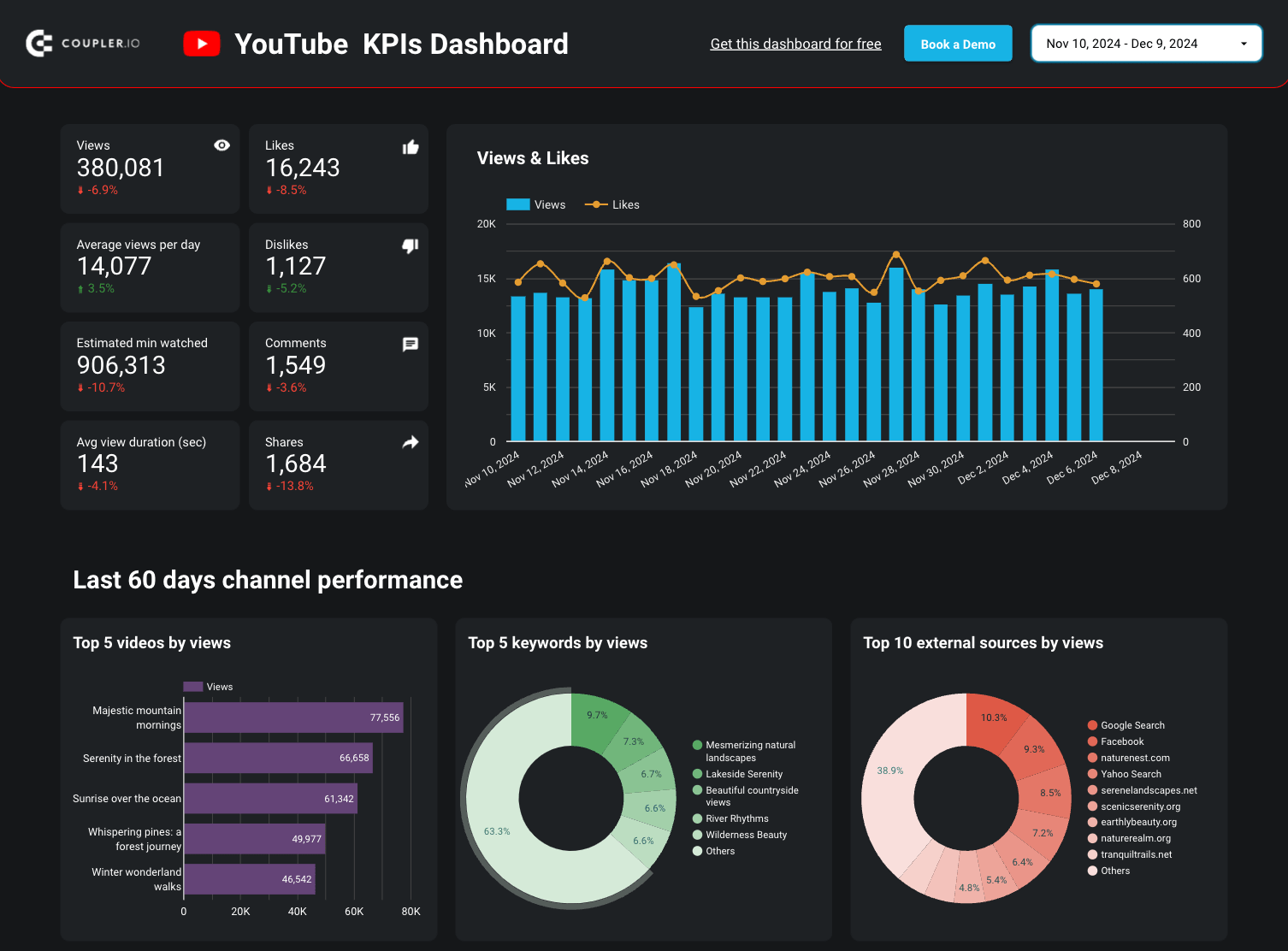
Key Performance Indicators or KPI dashboards
KPI dashboards focus on specific metrics that are important to an organization and are used to track progress toward goals. They allow you to monitor the performance of the organization and to identify areas where improvements can be made.
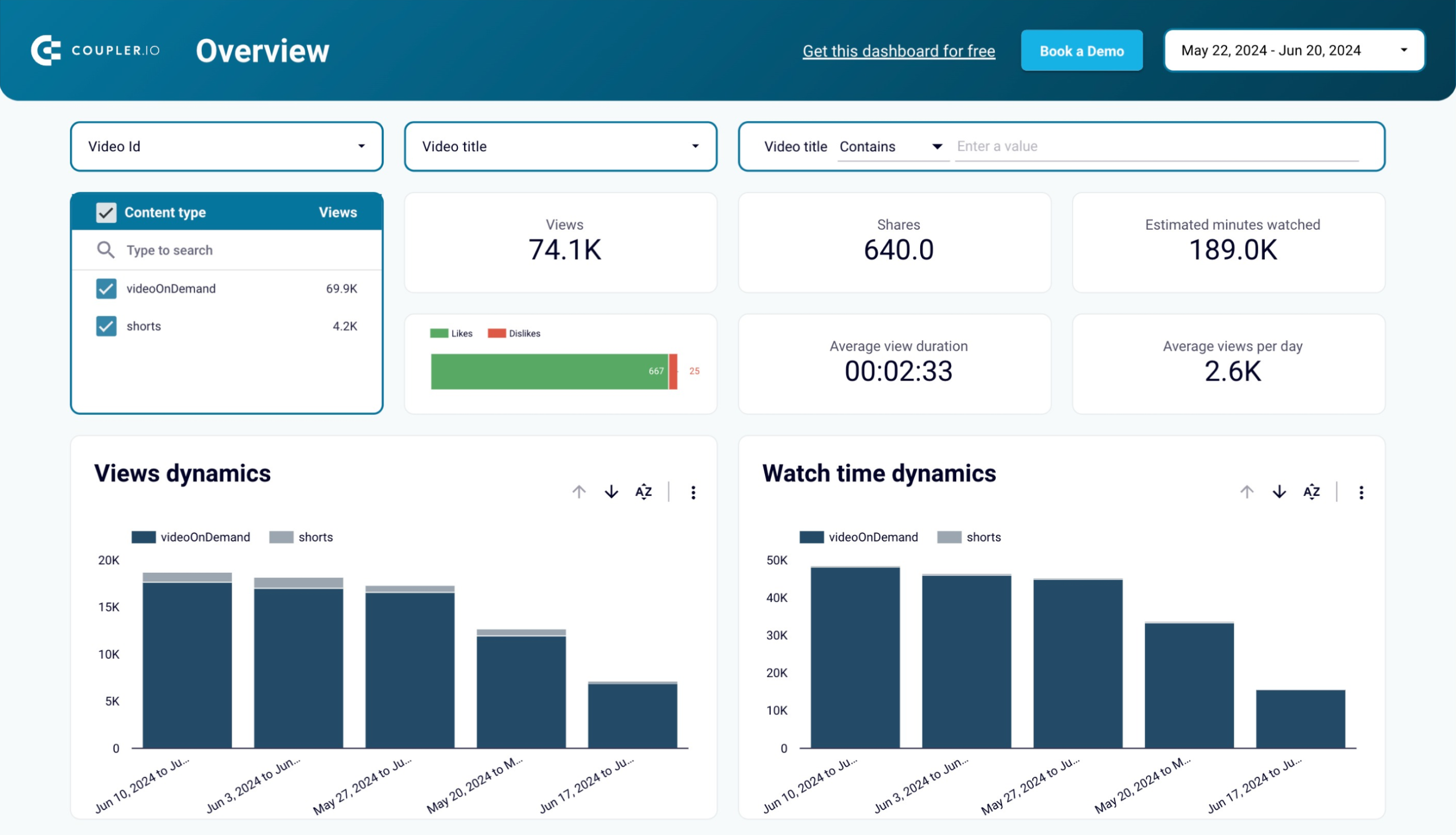
Here is an example of a KPI dashboard for YouTube.
KPI dashboard for YouTube in Looker Studio
 Explore dashboard
KPI dashboard for YouTube in Looker Studio
Explore dashboardKPI dashboards are different from other types of dashboards, as they focus on specific key performance indicators and on tracking progress towards specific goals.
Examples of information that may be displayed on a KPI dashboard include sales figures, production metrics, inventory levels, employee performance, customer service metrics, etc.
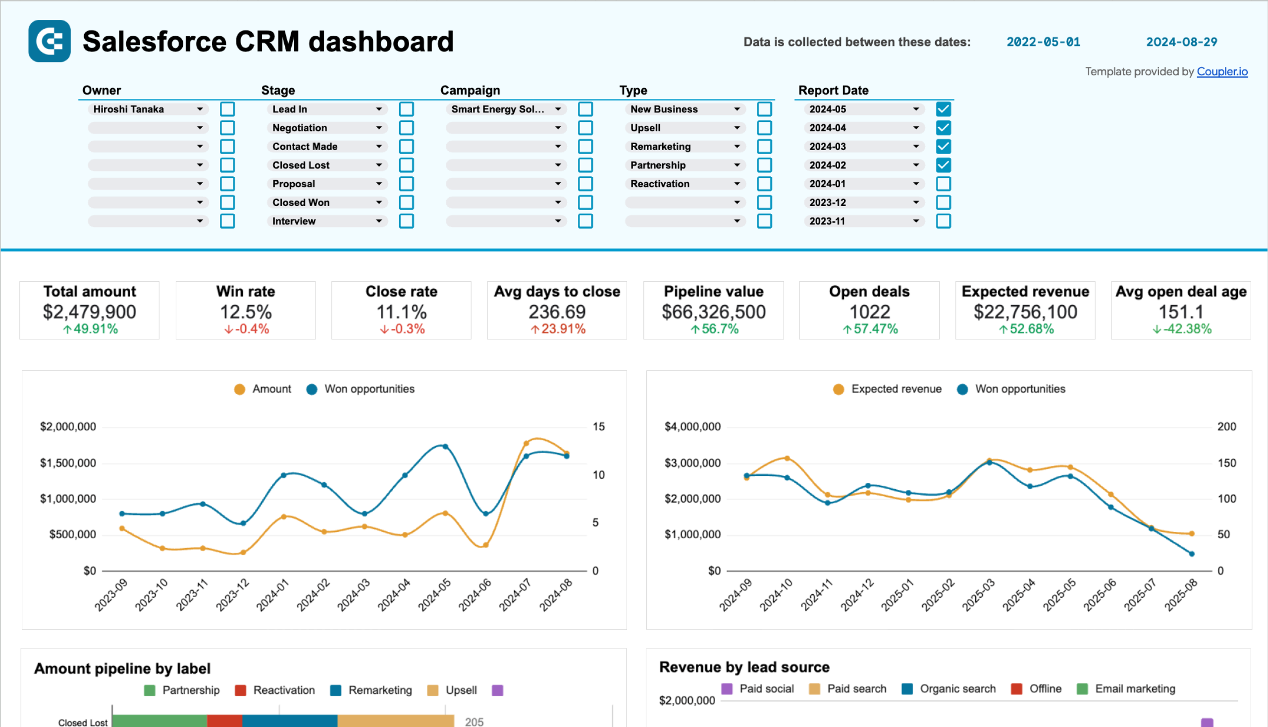
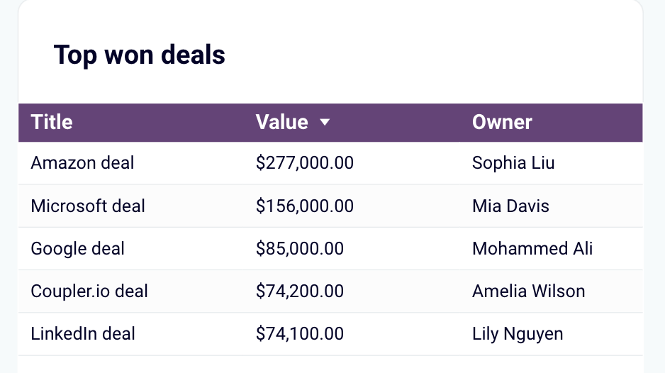
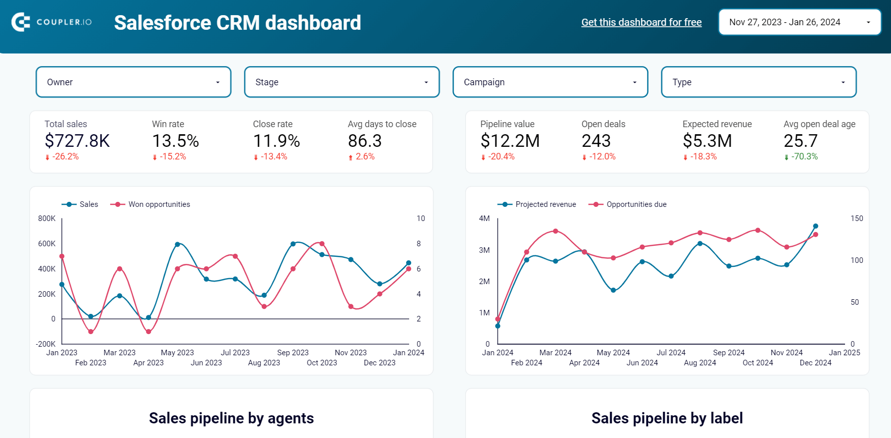
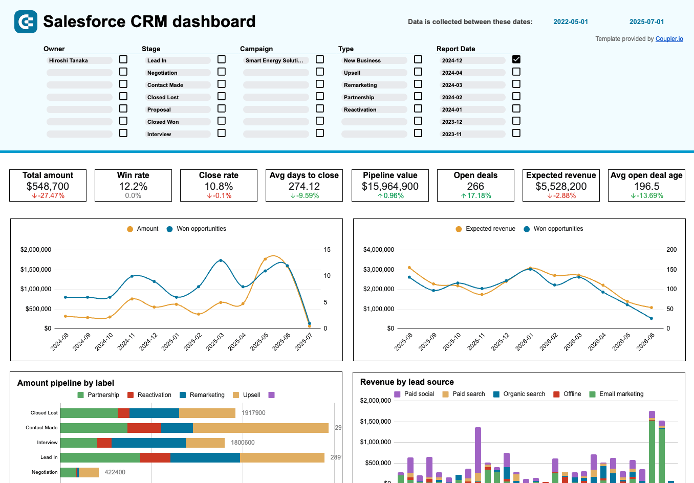
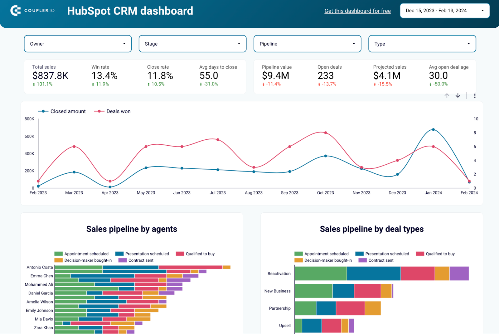
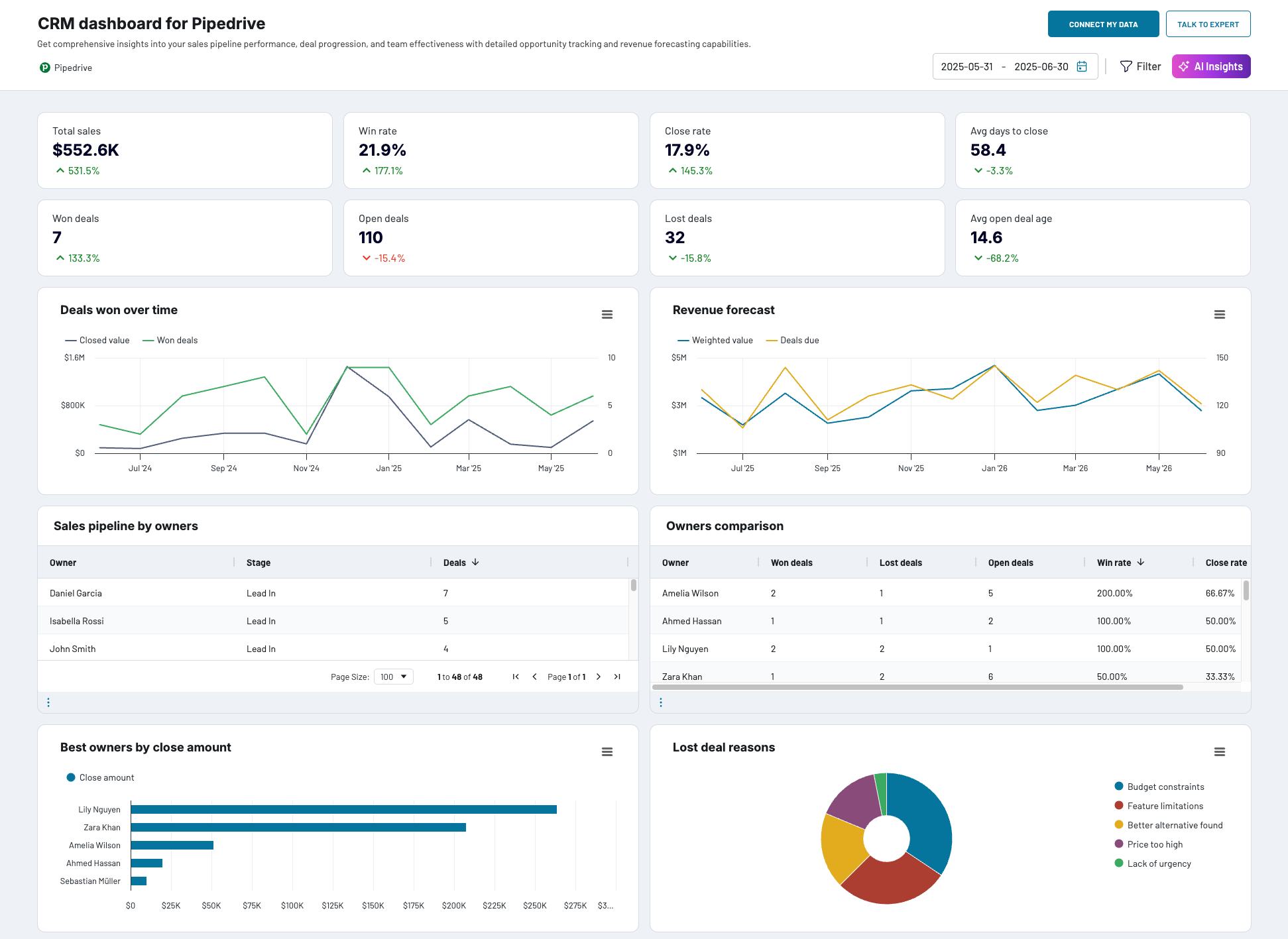
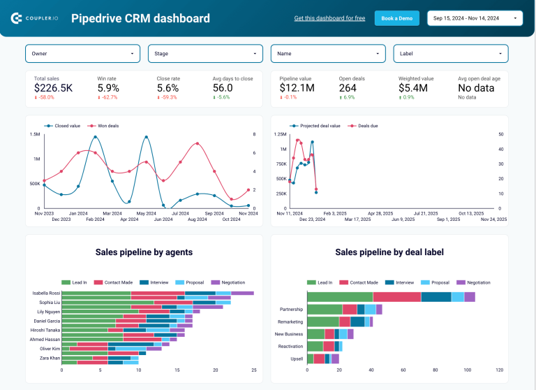
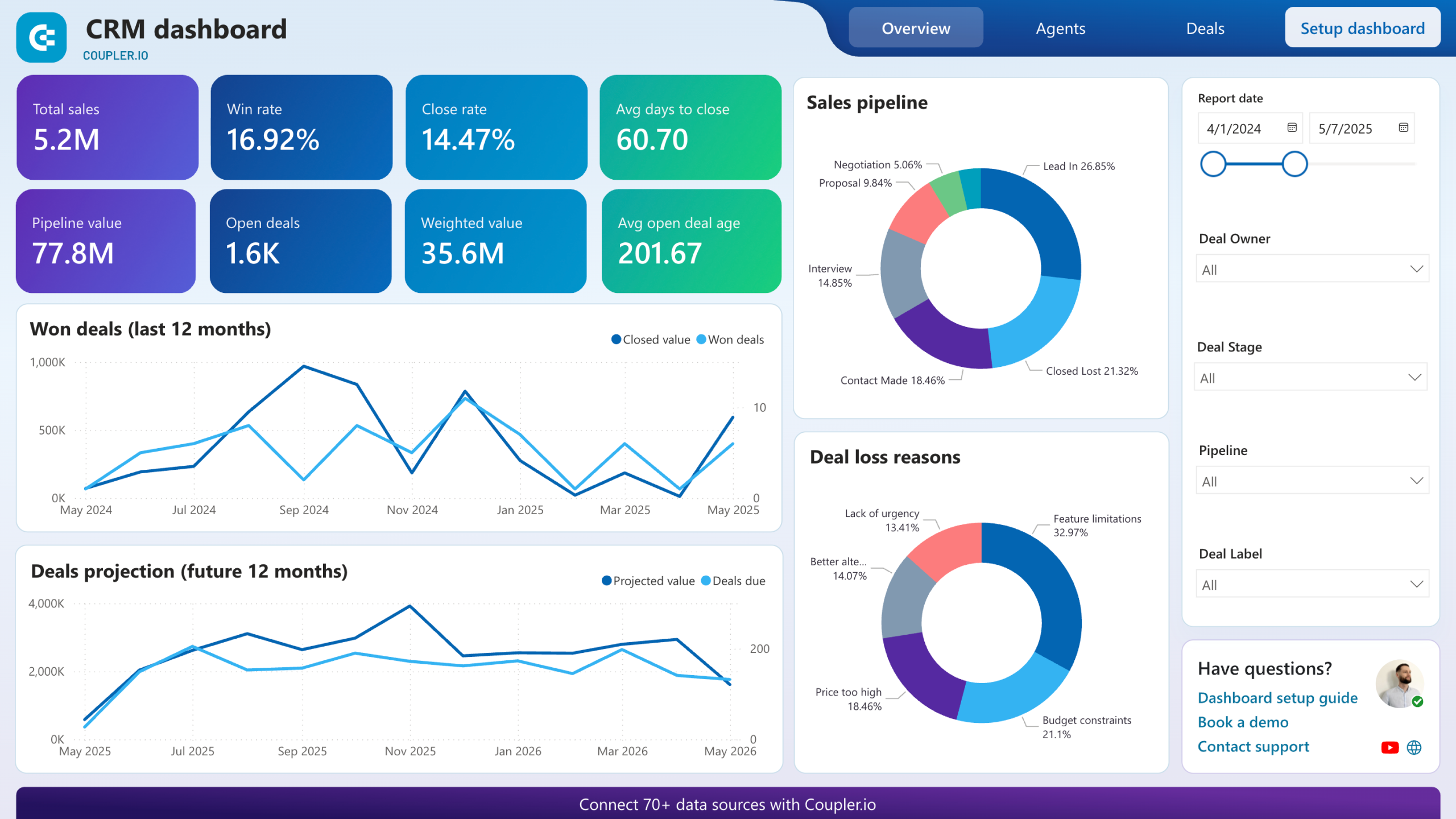
CRM dashboards
As the name suggests, CRM dashboards are used to better organize the customer relationship management process. For example, here is a CRM dashboard for Salesforce.
CRM dashboard for Salesforce in Google Sheets
 Explore dashboard
CRM dashboard for Salesforce in Google Sheets
Explore dashboardAlthough CRM tools usually offer some kind of native dashboards, they typically don’t give much room for customization. So it can be more practical to build a dashboard in a specialized data viz tool, such as Looker Studio or Power BI.
For more information on the topic, check our article on CRM dashboards.PPC monthly budget dashboard in Google Sheets
Bonus: scorecard, geographic, executive, and mobile dashboards
As we mentioned above, we enhanced our list of main types of dashboards with the types that can be useful for your project. We’ll check them out in brief.
- Scorecard dashboards provide an overview of an organization’s performance across multiple metrics and are used to evaluate progress toward overall goals. They are commonly used in combination with other types of dashboards to provide a more complete picture of the organization’s performance.
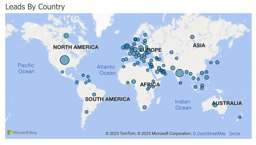
- Geographic dashboards display data on a map. They are used to identify patterns and trends in data that may not be immediately apparent when looking at raw data. These dashboards can include different forms of visualizations such as points, lines, polygons, and others. Geographic dashboards are meant to visualize data with a location component such as customer locations, sales data by region, and distribution of assets.
- Executive dashboards provide a high-level overview of an organization’s performance. They are typically used by senior management to monitor the organization’s overall performance and make strategic decisions. The design of executive dashboards is supposed to make them simple, easy to read, and provide a quick snapshot of the most important information. The information that can be displayed on an executive dashboard includes revenue and profit margins, market share, employee turnover, etc.
- Mobile dashboards are designed to be accessed and viewed on mobile devices such as smartphones and tablets. These dashboards are typically used to provide on-the-go access to important information and to allow users to make decisions and take action based on the data displayed.
Dashboard design: how to make a data visualization dashboard?
Basically, there are three options for you to get a data visualization dashboard:
- Use a white label template. Such dashboard templates are usually created in spreadsheet apps like Google Sheets or data visualization tools like Looker Studio. With these templates, you get a ready-to-use dashboard with a design that you can tune for your needs. All you need to do is connect your data source to the chosen template, for example, one of the Looker Studio marketing dashboards or Google Sheets dashboards, and enjoy it.
- Build a dashboard yourself. This is a long journey since you’ll need to choose a tool for your data visualization dashboard and build it from scratch. On one hand, you can tailor a custom solution considering all your likings. On the other hand, you’ll need to have knowledge and experience in using the particular data visualization tool and spend time on getting things done.
- Hire an expert service to tailor your data visualization dashboard. This option is the best when you lack knowledge or time to build your dashboard by hand. So, you ask an expert or group of experts to implement your ideas. As a result, you’ll get a ready-to-use solution designed by professionals in a quick way. For example, Coupler.io offers a data analytics service designed to deal with advanced data management and visualization tasks.
Different users choose different options based on their resources and requirements. Startups and small entrepreneurs tend to go with templates or the DIY method. Small to medium sized businesses can already afford to hire experts to streamline their reporting and analytics via dashboards. Large companies can also opt for third-party experts, but in most cases, they already have data analysts hired, so they can build their dashboards in-house.
Tools for dashboard design
Now, let’s explore the types of tools you will need to create a dashboard:
Data sources
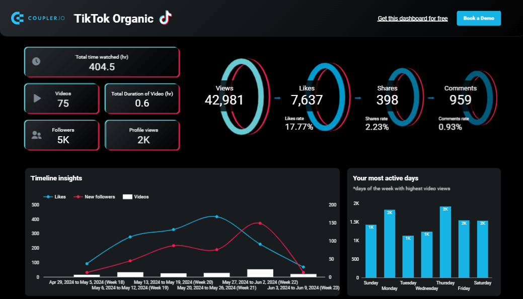
Identify the platforms, databases, and apps you want to extract data from. Each source must have the ability to integrate with third-party connectors or directly to business intelligence tools. Some examples of popular sources include marketing platforms like Facebook Ads, Google Analytics 4, or TikTok Organic, accounting tools like QuickBooks, and CRMs like HubSpot or Salesforce.
Connectors for data collection
To automate data exports and collect data from multiple sources simultaneously, you will need to set up data connectors. Coupler.io, a reporting automation platform, simplifies this process.
With Coupler.io’s built-in connectors, you can collect data from over 60 marketing, sales, finance, and ecommerce apps, including the sources mentioned above. Your data will be automatically channeled to a BI tool of your choice, such as Tableau. Additionally, you can modify, blend, and aggregate data from different sources before sending it to a dashboard tool.
Spreadsheets and BI tools
Finally, you will need dedicated tools for data visualization. There are two ways to go here. You can either use a spreadsheet tool like Google Sheets or Excel, or a more advanced solution like Looker Studio, Power BI, or Tableau.
Spreadsheets are easy to customize and have a low learning curve. However, they only offer basic options for data visualization, such as pie charts, bar charts, and scatterplots.
Meanwhile, purpose-built tools like Looker Studio or Power BI provide a broader selection of visuals and organization options. You can create geo maps, scorecards, complex charts, and other interactive elements.
For some inspiration, check out our articles on Power BI visuals.
Dashboard design principles
Let’s explore some best practices to keep in mind when creating a data visualization dashboard.
Graphic elements of a data visualization dashboard
There is a variety of visual elements you can use to present your data in a dashboard. Here are the most common of them.
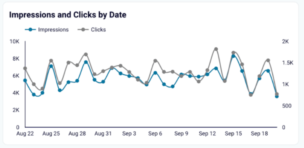
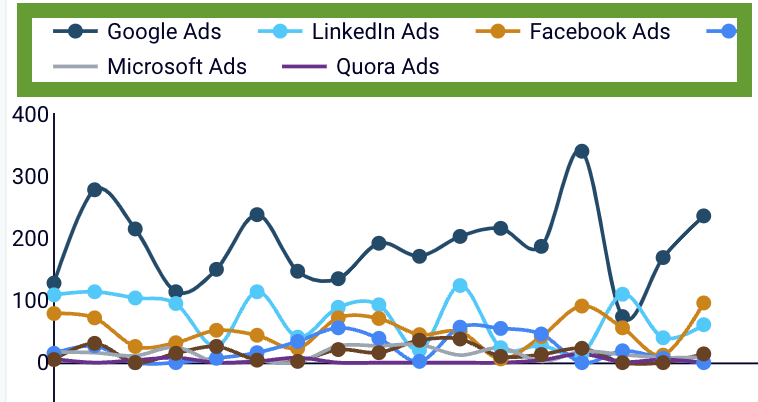
Line chart
That’s a graph that shows correlations in the form of a line between the two axes (most commonly, x – time/category and y – quantity). Sometimes, it’s also called a line plot or line graph.
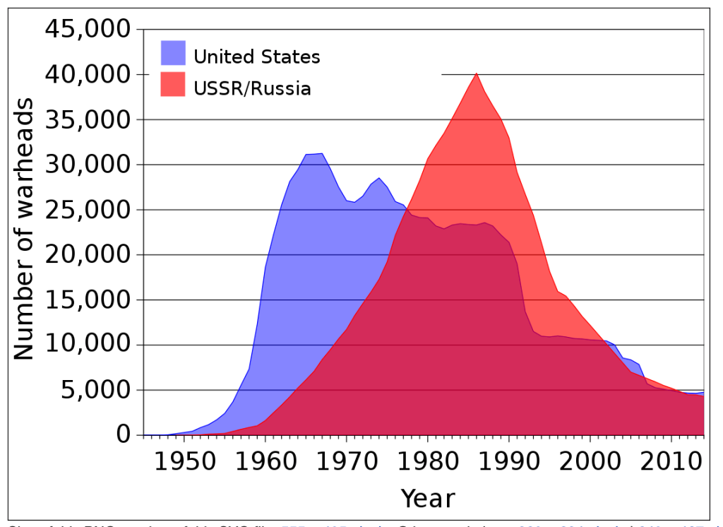
Area chart
An area chart works in the same way as a line chart, but the area below the line or lines used is filled with a corresponding colour for emphasis.
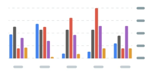
Bar chart
This chart depicts numerical values with the help of horizontal or vertical bars of different colours. It’s usually used for comparisons between several categories.
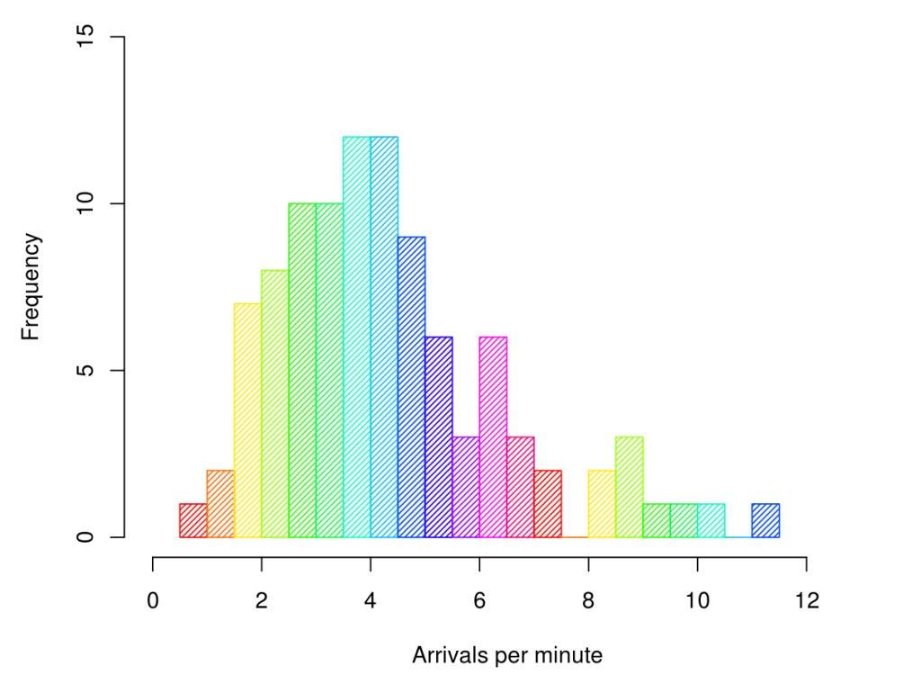
Histogram
This graph uses rectangles to depict the frequency of some variable/category, typically over time or with changing intervals. Unlike the bar chart, it’s not used for comparing different categories as it explores changes within one category.
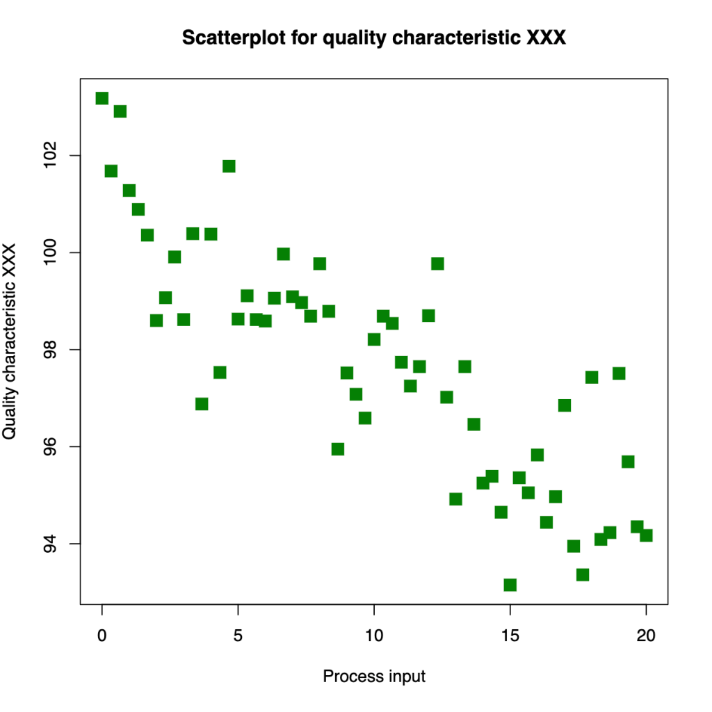
Scatter plot
A scatter plot looks similar to a line chart as it depicts correlations showing them between the two axes, but it uses dots instead of a line. A scatter plot is used when you need to determine whether there are clear correlations between two variables. It’s also helpful for identifying patterns and trends.
Pie chart
This graph presents data as a circular diagram where the size of each “slice” shows the proportion of a specific category compared to the whole, or 100%. Pie charts are handy for depicting percentages and comparing numeric values.
Donut chart
This is a variation of a pie chart that has a hollow center. The space inside can be used for text, such as labels or hints.
Bubble chart
This one is similar to the scatter chart, but it uses circles instead of dots. This allows you to reflect an additional dimension/criterion by varying the size of the circles, or bubbles.
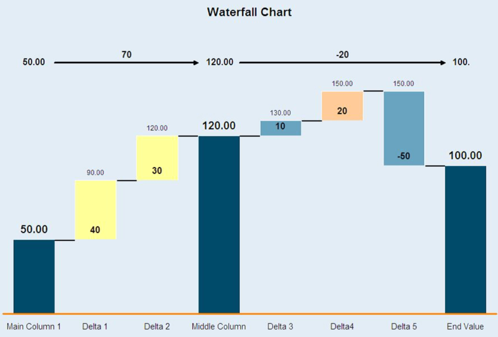
Waterfall chart
This chart uses bars of different colors to demonstrate how a sequence of positive and negative variables affects the outcome of a process.
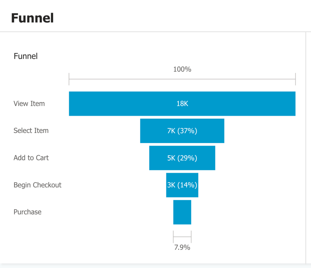
Funnel chart
This type of graph represents information as a funnel and is used to visualize different stages of a sales process.
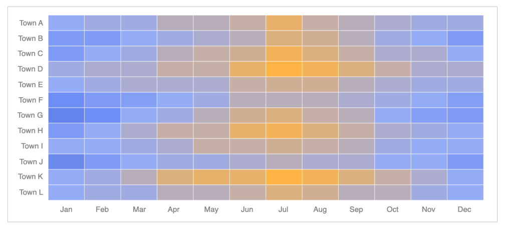
Heatmap
Typically, this is a table or matrix that shows numerical correlations between different categories, and each cell is assigned a specific color in accordance with the color coding principles selected. For example, green for high sale rates and red for low ones. Heatmap can also be used in the form of an actual map.
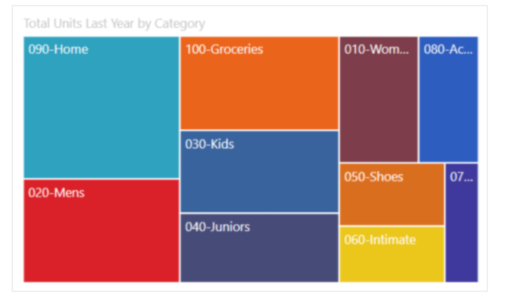
Treemap
Treemaps categorize data in the form of nested rectangles, where a bigger rectangle represents a category, adjacent smaller rectangles show sub-categories, and so on. Treemaps are used to organize hierarchical data.
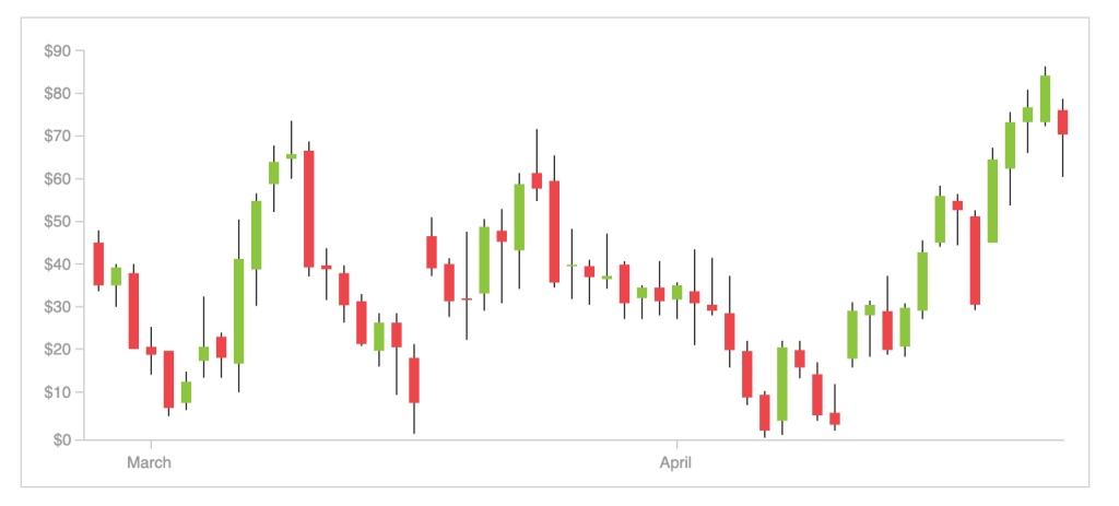
Candlestick chart
This type of graph is mostly used for trading and price monitoring. It’s similar to a scatter graph, but, instead of dots, it uses small rectangles – “candles”. They depict open, high, low, and close values, which are used to monitor and analyze price movements over time.
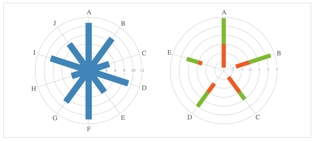
Radar chart
This chart is sometimes called a spider chart as its shape resembles cobwebs. It shows several lines or columns depicting different data categories, and those lines are arranged around a common axis in the center.
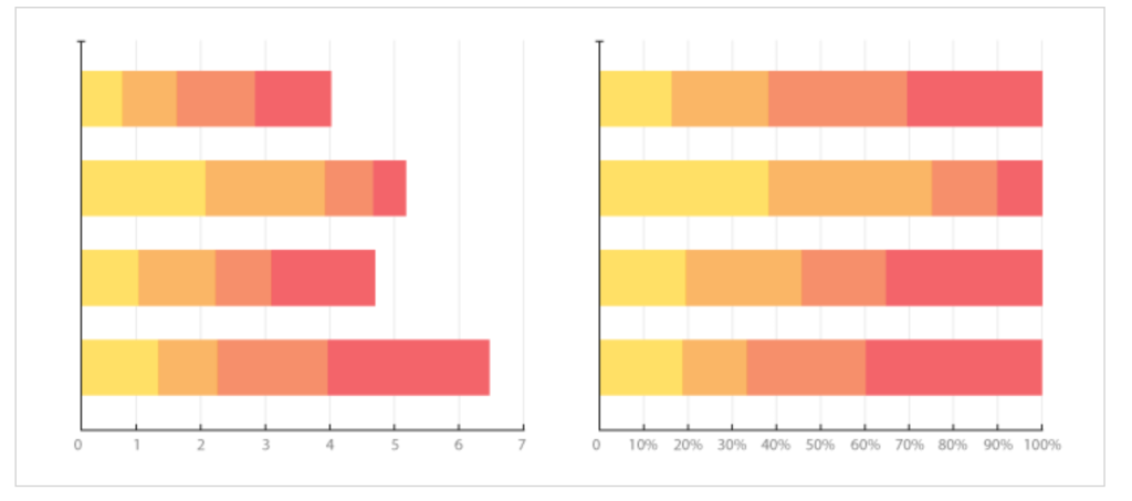
Progress bar chart
This is a variation of a bar chart, typically with horizontal bars, depicting the progress of a process over time. It’s used to track the completion of a task and its stages, as well as for planning.
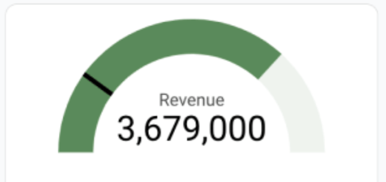
Gauge chart
This visual element shows data value on a dial, which allows you to quickly assess scale and see whether goals are met. Often, there are several gauge charts in a dashboard, which is convenient for monitoring different aspects of a process.
Data table
Presents information in a grid consisting of rows and columns. For dashboard purposes, it’s better to use colors for specific rows and columns to make the table easier to read.
Map
Shows data distribution on a map, allowing to track correlations across geographical areas. It can be in the form of a bubble map, where bubble size demonstrates the magnitude of a variable. Alternatively, it can be a choropleth map, where data is presented with colors or shades. The latter is typically used for presenting statistical data.
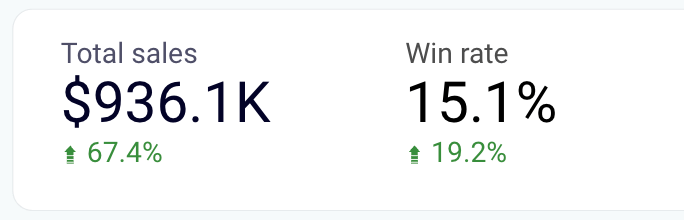
Scorecard / KPI indicator
Typically, this is a rectangle showing a key metric/KPI in a large font. For example, you can have a scorecard showing total revenue on the top of your dashboard.
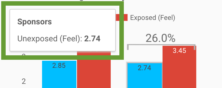
Tooltip
This is a commentary or additional explanation a user sees when hovering over a specific element. It can also be a label specifying the category.
Icon
A simple symbolical visual that can represent different values or categories. It can be added to a dashboard to make reading information easier.
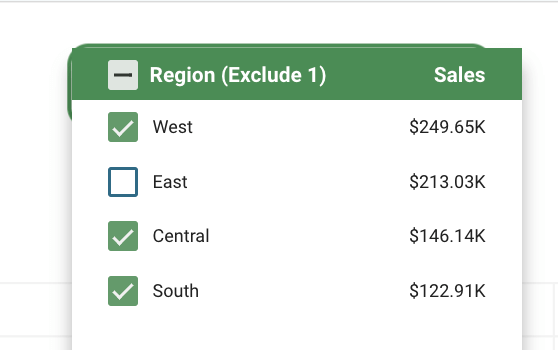
Filters
These are various interactive elements that allow your dashboard users to filter information and see it from different angles. These can be dropdown menus, checkboxes, calendar filters, or even a search bar.
Legend
If your dashboard uses complex color coding, a lot of icons, and so on, you can add a legend explaining what those colors or elements stand for. For example, maps are usually accompanied by a legend explaining what
We hope this list of graphic elements for a dashboard will help you build your data visualization. To select what you need, it’s best to list the types of information you want to depict and see which chart or graph can be the best fit for your goals. You can also explore common data visualization examples used in business to see how different chart types work with real data.
User experience considerations
A well-designed dashboard is a user-friendly one. Ideally, every data visualization dashboard should have:
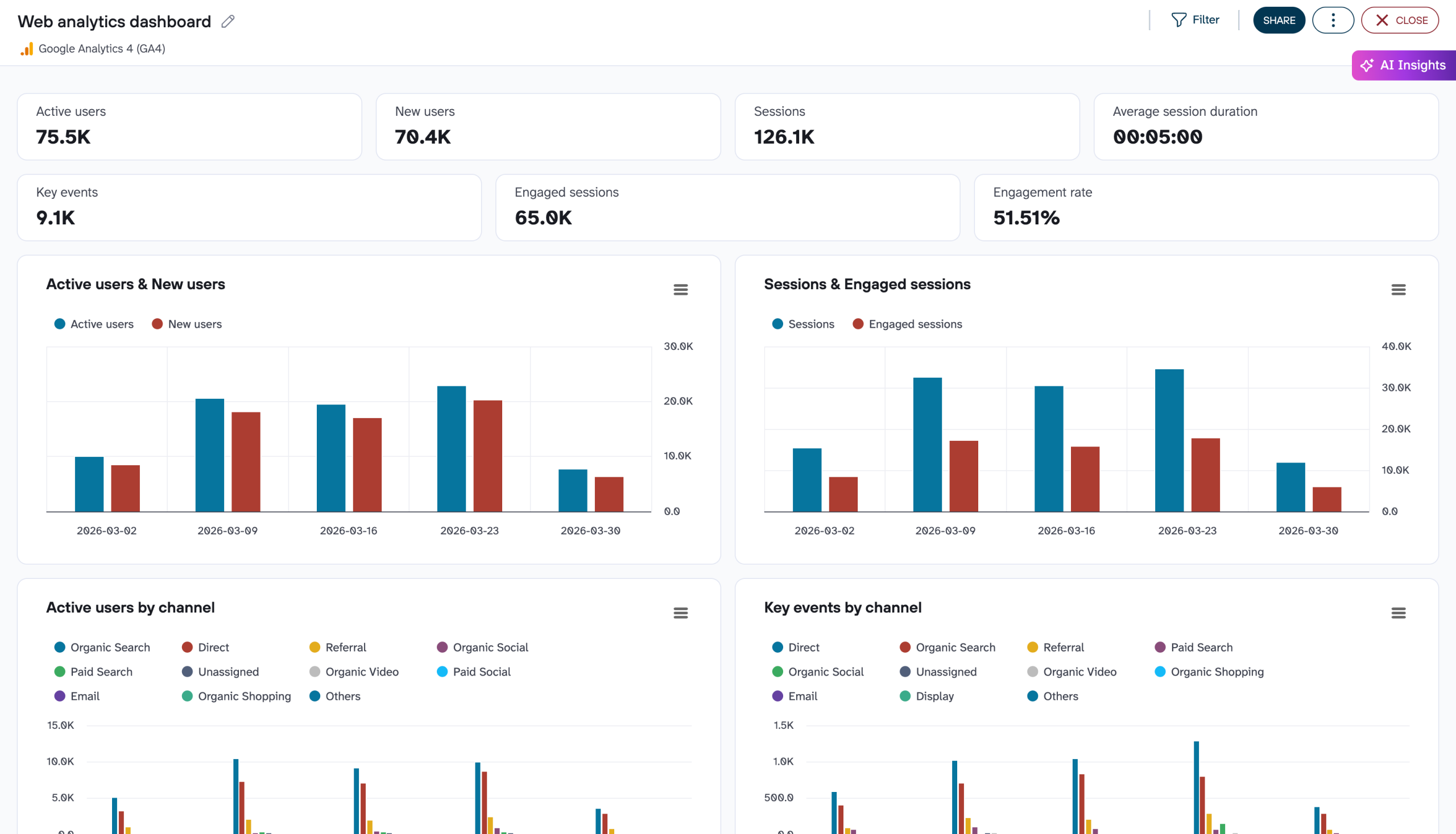
- A clear visual hierarchy. Arrange your information in a digestible way, starting with high-level details. At the top of the dashboard, present key metrics and results with scorecards. In the middle, use charts and graphs to show dynamics and progress over time. The bottom is where you can introduce tables or charts with granular data. This will prevent data overwhelm while still allowing you to dive into the numbers.
- Interactive elements. The most powerful dashboards allow you to interact with different visuals and customize your view. For example, it could be a map that lets you see financial performance by country, or a bar chart that lets you drill down into the results of a sales quarter. Adding filters for date periods, accounts, etc. is also a good idea.
- Smart color choices. Choose a color palette of 3-6 colors and use them consistently across the dashboard. The colors should complement each other while ensuring text and numbers are easy to read. You should also adhere to a clear logic for applying color to graphics, for example, to highlight key data points or trends.
- Shareability. It’s better to have a dashboard that you can share with stakeholders in a couple of clicks. That way, you won’t have to take screenshots or download PDFs. Shareability will depend on the type of BI tool you are using, with some (like Looker Studio) offering more flexibility than others.
- Fast load times. For the best user experience, dashboard visuals shouldn’t take more than a few seconds to load. However, loading times typically depend on your BI tool. In this particular case, Looker Studio is notorious for slow loading – something to keep in mind if you plan to consult your dashboard as frequently as every hour or day.
Free dashboard templates to build your data visualization in minutes
Coupler.io provides over 100 dashboard templates that you can start using for free. They all are equipped with connectors to easily load data from your source to the dashboard. Here you will find some examples of the templates by categories.
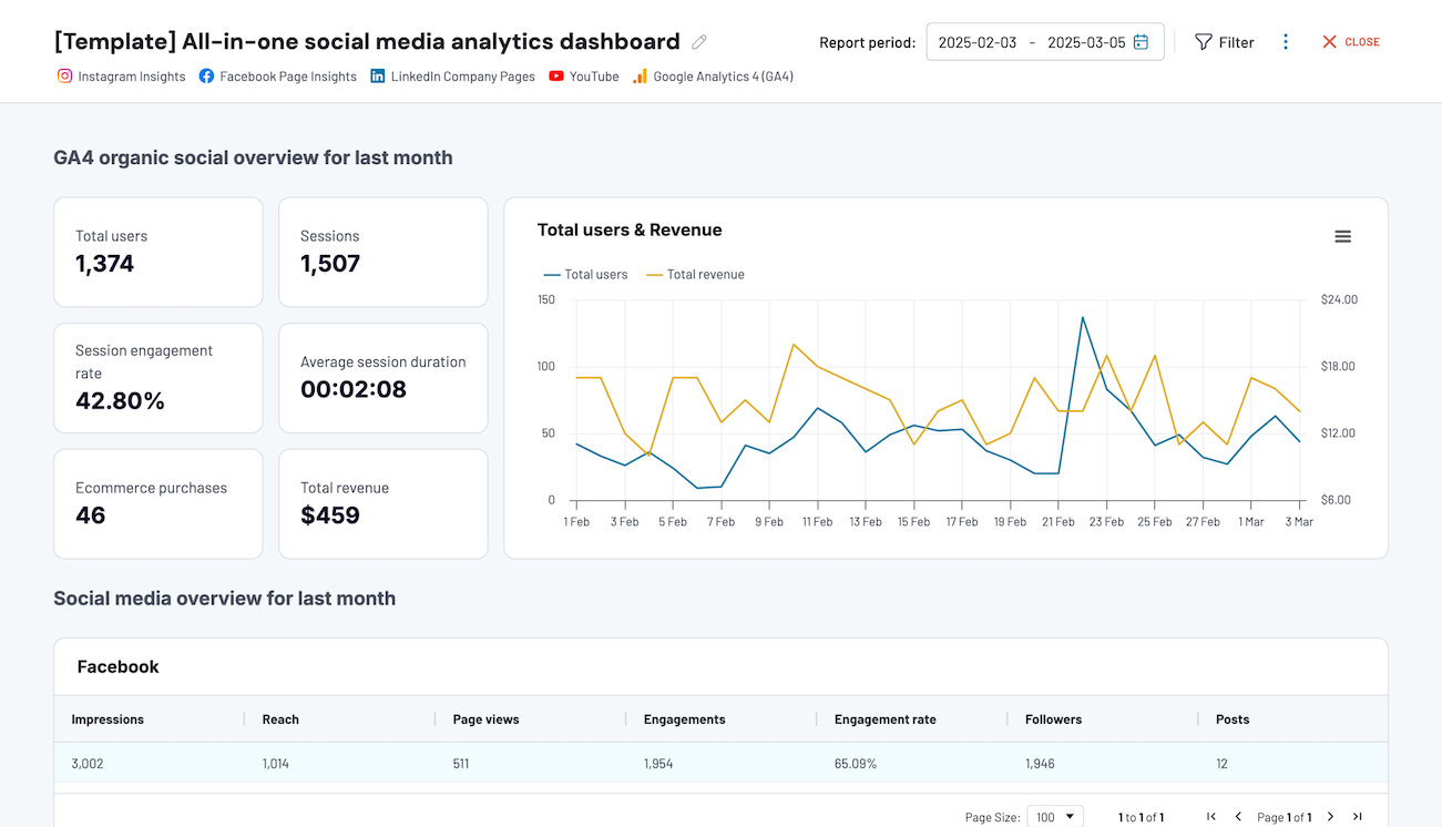
Marketing dashboard templates
Marketing dashboard templates provide an overview of your marketing efforts. They let you track ROI, identify trends, and make data-driven decisions to optimize your marketing strategy. You can understand campaign performance and get insights into lead generation and customer engagement. Use the dashboards to assess the effectiveness of your campaigns and adjust tactics as needed.


PPC dashboard templates
PPC dashboard templates let you analyze your pay-per-click advertising campaigns. You can monitor key metrics such as click-through rates, cost per click, and conversion rates in one place. The templates help you optimize your ad spend, identify high-performing keywords, and more.


Social media dashboard templates
Social media dashboard templates enable you to track your performance across multiple platforms. They offer insights into engagement metrics, follower growth, and content reach. This helps you understand which strategies are resonating with your audience.


Project management dashboard templates
Project management dashboard templates provide a clear overview of project progress, deadlines, and resource allocation. They help you keep track of tasks, milestones, and team performance. This way, you can ensure that projects stay on schedule and within budget. These templates enhance collaboration and communication, making project management more efficient and transparent.


Ecommerce dashboard templates
Ecommerce dashboard templates offer valuable insights into your online store’s performance. You can track sales, customer behavior, inventory levels, and other metrics. They help you identify trends, optimize product offerings, and improve customer satisfaction.


Finance dashboard templates
Finance dashboard templates provide insights into cash flow, expenses, and profitability. They help you monitor financial health, forecast trends, and make informed budgeting decisions. These templates help maintain financial stability and achieve business growth.


Sales dashboard templates
Sales dashboard templates give you a detailed view of your sales performance. You can track metrics like revenue, conversion rates, and sales pipelines. They help you identify top-performing products, monitor sales targets, and analyze team performance.


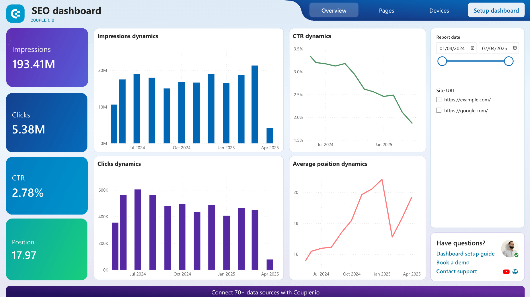
SEO dashboard templates
SEO dashboard templates help you monitor the effectiveness of your SEO strategies. They centralize key SEO metrics, such as keyword rankings, organic traffic, and backlink profiles. With these templates, you can enhance your website’s visibility and drive more organic traffic. For more on this topic, see our article on SEO dashboards.

CRM dashboard templates
CRM dashboard templates provide an overview of customer relationship management activities. They track lead conversion rates, customer satisfaction, sales pipelines, and other metrics. With these dashboards, you can understand customer interactions, improve service delivery, and build stronger relationships.

To use them, open the template you need and go to the Readme tab in the menu on the left. For more templates, check our dashboard templates gallery.
Steps to build a data visualization dashboard yourself
Define and interview your audience
The eyes you’ll be presenting a business dashboard to affect its structure greatly. If you’re creating it for your own analysis, the sky is the limit. You can make more than one dashboard, each filled with the data you think needs to be tracked.
If you’re making it for the top managers, your choices are narrowed down. You’ll figure out sooner or later what they’re interested in, and you’ll make sure those metrics are represented in a simple way. The last thing you want is a confused manager who requires additional reports and 3-hour-long meetings just to figure out the numbers.
On the other side, there are clients. Now, the ones you already do business with want to check where’s your team at with tasks and budget. Make sure you use the early meetings to figure out what they want to know, so you can set up a standard dashboard they’ll look at each time you meet. This way, they’ll know what to expect and can track changes easily.
Finally, potential clients can take a look at a dashboard that represents your company’s success. Naturally, this type of dashboard will also be updated, but it won’t have to be altered significantly for each potential client. Create the best visual representation of your data and use it when pitching your services.
Define the dashboard’s metrics
Once you’ve established your audience, you should have a clearer picture of the metrics that will find their way to your dashboard. Sometimes, you’ll need to track the trends of CTRs, sales, website visits, or return rates. Other times, colorful pie charts of customer group scans or product variety will be needed. In any case, before getting started with data extraction and data visualization, you need to be sure what you want to show.
Choose a data visualization software
The app market offers many solutions, and soon you’ll discover the most popular ones, like Google Looker Studio, Domo, or Tableau. Here’s a piece of advice: read the reviews. You’ll get a clearer picture of what it’s like to use a certain app before even starting to compare pricing plans.
Connect your data
Whatever the purpose of your dashboard is, you’ll want it to have fresh data. Use a connector or integration to automate data load to your dashboard. Most BI tools provide native connectors. However, they are usually limited, so, you’ll likely have to find a third-party solution. Consider Coupler.io which can save you time, so you don’t have to keep updating the dashboard manually. It supports over 400 apps as data sources and 15+ destinations.
Design your data visualization dashboard
Create a layout, add visuals, format styles, and do your best to deliver the dashboard that will meet your reporting requirements. Knowing the essential data visualization best practices will be quite useful if you want to take this journey.
For step-by-step instructions on building a dashboard on your own, check our Looker Studio Tutorial: Dashboard for Beginners.
Also, check out how to build a funnel in Looker Studio.
User experience considerations
A well-designed dashboard is a user-friendly one. Ideally, every data visualization dashboard should have:
- A clear visual hierarchy. Arrange your information in a digestible way, starting with high-level details. At the top of the dashboard, present key metrics and results with scorecards. In the middle, use charts and graphs to show dynamics and progress over time. The bottom is where you can introduce tables or charts with granular data. This will prevent data overwhelm while still allowing you to dive into the numbers.
- Interactive elements. The most powerful dashboards allow you to interact with different visuals and customize your view. For example, it could be a map that lets you see financial performance by country, or a bar chart that lets you drill down into the results of a sales quarter. Adding filters for date periods, accounts, etc. is also a good idea.
- Smart color choices. Choose a color palette of 3-6 colors and use them consistently across the dashboard. The colors should complement each other while ensuring text and numbers are easy to read. You should also adhere to a clear logic for applying color to graphics, for example, to highlight key data points or trends.
- Shareability. It’s better to have a dashboard that you can share with stakeholders in a couple of clicks. That way, you won’t have to take screenshots or download PDFs. Shareability will depend on the type of BI tool you are using, with some (like Looker Studio) offering more flexibility than others.
Fast load times. For the best user experience, dashboard visuals shouldn’t take more than a few seconds to load. However, loading times typically depend on your BI tool. In this particular case, Looker Studio is notorious for slow loading – something to keep in mind if you plan to consult your dashboard as frequently as every hour or day.
Ask for feedback and update the dashboard if needed. The first version of your dashboard might not be the final one. Ask your managers, clients, and team members if the information on it is vital or redundant and whether it’s clear enough. After all, you can keep as many versions as you want for yourself and tweak the ones that others use as well.
Data visualization dashboard – templates, DIY, or hire an expert?
Whether to build a data visualization dashboard yourself or hire an expert depends on several factors, including your organization’s resources and the complexity of the data and dashboard.
Learn more about how to create a dashboard in our comprehensive guide.
If you have a small amount of data and the dashboard requirements are simple, you may be able to create a basic dashboard using tools like Excel, Google Sheets, Tableau Public, etc. There are also open-source libraries in Python, such as Matplotlib and Seaborn, and JavaScript libraries like D3.js that you can use to create your own custom dashboards.
However, if the data is complex and the dashboard requirements are more advanced, it may be more efficient to hire an expert service. In this case, you will be able to design and implement a dashboard that is tailored to your specific needs. Plus you’ll be provided with guidance on the best tools and techniques to use. If you don’t have the time or the expertise to build the dashboard yourself, hiring an expert can save you time and ensure that the dashboard is built correctly.
Ultimately, the choice for using dashboard templates is a balanced decision between DIY and hiring an expert.
This completes our breakdown of data dashboards and interactive visualizations! We hope it will inspire you to try creating one of your own and start analyzing data in an automated and comprehensive way.

Create custom dashboards or use the white-label templates with Coupler.io
Get started for free